Let’s talk about the subject of noise. To begin with, we have to agree on a definition, which might become the biggest part of the problem. For normal people, going about their daily lives, “noise” is a word that usually means “unwanted sound”, as the Grinch explained, just before hitching up his dog to a sleigh:
However, “noise” means something else to an audio professional, who is consequently not “normal” and does not have a life – daily or otherwise.
When an audio professional says “noise”, they mean something very specific – “noise” is an audio signal that is random. For example, if the noise signal is digital, there would be no way to predict the value of the next sample – even if you know everything about all previous samples.
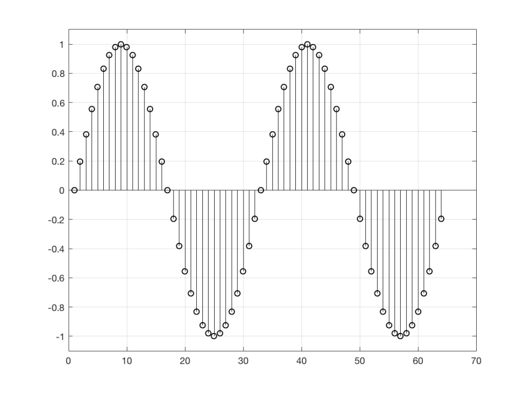
Figure 1: It would be fairly easy to guess the value of the next sample in the signal (#65), based on looking at what has happened before. This is because the signal is, as far as we can see here, periodic – meaning that it repeats itself – meaning that it repeats itself…
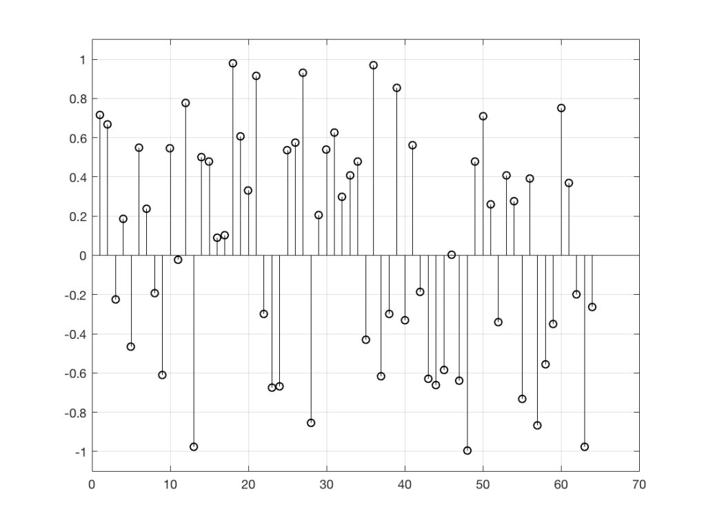
Figure 2: It’s impossible to predict the next value in the sequence, because there is no pattern in the previous samples. Each value is a random number between -1 and 1, and the next random number is, in no way, related to the ones before it.
So, “noise”, according to the professionals, is a signal made of a random sequence. However, we can be a little more specific than this. For example, in order to make the noise plotted in Figure 2, above, I asked Matlab to generate 64 random numbers between -1 and 1 using the code
rand(1,64)*2-1
So, although this will generate random numbers for me (we’ll assume for the purposes of this discussion that Matlab is able to generate truly random numbers… actually they’re “pseudorandom” – but let’s pretend for today…), there are some restrictions on those values. No matter how many random values I ask for using this code, I will never get a value greater than 1 or less than -1.
However, if I used a slightly different Matlab function – “randn” instead of “rand”, using the following code
randn(1,64)
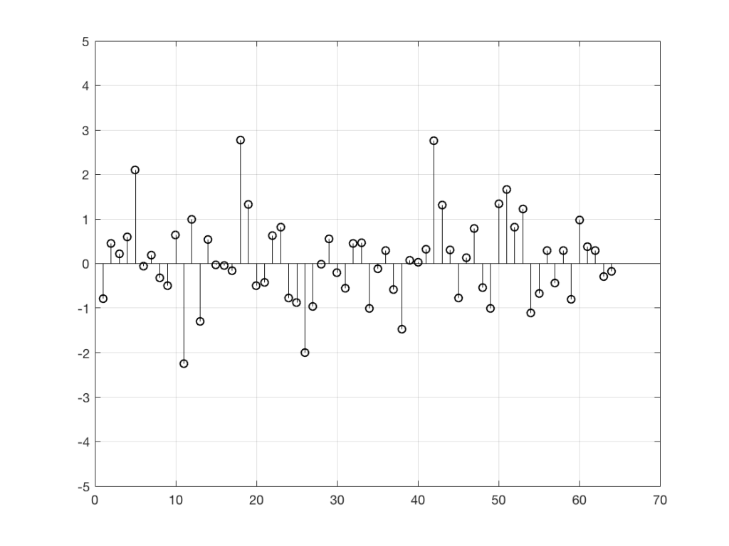
I would get 64 random numbers, but they are not restricted as my previous bunch were, as you can seen in Figure 2a, below.
Figure 2a: Another sequence of random numbers, this time with a different distribution.
Again, it’s impossible to guess what the next value will be, but now you can see that it might be greater than 1 or less than -1 – but it will more likely to be closer to 0 than to be a “big” number.
So, Figures 2 and 2a show two different types of noise. Both are random numbers, but the distribution of the numbers in those two sequences are different.
To be more specific:
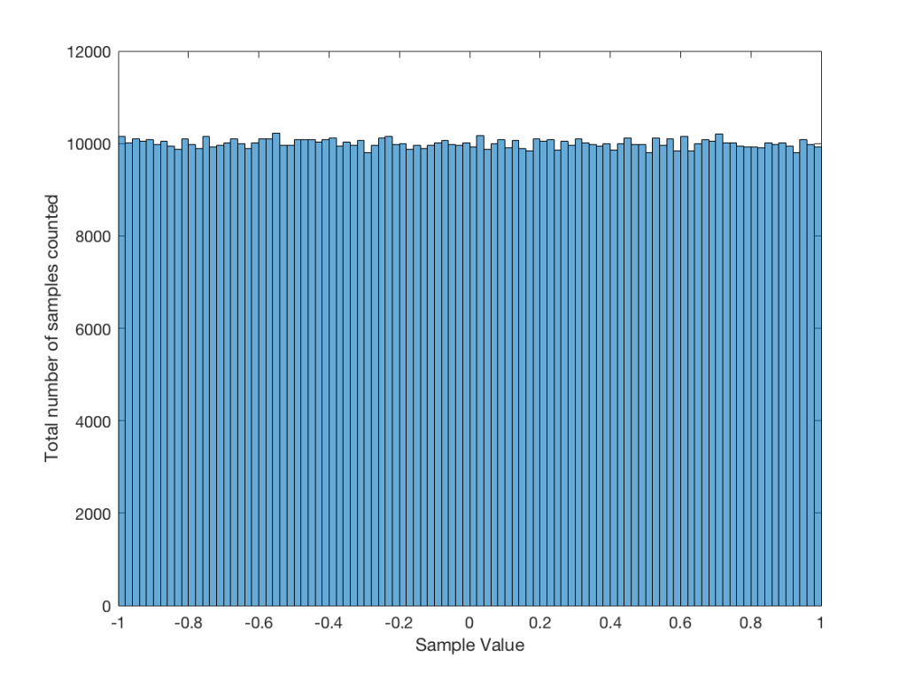
Let’s use the “rand(1,1000000)*2-1” function to make a sequence of 1,000,000 samples. We know that this will produce values ranging from -1 to 1. So, we’ll divide this range into 100 steps (-1.00 to -0.98, -0.98 to -0.96, -0.96 to -0.94, … and so on up to 0.98 to 1.00 – I know, I know, there’s some overlap here, but I didn’t want to use a bunch of less than or equal to symbols… The concept is the important point here… Back off!). For each of those divisions, we’ll count how many of the 1,000,000 samples fall inside that smaller range, and we’ll plot it. This is shown in Figure 3a.
Figure 3a: A plot showing the distribution of the values of 1,000,000 samples generated by the Matlab code “rand(1, 1000000) * 2 – 1”
As you can see in Figure 3a, there are about 10,000 samples in each “bin”. This means that about 10,000 samples have a value that fall within each of the smaller slices of the total range. Also, if I added up the values of all 100 of those numbers plotted in 3a, I would get 1,000,000, since that’s the total number of values that we analysed.
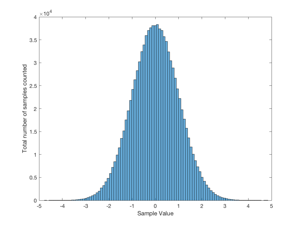
If I do the same thing to the numbers coming out of the other function: “randn(1,1000000)” it would look very different. As we already saw, the numbers can be outside the range of -1 to 1, and they’re more likely to be around 0 than to be far away from it. This can be seen in Figure 3b.
Figure 3b: A plot showing the distribution of the values of 1,000,000 samples generated by the Matlab code “randn(1,1000000)”.
Just to clean up a loose end – there are official terms to describe these differences. The noise plotted in Figure 2 has what is called a “rectangular distribution” because a plot of the distribution of the values in it (if we measure enough sample values) eventually looks like a rectangle (a blue rectangle, in the case of Figure 3a). The noise plotted in Figure 2a has a “normal distribution”, as can be seen in the bell-like shape of the plot in Figure 3b. There are many other types of distributions (for example, rolling 2 dice will give you random numbers with a “triangular distribution”), but we’ll leave it at 2 for now.
So, we’ve seen that we can have at least two different “types” of random number sets – but let’s do a little more digging.
Frequency content
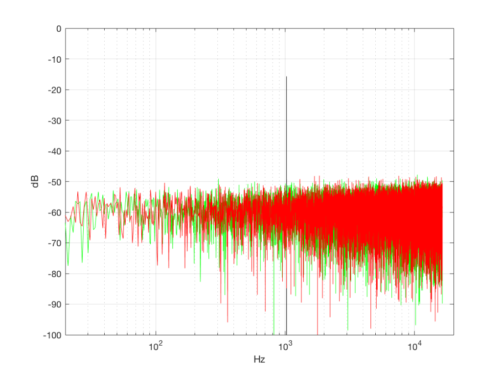
Here’s where things get a little interesting. If I take the 1,000,000 samples that I used to make the plot in Figure 3a and I pretend it’s an audio signal, and then calculate the frequency content (or spectrum) of the signal, it would look like the green plot in Figure 4a, below. If I did a frequency analysis of the signal used to make the plot in Figure 3b, it would look like the red plot.
Figure 4a: The frequency content of three different signals, as is described in the surrounding text.
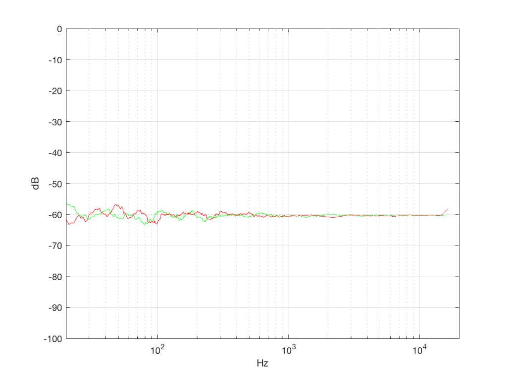
What’s interesting about this is that, basically speaking, the two signals, although they’re very different, have basically the same spectra – meaning they have the same frequency content, and therefore they’ll sound the same. This is really evident if I smooth these two plots using, for example, a 1/3 octave smoothing function, as is shown below in Figure 4b.
Figure 4b: The same data as is shown in Figure 4a, with a 1/3 octave smoothing applied.
As you can see there, the very fine peaks and dips in the response shown in Figure 4a, when averaged, smooth to the flat response shown in Figure 4b.
Now we have to clear up a couple of issues…
The first is that, as you can see in the plot above, the spectrum of both random signals (both noise generators) is flat. However, due to the way that I did the math to calculate this, this means that we have an equal amount of energy in equal-sized frequency ranges throughout the entire frequency range of the signal. So, for example, we have as much energy from 20-30 Hz as we do from 1000-1010 Hz as we do from 10,000 – 10,010 Hz. In other words, we have equal energy per Hz. This might be a little counter-intuitive, since we’re looking at a semilogarithmic plot (notice the scale of the x-axis) but trust me, it’s true. This means that, in both cases, we have what is known as a “white noise” signal – which is a colourful way of saying “noise with an equal amount of energy per Hz”.
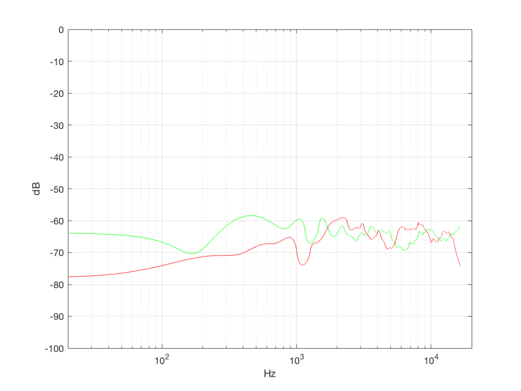
The second thing is that I just lied to you. In order to get the pretty plots in Figures 4a and 4b, I had to take long signals and analyse how much energy we got, over a long period of time. If I had taken a shorter slice of time (say, 100 samples long) then the spectra plots would not have looked as pretty – or as flat. For example, if I just take the first 100 samples of both of those noise generator outputs, and calculate the spectra in those, I get the plots in Figure 4c, below.
Figure 4c: The spectra in the first 100 samples of the signals analysed in Figures 4a and 4b.
Notice that these plots do not look nearly as flat – even though I’ve smoothed them with a 1/3 octave smoothing filter again. Why is this?
Well, the problem is probability. Since the two signals are random, there is no guarantee that all frequencies will be contained in them for any one little slice of time. However, there is an equal probability of getting energy at all frequencies over time. So, in a really strange universe, you might get all frequencies below 1000 Hz for one second, and then all frequencies above 1000 Hz for the next second – over two seconds, you get all frequencies, but at any one moment, you don’t.
What this means is that “white noise” doesn’t necessarily contain energy at all frequencies equally – unless you wait for a long time. If you listen for long enough, all frequencies will be represented, but the shorter the measurement, the less “flat” your response.
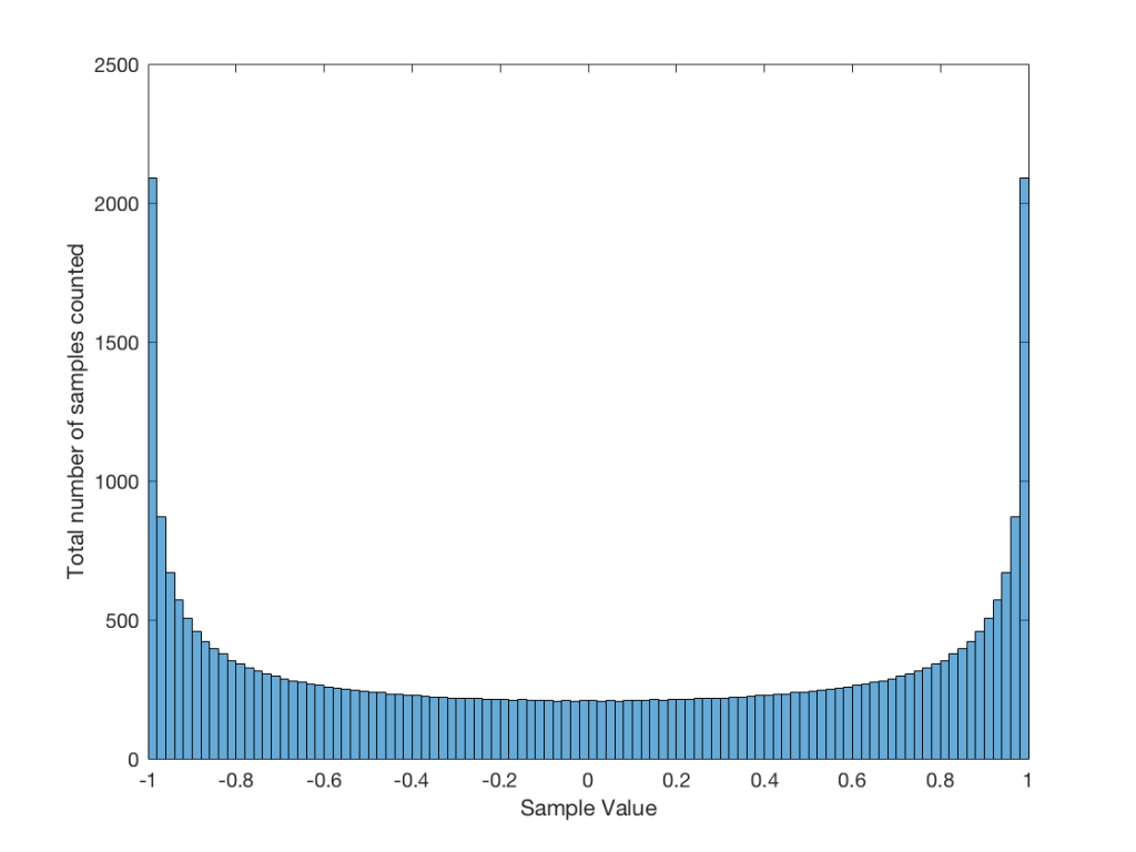
Just for the purposes of comparison, let’s also find out what the distribution of values is for a sine wave – since this might be interesting later… This is shown in Figure 5, below.
Fig 5: The distribution of values in a sine wave that has a peak value of 1. Basically, what this plot means is that, on average, a sine wave doesn’t spend much time around “0” – and it spends a lot of time out at the extremes.
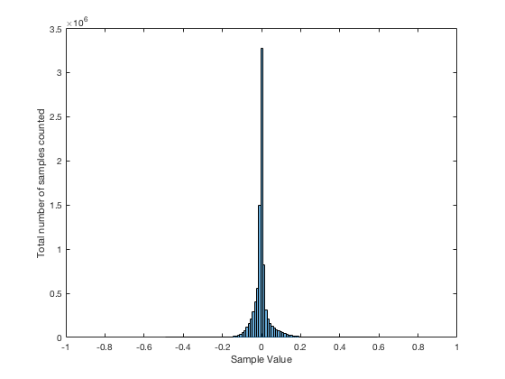
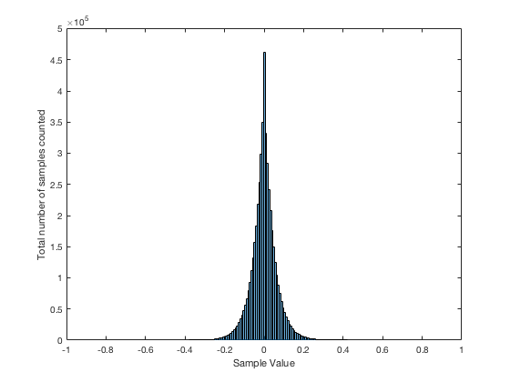
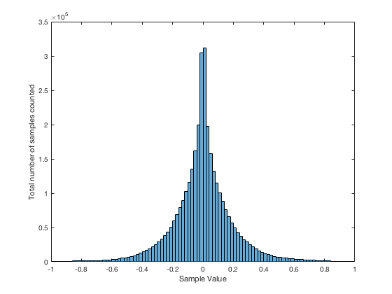
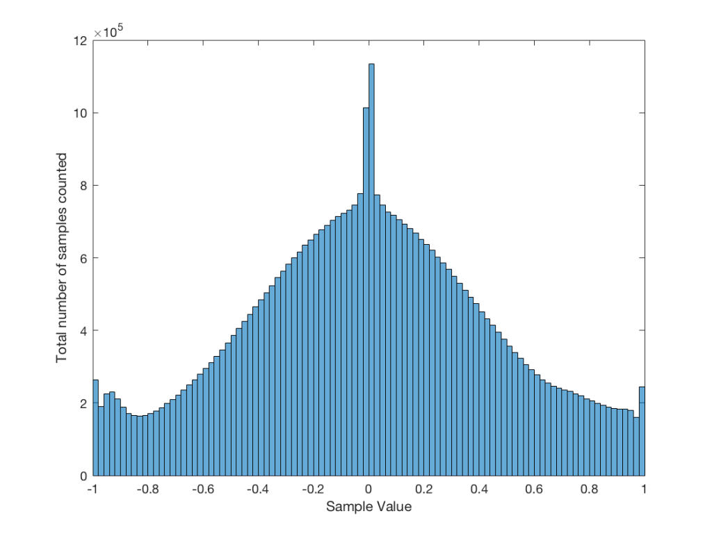
It may be interesting to note that “normal” sounds like music and speech have distributions that look much more like Figure 3b than like Figure 5, as is shown in the examples in Figures 6, 7, and 8. This is why you shouldn’t necessarily use a sine wave to measure a piece of audio equipment and draw a conclusion about how music will sound…
Fig 6. The distribution of values for an anechoic recording of female voice, made without any processing. A non-anechoic recording of any voice would have a similar shape…
Fig 7. The distribution of values in a recording of a Brandenburg Concerto that I happen to like.
Fig 8. The distribution of values in the samples in the first 60 seconds of “Smells Like Teen Spirit” by Nirvana.
Fig 9: The distribution of all of the samples in Metallica’s “The Day that Never Comes”. This one is admittedly pretty strange – but that won’t come as a surprise to many people.
Averaging
If I play the first kind of white noise (the one shown in Figure 2) and measure how loud it is with a sound pressure level meter, I’ll get a number – probably higher than 0 dB SPL (or else I can’t hear it) and hopefully lower than 120 dB SPL (or else I’ll probably be in pain…). Let’s say that we turn up the volume until the meter says 70 dB SPL – which is loud enough to be useful, but not loud enough to be uncomfortable.
Then, I switch to playing the other kind of white noise (the one shown in Figure 2a) and turn up the volume until it also measures 70 dB SPL on the same meter.
Then, I switch to playing a sine wave at 1 kHz and turn up the volume until it also reads 70 dB SPL.
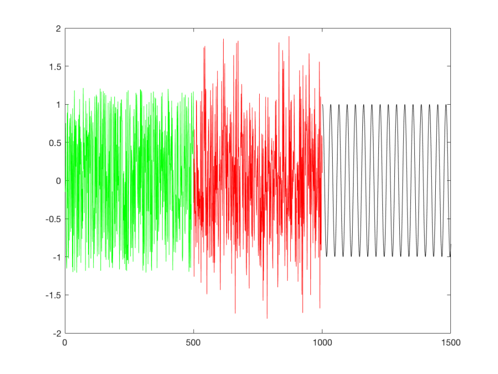
If I were to compare what is coming into the loudspeaker for each of those three signals, after they have been calibrated to have the same output level, they would look like the three signals in Figure 9.
Fig 9: Three different signals, all calibrated to have the same output level when measured with a meter that doesn’t know anything about frequency content. The green signal is white noise as shown in Figure 2. The red plot is white noise as shown in Figure 2a. The black plot is a sine wave.
These will all sound roughly the same level, but as you can see in the plot in Figure 9, they do not have the same PEAK level – they have the same average level – averaged over time…
However, if we were to do a frequency-dependent analysis of these three signals, one of these things would not look like the others… Check out Figure 4a, which I’ve copied below…
Figure 4a: The frequency content of three different signals, as is described in the surrounding text.
Notice that, in a frequency-dependent analysis, the sine wave (the black line sticking up around 1000 Hz) looks much louder (35 dB louder is a lot!) than the green plot and the red plot (our two types of white noise). So, even though all three of these signals sound and measure to have roughly the same level, the distribution of energy in frequency is very different.
Another way to think about this is to say that each of the three signals has the same energy – but the sine wave has all of it at only one frequency all the time – so there’re more energy right there. The noise signals have the energy at that frequency only some of the time (as was explained above…).
ANOTHER way to think about this is to put a glass of water in the bottom of an empty bathtub. If the depth of the water in the glass is 10 cm – and you pour it out into the tub, the depth of the water will be less, since it’s distributed over a larger area.
As you can see in the title of this posting, this is “Part 1″… All of this was to set up for Part 2, which will (hopefully) come next week. As a preview: the topic will be the use (and mis-use) of weighting functions (like “A-weighting”) when doing measurements…
“Lyden av BeoLab 90 er vanskelig å forklare, den må egentlig bare oppleves. Personlig har jeg aldri hørt en mer livaktig musikkgjengivelse, og flere som har vært på besøk reagerte med å klype seg i armen eller felle en tåre når de hørte et opptak de kjente, eller rettere sagt trodde de kjente!”
“The sound of the BeoLab 90 is hard to explain, it must really be experienced. Personally I have never heard a more lifelike music reproduction, and several who have been visiting reacted by pinching their own arm or shedding a tear when they heard a recording they knew, or rather thought they knew!”
Goethe said “I do not know myself, and God forbid that I should.” However, when I’m asked the question “what are you?” this is a well-edited version of my typically rambling answer…
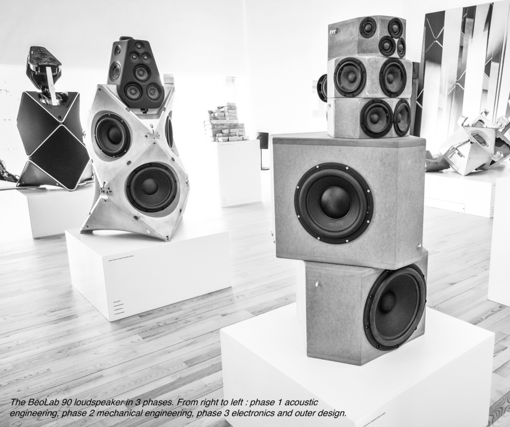
Over the past year or so, I’ve had lots of discussions and interviews with lots of people (customers, installers, and journalists) about Bang & Olufsen’s loudspeakers – Beolab 90 in particular. One of the questions that comes up when the chat gets more technical is whether our loudspeakers use native sampling rates or sampling rate conversion – and why. So, this posting is an attempt to answer this – even if you’re not as geeky as the people who asked the question in the first place.
There are advantages and disadvantages to choosing one of those two strategies – but before we get to talk about some of them, we have to back up and cover some basics about digital audio in general. Feel free to skip this first section if you already know this stuff.
A very quick primer in digital audio
An audio signal in real life is a change in air pressure over time. As the pressure increases above the current barometric pressure, the air molecules are squeezed closer together than normal. If those molecules are sitting in your ear canal, then they will push your eardrum inwards. As the pressure decreases, the molecules move further apart, and your eardrum is pulled outwards. This back-and-forth movement of your eardrum starts a chain reaction that ends with an electrical signal in your brain.
If we take your head out of the way and replace it with a microphone, then it’s the diaphragm of the mic that moves inwards and outwards instead of your eardrum. This causes a chain reaction that results in a change in electrical voltage over time that is analogous to the movement of the diaphragm. In other words, as the diaphragm moves inwards (because the air pressure is higher), the voltage goes higher. As the diaphragm moves outwards (because the air pressure is lower) the voltage goes lower. So, if you were to plot the change in voltage over time, the shape of the plot would be similar to the change in air pressure over time.
We can do different things with that changing voltage – we could send it directly to a loudspeaker (maybe with a little boosting in between) to make a P.A. system for a rock concert. We could send it to a storage device like a little wiggling needle digging a groove in a cylinder made of wax. Or we could measure it repeatedly…
That last one is where we’re headed. Basically speaking, a continuous, analogue (because it’s analogous to the pressure signal) audio signal is converted into a digital audio signal by making instantaneous measurements of it repeatedly, and very quickly. It’s a little bit like the way a movie works: you move your hand and take a movie – the camera takes a bunch of still photographs in such quick succession that, if you play back the photos quickly, it looks like movement to our slow eyes. Of course, I’m leaving out a bunch of details, but that’s the basic concept.
So, a digital audio signal is a series of measurements of an electrical voltage (which was changing over time) that are transmitted or stored as numbers somehow, somewhere.
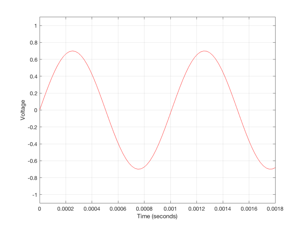
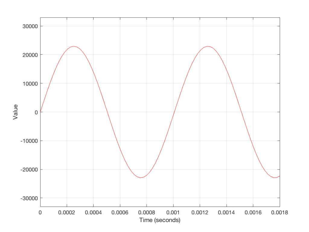
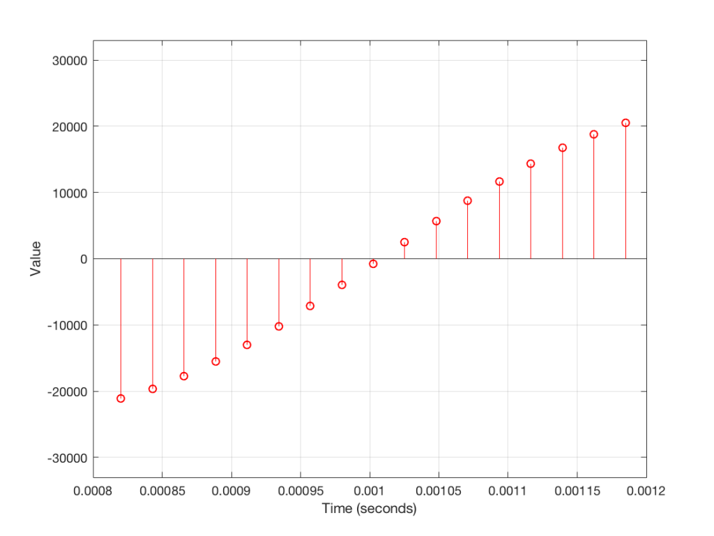
Figure 1: A plot showing the change in voltage over time by an arbitrary signal (which happens to look very much like a sine wave, because you always use sine waves when you’re doing science).Figure 2: A plot showing the same waveform after it has been converted to a digital representation. Notice that it’s the same shape, only the values on the y-axis have changed. Note as well that these values are arbitrary. In this case, I’ve done the conversion such that an analogue signal of 1 V at the input corresponds to a value of 32768 in the digital representation. It doesn’t matter why I picked this scaling.Figure 3: If we zoom in on a small section of Figure 2, it would look like this. Notice that the wave is not really a continuous line – it’s a series of discrete measurements (represented here by a bunch of circles on sticks – or poorly-drawn lollipops, depending on your point of view.)
Figure 3 shows a small slice of time from Figure 2, which is, itself a small slice of time that normally is considered to extend infinitely into the past and the future. If we want to get really pedantic about this, I can tell you the actual values represented in the plot in Figure 3. These are as follows:
-21115
-19634
-17757
-15522
-12975
-10167
-7153
-3996
-758
2495
5698
8786
11697
14373
16759
18807
20477
The actual values that I listed there really aren’t important. What is important is the concept that this list of numbers can be used to re-construct the signal. If I take that list and plot them, it would look like Figure 4.
Figure 4: A plot of the values listed above. Notice that this looks exactly like the plot in Figure 3 (because it is…)
So, in order to transmit or store an audio signal that has been converted from an analogue signal into a digital signal, all I need to do is to transmit or store the numbers in the right order. Then, if I want to play them back (say, out of loudspeaker) I just need to convert the numbers back to voltages in the right order at the right rate (just like a movie is played back at the same frame rate that the photos were take in – otherwise you get things moving too fast or too slowly).
One last piece of information that you’ll need before we move on is that, in a digital audio system, the audio signal can only contain reliable information below the frequency that is one-half of the “sampling rate” (which is the rate at which you are grabbing those measurements of the voltages – each of those measurements is called a “sample”, since it’s taking an instantaneous sample of the current state of the system). It’s just like taking a blood sample or a water sample – you use it as a measurement of one portion of one thing right now. This means that if you want to record and play back audio up to 20,000 Hz (or 20,000 cycles per second – which is what textbooks say that we can hear) you will need to be making more than 40,000 measurements per second. If we use a CD as an example, the sampling rate is 44,100 samples per second – also known as a sampling rate of 44.1 kHz. This is very fast.
Sidebar: Please don’t jump to conclusions about what I have said thus far. I am not saying that “digital audio is perfect” (or even “perfect-er or worse-er than analogue”) or that “this is all you need to understand how digital audio works”. And, if you are the type of person who worships at “The Church of Our Lady of Perpetual Jitter” or “The Temple of Inflationary Bitrates” please don’t email me with abuse. All I’m trying to do here is to set the scene for the discussion to follow. Anyone really interested in how digital audio really works should read the collected writings of Harry Nyquist, Claude Shannon, John Watkinson, Jamie Angus, Stanley Lipshitz, and John Vanderkooy and send them emails instead. (Also, if you’re one of the people that I just mentioned there, please don’t get mad at me for the deluge of spam you’re about to receive…)
Filtering an audio signal
Most loudspeakers contain a filter of some kind. Even in the simplest passive two-way loudspeaker, there is very likely a small circuit called a “crossover” that divides the analogue electrical audio signal so that the low frequencies go to the big driver (the woofer) and the higher frequencies go to the little driver (the tweeter). This circuit contains “filters” that have an input and an output – the output is a modified (or filtered) version of the input. For example, in a low-pass filter, the low frequencies are allowed to pass through it, and the higher frequencies are reduced in level (which makes it useful for sending signals to the woofer).
Once again over-simplifying, this is accomplished in an electrical circuit by playing with something called electrical impedance – a measure of how much the circuit impedes the flow of current to the next device. Some circuits will impede the flow of current if it’s alternating quickly (a high frequency) other circuits might impede the flow of current if it’s alternating slowly (a low frequency). Other circuits will do something else…
It is also possible to filter an audio signal when it is in the digital domain instead. We have the series of numbers (like the one above) and we can send these to a mathematical function which will change the values into other numbers to produce the desired characteristics (like a low-pass filter, for example).
As a simple example, if we take all of the values in the list above, and multiply them by 0.5 before converting them back to voltages, then the output level will be quieter. In other words, we’ve made a volume knob in the digital domain. Of course, it’s not a very good knob, since it’s stuck at one setting… but this isn’t a course in advanced DSP…
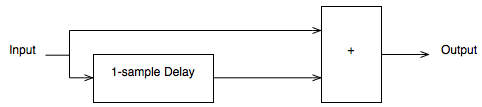
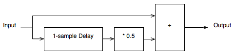
If you want to make something more exciting than a volume knob, the typical way of making an audio filter in the digital world is to use delays to mix the signal with delayed copies of itself. This can get very complicated, but let’s make a simple filter to illustrate…
Figure 5. A very simple digital audio low pass filter
Figure 5 shows a very simple low pass filter for digital audio. Let’s think though what will happen when we send a signal through it.
If you have a very low frequency, then the current sample goes into the input and heads in two directions. Let’s ignore the top path for now and follow the lower path. The sample goes into a delay and comes out on the other side 1 sample later (in the case of a CD, this is 1/44100-th of a second later). When that sample comes out of the delay, the one that followed it (which is now “now” at the input) meets it at the block on the right with the “+” sign in it. This adds the two samples together and spits out of the result. In other words, the filter above adds the current audio sample to the previous audio sample and delivers the result as the current output.
What will this do to the audio signal?
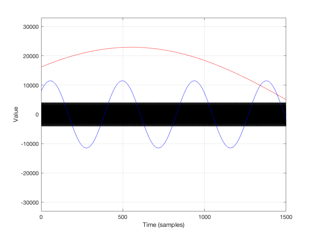
If the frequency of the audio signal is very low, then the two samples (the current one, and the previous one) are very similar in level, as can be seen in the plot in Figures 6 and 7, below. This means, basically, that the output of the filter will be very, very similar to the output, just twice as loud (because it’s the signal plus itself). Another way to think of this is that the current sample of the audio signal and the previous sample of the same signal are essentially “in phase” – and any two audio signals that are “in phase” and added together will give you twice the output.
However, as the frequency of the audio signal gets higher, the relative levels of those two adjacent samples becomes more and more different (because the sampling rate doesn’t change). One of them will be closer to “0” than the other – and increasingly so as the frequency increases . So, the higher the audio frequency, the lower the level of the output (since it will not go higher than the signal plus itself, as we saw in the low frequency example…) If we’re thinking of this in terms of phase, the higher the frequency of the audio signal, the greater the phase difference between the adjacent samples that are summed, so the lower the output…
That output level keeps dropping as the audio frequency goes up until we hit a frequency where the audio signal’s frequency is exactly one half of the sampling rate. At that “magic point”, the two samples are so far apart (in terms of the audio signal’s waveform) that they have opposite polarity values (because they’re 180 degrees out-of-phase with each other). So, if you add those two samples together, you get no output – because they are equal, but opposite.
Figure 6: Portions of three sine waves – one at 10 Hz (red), one at 100 Hz (blue) and one at 22050 Hz (black), sampled at 44.1 kHz.
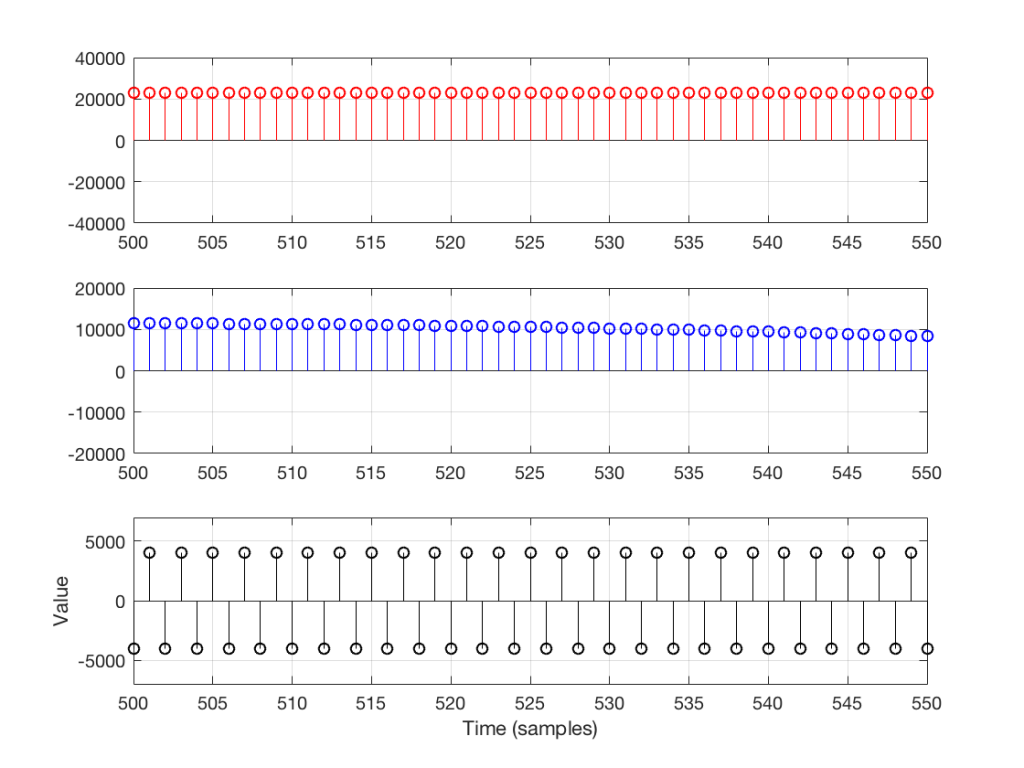
Let’s zoom in on the plot in Figure 6 to see the individual samples. We’ll take a slice of time around the 500-sample mark. This is shown below in Figure 7.
Figure 7: a portion of Figure 6, zooming in around the 500-sample mark. Note that the vertical scales of the three plots are different – just to make things more clear visually.
As you can see in Figure 7, any two adjacent samples for a low frequency (the red plot) are almost identical. The middle frequency (the blue plot) shows that two adjacent samples are more different than they are for this low frequency. For the “magic frequency” of “sampling rate divided by 2” (in this case, 22050 Hz) two adjacent samples are equal and opposite in polarity.
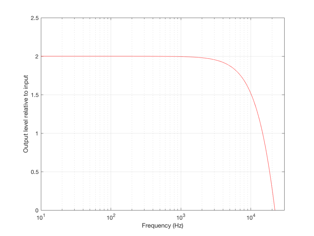
Now that you know this, we are able to “connect the dots” and plot the output levels for the filter in Figure 5 for a range of frequencies from very low to very high. This is shown in Figures 8 and 9, below.
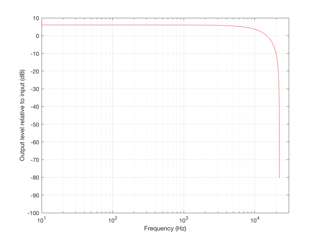
Figure 8: A plot of the output level of the filter we’re talking about, as a multiple of the level of its input. Note the output is twice as loud as the input in the low frequency region (hence the “2” on the Y-axis) and that that we have no output (or a level of 0) at 22050 Hz.Figure 9: The same information plotted in Figure 8, shown on a decibel scale. The last point (at 22050 Hz) is not shown because it’s at -infinity dB, so showing this this would require that you buy a bigger screen for your computer.
Normalised frequency
Now we have to step up the coefficient of geekiness…
So far, we have been thinking with a fixed sampling rate of 44.1 kHz – just like that which is used for a CD. However, audio recordings that you can buy online are available at different sampling rates – not just 44.1 kHz. So, how does this affect our understanding so far?
Well, things don’t change that much – we just have to change gears a little by making our frequency scales vary with sampling rate.
So, without using actual examples or numbers, we already know that an audio signal with a low frequency going through the filter above will come out louder than the input. We also know that the higher the frequency, the lower the output until we get to the point where the audio signal’s frequency is one half the sampling rate, where we get no output. This is true, regardless of the sampling rate – the only change is that, by changing the sampling rate, we change the actual frequencies that we’re talking about in the audio signal.
So, if the sampling rate is 44.1 kHz, we get no output at 22050 Hz. However, if the sampling rate were 96 kHz, we wouldn’t reach our “no output” frequency until the audio signal gets to 48 kHz (half of 96 kHz). If the sampling rate were 176.4 kHz, we would get something out of our filter up to 88.2 kHz.
So, the filter generally behaves the same – we’re just moving the frequency scale around.
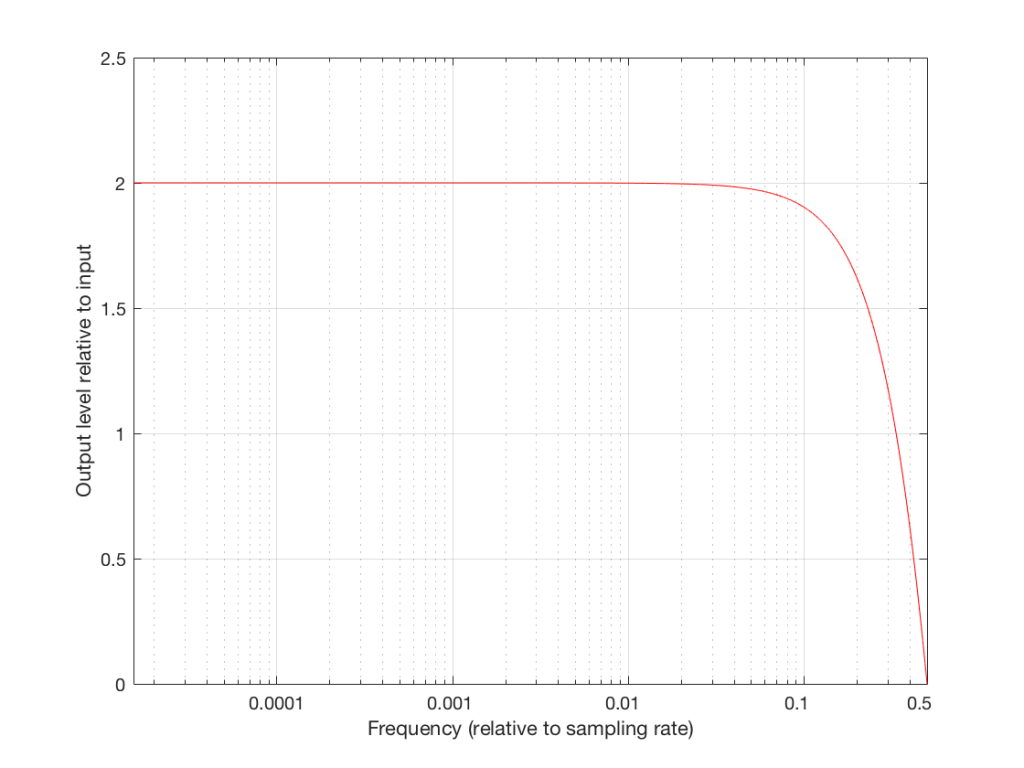
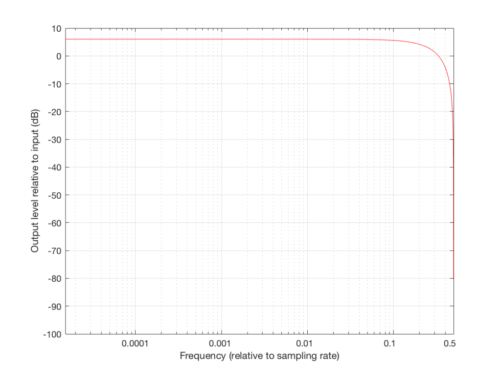
So, instead of plotting the magnitude response of our filter with respect to the actual frequency of the audio signal out here in the real world, we can plot it with respect to the sampling rate, where we can get all the way up to 0.5 (half of the sampling rate) since this is as high as we’re allowed to go. So, I’ve re-plotted Figures 8 and 9 below using what is called a “normalised frequency” scale – where the frequency of the audio signal is expressed as a fraction of the sampling rate.
Figure 8a: The same plot as Figure 8, but shown on a Normalised Frequency scale.Figure 9a: The same plot as Figure 9, but shown on a Normalised Frequency scale.
These last sentences are VERY IMPORTANT! So, if you didn’t understand everything I said in the previous 6 paragraphs, go back and read them again. If you still don’t understand it, please email me or put a comment in below, because it means that I didn’t explain it well enough. ..
Note that there are two conventions for “normalised frequency” just to confuse everyone. Some people say that it’s “audio frequency relative to the sampling rate” (like I’ve done here). Some other people say that it’s “audio frequency relative to half of the sampling rate”. Now you’ve been warned.
Designing an audio filter
In the example above, I made a basic audio filter, and then we looked at its output. Of course, if we’re making a loudspeaker with digital signal processing, we do the opposite. We have a target response that we want at the output, and we build a filter that delivers that result.
For example, let’s say that I wanted to make a filter that has a similar response to the one shown above, but I want it to roll off less in the high frequencies. How could I do this? One option is shown below in Figure 10:
Fig. 10. A modified version of our first low pass filter shown in Figure 5.
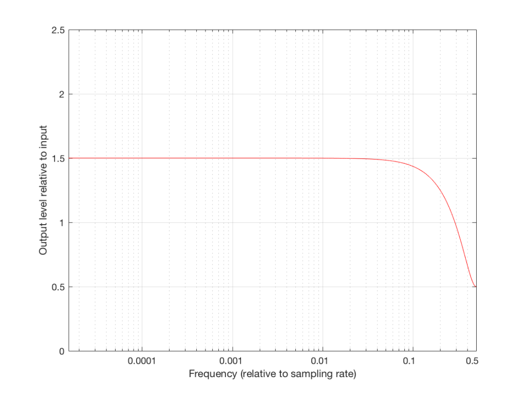
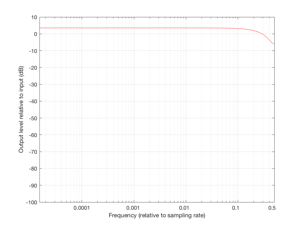
Notice that I added a multiplier on the output of the delay block. This means that if the frequency is low, I’ll add the current sample to half the value of the previous one, so I’ll get a maximum output of 1.5 times the input (instead of 2 like we had before). When we get to one half the sampling rate, we won’t cancel completely, so the high end won’t drop off as much. The resulting magnitude response is shown in Figures 11 and 12, below.
Figure 11: The magnitude response, plotted on a Normalised Frequency scale, of the filter shown in Figure 10.Figure 12: The same information as is shown in Figure 11, on a decibel scale.
So, we can decide on a response for the filter, and we can design a filter that delivers that response. Part of the design of that filter is the values of the “coefficients” inside it. In the case of digital filters, “coefficient” is a fancy term meaning “number” – in the case of the filter in Figure 10, it has one coefficient – the “0.5” that is multiplied by the output of the delay. For example, if we wanted less of a roll-off in the high end, we could set that coefficient to 0.1, and we would get less cancellation at half the sampling rate (and less output in the low end….)
Putting some pieces together
So, now we see that a digital filter’s magnitude response (and phase response, and other things) is dependent on three things:
its design (e.g. how many delays and additions)
the sampling rate
the coefficients inside it
If we change one of these three things, the magnitude response of the filter will change. This means that, if we want to change one of these things and keep the magnitude response, we’ll have to change at least one of the other things.
For example, if we want to change the sampling rate, but keep the design of the filter, in order to get the same sampling rate, we’re going to have to change the coefficients.
Again, those last two paragraphs were important… Read’em again if you didn’t get it.
So what?
Let’s now take this information into the real world.
In order for Beolab 90 to work, we had to put a LOT of digital filters into it – and some of those filters contain thousands of coefficients… For example, when you’re changing from “Narrow” mode to “Wide” mode, you have to change a very large filter for each of loudspeaker driver (that’s thousands of coefficients times 18 drivers) – among other things… This has at least four implications:
there has to be enough computing power inside the Beolab 90 to make all those multiplications at the sampling rate (which, we’ve already seen above, is very fast)
there has to be enough computer memory to handle all of the delays that are necessary to build the filters
there has to be enough memory to store all of those coefficients (remember that they’re not numbers like 1 or 17 – they’re very precise numbers with a lot of digits like 0.010383285748578423049 (in case you’re wondering, that’s not an actual coefficient from one of the filters in a loudspeaker – I just randomly tapped on a bunch of keys on my keyboard until I got a long number… I’m just trying to make an intuitive point here…))
You have to be able to move those coefficients from the memory where they’re stored into the calculator (the DSP) quickly because people don’t want to wait for a long time when you’re changing modes
This is why (for now, at least) when you switch between “Narrow” and “Wide” mode, there is a small “break” in the audio signal to give the processor time to load all the coefficients and get the signal going again.
One sneaky thing in the design of the system is that, internally, the processor is always running at the same sampling rate. So, if you have a source that is playing back audio files from your hard drive, one of them ripped from a CD (and therefore at 44.1 kHz) and the next one from www.theflybynighthighresaudiodownloadcompany.com (at 192 kHz), internally at the DSP, the Beolab 90 will not change.
Why not? Well, if it did, we would have to load a whole new set of coefficients for all of the filters every time your player changes sampling rates, which, in a worst case, is happening for every song, but which you probably don’t even realise is happening – nor should you have to worry about it…
So, instead of storing a complete set of coefficients for each possible sampling rate – and loading a new set into the processor every time you switch to the next track (which, if you’re like my kids, happens after listening to the current song for no more than 5 seconds…) we keep the internal sampling rate constant.
There is a price to pay for this – we have to ensure that the conversion from the sampling rate of the source to the internal sampling rate of the Beolab 90 is NOT the weakest link in the chain. This is why we chose a particular component (specifically the Texas Instruments SRC4392 – which is a chip that you can buy at your local sampling rate converter store) to do the job. It has very good specifications with respect to passband ripple, signal-to-noise ratio, and distortion to ensure that the conversion is clean. One cost of this choice was that its highest input sampling rate is 216 kHz – which is not as high as the “DXD” standard for audio (which runs at 384 kHz).
So, in the development meetings for Beolab 90, we decided three things that are linked to each other.
we would maintain a fixed internal sampling rate for the DSP, ADC’s and DAC’s.
This meant that we would need a very good sampling rate converter for the digital inputs.
The choice of component for #2 meant that Beolab 90’s hardware does not support DXD at its digital inputs.
One of the added benefits to using a good sampling rate converter is that it also helps to attenuate artefacts caused by jitter originating at the audio source – but that discussion is outside the scope of this posting (since I’ve already said far too much…) However, if you’re curious about this, I can recommend a bunch of good reading material that has the added benefit of curing insomnia… Not unlike everything I’ve written here…