Let’s talk about the subject of noise. To begin with, we have to agree on a definition, which might become the biggest part of the problem. For normal people, going about their daily lives, “noise” is a word that usually means “unwanted sound”, as the Grinch explained, just before hitching up his dog to a sleigh:
However, “noise” means something else to an audio professional, who is consequently not “normal” and does not have a life – daily or otherwise.
When an audio professional says “noise”, they mean something very specific – “noise” is an audio signal that is random. For example, if the noise signal is digital, there would be no way to predict the value of the next sample – even if you know everything about all previous samples.
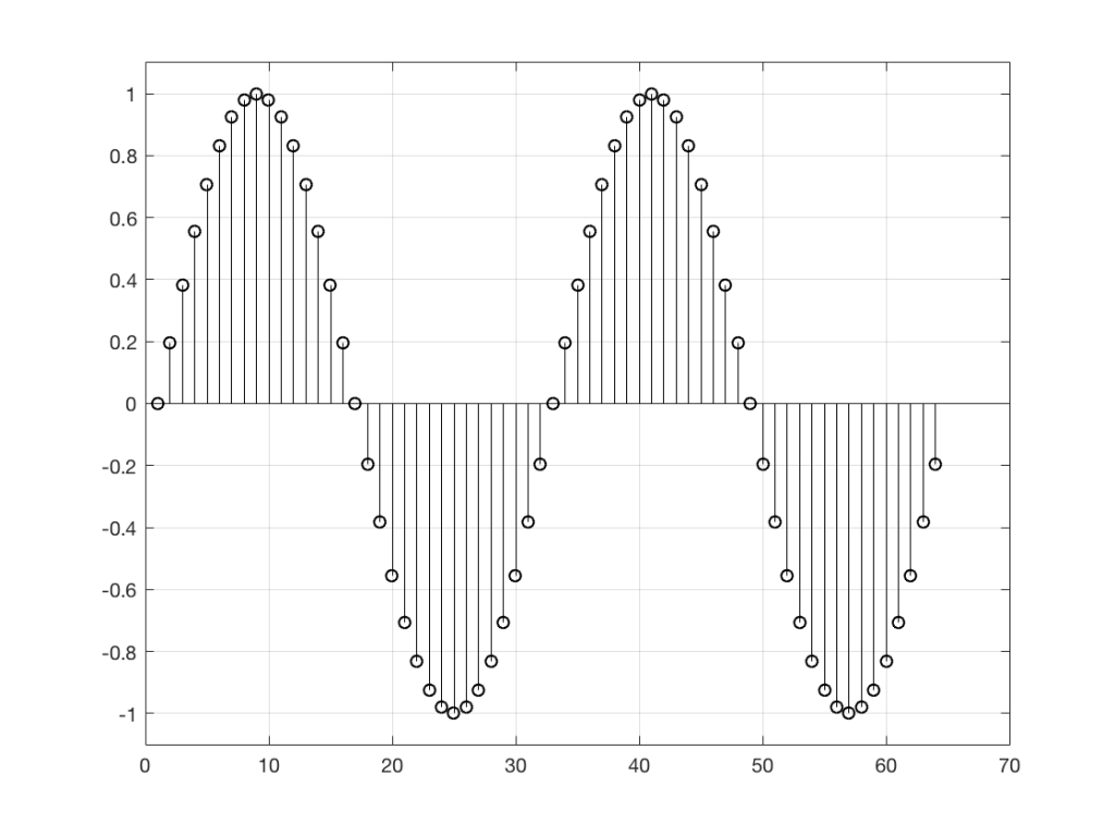
So, “noise”, according to the professionals, is a signal made of a random sequence. However, we can be a little more specific than this. For example, in order to make the noise plotted in Figure 2, above, I asked Matlab to generate 64 random numbers between -1 and 1 using the code
rand(1,64)*2-1
So, although this will generate random numbers for me (we’ll assume for the purposes of this discussion that Matlab is able to generate truly random numbers… actually they’re “pseudorandom” – but let’s pretend for today…), there are some restrictions on those values. No matter how many random values I ask for using this code, I will never get a value greater than 1 or less than -1.
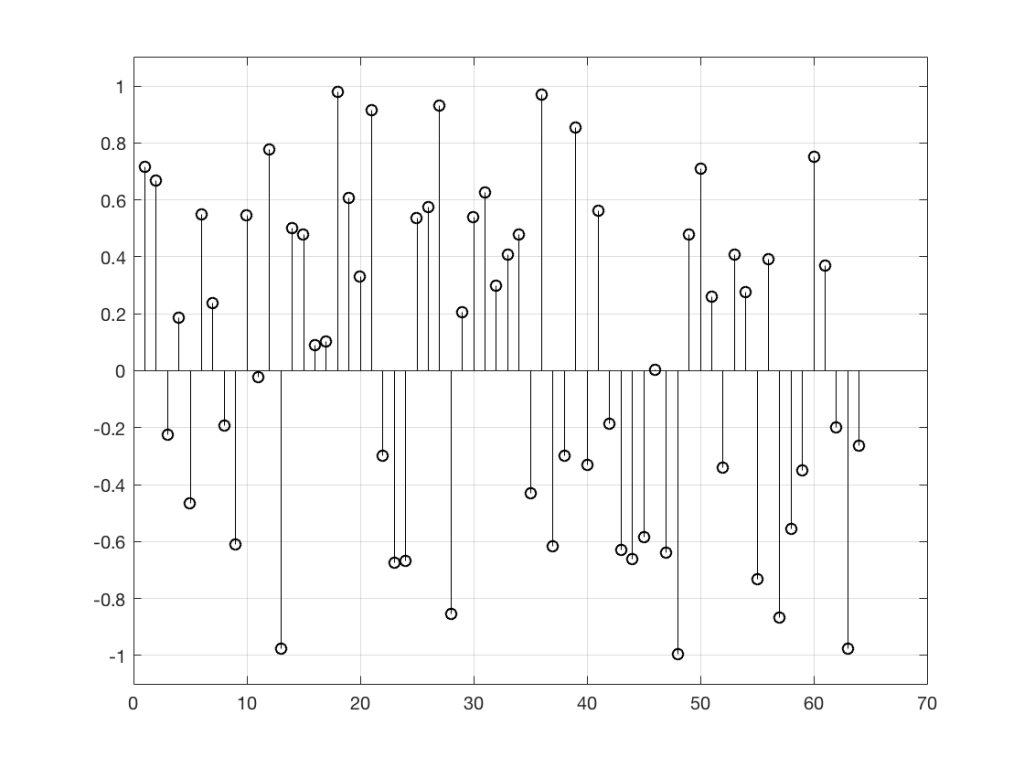
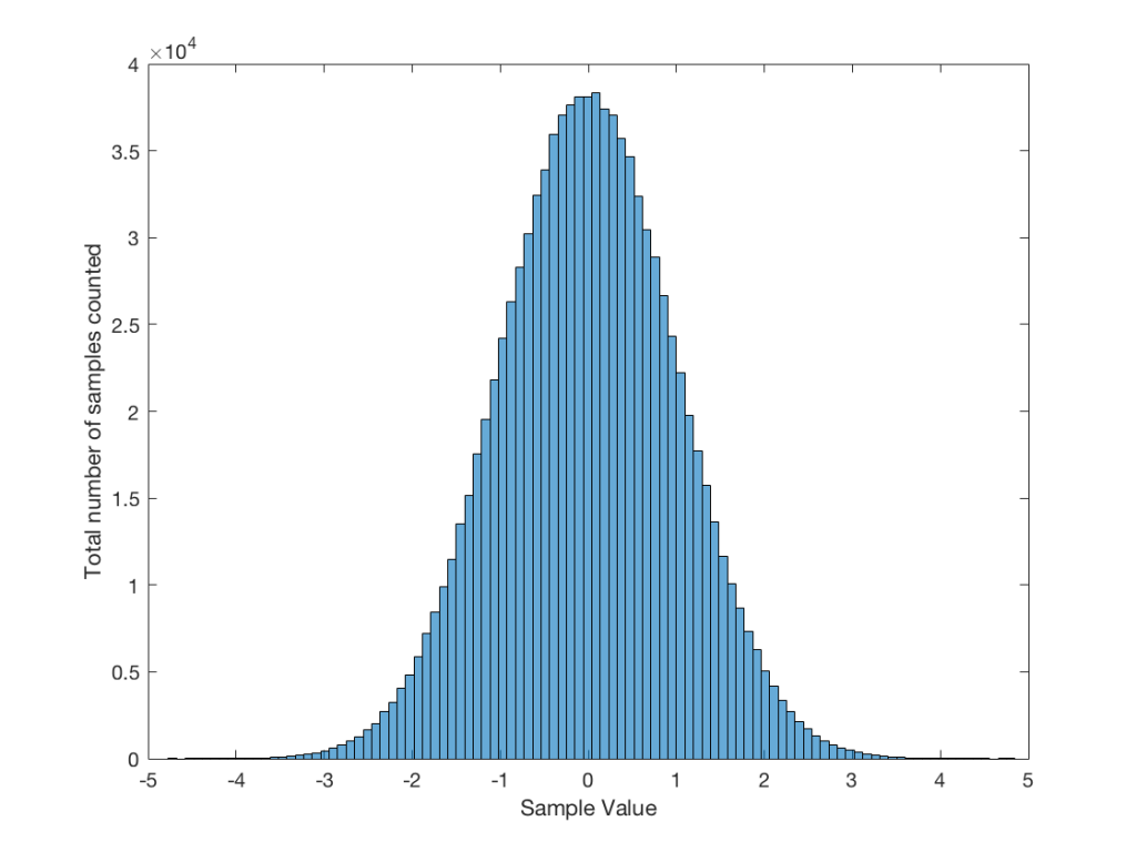
However, if I used a slightly different Matlab function – “randn” instead of “rand”, using the following code
randn(1,64)
I would get 64 random numbers, but they are not restricted as my previous bunch were, as you can seen in Figure 2a, below.
Again, it’s impossible to guess what the next value will be, but now you can see that it might be greater than 1 or less than -1 – but it will more likely to be closer to 0 than to be a “big” number.
So, Figures 2 and 2a show two different types of noise. Both are random numbers, but the distribution of the numbers in those two sequences are different.
To be more specific:
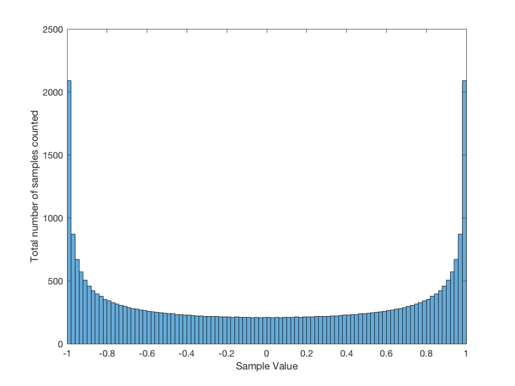
Let’s use the “rand(1,1000000)*2-1” function to make a sequence of 1,000,000 samples. We know that this will produce values ranging from -1 to 1. So, we’ll divide this range into 100 steps (-1.00 to -0.98, -0.98 to -0.96, -0.96 to -0.94, … and so on up to 0.98 to 1.00 – I know, I know, there’s some overlap here, but I didn’t want to use a bunch of less than or equal to symbols… The concept is the important point here… Back off!). For each of those divisions, we’ll count how many of the 1,000,000 samples fall inside that smaller range, and we’ll plot it. This is shown in Figure 3a.
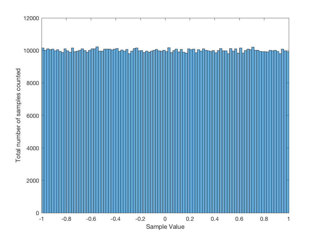
As you can see in Figure 3a, there are about 10,000 samples in each “bin”. This means that about 10,000 samples have a value that fall within each of the smaller slices of the total range. Also, if I added up the values of all 100 of those numbers plotted in 3a, I would get 1,000,000, since that’s the total number of values that we analysed.
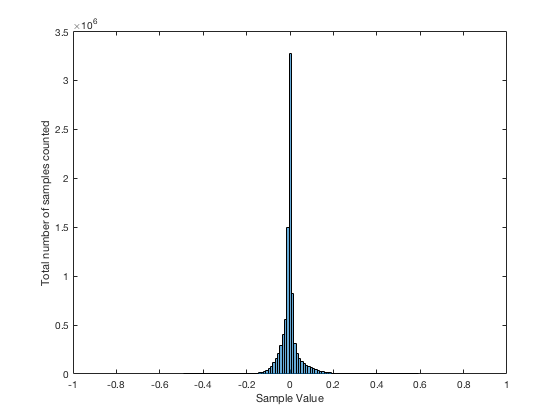
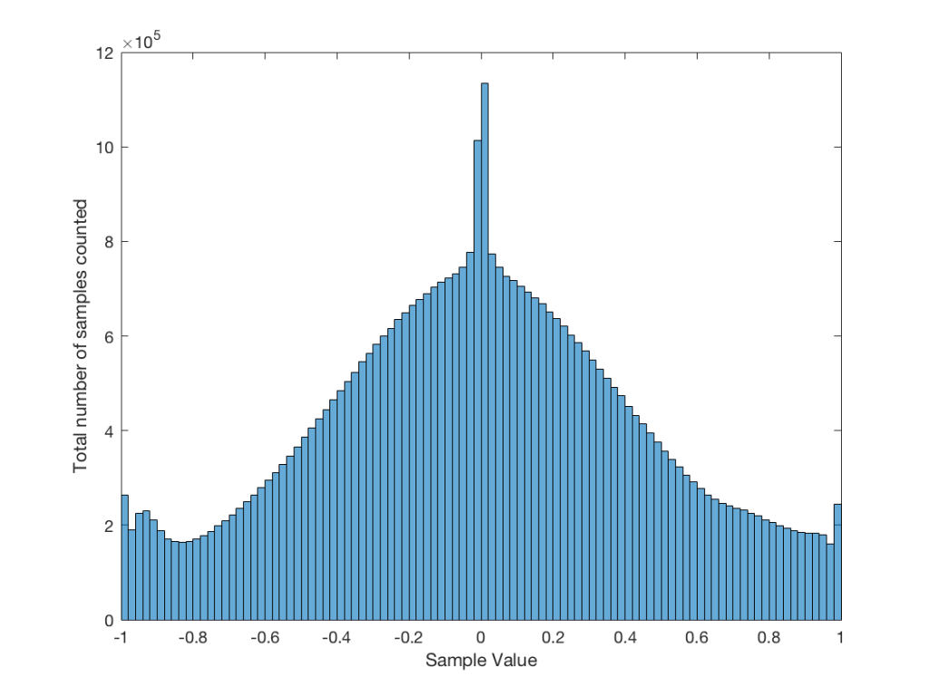
If I do the same thing to the numbers coming out of the other function: “randn(1,1000000)” it would look very different. As we already saw, the numbers can be outside the range of -1 to 1, and they’re more likely to be around 0 than to be far away from it. This can be seen in Figure 3b.
Just to clean up a loose end – there are official terms to describe these differences. The noise plotted in Figure 2 has what is called a “rectangular distribution” because a plot of the distribution of the values in it (if we measure enough sample values) eventually looks like a rectangle (a blue rectangle, in the case of Figure 3a). The noise plotted in Figure 2a has a “normal distribution”, as can be seen in the bell-like shape of the plot in Figure 3b. There are many other types of distributions (for example, rolling 2 dice will give you random numbers with a “triangular distribution”), but we’ll leave it at 2 for now.
So, we’ve seen that we can have at least two different “types” of random number sets – but let’s do a little more digging.
Frequency content
Here’s where things get a little interesting. If I take the 1,000,000 samples that I used to make the plot in Figure 3a and I pretend it’s an audio signal, and then calculate the frequency content (or spectrum) of the signal, it would look like the green plot in Figure 4a, below. If I did a frequency analysis of the signal used to make the plot in Figure 3b, it would look like the red plot.
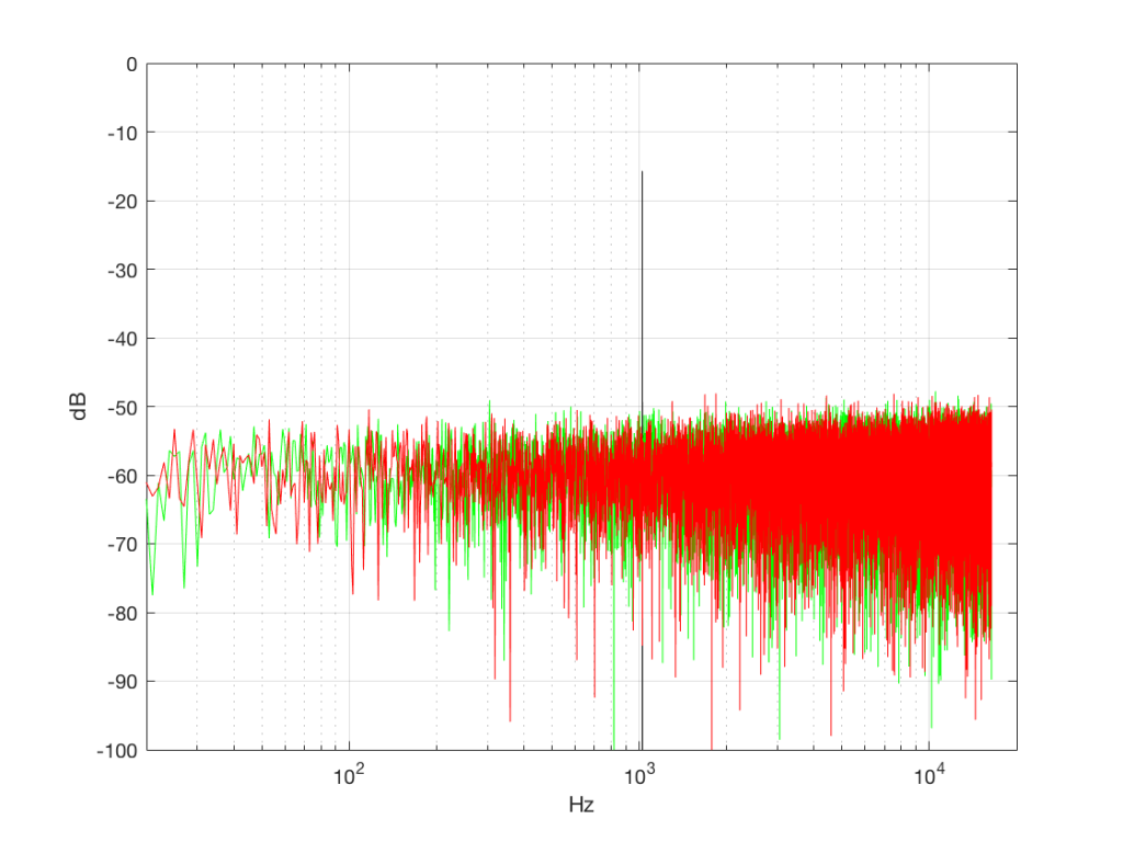
What’s interesting about this is that, basically speaking, the two signals, although they’re very different, have basically the same spectra – meaning they have the same frequency content, and therefore they’ll sound the same. This is really evident if I smooth these two plots using, for example, a 1/3 octave smoothing function, as is shown below in Figure 4b.
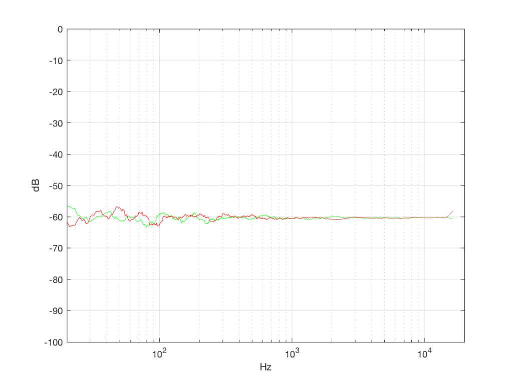
As you can see there, the very fine peaks and dips in the response shown in Figure 4a, when averaged, smooth to the flat response shown in Figure 4b.
Now we have to clear up a couple of issues…
The first is that, as you can see in the plot above, the spectrum of both random signals (both noise generators) is flat. However, due to the way that I did the math to calculate this, this means that we have an equal amount of energy in equal-sized frequency ranges throughout the entire frequency range of the signal. So, for example, we have as much energy from 20-30 Hz as we do from 1000-1010 Hz as we do from 10,000 – 10,010 Hz. In other words, we have equal energy per Hz. This might be a little counter-intuitive, since we’re looking at a semilogarithmic plot (notice the scale of the x-axis) but trust me, it’s true. This means that, in both cases, we have what is known as a “white noise” signal – which is a colourful way of saying “noise with an equal amount of energy per Hz”.
The second thing is that I just lied to you. In order to get the pretty plots in Figures 4a and 4b, I had to take long signals and analyse how much energy we got, over a long period of time. If I had taken a shorter slice of time (say, 100 samples long) then the spectra plots would not have looked as pretty – or as flat. For example, if I just take the first 100 samples of both of those noise generator outputs, and calculate the spectra in those, I get the plots in Figure 4c, below.
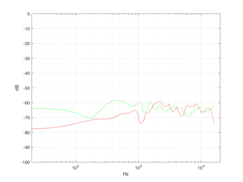
Notice that these plots do not look nearly as flat – even though I’ve smoothed them with a 1/3 octave smoothing filter again. Why is this?
Well, the problem is probability. Since the two signals are random, there is no guarantee that all frequencies will be contained in them for any one little slice of time. However, there is an equal probability of getting energy at all frequencies over time. So, in a really strange universe, you might get all frequencies below 1000 Hz for one second, and then all frequencies above 1000 Hz for the next second – over two seconds, you get all frequencies, but at any one moment, you don’t.
What this means is that “white noise” doesn’t necessarily contain energy at all frequencies equally – unless you wait for a long time. If you listen for long enough, all frequencies will be represented, but the shorter the measurement, the less “flat” your response.
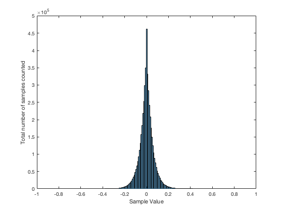
Just for the purposes of comparison, let’s also find out what the distribution of values is for a sine wave – since this might be interesting later… This is shown in Figure 5, below.
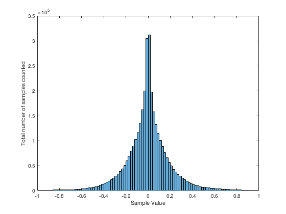
It may be interesting to note that “normal” sounds like music and speech have distributions that look much more like Figure 3b than like Figure 5, as is shown in the examples in Figures 6, 7, and 8. This is why you shouldn’t necessarily use a sine wave to measure a piece of audio equipment and draw a conclusion about how music will sound…
Averaging
If I play the first kind of white noise (the one shown in Figure 2) and measure how loud it is with a sound pressure level meter, I’ll get a number – probably higher than 0 dB SPL (or else I can’t hear it) and hopefully lower than 120 dB SPL (or else I’ll probably be in pain…). Let’s say that we turn up the volume until the meter says 70 dB SPL – which is loud enough to be useful, but not loud enough to be uncomfortable.
Then, I switch to playing the other kind of white noise (the one shown in Figure 2a) and turn up the volume until it also measures 70 dB SPL on the same meter.
Then, I switch to playing a sine wave at 1 kHz and turn up the volume until it also reads 70 dB SPL.
If I were to compare what is coming into the loudspeaker for each of those three signals, after they have been calibrated to have the same output level, they would look like the three signals in Figure 9.
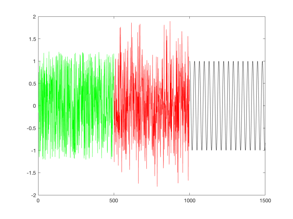
These will all sound roughly the same level, but as you can see in the plot in Figure 9, they do not have the same PEAK level – they have the same average level – averaged over time…
However, if we were to do a frequency-dependent analysis of these three signals, one of these things would not look like the others… Check out Figure 4a, which I’ve copied below…
Notice that, in a frequency-dependent analysis, the sine wave (the black line sticking up around 1000 Hz) looks much louder (35 dB louder is a lot!) than the green plot and the red plot (our two types of white noise). So, even though all three of these signals sound and measure to have roughly the same level, the distribution of energy in frequency is very different.
Another way to think about this is to say that each of the three signals has the same energy – but the sine wave has all of it at only one frequency all the time – so there’re more energy right there. The noise signals have the energy at that frequency only some of the time (as was explained above…).
ANOTHER way to think about this is to put a glass of water in the bottom of an empty bathtub. If the depth of the water in the glass is 10 cm – and you pour it out into the tub, the depth of the water will be less, since it’s distributed over a larger area.
As you can see in the title of this posting, this is “Part 1″… All of this was to set up for Part 2, which will (hopefully) come next week. As a preview: the topic will be the use (and mis-use) of weighting functions (like “A-weighting”) when doing measurements…
Jamie Angus says:
Hi Geoff,
Nice article, I especially liked you music and voice distributions, as they are Laplacian, and not Gaussian, something I’ve been banging on about for a while.
See my recent papers on “green amplification” I would be interested in analysing your example with my own stats software.
If you could tell me which recordings please that would be brilliant!
Thank you,
Jamie
geoff says:
Hi Jamie,
The anechoic speech is the Danish Female track from the Archimedes disc.
The Brandenburg concerto is the first 60 seconds of the first movement of Brandburg 2 from this recording with Trevor Pinnock and a decent pickup orchestra…
https://www.amazon.de/Concertos-Margrave-Brandenburg-Johann-Sebastian/dp/B000XJ1444/ref=sr_1_15?ie=UTF8&qid=1481294086&sr=8-15&keywords=brandenburg+concertos+cd
The Nirvana Track is the first 60 seconds of “Smells Like Teen Spirit” from this album
https://www.amazon.de/Nirvana-International-Version/dp/B002JB6ZLQ/ref=sr_1_3?ie=UTF8&qid=1481294257&sr=8-3&keywords=nirvana
Laplacian, huh? Interesting… I think that I need to spend some time on the weekend looking up “Laplacian distribution” to try and decide if this inspires anything interesting… ;-)
Have a good weekend!
-geoff
geoff says:
Hi again Jamie,
As you can see, I added the distribution of another track from Metallica’s Death Magnetic album. It appears that Laplace cannot survive abusive compression…
Cheers
-geoff
Bart says:
Hi Geoff,
Why did you use in Fig. 8 the “Smells Like Teen Spirit” audio sample from Nirvana’s 2002 eponymous compilation album. Geffen.
The reason i ask this:
http://www.isitloud.com/?page_id=7
https://www.youtube.com/watch?v=mf8DET7ILR4
https://jgtwo.wordpress.com/2011/10/07/the-guy-who-remastered-nevermind-doesnt-care-if-you-think-its-too-loud/
Kind regards
Bart
geoff says:
Hi Bart,
Mostly because it’t a tune that many people use – not only because they like the track, but because they know it well. Not only that, personally, I like the tune and the recording – so I use it often as well…
Cheers
-geoff
Jamie Angus says:
Hi Geoff,
The Metallica track is interesting. It’s clearly heavily limited (clipped?) too!
It’s still is not Gaussian. Speech researchers have know since I was a girl that a single voice is better described by a laplacian distribution, Ae^(-B|x|).
Music seems to be similar, mostly, but compression does do some modification.
The main feature is that there is a higher probability of peak values, and small values, and small values compared to a Gaussian.
In many cases a Generalised normal distribution may give a slightly better fit (but not for the Metallica track!)
https://en.wikipedia.org/wiki/Generalized_normal_distribution
I have sent a paper I published at a UK conference to your B&O addressthat may give you some ideas. :-)
Cheers,
Jamie
Bart says:
Hi Geoff,
I also like the tune and the recording, it’s great.
The reason i asked is because you can see clearly in the provided links that on the remasters of nirvana they used to much loudness and dynamic range compression. (all because of the stupid loudness wars)
Doesn’t that bad remaster cause an unwanted/unintentional error in your calculations. (when comparing the “relatively” clean mastering of the 1991 nevermind record vs the way to loud remaster of the album you used to take a sample of)
I personally think it’s sad that such a great album is mistreated by an ignorant record company who is only interested in making the loudest record vs a great/dynamic/noise free sounding album.
kind regards
Bart
geoff says:
Hi Bart,
I’m kind of on the fence regarding this issue. As Bob Ludwig replied in one of those links you provided – the remastering sounded the way the client wanted it… If you or I don’t like what they did with a compressor, then that’s our taste… The dynamic processing of the recording is another artistic decision made by the people who created it – just like everything else in the production. It would be like complaining about the choice of backup singer on a Peter Gabriel tune, or arguing that Queen ruined Bohemian Rhapsody by using parallel 5ths in the harmonisation…
In other words, who are we do decide how much compression is too much compression?
I’d much rather have a war on autotuners, instead… because I find that robot sound much more offensive than Death Magnetic’s modulated square wave… :-)
However, the point of the histograms was not to show what’s good and bad – it’s (partly) heading towards showing that music and speech have very different probability distributions than the signals we use to test, specify, and compare equipment.
Cheers
-geoff