Category: recordings
997 Hz?
In my previous posting, I mentioned that I was using a tone at or around 997 Hz to test my signal. In truth, only one of the plots I showed there actually used 997 Hz – but that doesn’t really matter.
The question that I’ll talk about in this posting is “why did I prefer to use 997 Hz instead of 1 kHz as my target frequency?” (I didn’t just randomly choose 997 Hz – it’s a common number that’s often used by people in the audio industry.)
The answer to that question has to do with some considerations on how digital audio equipment and software is tested.
Let’s start by talking a little about how a signal gets a PCM (Pulse-Code Modulation) representation in the digital domain. Note that this is the VERY basic explanation – I’m leaving out a lot of steps here…
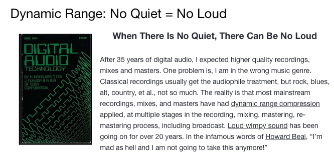
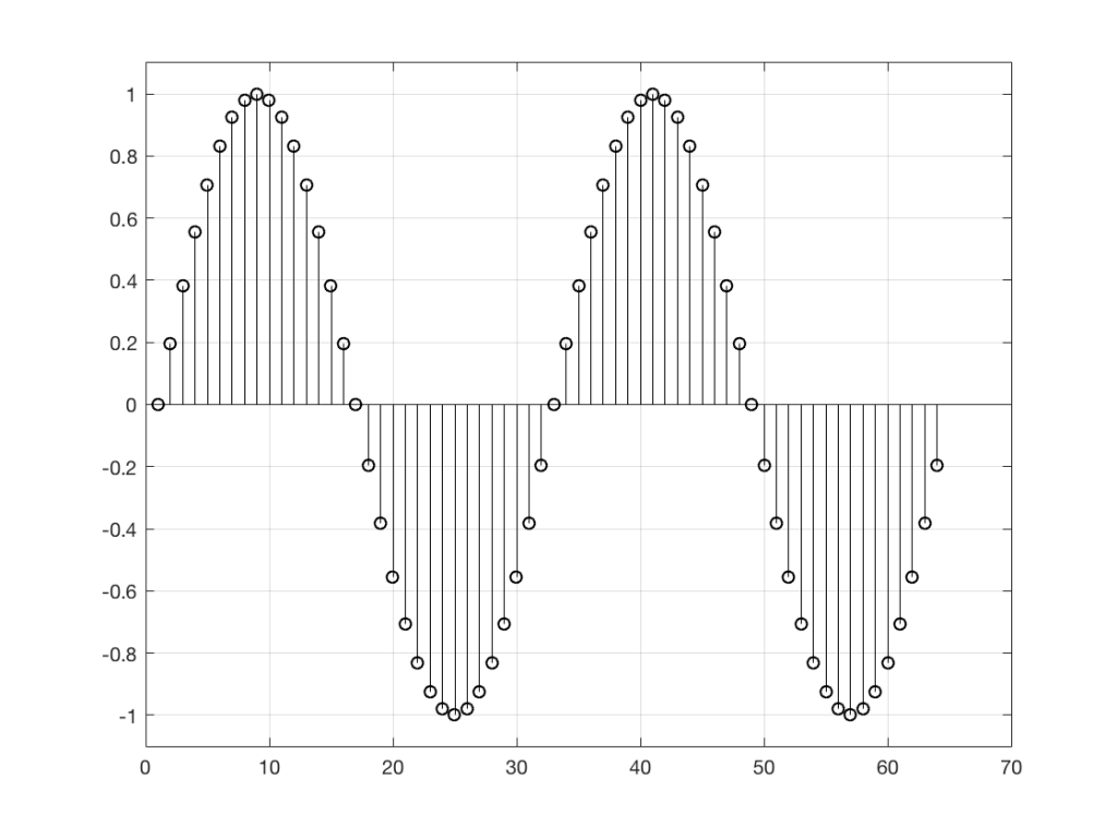
We’ll start with a signal like the portion of a sine wave shown in Figure 1.
This signal is continuous – meaning that we can zoom in infinitely and still get a smooth curve – both in terms of time, and amplitude.
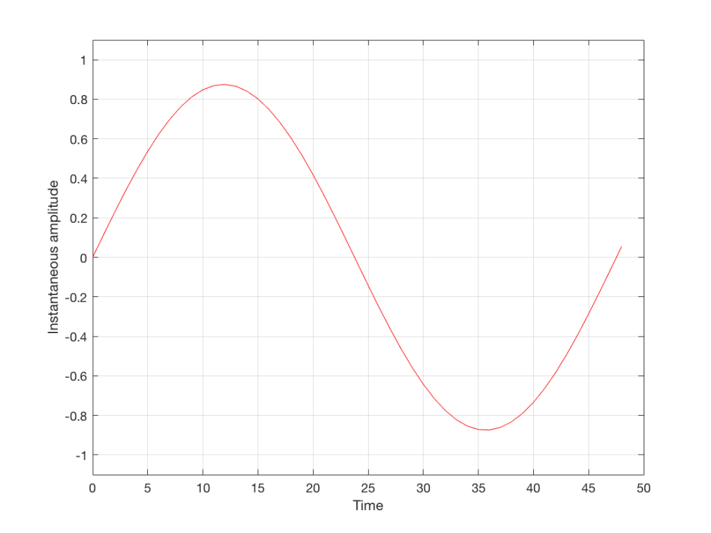
We then take that signal and measure its amplitude every time a clock ticks – and regular intervals. This is represented by the red dots in Figure 2. (I just left out a whole lot of information about anti-aliasing filters, but it doesn’t matter for the purposes of this discussion…)
So, in Figure 2 we have a representation of a sinusoidal wave that has been “sampled” – a word that means “measured at regular time intervals. We are grabbing a “sample” or a “measurement” of the amplitude of the signal.
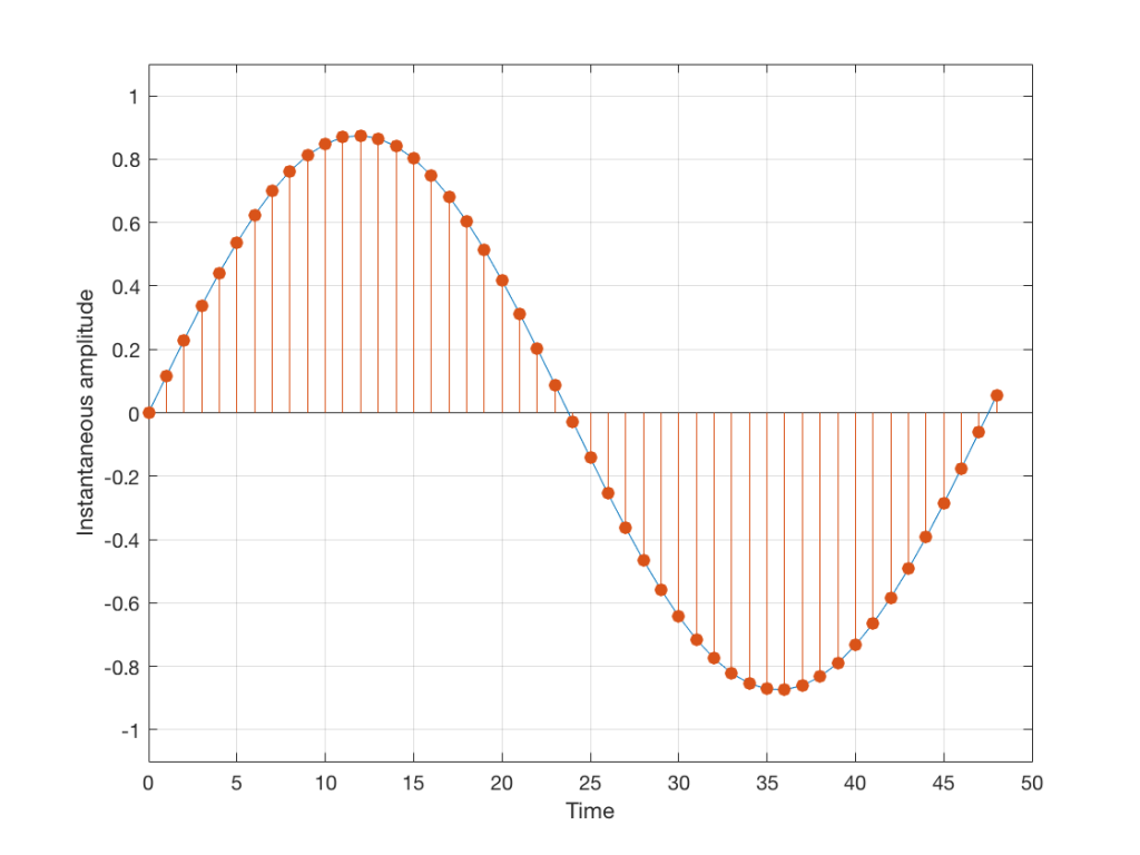
The problem is that the “ruler” we use to measure those values doesn’t have infinite resolution – just like the ruler that you would use to measure the length of something. If your ruler has lines only as fine as millimetres or 1/16th of an inch, then you cannot measure something accurately to the micrometer or to 1/64th of an inch. So, you “round off” your measurement to the nearest value on the ruler.
We do the same with audio – we have a finite number of values that we can store or transmit to represent the instantaneous amplitude of the signal, so we have to round off or “quantise” the values to the nearest value that we have. The result looks something like Figure 3:
I’ve shown the quantisation values on the left (the Y-axis) as binary values. As you can see there, we have a 4-bit signal which gives us a total of 2^4 = 16 possible quantisation values for storing the signal’s amplitude at each sample.
If you’re really paying attention, you’ll notice that there are one fewer positive values than negative values, since one of the positive values is taken to represent the “0” line. This is why, when I made my original signal, I didn’t scale it all the way up to ±1 – just to keep things smooth in the explanations. If you aren’t paying that much attention, and you didn’t notice this – then please have a look, since it will come up again later…
Normally, of course, we store audio signals with a LOT more bits than this – a CD uses 16-bit resolution, which gives us a total of 65536 possible quantisation levels (2^16). Other systems use a different number of bits – either fewer or more, depending.
At this point, it should be pretty clear that you have a finite number of samples (or measurements) per second (typically 44100 samples per second (or 44.1 kHz), if it’s a CD, although 48000 samples per second (48 kHz) is also a pretty common number – other systems use other values for this.)
So, if we look at a CD, we have 44100 samples per second, and 65536 possible quantisation values to choose from for each sample (because it’s a 44.1 kHz, 16-bit system). Notice that we have more quantisation values than samples per second…
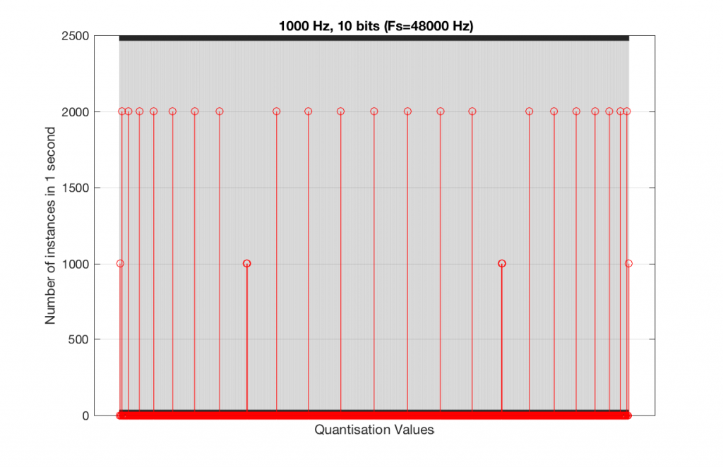
Now, let’s say that we want to test a piece of digital audio gear, and one of the tests that we wanted to perform was to ensure that all possible quantisation values are working properly (whatever that means). Let’s also say that the gear has only 4 bits of resolution and is running at a sampling rate o 48 kHz, to start. One way to test any audio gear is to feed in a sine tone and to see what comes out. So, we’ll do that, using a 1 kHz sine tone. The result looks like Figure 4, below.
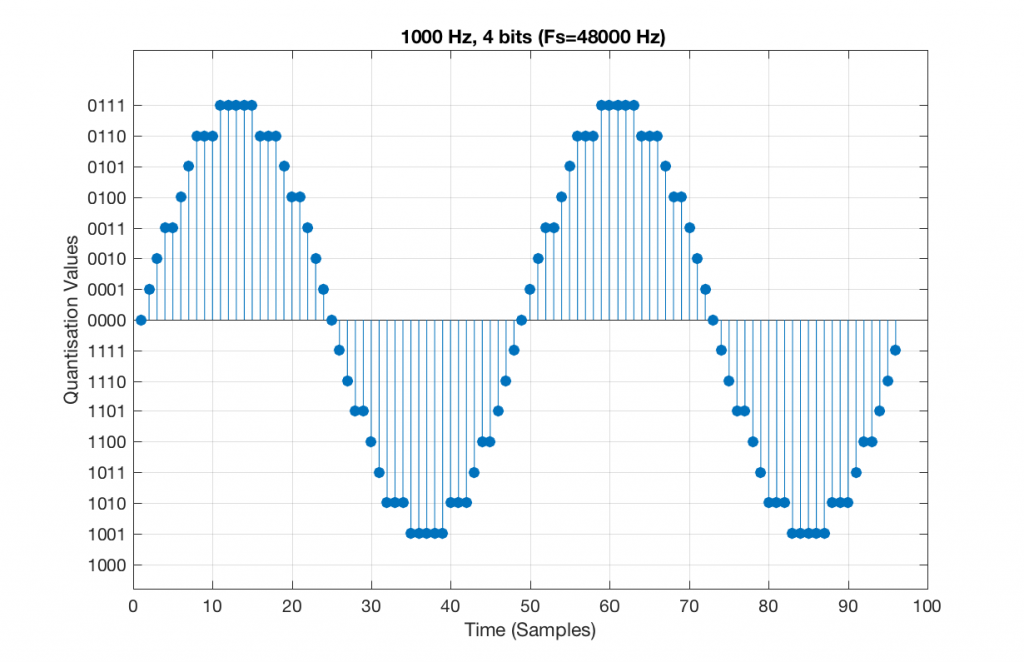
There are two things to notice about that signal in Figure 5:
- The first is that all possible quantisation values are used at least once – except for the very bottom one – but that last one is my fault, caused by the scaling of the sine wave, and the fact that it is symmetrical.
- The second is that the wave is perfectly periodic – meaning that it repeats itself over and over and over… There are two cycles of the waveform shown in the plot, and if you count the dots, you’ll see that the two are identical. This second point is the one that will be important to understand as we go further. The reason this exact repetition happens is because the frequency of the sine tone (1000 Hz) is an integer divisor of the sampling rate (48000 Hz). In other words, 48000 / 1000 = 48 – not a weird number like 48.3.
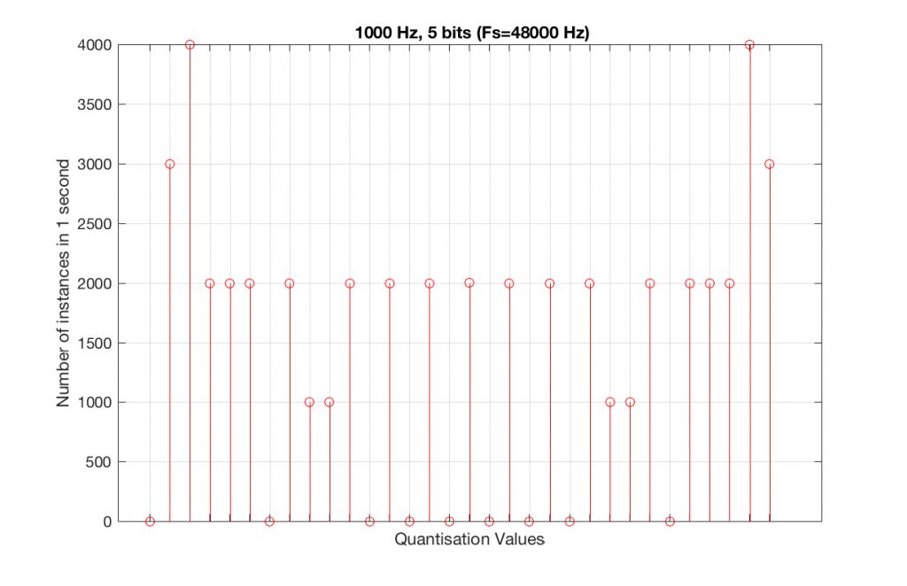
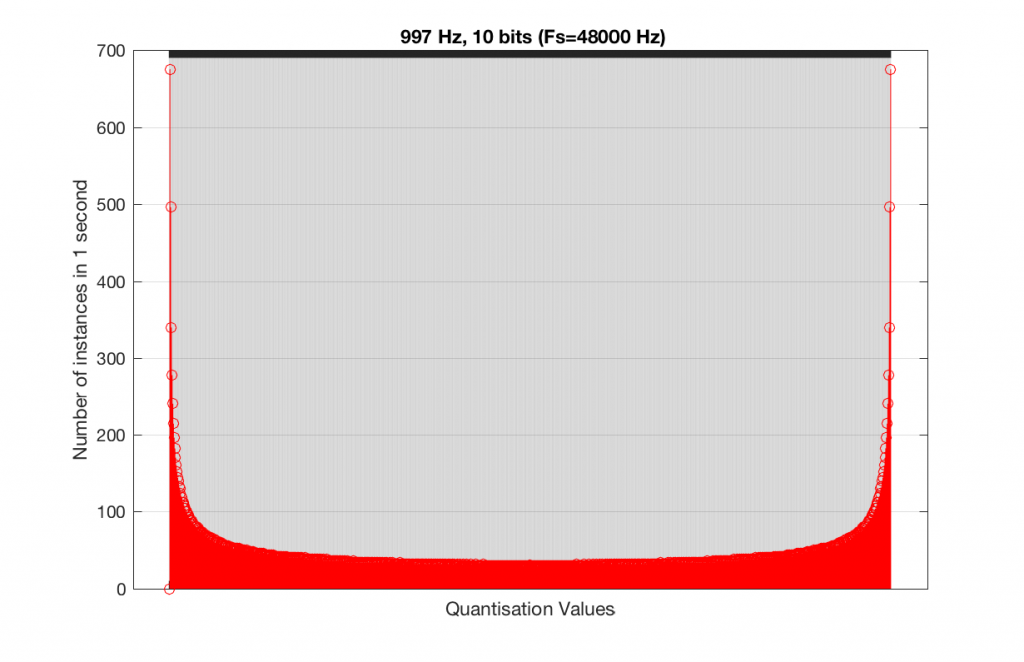
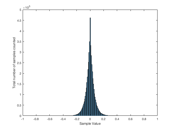
Let’s take that same signal (1 kHz in a 4-bit, 48 kHz PCM system) and we’ll count the number of times each sample value occurs after 1 second (or in a time of 48000 samples). We can then plot these values as is shown in Figure 6, which is a kind of plot called a “histogram”.
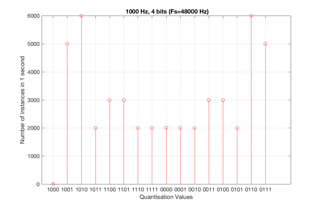
As can be seen in Figure 6, the bottom quantisation value (1000) is never used – but apart from that one, all others are.
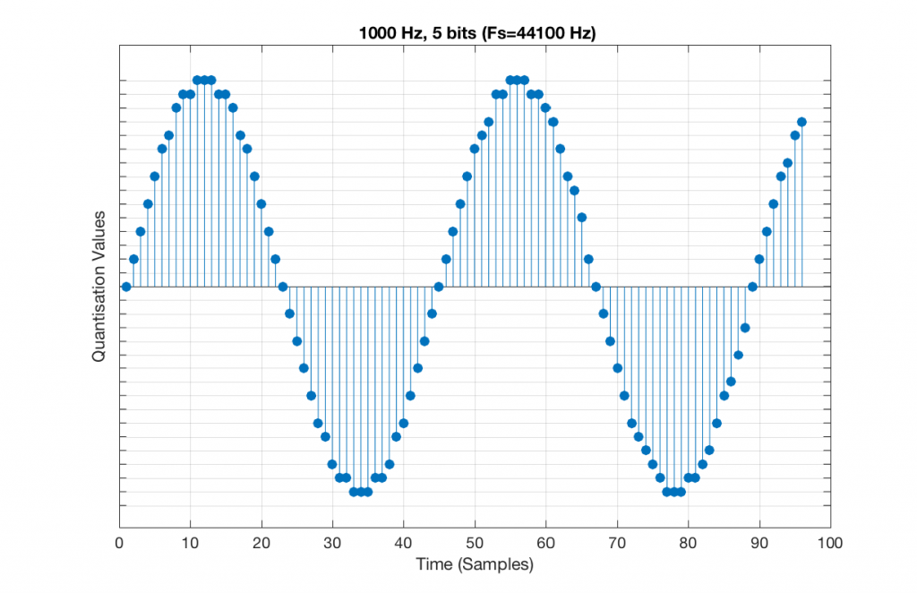
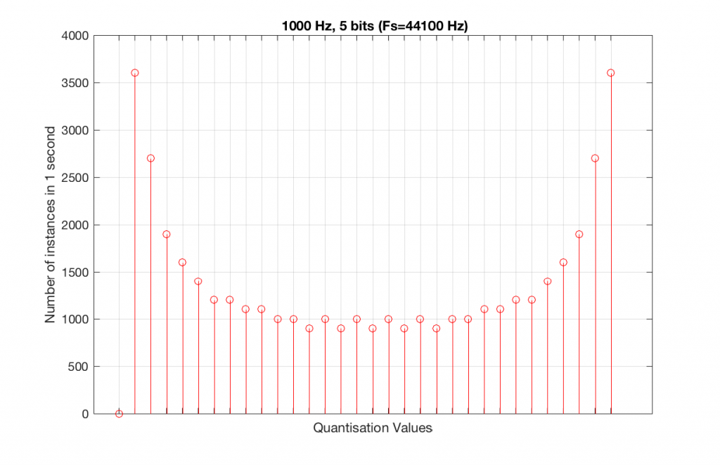
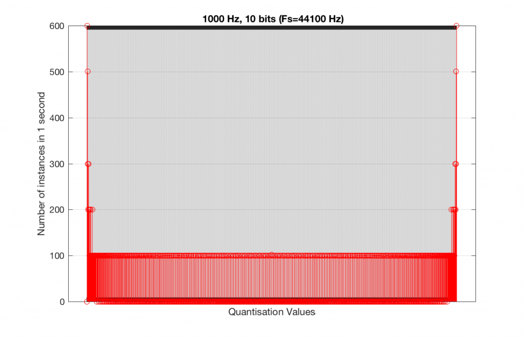
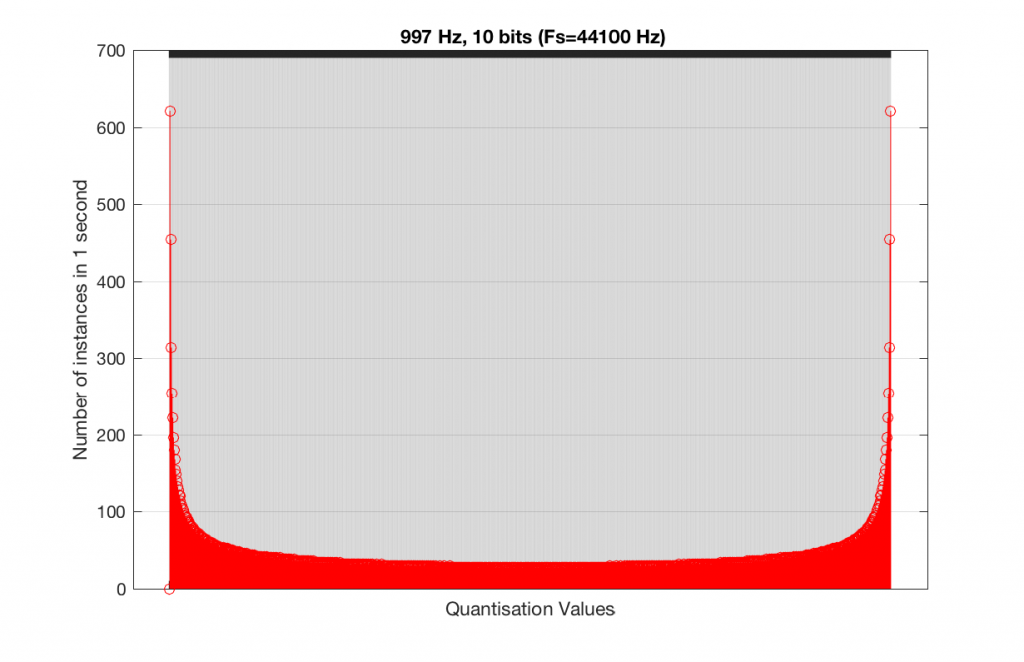
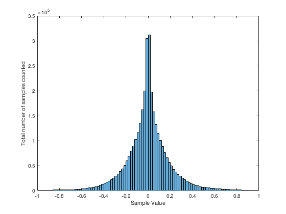
Let’s do the same thing, but with a 4-bit, 44.1 kHz system instead. The results of this are shown below in Figure 7 and 8.
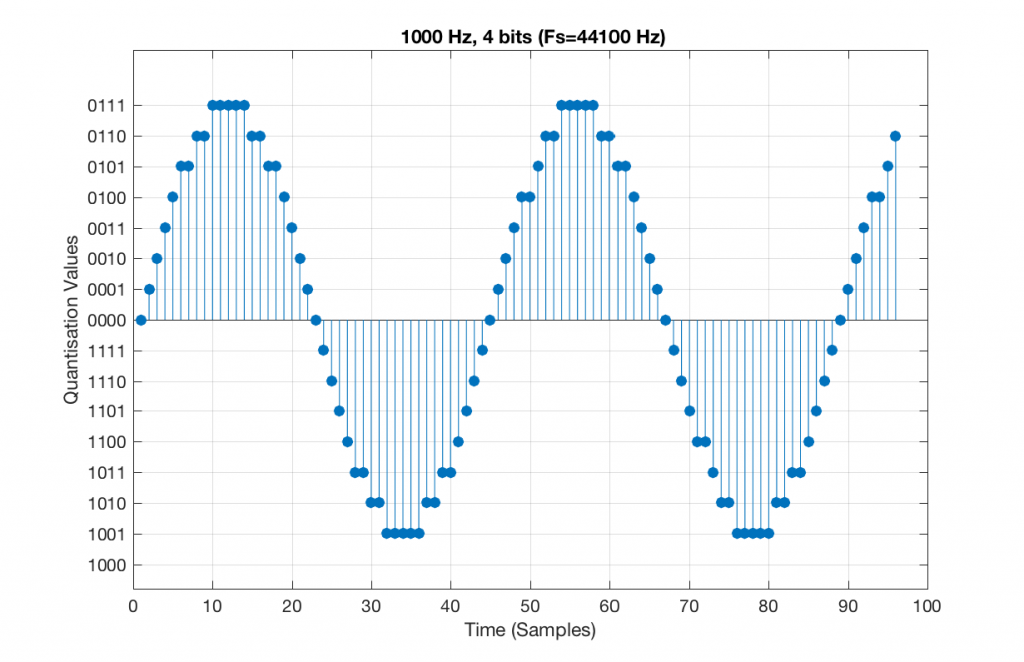
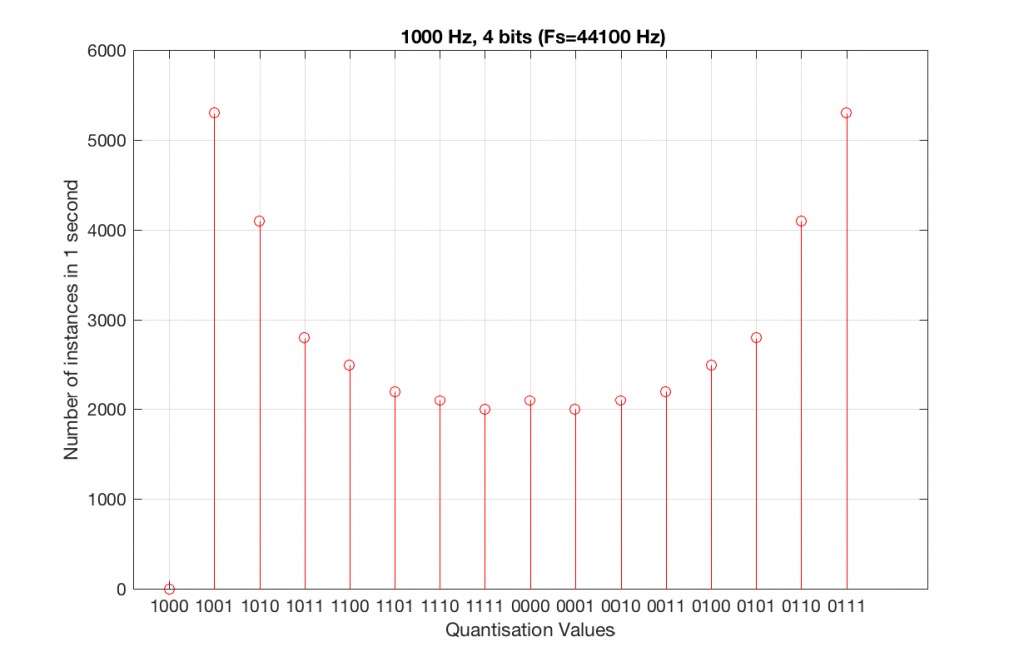
Compare Figures 6 and 8. Notice that Figure 8 appears to be a “smoother” shape. This is due to the fact that the instances of the waveform are not identical copies of each other. As can be seen in Figure 7, the waveform is slightly different. Of course, after a full second, then the whole cycle repeats itself, since there are 1000 cycles per second in the signal, and 44100 samples per second. If the signal were 1000.1 Hz, then it would take 10 seconds for the repetition to start.
Let’s increase the number of bits and see what happens. We’ll take it up to 6 bits.
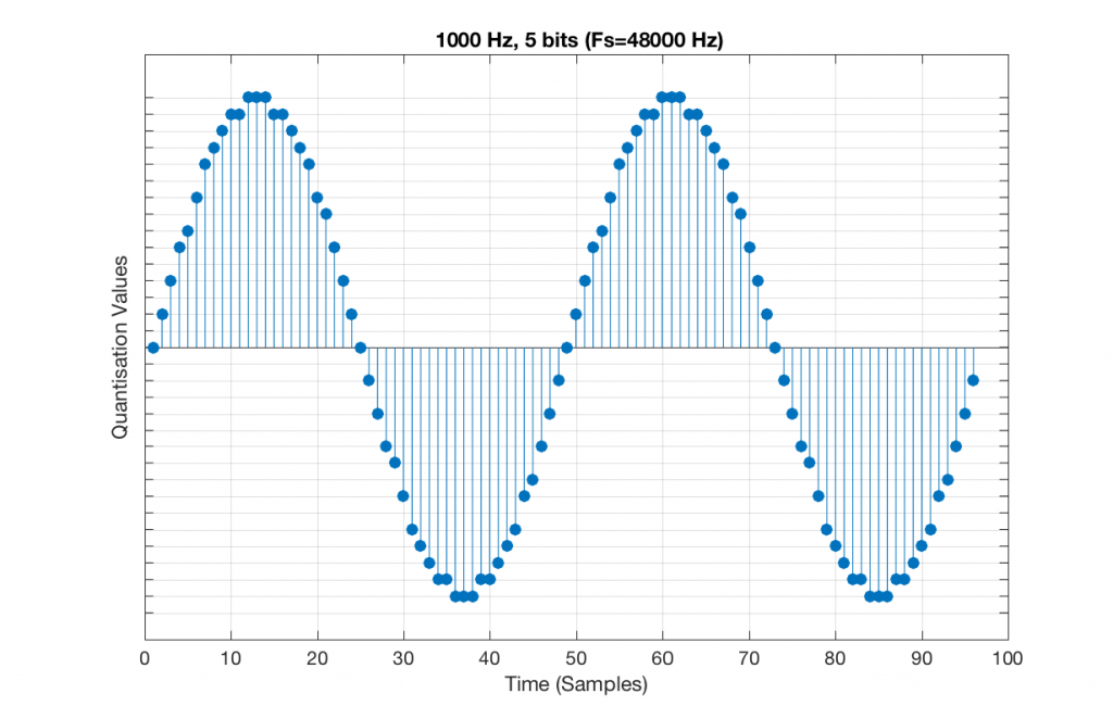
Figure 9 shows a 1 kHz sine tone in a 5-bit, 48 kHz system. Again, since 48000/1000 = 48, the two cycles are identical to each other. However, something new has happened here. If you look carefully at the positive side of the sine wave, you may notice that there are 5 quantisation values that are never used. On the negative side, there are 3 unused values, as well as the very bottom one.
So, because we are in a 5-bit system, we have 2^5 = 32 possible quantisation values, but, because we are using a 1 kHz sine tone, 9 of those possible values are never used. As a result, our histogram looks like Figure 10, below.
Let’s now compare that to a 5-bit, 44.1 kHz system.
We can see that there is a basic problem here. The behaviour of the system may be different due only to the relationship between the sampling rate and the frequency of the signal.
The question is “what do we do about this?” We can see from Figures 10 and 12 that, when the signal’s frequency is not a nice round divisor of the sampling rate, we stand a better chance of testing the system more completely. So, instead of using a “nice” frequency like 1000 Hz, let’s use something close, but different enough to make things “misbehave” a little. One possible solution is to use 997 Hz, as we can see below:
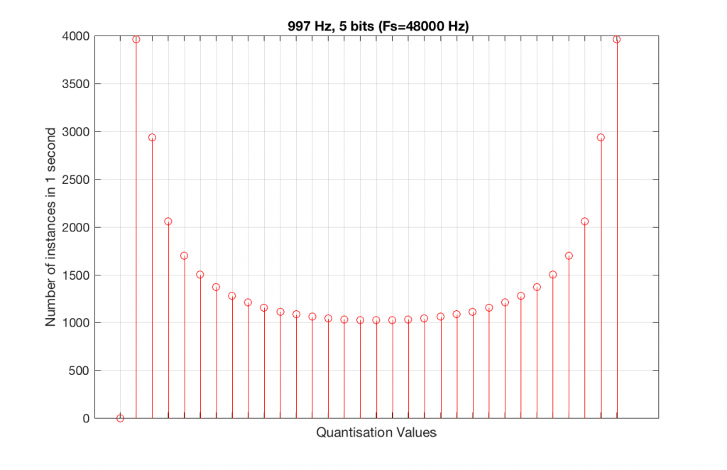
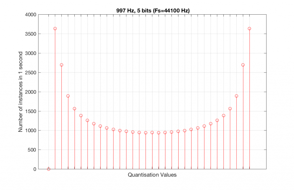
As can be seen in the histograms in Figure 13 and 14, changing the signal to 997 Hz from 1000 Hz results in us using all of the quantisation values in both sampling rates. So, we do a more thorough test, and stand a better chance of not missing anything…
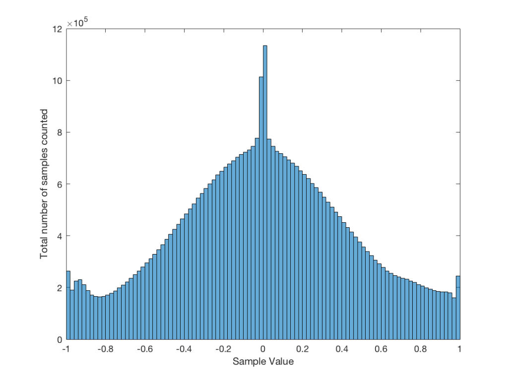
At this point, you might say, “yes, but normally we used far more than 5 or 6 bits – this won’t happen in a system with more bits…” Nice try, but actually, things get worse, as you can see in Figures 15 and 16, below.
As you can see in Figures 15 and 16, lots of quantisation values are unused in both sampling rates with a 1 kHz signal. By comparison, if we used a 997 Hz tone, the results would be very different, as is shown in Figures 17 and 18.
In fact, as we get more and more bits of resolution, the worse the problem gets, since we have an increasing number of available of quantisation values (increasing by a factor of 2 every time we add another bit), but the number of values that we use does not increase.
This is because, at some time, we start repeating the cycle. If the sampling rate divided by the signal frequency is an integer value (like a 1 kHz tone in a 48 kHz system), then we don’t use any new quantisation values after the first cycle of the tone (or 1 ms, in this case). If the sampling rate divided by the signal frequency is not an integer value (like a 997 Hz tone in a 48 kHz system) then we don’t start repeating ourselves until 1 second has passed.
However, think back to a comment that I made up at the top – if signal does start repeating itself after 1 second (in other words, if the frequency is an integer value), and if the number of samples per second is smaller than the number of quantisation values, then we will start repeating ourselves after 1 second, and we will only test the number of quantisation values that is equal to the sampling rate.
For example, if you have a 16-bit system, then you have 65536 possible quantisation values. If the sampling rate is 48000 Hz then we could only test a maximum of 48000 possible quantisation values out of the 65536 possible ones in one second, regardless of the frequency that we choose. Typically, however, we test fewer than this, because of the repetition of some values (e.g. the maximum value, if you have a periodic signal with a frequency greater than 1 Hz).
If we do this for the two frequencies we’ve been looking at – 1 kHz and 997 Hz, for two sampling rates, 44.1 kHz and 48 kHz, at different bit depths, the results look like the following figures.
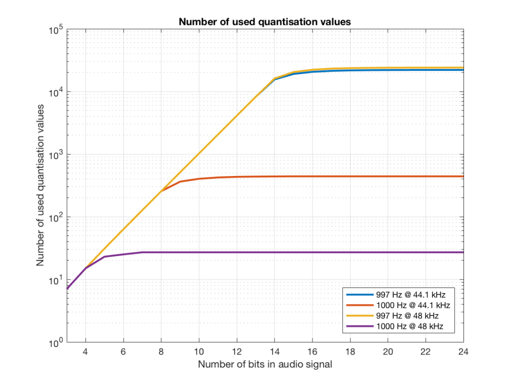
Notice in Figure 17 that the total number of quantisation values that are used when you have a 1 kHz tone in a 48 kHz system does not increase once you hit a word length of 7 bits. That does not mean that the signal’s representation does not improve – it does, since the quantisation values that you are using have a better resolution – so you’re rounding off less, so the error is smaller.
Notice as well that the 997 Hz tone not only results in us using far more quantisation values (topping out at the sampling rates) than the 1000 Hz tone, but that they are more similar in the two sampling rates.
If we plot the number of unused samples instead, it looks like Figure 18.
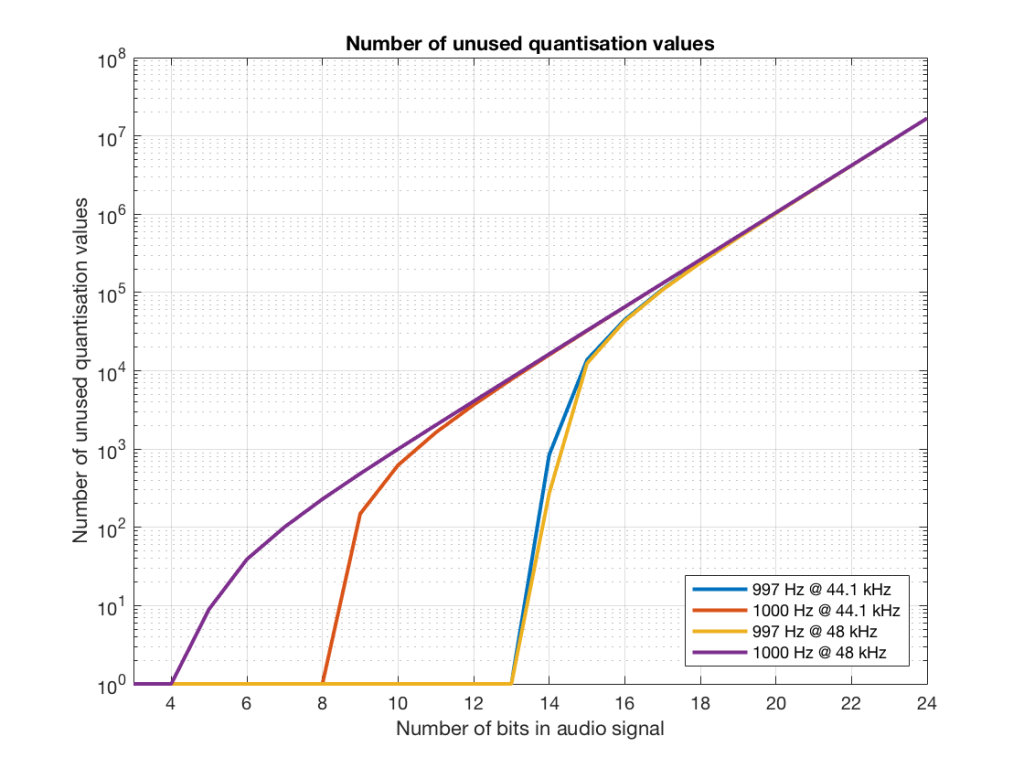
Figure 18 is a little misleading, since as the bit depth increases, the total possible number of quantisation values also increases, however, since the two frequencies that we are analysing are integer values, the maximum number cannot go past the sampling rate. So, in an extreme case (if you choose your frequency or signal carefully), only 48000 values out of a possible 16777216 values are used in a 24-bit system per second in a system with a sampling rate of 48 kHz.
Figure 19 shows the same information as Figure 18, except that I’ve displayed the values in percent.
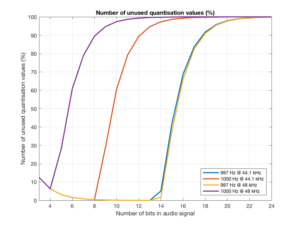
So, as you can see there, in a 16-bit system, even if you use a 997 Hz tone, about 70% of the total possible quantisation values are used.
Caveat
Of course, the signals that I used here were generated digitally, and did not include dither. If I had included proper dithering, then more of the quantisation values would have been used. However, the point of this posting was not to talk about correct ways of creating PCM signals – it was an attempt to explain why we use 997 Hz instead of 1 kHz when we test digital audio systems.
Don’t believe your eyes
Sometimes, someone will use a plot to show the relative levels of different frequency bands in a signal. Even I have done this from time to time…. However, it’s important to have the skills to be able to read these plots with a little-more-knowledge-than-normal in order to not be distracted into thinking something that isn’t true.
One way to calculate the relative levels of frequency bands of a signal (whether it’s a measurement of a loudspeaker, a black box, or your favourite track on your favourite CD) is to so something called a “Fourier Transform”. This is a set of calculations that can be used to show how much energy there is in a signal, by frequency.
Typically, we do a Discrete Fourier Transform or “DFT” – although most people call it a Fast Fourier Transform or “FFT”. We will not discuss the difference between these things in this posting. I’ll just use the term “FFT” here, in order to be like everyone else…
(If you’d like to know how to do your own FFT’s by hand, this is one place to start learning…)
In order to give me something to analyse, I made a signal comprised of a sine tone with a frequency around 997 Hz. (I’ll explain at the end why it’s not exactly 997 Hz. I’ll also explain in another posting why I chose 997 Hz instead of a good-old-fashioned 1 kHz.)
I set that sine tone to have a level of -1 dB FS.
Then, I made some white noise and set its level to be exactly 80 dB below the level of the sine tone. In order to calculate this, I found the total RMS value of the noise signal, and used this to create a gain that makes it a level of -81 dB FS. (Just for the sake of being as pedantic as possible, the white noise that I created was the result of a “rand” function in Matlab, which, as you can see in this posting, has a rectangular probability density function.)
Therefore, I have an input that has a signal-to-noise ratio of 80 dB. (Note that this measurement does not use any band-limiting on the white noise… Typically a SNR measurement would apply some low pass filter to the noise.)
To keep things looking pretty on my graphs, I set the sampling rate to 65536 Hz (2^16).
Then, I pretended that this signal was coming in from some unknown device, and I do an FFT on it to find out the relative balance between the signal (the sine tone) and the noise (which I already “secretly” know is 80 dB lower)
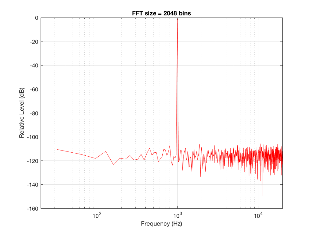
If I do an FFT of 256 points on the signal (and therefore, I’m only looking at the first 256 samples of the signal – this is an important point that we’ll come back to later…), the result looks like Figure 1.
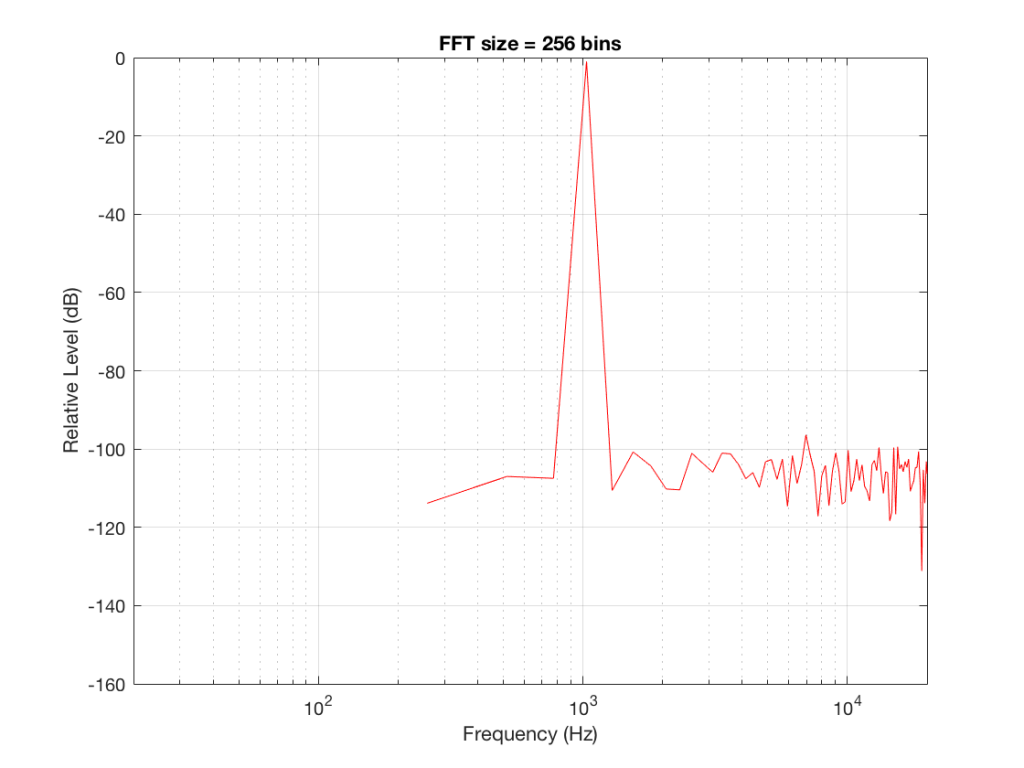
Note that the sine tone is a little higher than 997 Hz – but this is not really important. (the explanation is at the end!).
There are some things to notice here:
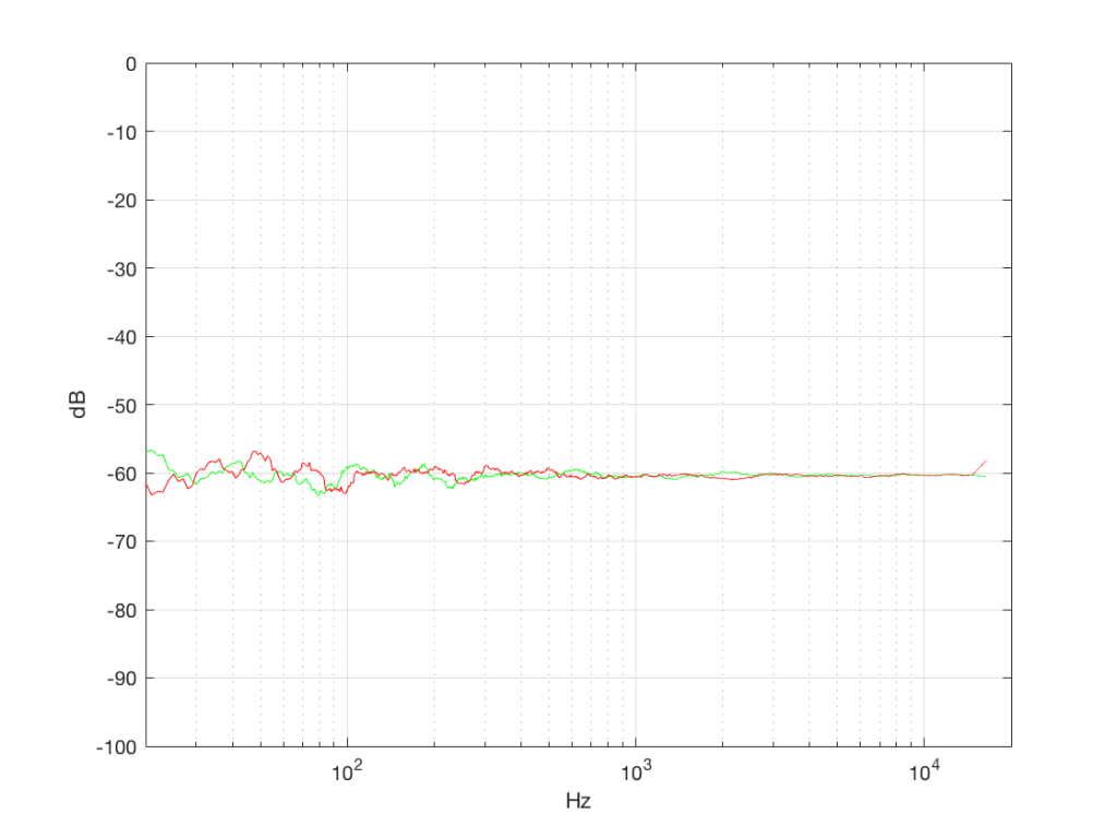
The first is that the plot does not extend lower than a frequency of 256 Hz. This is because the resolution of a 256-point FFT is 256 Hz – so, there is a “point” on the plot every 256 Hz – typically called a “bin” – since it contains information about the level of a collection of frequencies around its centre frequency. (If you’re new to FFT’s, don’t jump to the conclusion that the frequency resolution is equal to the length of the FFT. This is incorrect. The frequency resolution is equal to the sampling rate divided by the FFT length – 65536 Hz / 256 bins = 256 Hz.) Limiting the length of the FFT limits its resolution, which has an obvious impact when we plot the results on a logarithmic frequency scale.
The second is that, although the SNR of the signal is 80 dB, on the magnitude response, it appears that the noise is generally lower than -100 dB. This is not that difficult to believe, since the noise is spread over a wide frequency range – so, although any one frequency may, indeed, be more than 100 dB below the signal – the sum of the energy in all of those frequency bands totals more than any of the individual contributions. (In the same way that 1000 people can shout louder than 1 person – even if all 1000 people are, individually, shouting at the same level.)
One thing that is not obvious from the plot, but that we have to keep in mind is that this shows us the level of the different frequency ranges over the entire length of the signal (all 256 samples of it). However, the noise that I created that is part of that signal is exactly that – noise. Since it is noise, there is no guarantee that all frequencies are represented at the same level at any one time – in fact, they’re not. “White noise” has the characteristic of having equal probability of having the same level at all frequencies. But if 1000 people have equal probability of winning a lottery, that doesn’t mean than 1000 of them will win. In order to ensure that you actually get the same level at all frequencies, you would have to listen to white noise forever – and I’m not willing to wait that long…
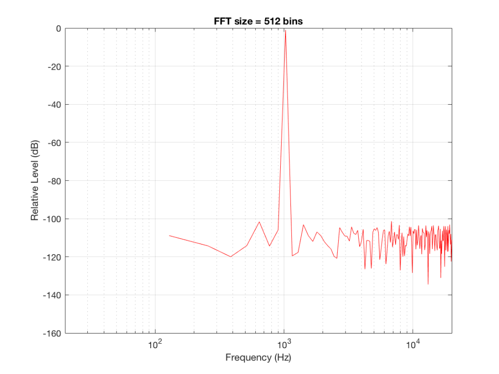
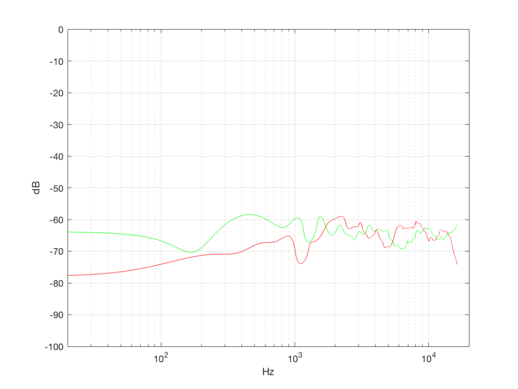
Figure 2 shows the same analysis done on the same signal, but with a 512-bin FFT instead. There, you can see that the the resolution of the plot is better – we have a bin or point every 128 Hz (remember 65536 Hz / 512 bins = 128 Hz). Also, the sine tone has the same level (-1 dB FS) but the noise, which we know is 80 dB lower, appears to be even lower than it does in Figure 1… Strange…
Let’s do some more FFT’s with more and more bins to see what happens…
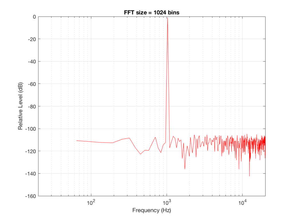
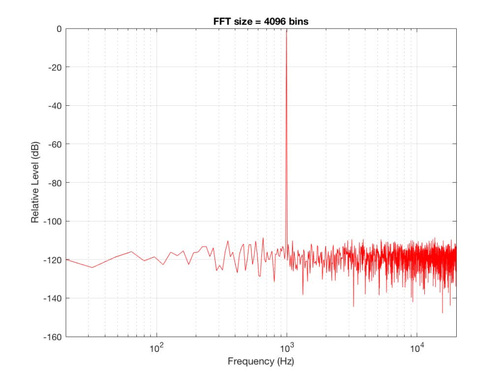
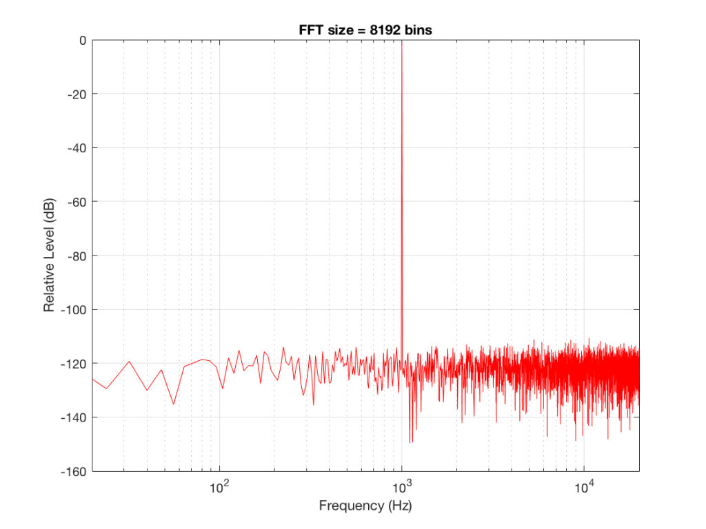
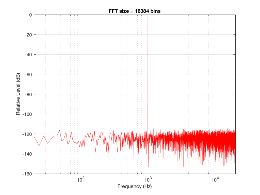
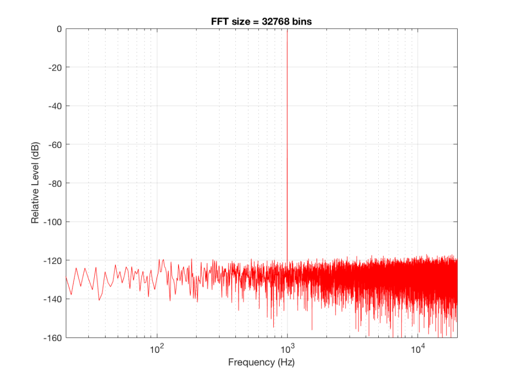
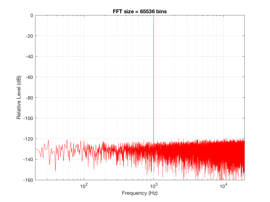
So, by going from a 256-bin FFT to a 65536-bin FFT, we appear to have dropped the noise floor by more than 20 dB.
Weird? No. Why?
Remember that every time we double the length of the FFT, we double the number of frequency bins in its output. So, that plot in Figure 9 has more individual frequencies contributing to add together to the same noise signal, 80 dB lower than the sine tone. (If you asked 1000 people to shout as loudly as 10 people, each individual in the larger group would have to be quieter to produce the same total output.)
The “punch line” here is that we cannot make a direct conclusion about the overall Signal-to-Noise ratio of the signal by looking at any of the plots above. Of course we can say that the “signal” (the sine tone) is obviously louder than the noise – by a lot. But we can’t be much more detailed than that.
So, if someone jumps between a SNR number and a spectral plot like the ones above, in an effort to convince you of something, be very careful about being led down a garden path.
Some extra information:
We also have to remember that, although the signal that I used to make these graphs was initially the same, the actual signal that was used by each of the FFT’s was different. This is because, by default, the length of the signal used by an FFT calculation is the same as the number off bins in the FFT. So, for example, a 256-bin (or 256-point) FFT only uses 256 samples as its input. A 32768-point FFT uses 32768 samples (the first 256 of which were the ones used by the 256-point FFT). So, for example, if you load a recording of Britney Spears singing “Toxic” into Matlab, and you type the command FFT(toxic, 256) – you’ll get a 256-bin FFT of the first 5 .8 milliseconds (256 samples) of the recording – not a representation of the spectral content of the entire song.
Initially, I started out by saying that I would use a 997 Hz sine tone. This might look a little weird because it’s not a nice number like 1000 Hz. There’s a good reason for this, and I’ll write a posting about it some other day.
Then, I said that it’s not really 997 Hz – I moved it a little. This is because I wanted the frequency of my sine tone to land exactly on one of the bins of my FFT. So for example, in the case of the 256-bin FFT, I had a frequency resolution of 256 Hz – so my bins are at the following:
256 Hz
512 Hz
768 Hz
1024 Hz
1024 Hz is the closest value to 997 Hz that occurs in the sequence so I used that instead. If I had kept the sine tone fixed at 997 Hz, the plots would not have looked as pretty, because the information about its level would have “leaked” or “been spread out” into the adjacent bins. So, instead of a nice clean spike, we would have seen a big, round bump.
The Art of Listening
DSD is open source??? I didn’t get that memo…

Signal levels and Dynamic Range
If you have a bunch of audio devices in a chain (say, a CD player connected to a preamplifier connected to a power amplifier connected to a loudspeaker) then one of the simplest things that you can do to improve or optimise your audio quality is to look after the gain of the signal through the system. It’s also free – and getting a lot for free is always a good thing…
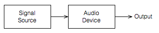
Let’s start by taking a simple view of one device – a piece of audio gear. It doesn’t matter what the gear is – it could be an MP3 player, it could be a giant mixing console. What we’ll do is just look at the output of this device as it tries to play an audio signal with a varying level.
Let’s use a very simple example of a sine wave as our audio signal; we’ll look at the output of the Audio Device as we increase the level of our sine wave from very quiet to very loud.
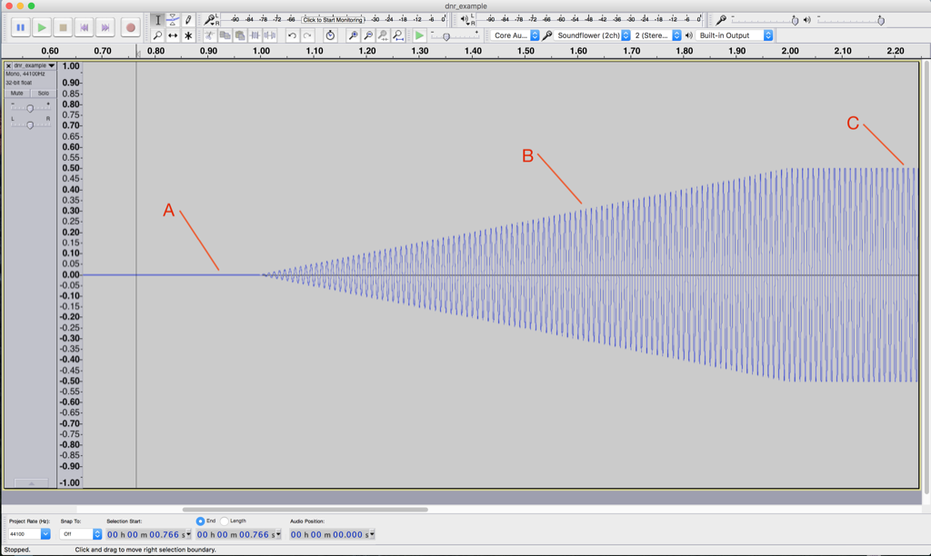
This screen shot shown in Figure 2, by itself, is not that interesting. Let’s zoom in to the three points on the plot to see what’s going on.
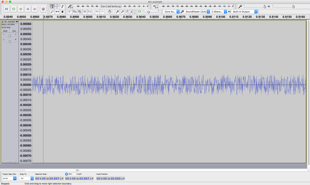
Figure 3 shows a zoomed-in view of point “A” in Figure 2. Notice that you cannot see a sine wave in that signal – it’s just noise. This is the noise that is naturally generated by the device for some reason. This may be natural noise in the analogue chain – caused by thermal movement of electrons in resistors, amplified by the device itself. It may be intentional noise like dither which is added to the signal to randomise errors in a digital audio chain. Or, it may be something else entirely…
But be careful not to jump to conclusions… Just because you can’t see a sine wave there doesn’t mean that you won’t be able to hear it. As the level of the sine wave is increased, we’ll be able to hear it along with the noise before we’ll be able to see it on the screen.
In this case, we have a very low “signal-to-noise ratio”. In other words, the level of the signal (the sine wave) divided by (because it’s a ratio) the level of the noise gives us a low number. Or, in normal English – the sine wave is “drowned out” by the noise.
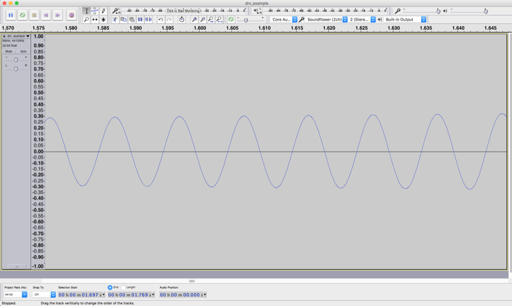
Figure 4 shows a nice, clean-looking sine wave coming out of our audio device. It’s what’s going on at point “B” in Figure 2. We’ve zoomed in so much that you can’t see the increase in level over time – but trust me, it’s happening there.
The noise is still there, “riding the wave” of the sine tone. In fact, if we were to zoom in on the sine wave in that figure, we’d see the same kind of noise that we saw in Figure 3 – like little ripples on big ocean waves. Now, however, the sine wave is much louder than the noise – so we have a reasonably high “signal-to-noise ratio”. In other words, the level of the signal (the sine wave) divided by (because it’s a ratio) the level of the noise gives us a high number. Or, in normal English – the sine wave “drowns out” the noise.
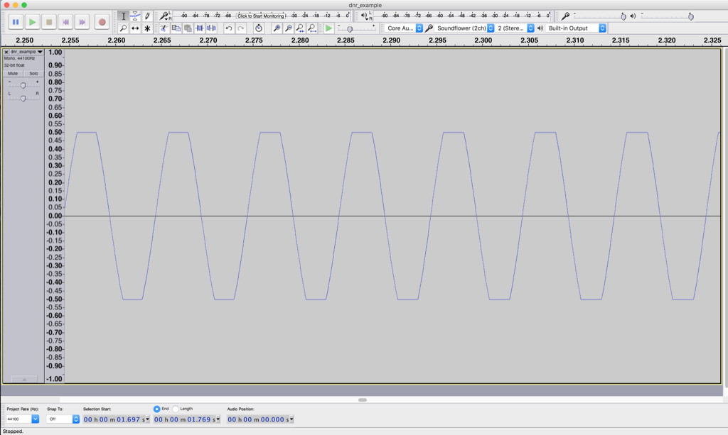
Figure 5 shows what’s happening at point “C” in Figure 2. Notice that this doesn’t really look like a sine wave any more – the top and bottom has been chopped off or “clipped”. This has happened because we are trying to make our audio device have an output level that is beyond its abilities. As the sine wave increases, the audio device follows along, until its output can go no higher, so it stops and holds that output level until the sine wave comes back down.
At the point, the noise is still very much lower in level than the signal – but we have caused a problem – the input is a sine wave, but the output is not. In other words, we have distorted the shape of the audio signal.
Note that distortion of an audio signal can take an infinite number of forms. The example here is symmetrical clipping of the signal – which is what many people mean when they say “distorted” – but don’t be fooled… “Distortion” means a whole lot more than this.
So, there’s a moral to the story-thus-far: every audio device has an upper and lower limit for audio level. (Yes, even a wire has a lower limit set by thermal noise in the electrons it contains and an upper limit set by the amount of current it will pass through before melting.) That range of dynamics or dynamic range is (hopefully) big – in other words, the noise floor (the quietest sound) should be MUCH MUCH quieter than a just-clipped signal (the loudest sound). Because this difference is so big, we’ll measure it in decibels (for kind of the same reason it doesn’t make sense to measure the speed of a car in millimetres per year, or the area of Canada in square micrometres.)
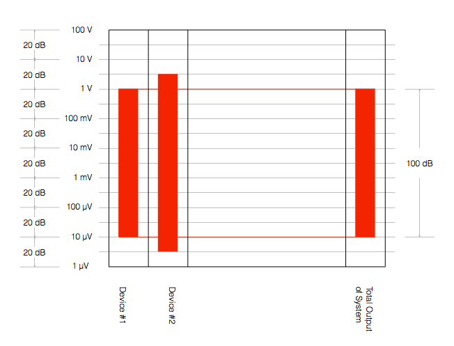
We can also represent these two numbers (the level of the noise floor and the level of a just-clipped signal) as two values relative to each other. Let’s say, for the purposes of keeping the numbers pretty, that we have an audio device that just so happens to have a level of noise floor that it 100 dB below the level of a signal that just starts to clip at its output.
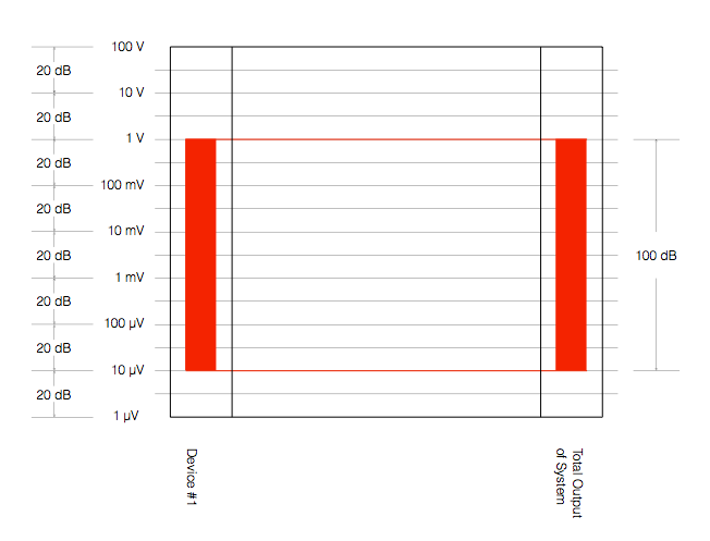
Figure 6 shows one way to represent this. The red vertical rectangle on the left shows the range of audio levels that is possible to achieve with “Device #1”. It has a noise floor of 10 µV and will clip at 1 V – therefore it has a total dynamic range of 100 dB. Since, in this example, Device #1 is the only device in our audio system, the dynamic range of the entire system is also 100 dB (shown as the ride rectangle on the right) – since the entire system consists of just one device.
What happens if we add another device in our chain? Let’s say, for example, that we put a second device in the system after Device #1. Let’s also say that Device #2 can play louder signals than Device #1 – and it has a lower noise floor, as is shown in Figure 7.
There are three things to notice in Figure 7:
- Device #2 can play louder than Device #1
- Device #2 has a lower noise floor than Device #1
- Therefore Device #2 has a wider dynamic range than Device #1
- The dynamic range of the total system is set by Device #1, since it is not limited by Device #2.
However, we should be careful here. The fact that Device #2 has a wider dynamic range than Device #1 does not automatically mean that the total system has a dynamic range that is defined by the “weakest link” (Device #1). Look at Figure 8, for example.
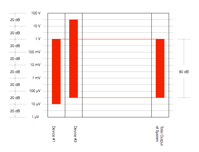
In Figure 8, we have not changed the devices – Device #2 still has a 120 dB dynamic range – but the Total System has a dynamic range that is reduced to 90 dB because of the alignment of levels in the system. Now, the noise floor of the system comes from Device #2 because we have not been careful about setting up the alignment of the levels of the devices.
Another way to think of this is that Device #2 is set up with the expectation that it will go much louder – but it doesn’t because of the limitations of Device #1. Because of that incorrect setup, the noise that you hear at the output of the system comes from Device #2.
An example of a system like the one shown in Figure 8 is when you connect a low-end audio device’s output (say, the headphone jack of your computer or phone) to a better device that is built to handle a much higher input level. The possible result is that the “headroom” (the amount by which the better device can handle higher level signals) is wasted (since the lower-quality device doesn’t deliver those high levels) and the total system has a degraded dynamic range.
So, the moral of the story here so far is that you should always try to ensure that your system’s dynamic range is not limited by the way it’s connected.
For example, if you have a system that has an adjustable input sensitivity, you should set it so that the input is not expecting more level than the device that’s feeding it can deliver. If your output device can only deliver 2 V RMS maximum, it my not be helpful for the thing it’s connected to to be “expecting” to see 4 V coming from it. If this is the way things are setup, then you might be “throwing away” 6 dB of dynamic range (because 4 V is 6 dB louder than 2 V).
Generally, there are two good “rules of thumb” that can help you here.
The first one is to try to align all your maximum levels as much as possible. So, as in the last example above, if your source device has a maximum output of 2.0 V RMS, set the input sensitivity of your next device to “expect” 2.0 V RMS maximum. This will make the tops of the red rectangles all align, and the dynamic range will be defined by the worst link in the chain instead of the way the devices are connected.
The second rule of thumb is to put as much gain as possible at the beginning of the chain. This is particularly true if you’re working in a recording studio. This is because every piece of gear contributes noise to the audio signal. If you put all the gain at the end of the chain, then you are making the signal louder, but you’re also making all of the noise from all of the gear “upstream” louder as well. If you put all the gain at the beginning of the chain, then you might wind up in a situation where you have to turn DOWN the signal through the chain, those reducing your signal to the correct level, and bringing the noise floor down with it. (Two obvious examples of this are using lots of gain at your mic preamp in a recording studio, or getting a RIAA preamp with a healthy output level for your turntable…) Another good example of this is the case where you have a headphone output from your phone connected to the aux input of a small stereo system. You want to turn up the phone as much as possible, and turn down the stereo volume. If you do the opposite, you’ll be using the stereo system to turn up the noise output of your phone.
One last thing: connecting devices digitally will probably help with your dynamic range, however, this is not necessarily always true. You certainly cannot make an automatic conclusion that a digital connection is better in all respects than an analogue one – or vice versa. For example, in some cases, the errors in a sampling rate converter at a digital input stage may result in a higher level of “noise” floor than the analogue noise caused by an analogue-to-digital converter on the same device. Or, it might be that these two inputs have the same measurable noise floor, but those two noises have very different characteristics. Typically analogue noise is program independent – meaning it’s unrelated to the signal – whereas poorly-implemented digital transmission and processing typically results in program-dependent errors. These can be interpreted by the listener as being part of the signal (more like distortion artefacts than noise) and therefore will be different for different signals. To make things even more confusing, different digital inputs on the same device (e.g. Optical, S/P-DIF, and HDMI) may (or may not) behave differently – so any decisions you make about one of them may (or may not) be applicable to the others…
The future of streaming?

Probability and Death
Inspired by a conversation with Jamie Angus following my last posting, I did some digging into the probability density functions (PDF’s) of a bunch of test tracks that I use for tuning and testing loudspeakers.
The plots below are the results of this analysis.
Some explanations, to start…
A PDF of an audio signal is a measurement of the probability that a given level (or sample value) will happen in a given period of time. In the case of the plots below, I just counted each time every sample value the 16-bit range of possibilities (from -32768 to 32767, if you think in binary – from -1 to +1-2^-15 in steps of 2^-15 if you prefer to think in floating point decimal) occurred in an entire track (usually the full tune). That’s plotted below as the gray “curve” in a linear world.
I converted the linear levels to “instantaneous” (sample-by-sample) dB values (since they’re instantaneous, they’re not in dB FS – but let’s not get into that discussion), but kept the positive and negative polarities of the linear values separate. Those are plotted as the red (negative values, expressed in dB) and black (positive values, expressed in dB). I cheated a little here, since a linear value of “0” isn’t really -96 dB – it’s -infinity dB… but, except for that one value, everything else is plotted correctly.
When I did these analyses, I noticed lots of sample values in lots of tracks that had no probability of ever occurring. Sometimes, this is just because the track is mastered low in level – so the “upper” sample values are not used. Sometimes, there are “dead values” well inside the range. This likely points to an error in the converter and/or digital mixing and/or mastering equipment.
Finally, I made a plot of the number of “dead” sample values per 128 sample values in 512 blocks (65536/128 = 512). That’s the red line above the gray one.
Some other things are noticeable in the plots, but we’ll take those as they come, below…
Note that I will not reveal the names of the tracks I used, since it’s not my purpose here to make anyone look bad. It’s to look at the differences between different recordings, types, and even equipment… Don’t ask which recordings I used.

This plot of an orchestral recording (“orchestral8”) looks fairly normal. As Jamie pointed out in the last posting, the distribution looks to be Laplacian. There is a big spike at the “0” mark – due to the silence at the beginning and end of the track. As can be seen, the track peaks around a linear value of about +/- 0.2 or about -14 dB below full scale. So, the sample values above 0.2 (or below -0.2) are unused. This can be seen in the blue lines (comprised of a blue dot at each sample value) in the top plot, and the red line at 128 (the number of “dead values” per 128 possible values) in the bottom plot.

The “solo inst3” is very similar in behaviour, even though it’s a completely different recording. This one is of a solo stringed instrument in a fairly reverberant space. Notice that its basic characteristics are very similar to those shown in “orchestra8”.

The “voice3” recording is also similar. It’s a little interesting in all three of these recordings to note the transition between levels where there are no dead sample values (around the “0” line) and levels where there are nothing but dead values. In this area (in the “voice3” recording, for example, around +/- 0.3, there are sample values that are used – but others that are skipped. This is because the track has a reasonably large crest factor (the ratio between the peak and the RMS of the track) – in other words, it has noticeable peaks. When the levels peak positively or negatively, there will be some values skipped along the way…
Although these are very different recordings of different instruments in different spaces on different labels – they all appear to have some characteristics in common.
- They very likely had little or no compression applied
- They don’t use the entire dynamic range available. This is not necessarily a bad thing, since it could be that each of those tracks was part of a larger collection, and its level made sense in the context of the entire album.
Now let’s look at another acoustic recording that was done with four microphones, and no compression – but possibly some small processing done in the mastering.

Obviously the “orchestra6” recording has something strange going on. It almost looks as though something in the recording chain “favoured” every second sample value – hence the zig-zag pattern in the probability density function. Note that this was not a small thing – the difference in how much the sample values are “preferred” is by a factor of 10.
What could cause this? This is difficult to say by just looking at this plot, since we have to remember that these values are complied using the entire track. So, for example, three possibilities that come immediately to mind are:
- for some strange reason, the analogue-to-digital converter, or one of the DSP blocks in the mastering console “liked” every second sample value 10 times more than the others
- for some other strange reason, the original ADC only used every second sample value – and one 10th of the track was edited together (or “spliced”) from a different take that needed extra gain.
- something else
To be honest, I think that the first or third of these is more likely than the second – but either way, it certainly looks weird…

This track of another solo instrument (hence “solo inst1”) is a little different – but not terribly so. There is a little flatter behaviour in the upper plot, which corresponds to a more convex “umbrella” shape in the lower one – but generally, this is nothing serious to raise any eyebrows in my opinion… It probably indicates some minor compression.
Let’s look at some other tracks with compression…


“testtracks4” and “pop21” both have indications of compression in the flat response of the top plots and the convex shape of the lower ones. The “pop21” track has the added indication of clipping – the spikes on the sides of the plots. This indicates that we have an unusual number of samples with values of either -1 or +1. Note, however, that we do not move smoothly into that clipping – it was what we call “hard clipping”, since the values just before the +/- 1 values show no indication of a smooth transition to the spike.

The “bass20” track is interesting, not only because of the compression, but the apparent lack of silence (notice there is no spike around the “0” line). This is because this track is from a live album that is intended for gapless playback – and I just grabbed the track. So, it starts and stops with a hard transition to and from audience sound – there is no fade in or fade out.

The “bass2” track also has the spikes on the ends, showing the clipping – but, as you can see, the plots (particularly the linear plot on the bottom) starts to slope upwards just before the spike – indicating some kind of soft clipping or a peak limiting function was used to shape the envelope.

The “bass15” track is interesting, since it has the characteristic spikes on the sides that look a little like clipping (especially if you only look at the upper plot) but, as can be seen in the bottom plot, these are not at values of -1 or +1. So, this would indicate either that something else in the recording chain clipped – and then was smoothed out and reduced in level a little later in the process – or we’re looking at some kind of interesting soft-clipping processor that keeps a little “bump” in the envelope of the signal above the “clipping” area.
Now let’s look at some really strange ones…

I have no explanation for the plot in “testtracks6”. I can’t understand what would cause that bump only in the negative portion of the signal around -70 dB FS. My guess is that this is some sort of weird watermark that is inserted – but this is really stretching my imagination… Of course, if could just be that something in the processing chain is just broken… Anyone reading this have any good ideas? Seems to me that I should do a little more digging into this track to see what’s going on around those sample values…

The “pop11” track is an example of a recording that was probably done on early digital recording gear – or an early digital mastering console. As can be seen in both plots, there are missing sample values across the entire range of possible values.
One possible explanation of this is that this is a digital recording that had gain applied to it using a processor that did not use dither. This would cause the signal to not use every second sample value (or every third or fourth – depending on the gain applied). It’s also possible that it was processed or recorded using a device that had a “stuck bit”. I’ll do some simulations to show what that would look like and publish the plots in a future posting.
Note that the small “spikes” of peak limiting (looking a little like clipping on a small scale) are visible in the bottom plot – but they’re very small…
Some more recordings with strangely dead sample values are shown below. Note that some of these are very recent recordings – so the “early digital gear” excuse doesn’t hold up for all of them…


So, something is obviously broken in all four of these examples… Please don’t ask me how to explain them. The only thing I can do is to suspect that at least one piece of gear and/or software that was used in the late stages of the process was really broken… I just hope that, whatever gear/software it was, it didn’t cost a lot of money….
An interesting pair of examples are shown below…


The “jazz1” and “jazz2” recordings both come from the same album released by a small jazz ensemble. Notice that, although they are different tracks, they have similar PDF’s, seen in the “spikes” through the upper plots. It seems that there is something weird going on in the mastering console (or software) in this case – or perhaps the final mixing console…

The “speech4” track has obvious “favouring” of alternate sample values – but this was a track that was recorded on a very early DAT machine about 35 years ago… To be honest, knowing what I know about using an identical model DAT recorded, I’m surprised this looks as good as it does…
I’ll just put in a bunch more plots without comment – just to let you see some of the variety that shows up with this kind of analysis.


Post-script
This posting has a Part 2 that you’ll find here, and a Part 3 that you’ll find here.
Noise, Averages, and Incorrect Assumptions, Part 1
Let’s talk about the subject of noise. To begin with, we have to agree on a definition, which might become the biggest part of the problem. For normal people, going about their daily lives, “noise” is a word that usually means “unwanted sound”, as the Grinch explained, just before hitching up his dog to a sleigh:
However, “noise” means something else to an audio professional, who is consequently not “normal” and does not have a life – daily or otherwise.
When an audio professional says “noise”, they mean something very specific – “noise” is an audio signal that is random. For example, if the noise signal is digital, there would be no way to predict the value of the next sample – even if you know everything about all previous samples.
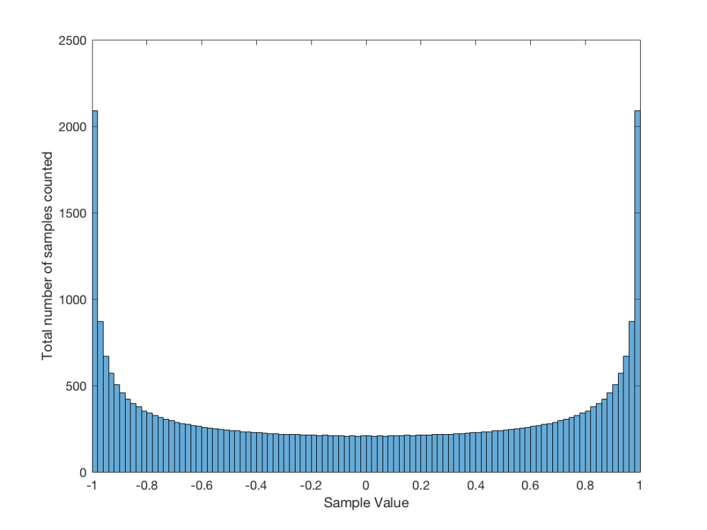
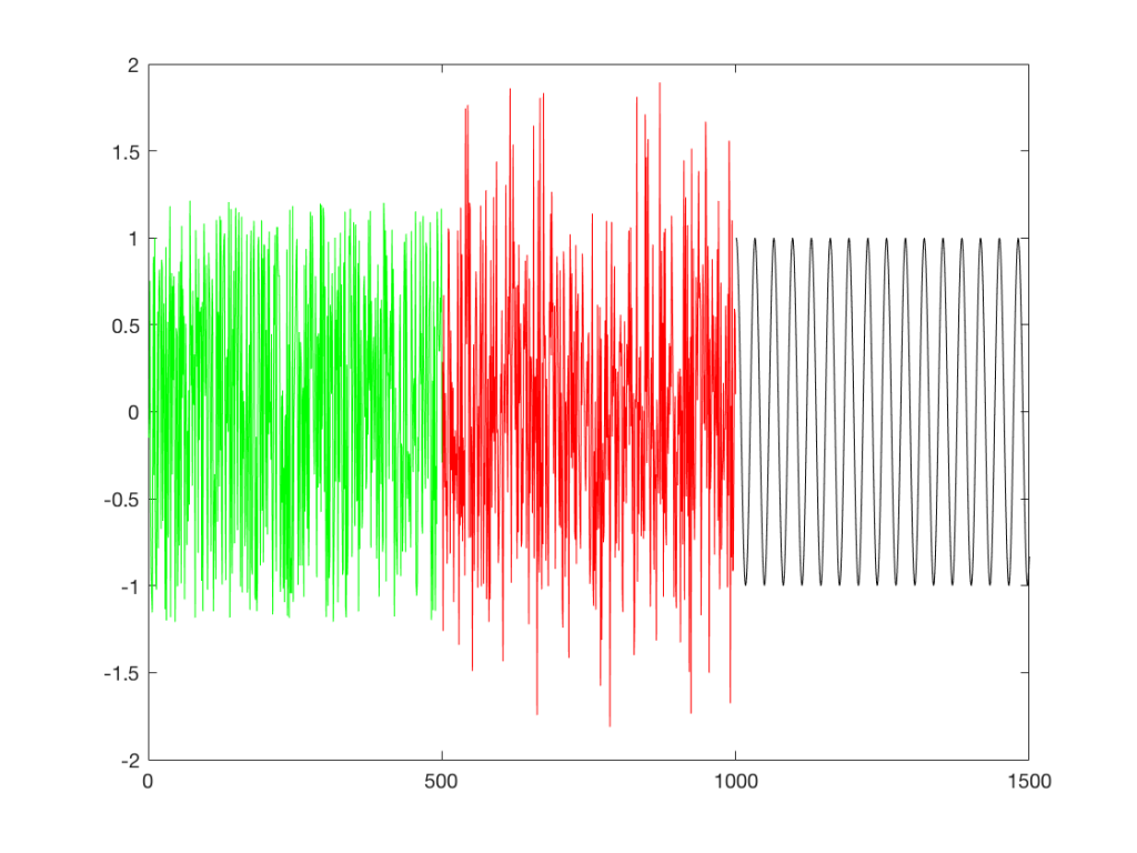
So, “noise”, according to the professionals, is a signal made of a random sequence. However, we can be a little more specific than this. For example, in order to make the noise plotted in Figure 2, above, I asked Matlab to generate 64 random numbers between -1 and 1 using the code
rand(1,64)*2-1
So, although this will generate random numbers for me (we’ll assume for the purposes of this discussion that Matlab is able to generate truly random numbers… actually they’re “pseudorandom” – but let’s pretend for today…), there are some restrictions on those values. No matter how many random values I ask for using this code, I will never get a value greater than 1 or less than -1.
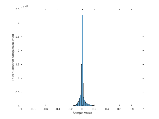
However, if I used a slightly different Matlab function – “randn” instead of “rand”, using the following code
randn(1,64)
I would get 64 random numbers, but they are not restricted as my previous bunch were, as you can seen in Figure 2a, below.
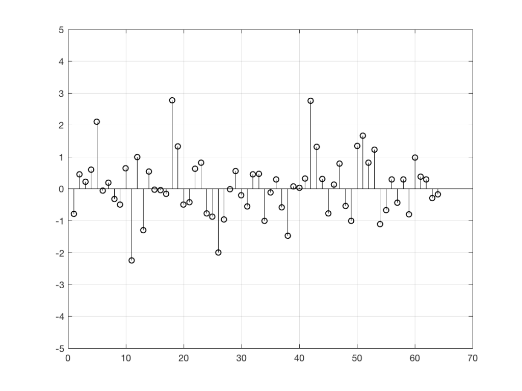
Again, it’s impossible to guess what the next value will be, but now you can see that it might be greater than 1 or less than -1 – but it will more likely to be closer to 0 than to be a “big” number.
So, Figures 2 and 2a show two different types of noise. Both are random numbers, but the distribution of the numbers in those two sequences are different.
To be more specific:
Let’s use the “rand(1,1000000)*2-1” function to make a sequence of 1,000,000 samples. We know that this will produce values ranging from -1 to 1. So, we’ll divide this range into 100 steps (-1.00 to -0.98, -0.98 to -0.96, -0.96 to -0.94, … and so on up to 0.98 to 1.00 – I know, I know, there’s some overlap here, but I didn’t want to use a bunch of less than or equal to symbols… The concept is the important point here… Back off!). For each of those divisions, we’ll count how many of the 1,000,000 samples fall inside that smaller range, and we’ll plot it. This is shown in Figure 3a.
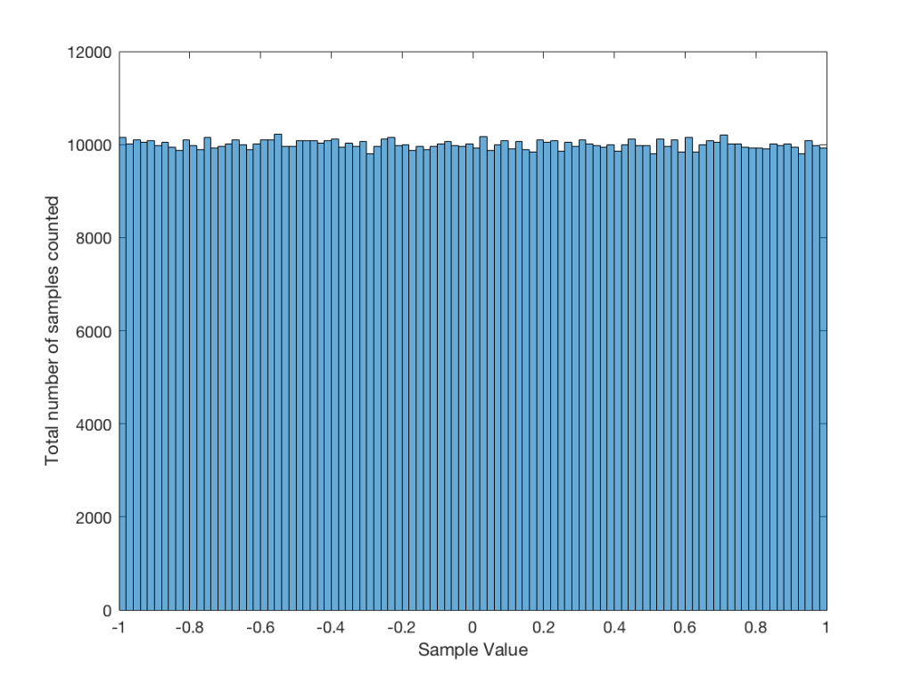
As you can see in Figure 3a, there are about 10,000 samples in each “bin”. This means that about 10,000 samples have a value that fall within each of the smaller slices of the total range. Also, if I added up the values of all 100 of those numbers plotted in 3a, I would get 1,000,000, since that’s the total number of values that we analysed.
If I do the same thing to the numbers coming out of the other function: “randn(1,1000000)” it would look very different. As we already saw, the numbers can be outside the range of -1 to 1, and they’re more likely to be around 0 than to be far away from it. This can be seen in Figure 3b.
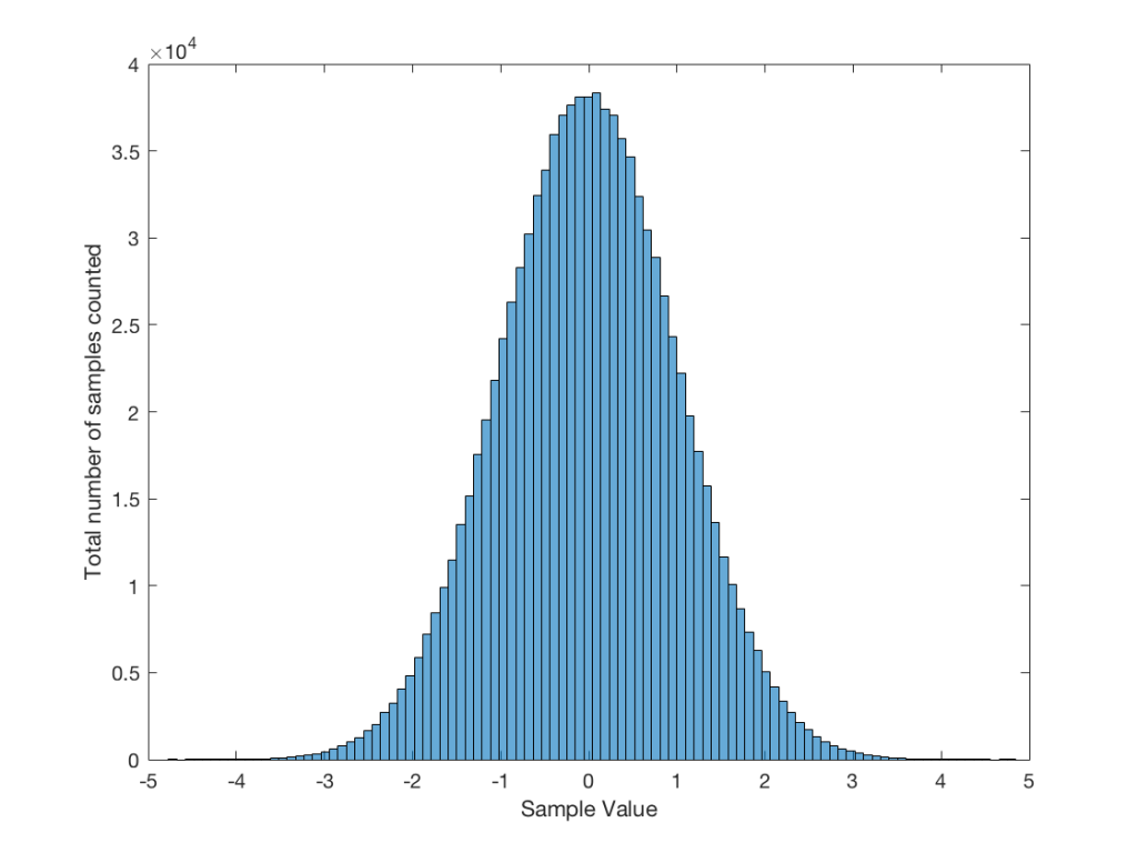
Just to clean up a loose end – there are official terms to describe these differences. The noise plotted in Figure 2 has what is called a “rectangular distribution” because a plot of the distribution of the values in it (if we measure enough sample values) eventually looks like a rectangle (a blue rectangle, in the case of Figure 3a). The noise plotted in Figure 2a has a “normal distribution”, as can be seen in the bell-like shape of the plot in Figure 3b. There are many other types of distributions (for example, rolling 2 dice will give you random numbers with a “triangular distribution”), but we’ll leave it at 2 for now.
So, we’ve seen that we can have at least two different “types” of random number sets – but let’s do a little more digging.
Frequency content
Here’s where things get a little interesting. If I take the 1,000,000 samples that I used to make the plot in Figure 3a and I pretend it’s an audio signal, and then calculate the frequency content (or spectrum) of the signal, it would look like the green plot in Figure 4a, below. If I did a frequency analysis of the signal used to make the plot in Figure 3b, it would look like the red plot.
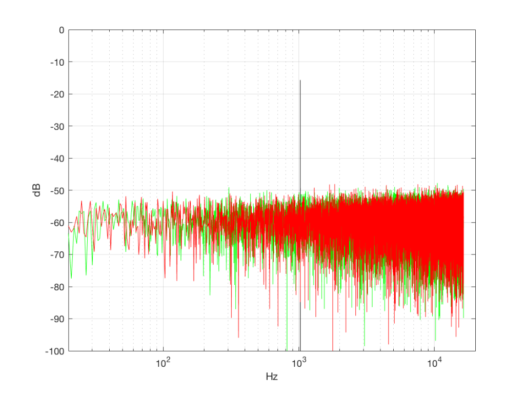
What’s interesting about this is that, basically speaking, the two signals, although they’re very different, have basically the same spectra – meaning they have the same frequency content, and therefore they’ll sound the same. This is really evident if I smooth these two plots using, for example, a 1/3 octave smoothing function, as is shown below in Figure 4b.
As you can see there, the very fine peaks and dips in the response shown in Figure 4a, when averaged, smooth to the flat response shown in Figure 4b.
Now we have to clear up a couple of issues…
The first is that, as you can see in the plot above, the spectrum of both random signals (both noise generators) is flat. However, due to the way that I did the math to calculate this, this means that we have an equal amount of energy in equal-sized frequency ranges throughout the entire frequency range of the signal. So, for example, we have as much energy from 20-30 Hz as we do from 1000-1010 Hz as we do from 10,000 – 10,010 Hz. In other words, we have equal energy per Hz. This might be a little counter-intuitive, since we’re looking at a semilogarithmic plot (notice the scale of the x-axis) but trust me, it’s true. This means that, in both cases, we have what is known as a “white noise” signal – which is a colourful way of saying “noise with an equal amount of energy per Hz”.
The second thing is that I just lied to you. In order to get the pretty plots in Figures 4a and 4b, I had to take long signals and analyse how much energy we got, over a long period of time. If I had taken a shorter slice of time (say, 100 samples long) then the spectra plots would not have looked as pretty – or as flat. For example, if I just take the first 100 samples of both of those noise generator outputs, and calculate the spectra in those, I get the plots in Figure 4c, below.
Notice that these plots do not look nearly as flat – even though I’ve smoothed them with a 1/3 octave smoothing filter again. Why is this?
Well, the problem is probability. Since the two signals are random, there is no guarantee that all frequencies will be contained in them for any one little slice of time. However, there is an equal probability of getting energy at all frequencies over time. So, in a really strange universe, you might get all frequencies below 1000 Hz for one second, and then all frequencies above 1000 Hz for the next second – over two seconds, you get all frequencies, but at any one moment, you don’t.
What this means is that “white noise” doesn’t necessarily contain energy at all frequencies equally – unless you wait for a long time. If you listen for long enough, all frequencies will be represented, but the shorter the measurement, the less “flat” your response.
Just for the purposes of comparison, let’s also find out what the distribution of values is for a sine wave – since this might be interesting later… This is shown in Figure 5, below.
It may be interesting to note that “normal” sounds like music and speech have distributions that look much more like Figure 3b than like Figure 5, as is shown in the examples in Figures 6, 7, and 8. This is why you shouldn’t necessarily use a sine wave to measure a piece of audio equipment and draw a conclusion about how music will sound…
Averaging
If I play the first kind of white noise (the one shown in Figure 2) and measure how loud it is with a sound pressure level meter, I’ll get a number – probably higher than 0 dB SPL (or else I can’t hear it) and hopefully lower than 120 dB SPL (or else I’ll probably be in pain…). Let’s say that we turn up the volume until the meter says 70 dB SPL – which is loud enough to be useful, but not loud enough to be uncomfortable.
Then, I switch to playing the other kind of white noise (the one shown in Figure 2a) and turn up the volume until it also measures 70 dB SPL on the same meter.
Then, I switch to playing a sine wave at 1 kHz and turn up the volume until it also reads 70 dB SPL.
If I were to compare what is coming into the loudspeaker for each of those three signals, after they have been calibrated to have the same output level, they would look like the three signals in Figure 9.
These will all sound roughly the same level, but as you can see in the plot in Figure 9, they do not have the same PEAK level – they have the same average level – averaged over time…
However, if we were to do a frequency-dependent analysis of these three signals, one of these things would not look like the others… Check out Figure 4a, which I’ve copied below…
Notice that, in a frequency-dependent analysis, the sine wave (the black line sticking up around 1000 Hz) looks much louder (35 dB louder is a lot!) than the green plot and the red plot (our two types of white noise). So, even though all three of these signals sound and measure to have roughly the same level, the distribution of energy in frequency is very different.
Another way to think about this is to say that each of the three signals has the same energy – but the sine wave has all of it at only one frequency all the time – so there’re more energy right there. The noise signals have the energy at that frequency only some of the time (as was explained above…).
ANOTHER way to think about this is to put a glass of water in the bottom of an empty bathtub. If the depth of the water in the glass is 10 cm – and you pour it out into the tub, the depth of the water will be less, since it’s distributed over a larger area.
As you can see in the title of this posting, this is “Part 1″… All of this was to set up for Part 2, which will (hopefully) come next week. As a preview: the topic will be the use (and mis-use) of weighting functions (like “A-weighting”) when doing measurements…
Song of Reproduction