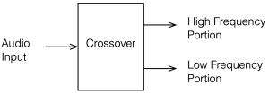
A crossover is a set of filters that take an audio signal and separate it into different frequency portions or “bands”.
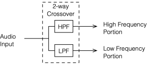
For example, possibly the simplest type of crossover will accept an audio signal at its input, and divide it into the high frequency and the low frequency components, and output those two signals separately. In this simple case, the filtering would be done with
a high-pass filter (which allows the high frequency bands to pass through and increasingly attenuates the signal level as you go lower in frequency), and
a low-pass filter (which allows the low frequency bands to pass through and increasingly attenuates the signal level as you go higher in frequency).
This would be called a “Two-way crossover” since it has two outputs.
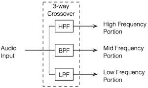
Crossovers with more outputs (e.g. Three- or Four-way crossovers) are also common. These would probably use one or more band-pass filters to separate the mid-band frequencies.
Why do we need crossovers?
In order to understand why we might need a crossover in a loudspeaker, we need to talk about loudspeaker drivers, what they do well, and what they do poorly.
It’s nice to think of a loudspeaker driver like a woofer or a tweeter as a rigid piston that moves in and out of an enclosure, pushing and pulling air particles to make pressure waves that radiate outwards into the listening room. In many aspects, this simplified model works well, but it leaves out a lot of important information that can’t be ignored. If we could ignore the details, then we could just send the entire frequency range into a single loudspeaker driver and not worry about it. However, reality has a habit of making things difficult.
For example, the moving parts of a loudspeaker driver have a mass that is dependent on how big it is and what it’s made of. The loudspeaker’s motor (probably a coil of wire living inside a magnetic field) does the work of pushing and pulling that mass back and forth. However, if the frequency that you’re trying to produce is very high, then you’re trying to move that mass very quickly, and inertia will work against you. In fact, if you try to move a heavy driver (like a woofer) a lot at a very high frequency, you will probably wind up just burning out the motor (which means that you’ve melted the wire in the coil) because it’s working so hard.
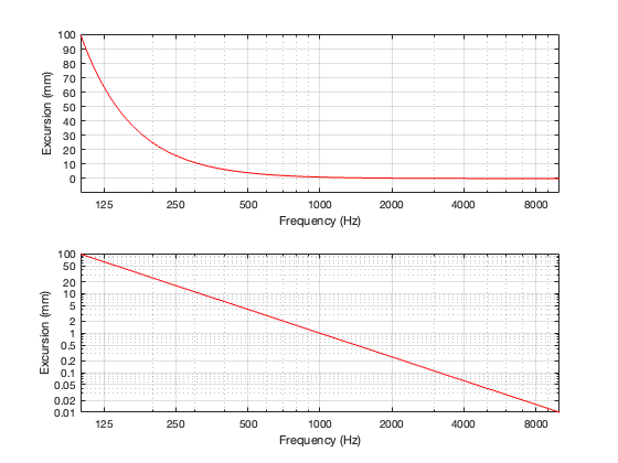
Another problem is that of loudspeaker excursion, how far it moves in and out in order to make sound. Although it’s not commonly known, the acoustic output level of a loudspeaker driver is proportional to its acceleration (which is a measure of its change in velocity over time, which are dependent on its excursion and the frequency it’s producing). The short version of this relationship is that, if you want to maintain the same output level, and you double the frequency, the driver’s excursion should reduce to 1/4. In other words, if you’re playing a signal at 1000 Hz, and the driver is moving in and out by ±1 mm, if you change to 2000 Hz, the driver should move in and out by ±0.25 mm. Conversely, if you halve the frequency to 500 Hz, you have to move the driver in and out with an excursion of ±4 mm. If you go to 1/10 of the frequency, the excursion has to be 100x the original value. For normal loudspeakers, this kind of range of movement is impractical, if not impossible.
Note that both of these plots show the same thing. The only difference is the scaling of the Y-axis.
One last example is that of directivity. The width of the beam of sound that is radiated by a loudspeaker driver is heavily dependent on the relationship between its size (assuming that it’s a circular driver, then its diameter) and the wavelength (in air) of the signal that it’s producing. If the wavelength of the signal is big compared to the diameter of the driver, then the sound will be radiated roughly equally in all directions. However, if the wavelength of the signal is similar to the diameter of the driver, then it will emit more of a “beam” of sound that is increasingly narrow as the frequency increases.
So, if you want to keep from melting your loudspeaker driver’s voice coil you’ll have to increasingly attenuate its input level at higher frequencies. If you want to avoid trying to push and pull your tweeter too far in and out, you’ll have to increasingly attenuate its input level at lower frequencies. And if you’re worried about the directivity of your loudspeaker, you’ll have to use more than one loudspeaker driver and divide up the signal into different frequency bands for the various outputs.
This week, a question came in from a B&O customer about their Beovox Cona subwoofer, starting with this photograph:
The question (as it was forwarded to me, at least…) was “what does ‘Long term max power 125w’ and ‘Max noise power 60w’ mean?”
This caused me to head to our internal library here in Struer and look at an ancient kind of document called a ‘book’ that contained the information for the answer.
The first clue is at the top of the photo where it says “IEC 268-5”, which is a reference to a document from the International Electrotechnical Commission in Switzerland called
CEI/IEC 268-5 International Standard Sound System Equipment Part 5: Loudspeakers
As you can see there, we happen to have two copies in our library: the second edition from 1989 and 3.1 from 2007, so I took a look at the 1989 edition.
Long Term Max Power
This term is defined in part 18.2 of that document, where it says that it’s the “electrical power corresponding to the long term maximum input voltage.” In order to convert voltage to power, you need to know the loudspeaker’s rated impedance, which is 6 Ω, as is shown in the photograph above.
Power = Voltage2 / R
So, in order to find the Long Term Maximum Power rating of the loudspeaker, we have to do a Long Term Maximum Input Voltage test, and then a little math to convert the result to power.
The Long Term Maximum Input Voltage is defined in section 17.3 as:
“… the maximum voltage which the loudspeaker drive-unit or system can handle, without causing permanent damage, for a period of 1 min when the signal is a noise signal simulating normal programme material (according to IEC 268-1).”
“The test shall be repeated 10 times with intervals of 2 min between the application of the signal.”
So, if I do the math backwards, I can calculate that the Cona was subjected to that special noise signal with an input voltage of 27.39 V with a pattern of
1 minute of continuous noise
2 minutes of silence
repeated 10 times
After this was done, the Cona was tested again to make sure that it worked. It did.
How I did the math to figure this out:
P = V2/R
therefore sqrt(P * R) = V
sqrt(125 * 6) = 27.39 V
To do the test, the loudspeaker is placed in a room of not less than 8 m3 with controlled temperature and humidity requirements. An amplifier droves the noise signal into the loudspeaker for 100 h
Max Noise Power
The Maximum Noise Power is tested in a similar way, however, instead of delivering the signal in 1 minute bursts with 2 minute rest periods, the speaker has to play the noise continuously for 100 hours. After the 100 hours are over, then the speaker is put in a room to recover for 24 hours. After this:
“The loudspeaker may be considered to have fulfilled the requirements of this test if, at the end of the storage period, there is no significant change in the electrical, mechanical or acoustical characteristics of the loudspeaker itself compared to those stated in the data sheet for the loudspeaker type, other than a change in the resonance frequency. The acceptability of this change is subject to negotiation; it shall therefore be stated when presenting the results.”
The reason the Maximum Noise Power is lower than the Long Term Maximum Power is the 2 minute rest time in the test. It’s important to remember that a loudspeaker driver is very inefficient when it comes to converting electrical power to acoustical power, and so most of the electrical power that goes into it is just lost as heat caused by inefficiency. The 2 minute rest time allows the loudspeaker to cool down a little before the signal starts heating it up again, and therefore it can handle more power (a little more than 3 dB more – which is the same as 2 x the power) than when it’s playing continuously.
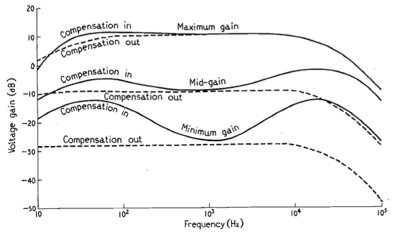
The June, 1968 issue of Wireless World magazine includes an article by R.T. Lovelock called “Loudness Control for a Stereo System”. This article partly addresses the issue of resistance behaviour one or more channels of a variable resistor. However, it also includes the following statement:
It is well known that the sensitivity of the ear does not vary in a linear manner over the whole of the frequency range. The difference in levels between the threshold of audibility and that of pain is much less at very low and very high frequencies than it is in the middle of the audio spectrum. If the frequency response is adjusted to sound correct when the reproduction level is high, it will sound thin and attenuated when the level is turned down to a soft effect. Since some people desire a high level, while others cannot endure it, if the response is maintained constant while the level is altered, the reproduction will be correct at only one of the many preferred levels. If quality is to be maintained at all levels it will be necessary to readjust the tone controls for each setting of the gain control
The article includes a circuit diagram that can be used to introduce a low- and high-frequency boost at lower settings of the volume control, with the following example responses:
These days, almost all audio devices include some version of this kind of variable magnitude response, dependent on volume. However, in 1968, this was a rather new idea that generated some debate.
In the following month’s issue The Letters to the Editor include a rather angry letter from John Crabbe (Editor of Hi-Fi News) where he says
Mr. Lovelock’s article in your June issue raises an old bogey which I naively thought had been buried by most British engineers many years ago. I refer, not to the author’s excellent and useful thesis on achieving an accurate gain control law, but to the notion that our hearing system’s non-linear loudness / frequency behaviour justifies an interference with response when reproducing music at various levels.
Of course, we all know about Fletcher-Munson and Robinson-Dadson, etc, and it is true that l.f. acuity declines with falling sound pressure level; though the h.f. end is different, and latest research does not support a general rise in output of the sort given by Mr. Lovelock’s circuit. However, the point is that applying the inverse of these curves to sound reproduction is completely fallacious, because the hearing mechanism works the way it does in real life, with music loud or quiet, and no one objects. If `live’ music is heard quietly from a distant seat in the concert hall the bass is subjectively less full than if heard loudly from the front row of the stalls. All a `loudness control’ does is to offer the possibility of a distant loudness coupled with a close tonal balance; no doubt an interesting experiment in psycho-acoustics, but nothing to do with realistic reproduction.
In my experience the reaction of most serious music listeners to the unnaturally thick-textured sound (for its loudness) offered at low levels by an amplifier fitted with one of these abominations is to switch it out of circuit. No doubt we must manufacture things to cater for the American market, but for goodness sake don’t let readers of Wireless World think that the Editor endorses the total fallacy on which they are based.
with Lovelock replying:
Mr. Crabbe raises a point of perennial controversy in the matter of variation of amplifier response with volume. It was because I was aware of the difference in opinion on this matter that a switch was fitted which allowed a variation of volume without adjustment of frequency characteristic. By a touch of his finger the user may select that condition which he finds most pleasing, and I still think that the question should be settled by subjective pleasure rather than by pure theory.
and
Mr. Crabbe himself admits that when no compensation is coupled to the control, it is in effect a ‘distance’ control. If the listener wishes to transpose himself from the expensive orchestra stalls to the much cheaper gallery, he is, of course, at liberty to do so. The difference in price should indicate which is the preferred choice however.
In the August edition, Crabbe replies, and an R.E. Pickvance joins the debate with a wise observation:
In his article on loudness controls in your June issue Mr. Lovelock mentions the problem of matching the loudness compensation to the actual sound levels generated. Unfortunately the situation is more complex than he suggests. Take, for example, a sound reproduction system with a record player as the signal source: if the compensation is correct for one record, another record with a different value of modulation for the same sound level in the studio will require a different setting of the loudness control in order to recreate that sound level in the listening room. For this reason the tonal balance will vary from one disc to another. Changing the loudspeakers in the system for others with different efficiencies will have the same effect.
In addition, B.S. Methven also joins in to debate the circuit design.
Apart from the fun that I have reading this debate, there are two things that stick out for me that are worth highlighting:
Notice that there is a general agreement that a volume control is, in essence, a distance simulator. This is an old, and very common “philosophy” that we forget these days.
Pickvance’s point is possibly more relevant today than ever. Despite the amount of data that we have with respect to equal loudness contours (aka “Fletcher and Munson curves”) there is still no universal standard in the music industry for mastering levels. Now that more and more tracks are being released in a Dolby Atmos-encoded format, there are some rules to follow. However, these are very different from 2-channel materials, which have no rules at all. Consequently, although we know how to compensate for changes in response in our hearing as a function of level, we don’t know what the reference level should be for any given recording.
One of the things I have to do occasionally is to test a system or device to make sure that the audio signal that’s sent into it comes out unchanged. Of course, this is only one test on one dimension, but, if the thing you’re testing screws up the signal on this test, then there’s no point in digging into other things before it’s fixed.
One simple way to do this is to send a signal via a digital connection like S/PDIF through the DUT, then compare its output to the signal you sent, as is shown in the simple block diagram in Figure 1.
Figure 1: Basic block diagram of a Device Under Test
If the signal that comes back from the DUT is identical to the signal that was sent to it, then you can subtract one from the other and get a string of 0s. Of course, it takes some time to send the signal out and get it back, so you need to delay your reference signal to time-align them to make this trick work.
The problem is that, if you ONLY do what I described above (using something like the patcher shown in Figure 2) then it almost certainly won’t work.
Figure 2: The wrong way to do it
The question is: “why won’t this work?” and the answer has very much to do with Parts 1 through 4 of this series of postings.
Looking at the left side of the patcher, I’m creating a signal (in this case, it’s pink noise, but it could be anything) and sending it out the S/PDIF output of a sound card by connecting it to a DAC object. That signal connection is a floating point value with a range of ±1.0, and I have no idea how it’s being quantised to the (probably) 24 bits of quantisation levels at the sound card’s output.
That quantised signal is sent to the DUT, and then it comes back into a digital input through an ADC object.
Remember that the signal connection from the pink noise output across to the latency matching DELAY object is a floating point signal, but the signal coming into the ADC object has been converted to a fixed point signal and then back to a floating point representation.
Therefore, when you hit the subtraction object, you’re subtracting a floating point signal from what is effectively a fixed point quantised signal that is coming back in from the sound card’s S/PDIF input. Yes, the fixed point signal is converted to floating point by the time it comes out of the ADC object – but the two values will not be the same – even if you just connect the sound card’s S/PDIF output to its own input without an extra device out there.
In order to give this test method a hope of actually working, you have to do the quantisation yourself. This will ensure that the values that you’re sending out the S/PDIF output can be expected to match the ones you’re comparing them to internally. This is shown in Figure 3, below.
Figure 3: A better way to do it
Notice now that the original floating point signal is upscaled, quantised, and then downscaled before its output to the sound card or routed over to the comparison in the analysis section on the right. This all happens in a floating point world, but when you do the rounding (the quantisation) you force the floating point value to the one you expect when it gets converted to a fixed point signal.
This ensures that the (floating point) values that you’re using as your reference internally CAN match the ones that are going through your S/PDIF connection.
In this example, I’ve set the bit depth to 16 bits, but I could, of course, change that to whatever I want. Typically I do this at the 24-bit level, since the S/PDIF signal supports up to 24 bits for each sample value.
Be careful here. For starters, this is a VERY basic test and just the beginning of a long series of things to check. In addition, some sound cards do internal processing (like gain or sampling rate conversion) that will make this test fail, even if you’re just doing a loop back from the card’s S/PDIF output to its own input. So, don’t copy-and-paste this patcher and just expect things to work. They might not.
But the patcher shown in Figure 2 definitely won’t work…
One small last thing
You may be wondering why I take the original signal and send it to the right side of the “-” object instead of making things look nice by putting it in the left side. This is because I always subtract my reference signal from the test signal and not the other way around. Doing this every time means that I don’t have to interpret things differently every time, trying to figure out whether things are right-side-up or upside-down.
It is often the case that you have to convert a floating point representation to a fixed point representation. For example, you’re doing some signal processing like changing the volume or adding equalisation, and you want to output the signal to a DAC or a digital output.
The easiest way to do this is to just send the floating point signal into the DAC or the S/PDIF transmitter and let it look after things. However, in my experience, you can’t always trust this. (I’ll explain why in a later posting in this series.) So, if you’re a geek like me, then you do this conversion yourself in advance to ensure you’re getting what you think you’re getting.
To start, we’ll assume that, in the floating point world, you have ensured that your signal is scaled in level to have a maximum amplitude of ± 1.0. In floating point, it’s possible to go much higher than this, and there’re no serious reason to worry going much lower (see this posting). However, we work with the assumption that we’re around that level.
So, if you have a 0 dB FS sine wave in floating point, then its maximum and minimum will hit ±1.0.
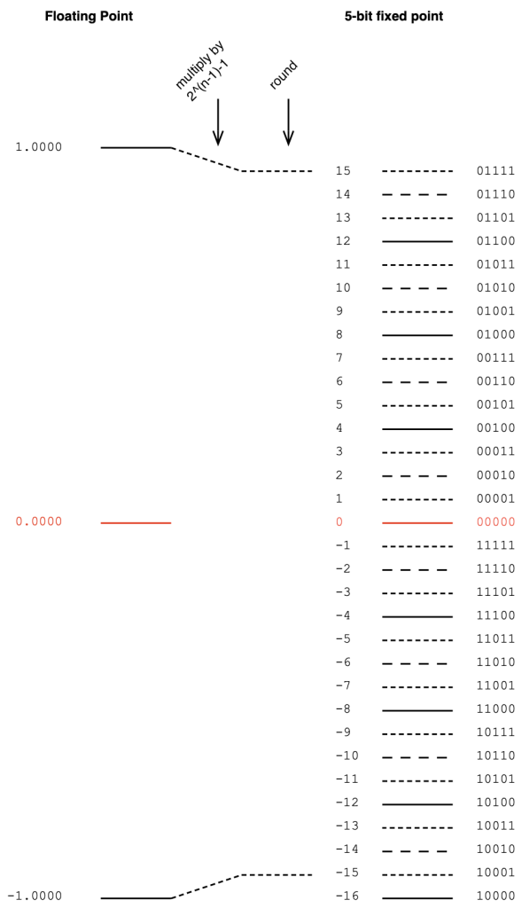
Then, we have to convert that signal with a range of ±1.0 to a fixed point system that, as we already know, is asymmetrical. This means that we have to be a little careful about how we scale the signal to avoid clipping on the positive side. We do this by multiplying the ±1.0 signal by 2^(nBits-1)-1 if the signal is not dithered. (Pay heed to that “-1” at the end of the multiplier.)
Let’s do an example of this, using a 5-bit output to keep things on a human scale. We take the floating point values and multiply each of them by 2^(5-1)-1 (or 15). We then round the signals to the nearest integer value and save this as a two’s complement binary value. This is shown below in Figure 1.
Figure 1. Converting floating point to a 5-bit fixed point value without dither.
As should be obvious from Figure 1, we will never hit the bottom-most fixed point quantisation level (unless the signal is asymmetrical and actually goes a little below -1.0).
If you choose to dither your audio signal, then you’re adding a white noise signal with an amplitude of ±1 quantisation level after the floating point signal is scaled and before it’s rounded. This means that you need one extra quantisation level of headroom to avoid clipping as a result of having added the dither. Therefore, you have to multiply the floating point value by 2^(nBits-1)-2 instead (notice the “-2” at the end there…) This is shown below in Figure 2.
Figure 2. Converting floating point to a 5-bit fixed point value with dither.
Of course, you can choose to not dither the signal. Dither was a really useful thing back in the days when we only had 16 reliable bits to work with. However, now that 24-bit signals are normal, dither is not really a concern.
In Part 1 of this series, I talked about three different options for converting from a fixed-point representation to another fixed-point representation with a bigger bit depth.
This happens occasionally. The simplest case is when you send a 16-bit signal to a 24-bit DAC. Another good example is when you send a 16-bit LPCM signal to a 24- or 32-bit fixed point digital signal processor.
However, these days it’s more likely that the incoming fixed-point signal (incoming signals are almost always in a fixed-point representation) is converted to floating point for signal processing. (I covered the differences between fixed- and floating-point representations in another posting.)
If you’re converting from fixed point to floating point, you divide the sample’s value by 2^(nBits-1). In other words, if you’re converting a 5-bit signal to floating point, you divide each sample’s value by 2^4, as shown below.
Figure 1. Converting a 5-bit fixed point signal to floating point
The reason for this is that there are 2^(nBits-1) quantisation levels for the negative portions of the signal. The positive-going portions have one fewer levels due to the two’s complement representation (the 00000 had to come from somewhere…).
So, you want the most-negative value to correspond to -1.0000 in the floating point world, and then everything else looks after itself.
Of course, this means that you will never hit +1.0. You’ll have a maximum signal level of 1 – 1/2^(nBits-1), which is very close. Close enough.
The nice thing about doing this conversation is that by entering into a floating point world, you immediately gain resolution to attenuate and headroom to increase the gain of the signal – which is exactly what we do when we start processing things.
Of course, this also means that, when you’re done processing, you’ll need to feed the signal out to a fixed-point world again (for example, to a DAC or to an S/PDIF output). That conversion is the topic of Part 4.
In Part 1, I talked about different options for converting a quantised LPCM audio signal, encoded with some number of bits into an encoding with more bits. In this posting, we’ll look at a trick that can be used when you combine these options.
To start, made two signals:
“Signal 1” is a sinusoidal tone with a frequency of 100 Hz. It has an amplitude of ±1, but then encoded it as a quantised 8-bit signal, so in Figure 1, it looks like it has an amplitude of ±127 (which is 2^(nBits-1)-1)
“Signal 2” is a sinusoidal tone with a frequency of 1 kHz and the same amplitude as Signal 1.
Both of these two signals are plotted on the left side of Figure 1, below. On the right, you can see the frequency content of the two signals as well. Notice that there is plenty of “garbage” at the bottom of those two plots. This is because I just quantised the signals without dither, so what you’re seeing there is the frequency-domain artefacts of quantisation error.
Figure 1. Two sinusoidal waveforms with different frequencies. Both are 8-bit quantised without dither.
If I look at the actual sample values of “Signal 1” for the first 10 samples, they look like the table below. I’ve listed them in both decimal values and their binary representations. The reason for this will be obvious later.
Sample number
Sample value (decimal)
Sample Value (binary)
1
0
00000000
2
2
00000010
3
3
00000011
4
5
00000101
5
7
00000111
6
8
00001000
7
10
00001010
8
12
00001100
9
13
00001101
10
15
00001111
Let’s also look at the first 10 sample values for “Signal 2”
Sample number
Sample value (decimal)
Sample Value (binary)
1
0
00000000
2
17
00010001
3
33
00100001
4
49
00110001
5
63
00111111
6
77
01001101
7
90
01011010
8
101
01100101
9
110
01101110
10
117
01110101
The signals I plotted above have a sampling rate of 48 kHz, so there are a LOT more samples after the 10th one… however, for the purposes of this posting, the ten values listed in the tables above are plenty.
At the end of the Part 1, I talked about the Most and the Least Significant Bits (MSBs and LSBs) in a binary number. In the context of that posting, we were talking about whether the bit values in the original signal became the MSBs (for Option 1) or the LSBs (for Option 3) in the new representation.
In this posting, we’re doing something different.
Both of the signals above are encoded as 8-bit signals. What happens if we combine them by just slamming their two values together to make 16-bit numbers?
For example, if we look at sample #10 from both of the tables above:
Signal 1, Sample #10 = 00001111
Signal 2, Sample #10 = 01110101
If I put those two binary numbers together, making Signal 1 the 8 MSBs and Signal 2 the 8 LSBs then I get
0000111101110101
Note that I formatted them with bold and italics just to make it easier to see them. I could have just written 0000111101110101 and let you figure it out.
Just to keep things adequately geeky, you should know that “slamming their values together” is not the correct term for what I’ve done here. It’s called binary concatenation.
Another way to think about what I’ve done is to say that I converted Signal 1 from an 8-bit to a 16-bit number by zero-padding, and then I added Signal 2 to the result.
Yet another way to think of it is to say that I added about 48 dB of gain to Signal 1 (20*log10(2^8) = about 48.164799306236993 dB of gain to be more precise…) and then added Signal 2 to the result. (NB. This is not really correct, as is explained below.)
However, when you’re working with the numbers inside the computer’s code, it’s easier to just concatenate the two binary numbers to get the same result.
If you do this, what do you get? The result is shown in Figure 2, below.
Figure 2. The binary concatenated result of Signal 1 and Signal 2
As you can see there, the numbers on the y-axis are MUCH bigger. This is because of the bit-shifting done to Signal 1. The MSBs of a 16-bit number are 256 times bigger in decimal world than those of an 8-bit number (because 2^8 = 256).
In other words, the maximum value in either Signal 1 or Signal 2 is 127 (or 2^(8-1)-1) whereas the maximum value in the combined signal is 32767 (or 2^(16-1)-1).
The table below shows the resulting first 10 values of the combined signal.
Sample number
Sample value (decimal)
Sample Value (binary)
1
0
0000000000000000
2
529
0000001000010001
3
801
0000001100100001
4
1329
0000010100110001
5
1855
0000011100111111
6
2125
0000100001001101
7
2650
0000101001011010
8
3173
0000110001100101
9
3438
0000110101101110
10
3957
0000111101110101
Why is this useful? Well, up to now, it’s not. But, we have one trick left up our sleeve… We can split them apart again, taking that column of numbers on the right side of the table above, cut each one into two 8-bit values, and ta-da! We get out the two signals that we started with!
Just to make sure that I’m not lying, I actually did all of that and plotted the output in Figure 3. If you look carefully at the quantisation error artefacts in the frequency-domain plots, you’ll see that they’re identical to those in Figure 1. (Although, if they weren’t, then this would mean that I made a mistake in my Matlab code…)
Figure 3. The two signals after they’ve been separated once again.
So what?
Okay, this might seem like a dumb trick. But it’s not. This is a really useful trick in some specific cases: transmitting audio signals is one of the first ones to come to mind.
Let’s say, for example, that you wanted to send audio over an S/PDIF digital audio connection. The S/PDIF protocol is designed to transmit two channels of audio with up to 24-bit LPCM resolution. Yes, you can do different things by sending non-LPCM data (like DSD over PCM (DoP) or Dolby Digital-encoded signals, for example) but we won’t talk about those.
If you use this binary concatenation and splitting technique, you could, for example, send two completely different audio signals in each of the audio channels on the S/PDIF. For example, you could send one 16-bit signal (as the 16 MSBs) and a different 8-bit signal (as the LSBs), resulting in a total of 24 bits.
On the receiving end, you split the 24-bit values into the 16-bit and 8-bit constituents, and you get back what you put in.
(Or, if you wanted to get really funky, you could put the two 8-bit leftovers together to make a 16-bit signal, thus transmitting three lossless LPCM 16-bit channels over a stream designed for two 24-bit signals.)
However, if you DON’T split them, and you just play the 24-bit signal into a system, then that 8-bit signal is so low in level that it’s probably inaudible (since it’s at least 93 dB below the peak of the “main” signal). So, no noticeable harm done!
Hopefully, now you can see that there are lots of potential uses for this. For example, it could be a sneaky way for a record label to put watermarking into an audio signal, for example. Or you could use it to send secret messages across enemy lines, buried under a recording of the Alvin and the Chipmunk’s cover of “Achy Breaky Heart”. Or you could use it for squeezing more than two channels out of an S/PDIF cable for multichannel audio playback.
One small issue…
Just to be clear, I actually used Matlab and did all the stuff I said above to make those plots. I didn’t fake it. I promise!
But if you’re looking carefully, you might notice two things that I also noticed when I was writing this.
I said above that, by bit-shifting Signal 1 over by 8 bits in the combined signal, this makes it 48 dB louder than Signal 2. However, if you look at the frequency domain plot in Figure 2, you’ll notice that the 1 kHz tone is about 60 dB lower than the 100 Hz tone. You’ll also notice that there are distortion artefacts on the 1 kHz signal at 3 kHz, 5 kHz and so on – but they’re not there in the extracted signal in Figure 3. So, what’s going on?
To be honest, when I saw this, I had no idea, but I’m lucky enough to work with some smart people who figured it out.
If you go back to the figures in Part 1, you can see that the MSB of a sample value in binary representation is used as the “sign” of the value. In other words, if that first bit is 0, then it’s a positive value. If it’s a 1 then it’s a negative value. This is known as a “two’s complement” representation of the signal.
When we do the concatenation of the two sample values as I showed in the example above, the “sign” bit of the signal that becomes the LSBs of the combined signal no longer behaves as a +/- sign. So, the truth is that, although I said above that it’s like adding the two signals – it’s really not exactly the same.
If we take the signal combined through concatenation and subtract ONLY the bit-shifted version of Signal 1, the result looks like this:
Figure 4. The difference between the combined signals shown in Figure 3 and Signal 1, after it’s been bit-shifted (or zero-padded) by 8 LSBs.
Notice that the difference signal has a period of 1 ms, therefore its fundamental is 1 kHz, which makes sense because it’s a weirdly distorted version of Signal 2, which is a 1 kHz sine tone.
However, that fundamental frequency has a lower level than the original sine tone (notice that it shows up at about -60 dB instead of -48 dB in Figure 2). In addition, it has a DC offset (no negative values) and it’s got to have some serious THD to be that weird looking. Since it’s a symmetrical waveform, its distortion artefacts consist of only odd multiples of the fundamental.
Therefore, when I stated above that you’re “just” adding the two signals together, so there’s no harm done if you don’t separate them at the receiving end. This was a lie. But, if your signal with the MSBs has enough bits, then you’ll get away with it, since this pushes the second signal further down in level.
This is the first of a series of postings about strategies for converting from one bit depth to another, including conversion back and forth between fixed point and floating point encoding. It’ll be focusing on a purely practical perspective, with examples of why you need to worry about these things when you’re doing something like testing audio devices or transmission systems.
As we go through this, it might be necessary to do a little review, which means going back and reading some other postings I’ve done in the past if some of the concepts are new. I’ll link back to these as we need them, rather than hitting you with them all at once.
To start, if you’re not familiar with the concept of quantisation and bit depth in an LPCM audio signal, I suggest that you read this posting.
Now that you’re back, you know that if you’re just converting a continuous audio signal to a quantised LPCM version of it, the number of bits in the encoded sample values can be thought of as a measure of the system’s resolution. The more bits you have, the more quantisation steps, and therefore the better the signal to noise ratio.
However, this assumes that you’re using as many of the quantisation steps as possible – in other words, it assumes that you have aligned levels so that the highest point in the audio signal hits the highest possible quantisation step. If your audio signal is 6 dB lower than this, then you’re only using half of your available quantisation values. In other words, if you have a 16-bit ADC, and your audio signal has a maximum peak of -6 dB FS Peak, then you’ve done a 15-bit recording.
But let’s say that you already have an LPCM signal, and you want to convert it to a larger bit depth. A very normal real-world example of this is that you have a 16-bit signal that you’ve ripped from a CD, and you export it as a 24-bit wave file. Where do those 8 extra bits come from and where do they go?
Generally speaking, you have 3 options when you do this “conversion”, and the first option I’ll describe below is, by far the most common method.
Option 1: Zero padding
Let’s simplify the bit depths down to human-readable sizes. We’ll convert a 3-bit LPCM audio signal (therefore it has 2^3 = 8 quantisation steps) into a 5-bit representation (2^5 = 32 quantisation steps), instead of 16-bit to 24-bit. That way, I don’t have to type as many numbers into my drawings. The basic concepts are identical, I’ll just need fewer digits in this version.
The simplest method to do is to throw some extra zeros on the right side of our original values, and save them in the new format. A graphic version of this is shown in Figure 1.
Figure 1. Zero-padding to convert to a higher bit depth.
There are a number of reasons why this is a smart method to use (which also explains why this is the most common method).
The first is that there is no change in signal level. If you have a 0 dB FS Peak signal in the 3-bit world, then we assume that it hits the most-negative value of 100. If you zero-pad this, then the value becomes 10000, which is also the most-negative value in the 5-bit world. If you’re testing with symmetrical signals (like a sinusoidal tone) then you never hit the most-negative value, since this would mean that it would clip on the positive side. This might result in a test that’s worth talking about, since sinusoidal tone that hits 011 and is then converted to 01100. In the 5-bit world, you could make a tone that is a little higher in level (by 3 quantisation levels – those top three dotted lines on the right side of Figure 1), but that difference is very small in real life, so we ignore it. The biggest reason for ignoring this is that this extra “headroom” that you gain is actually fictitious – it’s an artefact of the fact that you typically test signal levels like this with sine tones, which are symmetrical.
The second reason is that this method gives you extra resolution to attenuate the signal. For example, if you wanted to make a volume knob that only attenuated the audio signal, then this conversion method is a good way to do it. (For example, you send a 16-bit digital signal into the input of a loudspeaker with a volume controller. You zero-pad the signal to 24-bit and you now have the ability to reduce the signal level by 141 dB instead of just 93 dB (assuming that you’re using dither…). This is good if the analogue dynamic range of the rest of the system “downstream” is more than 93 dB.) The extra resolution you get is equivalent to 6 dB * each extra bit. So, in the system above:
(5 bits – 3 bits) = 2 extra bits 2 extra bits * 6 dB = 12 dB extra resolution
There is one thing to remember when doing it this way, that you may consider to be a disadvantage. This is the fact that you can’t increase the gain without clipping. So, let’s say that you’re building a digital equaliser or a mixer in a fixed-point system, then you can’t just zero-pad the incoming signal and think that you can boost signals or add them. If you do this, you’ll clip. So, you would have to zero-pad at the input, then attenuate the signal to “buy” yourself enough headroom to increase it again with the EQ or by mixing.
Option 2
The second option is, in essence, the same as the trick I just explained in the previous paragraph. With this method, you don’t ONLY pad the right side of the values with zeros, you pad the values on the left as well with either a 1 or a 0, depending on whether the signals are positive or negative. This means that your “old” value is inserted into the middle of the new value, as shown below in Figure 2. (In this 3- to 5-bit example, this is identical to using option 1, and then dropping the signal level by 6 dB (1 of the 2 bits)).
If your conversion to the bigger bit depth is done inside a system where you know what you’ve done, and if you need room to scale the level of the signal up and down, this is a clever and simple way to do things. There are some systems that did this in the past, but since it’s a process that’s done internally, and we normal people sit outside the system, there’s no real way for us to know that they did it this way.
(For example, I once heard through the grapevine that there was a DAW that imported 24-bits into a 48-bit fixed point processing system, where they padded the incoming files with 12 bits on either side to give room to drop levels on the faders and also be able to mix a lot of full-scale signals without clipping the output.)
Option 3
I only add the third option as a point of completion. This is an unusual way to do a conversion, and I only personally know of one instance where it’s been used. This only means that it’s not a common way to do things – not that NO ONE does it.
In this method, all the padding is done on the left side of the binary values, as shown below in Figure 3.
If we’re thinking along the same lines as in Options 1 and 2, then you could say that this system does not add resolution to attenuate signals, but it does give you the option to make them louder.
However, as we’ll see in Part 2 of this series, there is another advantage to doing it this way…
Nota Bene
I’ve written everything above this line, intentionally avoiding a couple of common terms, but we’ll need those terms in our vocabulary before moving on to Part 2.
If you look at the figures above, and start at the red 0 line, as you go upwards, the increase in signal can be seen as an increase in the left-most bits in each quantisation value. Reading from left-to-right, the first bit tells us whether the value is positive (0) or negative (1), but after this (for the positive values) the more 1s you have on the left, the higher the level. This is why we call them the Most Significant Bits or MSBs. Of course, this means that the last bit on the right is the Least Significant Bit or LSB.
This means that I could have explained Option 1 above by saying:
The three bits of the original signal become the three MSBs of the new signal.
… which also tells us that the signal level will not drop when converted to the 5-bit system.
Or I could have explained Option 3 by saying:
The three bits of the original signal become the three LSBs of the new signal.
.. which also tells us that the signal level will drop when converted to the 5-bit system.
Being able to think in terms of LSBs and MSBs will be helpful later.
Finally… yes, we will talk about Floating Point representations. Later. But if you can’t wait, read this in the meantime.
I just stumbled across this paper and it struck me as a brilliant idea – detecting symptoms of Parkinson’s disease by analysing frequency modulation of speech.
In Part 1, I talked about how any measurement of an audio device tells you something about how it behaves, but you need to know a LOT more than what you can learn from one measurements. This is especially true for a loudspeaker where you have the extra dimensions of physical space to consider.
Thought experiment: Fridges vs. Mosquitos
Consider a situation where you’re sitting at your kitchen table, and you can hear the compressor in your fridge humming/buzzing over on the other side of the room. If you make a small movement in your chair, the hum from the fridge sounds the same to you. This is partly because the distance from the fridge to you is much bigger than the changes in that distance that result from you shifting your butt.
Now think about the times you’ve been trying to sleep on a summer night, and there’s a mosquito that is flying near your ear. Very small changes in the location of that mosquito result in VERY big changes in how it sounds to you. This is because, relative to the distance to the mosquito, the changes in distance are big.
In other words, in the case of the fridge (that’s say, 3 m away) by moving 10 cm in your chair, you were changing the distance by about 3%, but the mosquito was changing its distance by more than 100% by moving just from 1 cm to 2 cm away.
In other words, a small change in distance makes a big change in sound when the distance is small to begin with.
The challenges of measuring headphones
The methods we use for measuring the magnitude response of a pair of headphones is similar to that used for measuring a loudspeaker. We send a measurement signal to the headphones from a computer, that signal comes out and is received by a microphone that sends its output back to the computer. The computer then is used to determine the difference between what it sent out and what came back. Simple, right?
Wrong.
The problems start with the fact that there are some fundamental differences between headphones and loudspeakers. For starters, there’s no “listening room” with headphones, so we don’t put a microphone 3 m away from the headphones: that wouldn’t make any sense. Instead, we put the headphones on some kind of a device that either simulates an ear, or a head, or a head with ears (with or without ear canals), and that device has a microphone (roughly) where your eardrum would be. Simple, right?
Wrong.
The problem in that sentence was the word “simulates”. How do you simulate an ear or a head or a head with ears? My ears are not shaped identically to yours or anyone else’s. My head is a different size than yours. I don’t have any hair, but you might. I wear glasses, but you might not. There are many things that make us different physically, so how can the device that we use to measure the headphones “simulate” us all? The simple answer to this question is “it can’t.”
This problem is compounded with the fact that measurement devices are usually made out of plastic and metal instead of human skin, so the headphones themselves “see” a different “acoustic load” on the measurement device than they do when they’re on a human head. (The people I work with call this your acoustic impedance.)
However, if your day job is to develop or test headphones, you need to use something to measure how they’re behaving. So, we do.
Headphone measurement systems
There are three basic types of devices that are used to measure headphones.
an artificial ear is typically a metal plate with a depression in the middle. At the bottom of the depression is a microphone. In theory, the acoustic impedance of this is similar to a human ear/pinna + the surrounding part of your head. In practice, this is impossible.
a headphone test fixture looks like a big metal can lying on its side (about the size of an old coffee can, for example) on a base. It might have flat metal sides, or it could have rubber pinnae (the fancy word for ears) mounted on it instead. In the centre of each circular end is a microphone.
a dummy head looks like a simplified model of a human head (typically a man’s head). It might have pinnae, but it might not. If it does, those pinnae might look very much like human ears, or they could look like simplified versions instead. There are microphones where you would expect them, and they might be at the bottom of ear canals, but you can also get dummy heads without ear canals where the microphones are flush with the side of the head.
The test system you use is up to you – but you have to know that they will all tell you something different. This is not only because each of them has a different acoustic response, but also because their different shapes and materials make the headphones themselves behave differently.
That last sentence is important to remember, not just for headphone measurement systems but also for you. If your head and my head are different from each other, AND your pinnae and my pinnae are different from each other, THEN, if I lend you my headphones, the headphones themselves will behave differently on your head than they do on my head. It’s not just our opinions of how they sound that are different – they actually sound different at our two sets of eardrums.
General headphone types
If I oversimplify headphone design, we can talk about two basic acoustical type of headphones: They can be closed (where the back of the diaphragm is enclosed in a sealed cabinet, and so the outside of the headphones is typically made of metal or plastic) or open (where the back of the diaphragm is exposed to the outside world, typically through a metal screen). I’d say that some kinds of headphones can be called semi-open, which just means that the screen has smaller (and/or fewer) holes in it, so there’s less acoustical “transparency” to the outside world.
Examples
To show that all these combinations are different, I took three pairs of headphones
open headphones
semi-open headphones
closed headphones
and I measured each of them on three test devices
artificial “simplified” ear
text fixture with a flat-plate
dummy head
In addition, to illustrate an additional issue (the “mosquito problem”), I did each of these 9 measurements 5 times, removing and replacing the headphones between each measurement. I was intentionally sloppy when placing the headphones on the devices, but kept my accuracy within ±5 mm of the “correct” location. I also changed the clamping force of the headphones on the test devices (by changing the extension of the headband to a random place each time) since this also has a measurable effect on the measured response.
Do not bother asking which headphones I measured or which test systems I used. I’m not telling, since it doesn’t matter. Not to me, anyway…
The raw results
I did these measurements using a 10-second sinusoidal sweep from 2 Hz to Nyquist, on a system running at 96 kHz. I’m plotting the magnitude responses with a range from 10 Hz to 40 kHz. However, since the sweep starts at 2 Hz, you can’t really trust the results below 20 Hz (a decade below the lowest frequency of interest is a good rule of thumb when using sine sweeps).
Figure 1: The “raw” magnitude responses of the open headphones measured 5 times each on the three systems
Figure 2: The “raw” magnitude responses of the semi-open headphones measured 5 times each on the three systems
Figure 3: The “raw” magnitude responses of the closed headphones measured 5 times each on the three systems
Looking at the results in the plots above, you can come to some very quick conclusions:
All of the measurements are different from each other, even when you’re looking at the same headphones on the same measurement device. This is especially true in the high frequency bands.
Each pair of headphones looks like it has a different response on each measurement system. For example, looking at Figure 3, the response of the headphones looks different when measured on a flat plate than on a dummy head.
The difference in the results of the systems are different with the different headphone types. For example, the three sets of plots for the “semi-open” headphones (Fig. 2) look more similar to each other than the three sets of plots for the “closed” headphones (Fig. 3)
the scale of these differences is big. Notice that we have an 80 dB scale on all plots… We’re not dealing with subtleties here…
In Part 3 of this series, we’ll dig into those raw results a little to compare and contrast them and talk a little about why they are as different as they are.