Links to:
DFT’s Part 1: Some introductory basics
DFT’s Part 2: It’s a little complex…
If you have an audio signal or the impulse response measurement of an audio device (which is just the audio output of a device when the input signal is a very short “click” – how the device responds to an impulse), one way to find out its spectral content is to use a Fourier Transform. Normally, we live in a digital audio world, with discrete divisions of time, so we use a DFT or a Discrete Fourier Transform (although most people call it an FFT – a Fast Fourier Transform).
If you do a DFT of a signal (say, a sinusoidal waveform), then you take a slice of time, usually with a length (measured in samples) that is a nice power of 2 – for example 2, or 4 (2^2), or 2^12 (4096 samples) or 2^13 (8192 samples). When you convert this signal in time through the DFT math, you get out the same number of number (so, 2048 samples in, 2048 numbers out). Each of those numbers can be used to find out the magnitude (the level) and the phase for a frequency.
Those frequencies (say, 2048 of them) are linearly spaced from 0 Hz up to just below the sampling rate (the sampling rate would be the 2049th frequency in this case… we’ll see why, below…)
So, generally speaking: if I have an audio signal (a measurement of level over time) and I do a DFT (which is just a series of mathematical equations) and then I can see the relative amount of energy by frequency for that “slice” of time.
So, how does the math work? In essence, it’s just a matter of doing a lot of multiplication, and then adding the results that you get (and then maybe doing a little division, if you’re in the mood…). We’ve already seen in Parts 1 and 2 of this series that
- a sinusoidal waveform is just 2 dimensions (dimension #1 is movement in space, the other dimension is time) of a three-dimensional rotation (dimensions #1 and #2 are space and #3 is time)
- if we want to know the frequency, the amplitude, and the direction of rotation of the “wheel”, we will need to see the real component (the cosine) and the imaginary component (the negative sine)
- the imaginary component is a negative sine wave instead of a positive sine wave because the wheel is rotation clockwise
A real-world example
I took a bell and I hit it, so it rang the way bells ring. While I was doing that, I recorded it with a microphone connected to my computer. The sampling rate was 48 kHz and I recorded with enough bits to not worry about that. The result of that recording is shown in Figure 1.

Seven seconds is a lot of samples at 48,000 samples per second. (In fact, it’s 7 * 48000 samples – which is a lot…) So, let’s take a slice somewhere out of the middle of that recording. This portion (a “zoomed-in” view of Figure 1) is shown below in Figure 2.

So, for the remainder of this posting, we’ll only be looking at that little slice of time, 2048 samples long. Since our sampling rate is 48 kHz, this means that the total length of that slice is 2048 * 1/48000 = 0.0427 seconds, or approximately 42.7 ms.
Let’s start by calculating the amount of energy there is at 0 Hz or “DC” in this section. We do this by taking the value of each individual sample in the section, and adding all those values together. Some of the values are positive (they’re above the 0 line in Figure 2) and some are negative (they’re below 0). So, if we add them all up we should be somewhere close to 0… Let’s try….
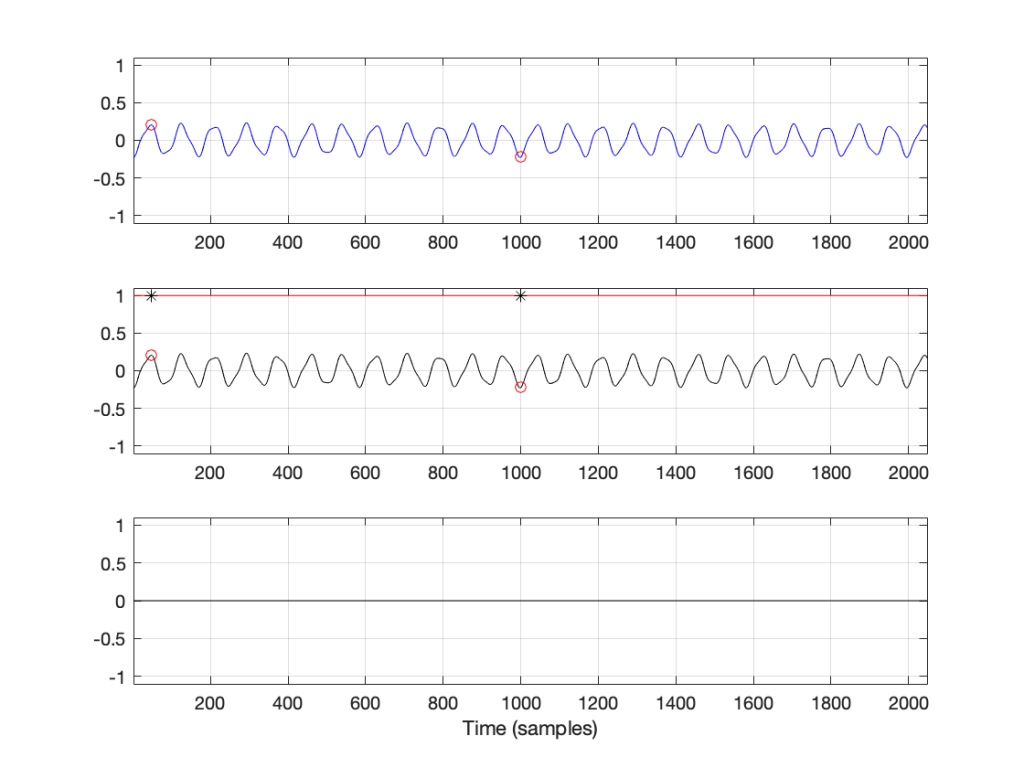
Figure 3 has three separate plots. The top plot in blue is the section of the recording that we’re using, 2048 samples long. You’ll see that I put a red circle around two samples, sample number 47 and sample number 1000. These were chosen at random, just so we have something near the beginning and something near the middle of the recording to use as examples…
So, to find the total energy at 0 Hz, we have to add the individual values of each of the 2048 samples. So, for example, sample #47 has a value of 0.2054 and sample #1000 has a value of -0.2235. We add those two values and the other 2046 sample values together and we get a total value of 2.9057. Let’s just leave that number sitting there for now. We’ll come back to it later.
For now, we’ll ignore the middle and bottom plots in Figure 3. This is because they’ll be easier to understand after Figure 4 is explained…
Now we want to move up to frequencies above 0 Hz. The way we do this is similar to what we did, with an extra step in the process.
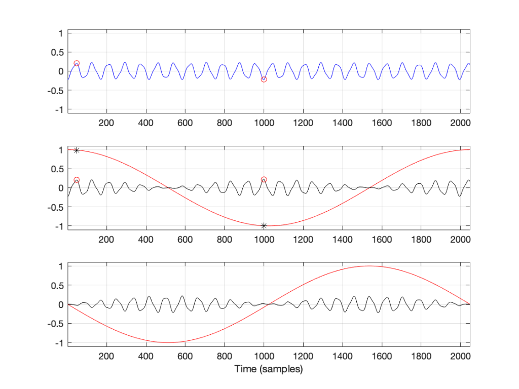
The top blue plot in Figure 4 shows the same thing that it showed in Figure 3 – it’s the 2048 samples in the recording, with sample numbers 47 and 1000 highlighted with red circles.
Take a look at the middle plot. The red curve in that plot is a cosine wave with a period (the amount of time it takes to complete 1 cycle) of 2048 samples. On that plot, I’ve put two * signs (“asterisks”, if you prefer…) – one on sample number 47 and the other at sample 1000.
One small, but important note here: although it’s impossible to see in that plot, the last value of the cosine wave is not the same as the first – it’s just a little lower in level. This is because the cosine wave would start to repeat itself on the next sample. So, the 2049th sample is equal to the 1st. This makes the period of the cosine wave 2048 samples.
The black curve in this plot is the result when you multiply the original recording (in blue) by the cosine curve (in red). So, for example, sample #47 on the blue curve (a value of 0.2054) multiplied by sample #47 on the red cosine curve (0.9901) equals 0.2033, which is indicated by a red circle on the black curve in the middle plot.
If you look at sample 1000, the value on the blue curve is positive, but when it’s multiplied by the negative value on the cosine curve, the result is a negative value on the black curve.
You’ll also notice that, when the cosine wave is 0, the result of the multiplication in the black curve is also 0.
So, we take each of the 2048 samples in the original recording of the bell, and multiply each of those values, one by one, by their corresponding samples in the cosine curve. This gives us 2048 sample values shown in the black curve, which we add all together, and that gives us a total of 1.5891.
We then do exactly the same thing again, but instead of using a cosine wave, we use a negative sine wave, shown as the red curve in the bottom plot. The blue curve multiplied by the negative sine wave, sample-by-sample results in the black curve in the bottom plot. We add all those sample values together and we get -2.5203.
Now, we do it all again at the next frequency.

Now, the period of the cosine and the negative sine waves is 1024 samples, so they’re at two times the frequency of those shown in Figure 4. However, apart from that change, the procedure is identical. We multiply the signal by the cosine wave (sample-by-sample), add up all the results, and we get 1.3547. We multiply the signal by the negative sine wave and we get -1.025.
This procedure is repeated, increasing the frequency of the cosine (the real) and the negative sine (the imaginary) waves each time. So far we have seen 0 periods (Figure 3), 1 period (Figure 2), and 2 periods (Figure 3) – we just keep going with 3 periods, 4 periods, and so on.
Eventually we get to 1024 periods. If I were to plot that, it would not look like a cosine wave, since the values would be 1, -1, 1, -1…. for 2048 samples. (But, due to the nature of digital audio and smoothing filters that we’re not going to talk about, it would, in fact, be a cosine wave at a frequency of one half of the sampling rate…)
At that frequency, the values for the negative sine wave would be a string of 2048 zeros – exactly as it is in Figure 3.
If we keep going up, we get to 2048 periods – one period of the cosine wave for each sample. This means that, at each sample, the cosine starts, so the result is a string of 2048 ones. Similarly, the negative sine wave will be a string of 2048 zeros. Note that both of these are identical to what we saw in Figure 1 when we were looking at 0 Hz…
Since we’ve already seen in the previous posting that, at a given frequency, the cosine component (the total sum of the results of multiplying the original signal by a cosine wave) is the real component and the negative sine is the imaginary component, then we can write all of the results as follows:
frequency “x”: Real + Imaginary contributions
f1: 2.9057 + 0.0000 j
f2: 1.5891 – 2.5203 j
f3: 1.3547 – 1.0251 j
…
f2047: 1.3547 – 1.0251 j
f2048: 1.5891 – 2.5203 j
f2049: 2.9057 + 0.0000 j
… and, as we saw in Figure 1 in the last post, for any one frequency, the real and imaginary contributions can be converted into a magnitude (a level) by using a little Pythagoras:
magnitude = sqrt(real^2 + imag^2)
So, we get the following magnitudes
frequency “x”: magnitude
f1: 2.9057
f2: 2.9794
f3: 1.6988
…
f2047: 1.6988
f2048: 2.9794
f2049: 2.9057
Let’s plot the first 10 values – f1 up to f10. (Remember that these are not in Hertz – they’re frequency numbers. We’ll find out what the actual frequencies are later…)

So, Figure 6 shows the beginning of the results of our calculations – the first 10 values of the 2048 values that we’re going to get. Not much interesting here yet, so let’s plot all 2048 values.
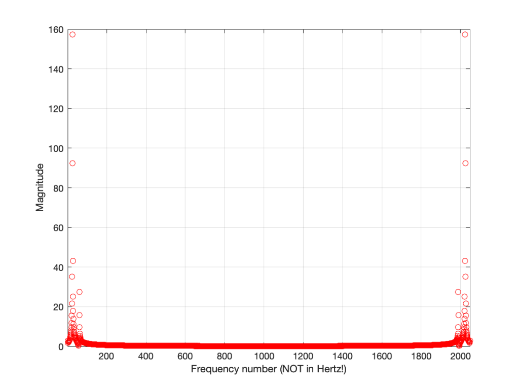
Figure 7 shows two interesting things. The first is that at least one of those numbers gets very big – almost up to 160 – whatever that means. The other is that, you may notice that we have some symmetry going on here. In fact, you might have already noticed this… If you go back and look at the lists of numbers I gave earlier, you’ll see that the values for f1 and f2049 are identical (this is true in the complex world, where we see the real and imaginary components separately, and also therefore in their magnitudes). Similarly, f2 and f2048 are identical, as are f3 and f2047. If I had put in all of the values, you would have seen that the symmetry started at f1024 which is identical to f1026. (See this posting for a discussion about aliasing, which may help to understand why this happens….)
So, since the values are repeated, we only need to look at the first 1025 values that we calculated – we know that f1026 to f2048 are the same in reverse order… So, let’s plot the bottom half of Figure 7.
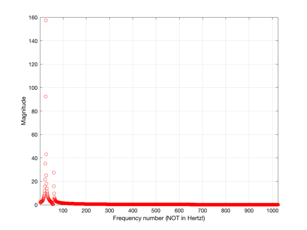
Figure 8 shows us the same information as Figure 7 – just without the symmetrical repetition. However, it’s still a little hard to read. This is because our frequency divisions are linear. Remember that we multiplied our original signal by 1 period, 2 period, 3 periods, etc… This means that we were going up in linear frequency steps – adding equal frequencies on each step. The problem is that humans hear frequency steps logarithmically – semitones (1.06 times the frequency) and octaves (2 times the frequency) are examples – we multiply (not add) in equal steps. So, let’s plot Figure 8 again, but change the X-axis to a logarithmic scale.
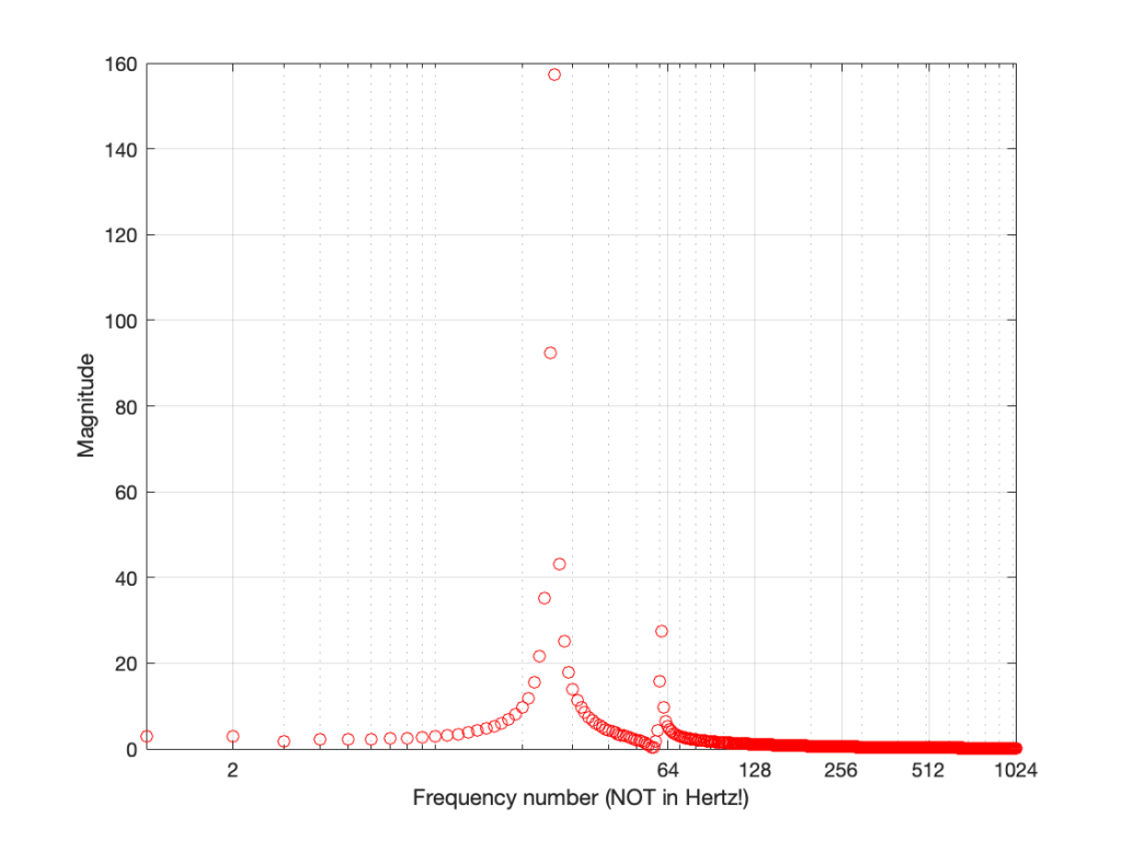
Figure 9 and Figure 8 show exactly the same information – I’ve just changed the way the x-axis is scaled so that it looks more like the way we hear distribution of frequency.
But what frequency is it?
There are two remaining problems with Figure 9 – the scaling of the two axes. Let’s tackle the X-axis first.
We know that, to get the value for f1, we found the average of all of the values in the recording. This told us the magnitude of the 0Hz. component of the signal.
Then things got a little complicated. To find the magnitude at f2, we multiplied the signal by a cosine (and a negative sine) with a period of 2048 sample. What is the frequency of that cosine wave in real life? Well, we know that the original recording was done with a sampling rate of 48 kHz or 48,000 samples per second, and our 2048-sample long slice of time equalled 42.66666666… milliseconds. If we divide the sampling rate by the period of the cosine wave, we’ll find its frequency, since we’ll find out how many times per second (per 48,000 samples) the wave will occur.
f2 = 48,000 / 2048 = 23.4375 Hz
The next frequency value will be the sampling rate divided the period of the next cosine wave – half the length of the first, or:
f3 = 48,000 / (2048 / 2) = 46.875 Hz
You might notice that f3 = 2 * f2… this helps the math.
f4 = 48,000 / (2048 / 3) = 70.3125 Hz
or f4 = 3 * f2
So, I can now keep going up to find all of my frequencies, and then change the labels on my X-axis so that they make sense to humans.

That’s one problem solved. We now know that the bell’s loudest frequency is just under 600 Hz (the peak with a magnitude of about 160) and there’s another frequency at about 1500 Hz as well – with a magnitude of about 30 or so.
But how loud is it?
So, let’s tackle the second problem – what does a magnitude of 160 mean in real life?
Not only do humans hear changes in frequency logarithmically, we also hear changes in level logarithmically as well. We say something like “a trumpet is twice as loud as a dog barking” instead of “the loudness of a trumpet is the loudness of a dog barking plus 2”. In fact, that second one just sounds silly when you say it…
As a result, we use logarithms to convert linear levels (like the ones shown on the Y-axis of Figure 10) to something that makes more sense. Instead of having values like 1, 10, 100, and 1000 (I multiplied by 10 each time), we take the log of those values, and tell people that…
Log10 (1) = 0
Log10 (10) = 1
log10 (100) = 2
log10 (1000) = 3
Now we can use the numbers on the right of those equations, which are small-ish instead of the other ones, which are big-ish…
We use this logarithmic conversion in the calculation of a decibel – which we will not get into here – but it would make the topic of another posting in the future. For now, you’ll just have to hang on…
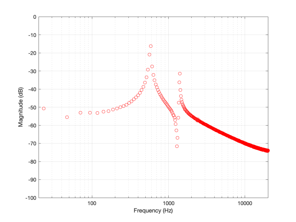
What we’ll do is to take the magnitude values plotted in Figure 10 and find their logarithms, multiply those by 20, and we get their values in decibels. Cool.
The only problem is that if I were to do that, the numbers would look unusually big. This is because I left out one step way up at the top. Back when we were multiplying and adding all those samples and cosine (and negative sine) waves, we should have done one more thing. We should have found the average value instead of the total sum. This means that we should have divided by the total number of samples. However, since we’re only looking at half of the data (the lower 1025 frequency bins – and not all 2048) we divide by half of the number of samples in our slice of time.
So, we take each sample in the recording, multiply each of those by a value in the cosine (or negative sine) wave – and divide the results by half of the number of samples. When you get that average, you then find its logarithm (base 10) and multiply by 20.
If you do that for each value, you get the result shown below in Figure 11.
If we connect the dots, then we get Figure 12.
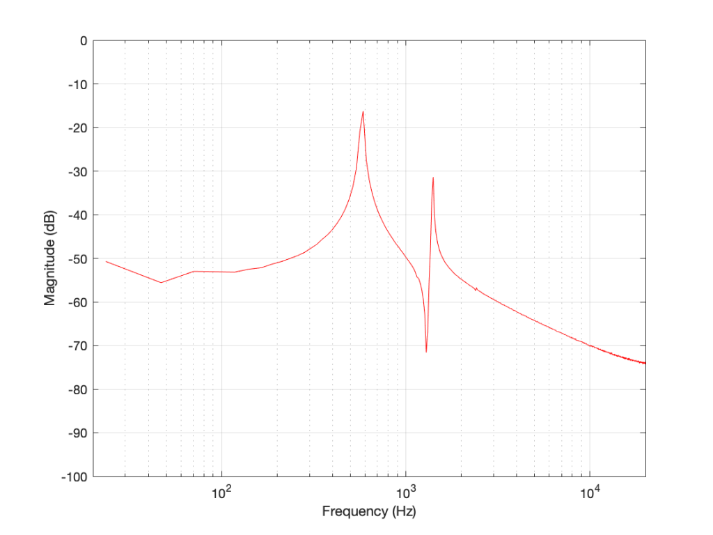
And there are the peaks we saw earlier. One just under 600 Hz at about -16 dB FS, and the other at about 1500 Hz with a level of about -31 dB FS.
The important stuff to remember for now…
There are two important things to remember from this posting.
- The frequencies that are calculated using a DFT (or FFT) are linearly spaced. That means that (on a human, logarithmic scale) we have a poor resolution in the low frequencies and a very fine resolution in the high frequencies. (for example, in this case, the first three frequencies are 0 Hz, 23.4 Hz, and 46.9 Hz. The last three frequencies are 23953.1 Hz, 23976.6 Hz, and 24,000 Hz.)
- If you want better resolution in the low frequencies, you’ll need to calculate with more samples – a longer slice of time, which means more might have happened in that time (although there are some tricks we can play, as we’ll see later).
And, you should be left with a question… Why does that plot in Figure 12 look like it’s got lots of energy at a bunch of frequencies – not just two clean spikes? We’ll get into that in the next posting: DFT’s Part 4: The Artefacts.