One of the things I have to do occasionally is to test a system or device to make sure that the audio signal that’s sent into it comes out unchanged. Of course, this is only one test on one dimension, but, if the thing you’re testing screws up the signal on this test, then there’s no point in digging into other things before it’s fixed.
One simple way to do this is to send a signal via a digital connection like S/PDIF through the DUT, then compare its output to the signal you sent, as is shown in the simple block diagram in Figure 1.

If the signal that comes back from the DUT is identical to the signal that was sent to it, then you can subtract one from the other and get a string of 0s. Of course, it takes some time to send the signal out and get it back, so you need to delay your reference signal to time-align them to make this trick work.
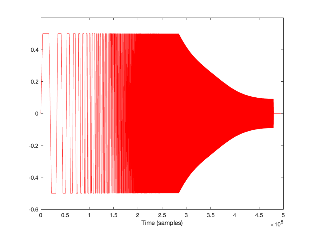
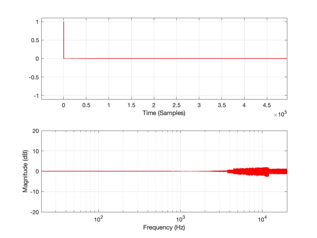
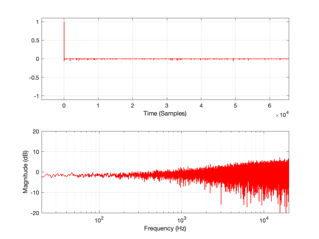
The problem is that, if you ONLY do what I described above (using something like the patcher shown in Figure 2) then it almost certainly won’t work.

The question is: “why won’t this work?” and the answer has very much to do with Parts 1 through 4 of this series of postings.
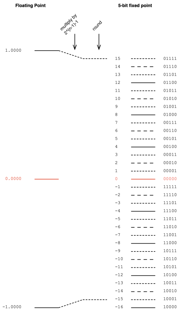
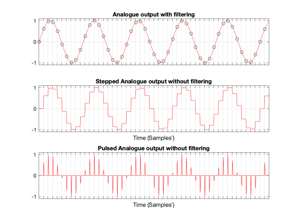
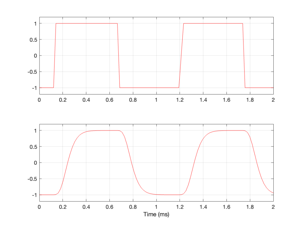
Looking at the left side of the patcher, I’m creating a signal (in this case, it’s pink noise, but it could be anything) and sending it out the S/PDIF output of a sound card by connecting it to a DAC object. That signal connection is a floating point value with a range of ±1.0, and I have no idea how it’s being quantised to the (probably) 24 bits of quantisation levels at the sound card’s output.
That quantised signal is sent to the DUT, and then it comes back into a digital input through an ADC object.
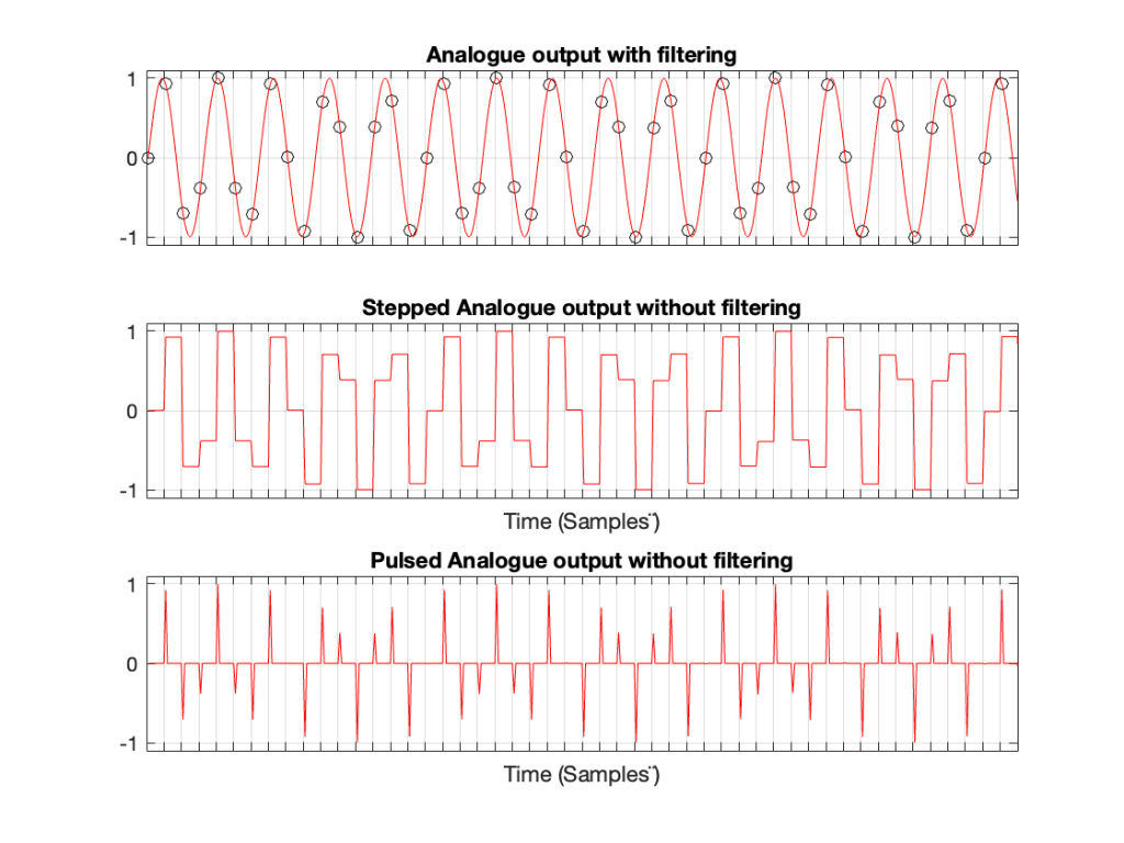
Remember that the signal connection from the pink noise output across to the latency matching DELAY object is a floating point signal, but the signal coming into the ADC object has been converted to a fixed point signal and then back to a floating point representation.
Therefore, when you hit the subtraction object, you’re subtracting a floating point signal from what is effectively a fixed point quantised signal that is coming back in from the sound card’s S/PDIF input. Yes, the fixed point signal is converted to floating point by the time it comes out of the ADC object – but the two values will not be the same – even if you just connect the sound card’s S/PDIF output to its own input without an extra device out there.
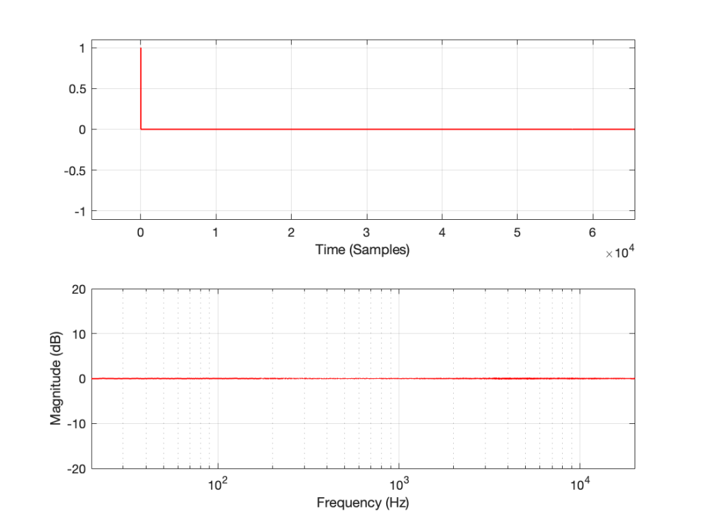
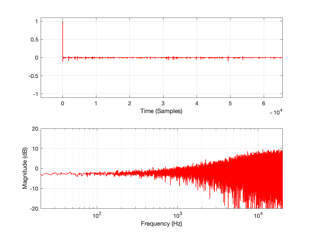
In order to give this test method a hope of actually working, you have to do the quantisation yourself. This will ensure that the values that you’re sending out the S/PDIF output can be expected to match the ones you’re comparing them to internally. This is shown in Figure 3, below.

Notice now that the original floating point signal is upscaled, quantised, and then downscaled before its output to the sound card or routed over to the comparison in the analysis section on the right. This all happens in a floating point world, but when you do the rounding (the quantisation) you force the floating point value to the one you expect when it gets converted to a fixed point signal.
This ensures that the (floating point) values that you’re using as your reference internally CAN match the ones that are going through your S/PDIF connection.
In this example, I’ve set the bit depth to 16 bits, but I could, of course, change that to whatever I want. Typically I do this at the 24-bit level, since the S/PDIF signal supports up to 24 bits for each sample value.
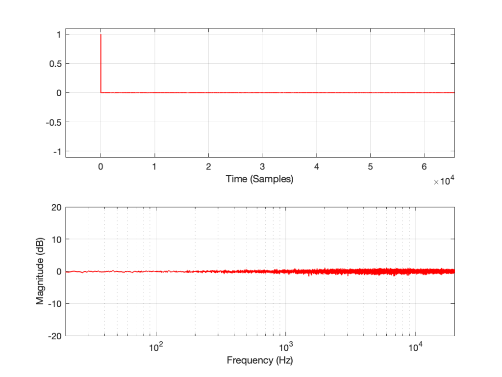
Be careful here. For starters, this is a VERY basic test and just the beginning of a long series of things to check. In addition, some sound cards do internal processing (like gain or sampling rate conversion) that will make this test fail, even if you’re just doing a loop back from the card’s S/PDIF output to its own input. So, don’t copy-and-paste this patcher and just expect things to work. They might not.
But the patcher shown in Figure 2 definitely won’t work…
One small last thing
You may be wondering why I take the original signal and send it to the right side of the “-” object instead of making things look nice by putting it in the left side. This is because I always subtract my reference signal from the test signal and not the other way around. Doing this every time means that I don’t have to interpret things differently every time, trying to figure out whether things are right-side-up or upside-down.