Sometimes, on a rare occasion, I can muster up enough gumption to admit that I’m wrong. This posting is just such an admission…
Once-upon-a-time, I learned about equal loudness contours (I will explain these below…). Then I learned about weighting filters and how they’re used to make a measurement system as imperfect as we are. (I will also explain this below). The short explanation at the end of that lesson was “A-weighting is for measuring quiet sounds, and C-weighting is for loud sounds.”
This put a hard-and-fast belief in my head that then made me grumpy any time someone published a specification that said something like “maximum sound pressure level: 120 dB SPL (A)”, since 120 dB SPL is NOT a quiet sound – so the idiot that wrote that should have used a C-weighting instead.
However, as Bertrand Russell once said, “It’s healthy now and then to hang a question mark on things you’ve long taken for granted.” It turns out that my almost-religious-indignation regarding “mis-” use of weighting curves might not be so righteous after all.
Equal Loudness Contours
Once-upon-a-time, some research (Fletcher and Munson) figured out that humans do not have a flat frequency response. We are, generally speaking, more sensitive to midrange information than lower- and higher-frequency bands. If you a play a tone for a test subject at a given sound pressure level at 1 kHz, then change to a different frequency and ask the subject to adjust the level of the second frequency so that it sounds the same level as the 1 kHz tone, you get some offset gain value. If you do that again and again for a lot of frequencies and a lot of people and average the results, you get curves that show contours of equal loudness – the sound pressure levels of different frequencies that sound the same level to us.
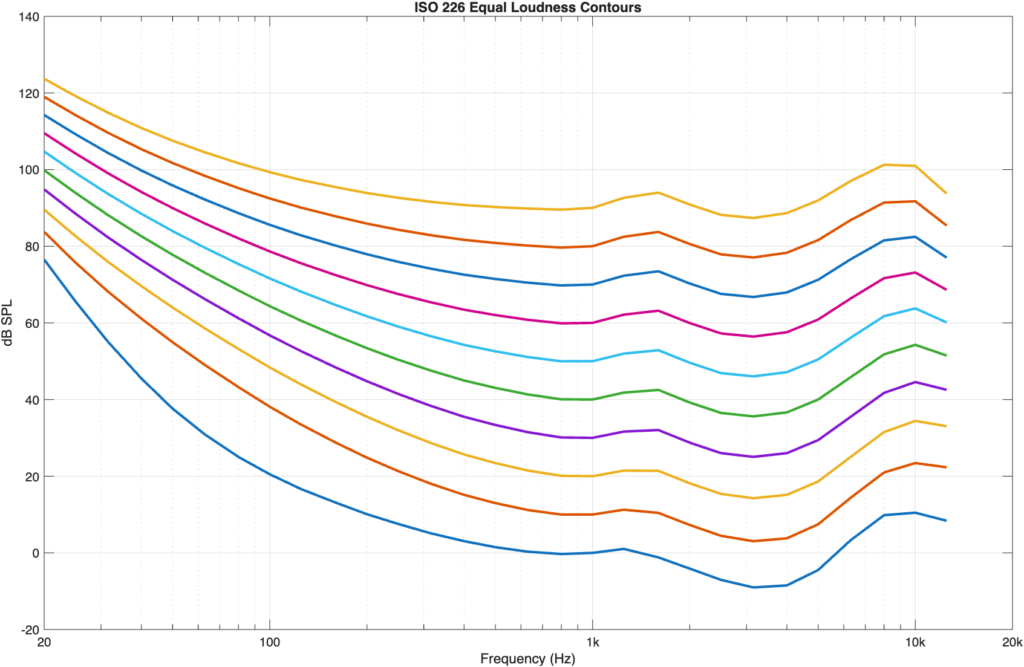
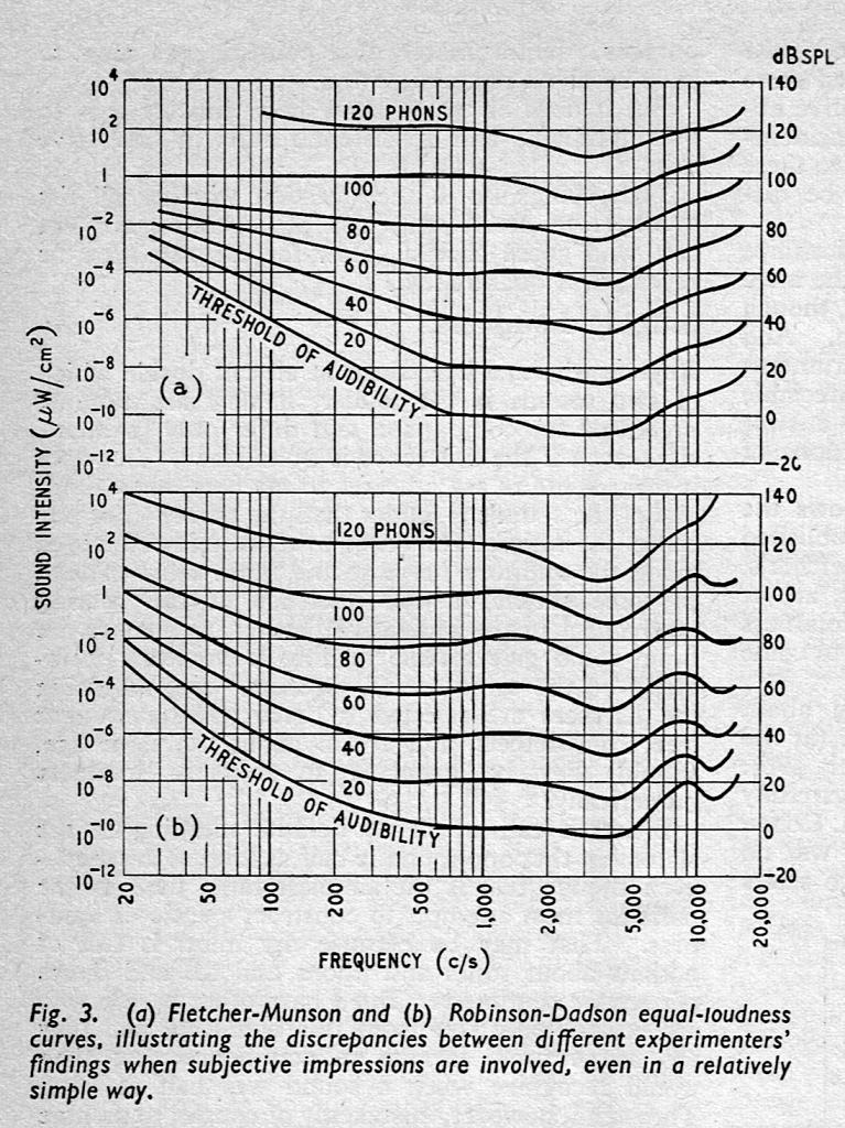
Figure 1, above shows the ISO 226 version of these equal loudness contours which are more like the ones found by Robinson and Dadson and not Fletcher and Munson, as can be seen in the comparison of the two data sets, below.
The curves are typically labelled using the SPL value where they cross 1 kHz. For example, the curve that hits 50 dB SPL at 1 kHz is called the “50-phon” curve; a sinusoidal tone at a given frequency on that line will have a perceived loudness of 50 phons, which will be 50 dB SPL at only 3 frequencies, one of which is 1 kHz.
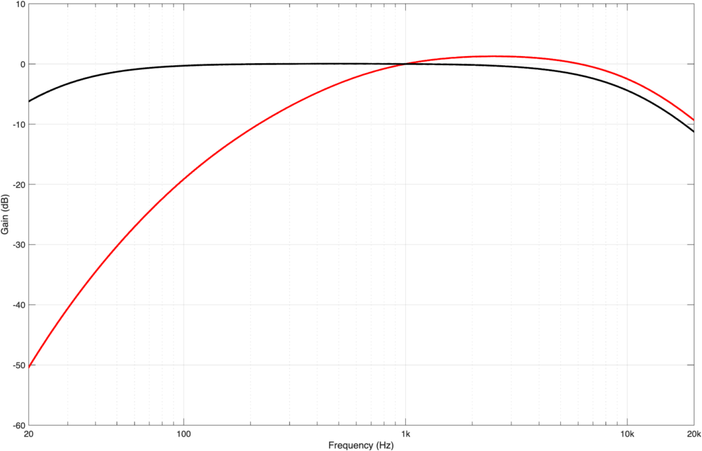
As I mentioned above, the A- and C-weighting filters (as well as other variants) were designed to simulate this lack-of-linearity to make measurements (like noise levels, for example) more aligned with human perception. For example, as can be seen above, we are bad at hearing low frequencies at low levels. So, if you are tasked with measuring the background noise caused by an air conditioning system in an office space, you’ll bring a microphone that can detect the noise better than we can, which results in you getting a high SPL value for something that we can’t hear. Therefore, we apply a roll-off to the microphone’s output before capturing a measurement value. This is the purpose of an A-weighting filter, the response of which is shown in Figure 3, below.
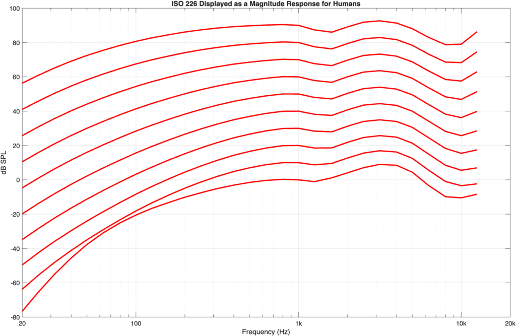
If we flip the equal loudness contours upside-down so that they show our hearing sensitivity as a magnitude response, then they’d look like the curves in Figure 4.
If you read the Wikipedia page on A-weighting you’ll come across these two statements:
The A-weighting was based on the 40-phon Fletcher–Munson curves, which represented an early determination of the equal-loudness contour for human hearing.
Subsequent research has demonstrated that A-weighting is in closer agreement with the updated 60-phon contour incorporated into ISO 226:2003 than with the 40-phon Fletcher-Munson contour, which challenges the common misapprehension that A-weighting represents loudness only for quiet sounds.
Let’s then test this by plotting the A-weighting response on top of the equal loudness contours.
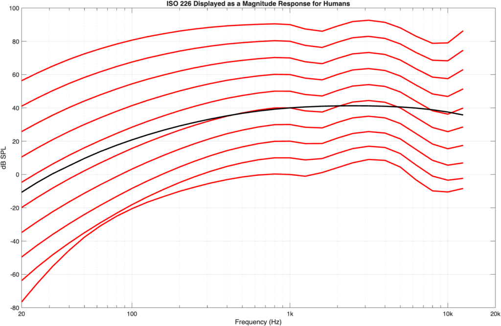
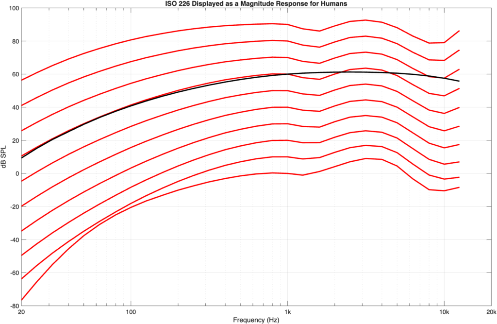
As you can see in Figure 5 and 6, the A-weighting curve better matches the 60-phon curve than the 40-phon curve. If I do this more generally, by looking at the difference between the A-weighting curve and each of the equal loudness contours (viewed as a magnitude response) then the result is as shown in Figure 7.
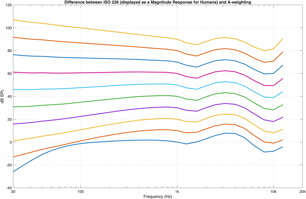
As you can see there, the flattest curve is the one for 60-phon; the one that crosses 1 kHz at 60 dB SPL, so that statement from Wikipedia is correct.
Of course, 60 dB SPL is not THAT loud – and it’s certainly not the same as 120 dB SPL… but it seems that my high horse might not be worth staying on, and maybe using A-weighting as a general approximation, regardless of the level might NOT be as terrible a sin as I believed for so many years…
Mea culpa