I’ve been collecting some so-called “high-resolution” audio files over the past year or two (not including my good ol’ SACD’s and DVD-Audio’s that I bought back around the turn of the century… Or my old 1/4″, half-track, 30 ips tapes that I have left over from the past century. (Please do not add a comment at the bottom about vinyl… I’m not in the mood for a fight today.) Now, let’s get things straight at the outset. “High Resolution” means many things to many people. Some people say that it means “sampling rates above 44.1 kHz”. Other people say that it means “sampling rates at 88.2 kHz or higher”. Some people will say that it means 24 bits instead of 16, and sampling rate arguments are for weenies. Other people say that if it’s more than one bit, it ain’t worth playing. And so on and so on. For the purposes of this posting, let’s say that “high resolution” is a blanket marketing term that is used by people these days when they’re selling an audio file that you can download that is has a bit rate that is higher than 44.1 kHz / 16 bits or 1378.125 kbps. (You can calculate this yourself as follows: 44100 samples per second * 16 bits per sample * 2 channels / 1024 bits in a kilobit = 1378.125) I’ll also go on record (ha ha…) as saying that I would rather listen to a good recording of a good tune played by good musicians recorded at 44.1 kHz / 16 bit (or even worse!) than a bad recording (whatever that means) of a boring tune performed poorly by musicians that are encumbered neither by talent nor the interest to rehearse (or any recording that used an auto-tuner). All of that being said, I will also say that I am skeptical when someone says that something is something when they could get away with it being nothing. So, I like to check once-and-a-while to see if I’m getting what I was sold. So, I thought I might take some of my legally-acquired LPCM “high-resolution audio” files and do a quick analysis of their spectral content, just to see what’s there. In order to do this, I wrote a little MATLAB script that
- loads one channel of my audio file
- takes a block of 2^18 samples multiplied by a Blackman-Harris function and does an 2^18-point FFT on it
- moves ahead 2^18 samples and repeats the previous step over and over until it gets to the end of the recording (no overlapping… but this isn’t really important for what I’m doing here…)
- looks through all of the FFT results and take the maximum value of all FFT results for each FFT bin (think of it as a peak monitor with an infinite hold function on each frequency bin)
- I plot the final result
So, the graphs below are the result of that process for some different tunes that I selected from my collection.
Track #1
Track 1 (an 88.2/24 file) is plotted first. Not much to tell here. You can see that, starting at about 1 kHz or so, the amplitude of the signals starts falling off. This is not surprising. If it did not do that, then we would use white noise instead of pink noise to give us a rough representation of the spectrum of music. You may notice that the levels seem quite low – the maximum level on the plot being about -40 dB FS but keep in mind that this is (partly) because, at no point in the tune, was there a sine wave that had a higher level than that. It does not mean that the peak level in the tune was -40 dB FS.

The second plot of the same tune just shows the details in the top 2 octaves of the recording. Since this is a 88.2 kHz file, then this means we’re looking at the spectrum from 11025 Hz to 44100 Hz. I’ve plotted this spectrum on a linear frequency scale so that it’s easier to see some of the details in the top end. This isn’t so important for this tune, but it will come in handy below…

Track #2
The full-bandwidth plot for Track #2 (another 94/24 file) is shown below.

This one is interesting if you take a look up at the very high end of the plot – shown in detail in the figure below.
Here, you can see a couple of things. Firstly, you can see that there is a rise in the noise from about 35 kHz up to about 45 kHz. This is possibly (maybe even probably) the result of some kind of noise shaping applied to the signal, which is not necessarily a bad thing, unless you have equipment that has intermodulation distortion issues in the high end that would cause energy around that region to fold back down. However, since that stuff is at least 80 dB below maximum, I certainly won’t lose any sleep over it. Secondly, you can see that there is a very steep low pass filter (probably an anti-aliasing filter) that causes the signal to drop off above about 45 kHz. Note that the boost in the energy just before the steep roll-off might be the result of a peak in the low pass filter’s response – but I doubt it. It’s more a “maybe” than a “probably”. You may also have some questions about why the noise floor above about 46 kHz seems to flatten out at about -190 dB FS. This is probably not due to content in the recording itself. This is likely “spectral leakage” from the windowing that comes along with making an FFT. I’ll talk a little about this at the end of this article.
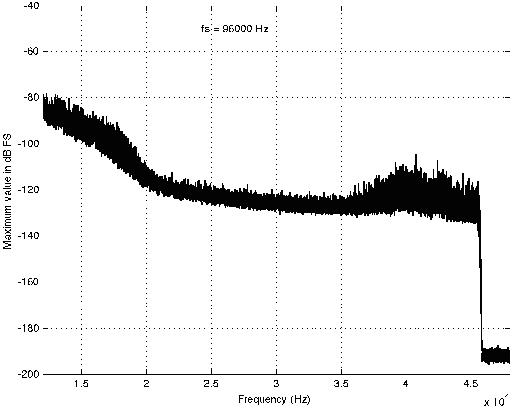
Track #3
The third track on my hit list (another 94/24 file) is interesting…

Take a look at the spike there around 20 kHz… What the heck are they doing there!? Let’s take a look at the zoom (shown below) to see if it makes more sense.

Okay, so zooming in more didn’t help – all we know is that there is something in this recording that is singing along at about 20 kHz at least for part of the recording (remember I’m plotting the highest value found for each FFT bin…). If you’re wondering what it might be, I asked a bunch of smart friends, and the best explanation we can come up with is that it’s noise from a switched-mode power supply that is somehow bleeding into the recording. HOW it’s bleeding into the recording is a potentially interesting question for recording engineers. One possibility is that one of the musicians was charging up a phone in the room where the microphones were – and the mic’s just picked up the noise. Another possibility is that the power supply noise is bleeding electrically into the recording chain – maybe it’s a computer power supply or the sound card and the manufacturer hasn’t thought about isolating this high frequency noise from the audio path. Or, maybe it’s something else.
Track #4
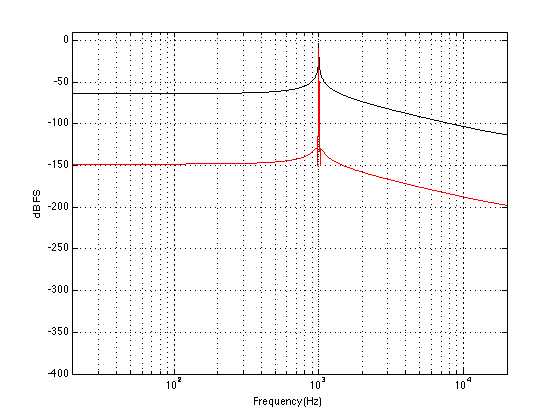
This last track is also sold as a 48 kHz, 24 bit recording. The total spectrum is shown below.

This one is particularly interesting if we zoom in on the top end…

This one has an interesting change in slope as we near the top end. As you go up, you can see the knee of a low-pass filter around 20 kHz, and a second on around 23 kHz. This could be explained a couple of different ways, but one possible explanation is that it was originally a 44.1 kHz recording that was sample-rate converted to 48 kHz and sold as a higher-resolution file. The lower low-pass could be the anti-aliasing filter of the original 44.1 kHz recording. When the tune was converted to 48 kHz (assuming that it was…) there was some error (either noise or distortion) generated by the conversion process. This also had to be low-pass filtered by a second anti-aliasing filter for the new sampling rate. Of course, that’s just a guess – it might be the result of something totally different.
So what?
So what did I learn? Well, as you can see in the four examples above, just because a track is sold under the banner of “high-resolution”, it doesn’t necessarily mean that it’s better than a “normal resolution”recording. This could be because the higher resolution doesn’t actually give you more content or because it gives you content that you don’t necessarily want. Then again, it might mean that you get a nice, clean, recording that has the resolution you paid for, as in the first track. It seems that there is a bit of a gamble involved here, unfortunately. I guess that the phrase “don’t judge a book by its cover” could be updated to be “don’t judge a recording by its resolution” but it doesn’t really roll off the tongue quite so nicely, does it?
P.S.
Please do not bother asking what these four tracks are or where I bought them. I’m not telling. I’m not doing any of this to “out” anyone – I’m just saying “buyer beware”.
P.P.S
Please do not use this article as proof that high resolution recordings are a load of hooey that aren’t worth the money. That’s not what I’m trying to prove here. I’m just trying to prove that things are not always as they are advertised – but sometimes they are. Whether or not high res audio files are worth the money when they ARE the real McCoy is up to you.
Appendix
I mentioned some things above about “spectral leakage” and FFT windowing and a Blackman Harris function. Let’s do a quick run-through of what this stuff means without getting into too many details. When you do an FFT (a Fast Fourier Transform – but more correctly called a DFT or Discrete Fourier Transform in our case – but now I’m getting picky), you’re doing some math to convert a signal (like an audio recording) in the time domain into the frequency domain. For example, in the time domain, a sine wave will look like a wave, since it goes up and down in time. In the frequency domain, a sine wave will look like a single spike, because it contains only one frequency and no others. So, in a perfect world, an FFT would tell us what frequencies are contained in an audio recording. Luckily, it actually does this pretty well, but it has limitations. An FFT applied to an audio signal has a fixed number of outputs, each one corresponding to a certain frequency. The longer the FFT that you do, the more resolution you have on the frequencies (in other words, the “frequency bins” or “frequency centres” are closer together). If the signal that you were analysing only contained frequencies that were exactly the same as the frequency bins that the FFT was reporting on, then it would tell you exactly what was in the signal – limited only by the resolution of your calculator. However, if the signal contains frequencies that are different from the FFT’s frequency bins, then the energy in the signal “leaks” into the adjacent bins. This makes it look like there is a signal with a different frequency than actually exists – but it’s just a side effect of the FFT process – it’s not really there. The amount that the energy leaks into other frequency bins can be minimised by shaping the audio signal in time with a “windowing function”. There are many of these functions with different names and equations. I happened to use the Blackman Harris function because it gives a good rejection of spectral artefacts that are far from the frequency centre, and because it produces relatively similar artefact levels regardless of whether your signal is on or off the frequency bin of the FFT. For more info on this, read this.


Rowan says:
Great stuff as usual, Geoff! Not completely surprising but very good to see such clear examples.
Bart says:
Hi Geoff & Rowan,
When talking about High-Resolution Audio there are 4 articles that in my opinion explain the misconceptions really good.
They also compliment your (as usual very well made) article very well.
http://www.kenrockwell.com/audio/why-cds-sound-great.htm
https://people.xiph.org/~xiphmont/demo/neil-young.html
https://www.androidauthority.com/why-you-dont-want-that-32-bit-dac-667621/
http://www.enjoythemusic.com/magazine/manufacture/1104/index.html
Kind regards
Bart
geoff says:
Hi Bart,
I would recommend caution when reading those first two links. As Abraham Lincoln once said – “don’t believe everything you read on the Internet…”
I don’t know the other two links – but I’ll check them out.
Cheers
-geoff