I found this document from Roland, published in 1978. The information in here is still valuable – and presented as an excellent introduction.
I found this document from Roland, published in 1978. The information in here is still valuable – and presented as an excellent introduction.
When working on the last series of posts, I stumbled on a signal that caused an FFT analysis to look a little strange to me. This post is about that strangeness.
If I make a sine wave (in a floating point world) that sits perfectly on an FFT bin, and I do an FFT of it, the noise floor that I see is the result a lack of precision of the calculations that were used to make the signal. An example of this is shown in Figure 1.
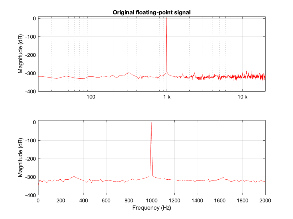
As can be seen there, the noise floor in the fit is typically at least 300 dB down from the signal level. This means that if the signal has a peak amplitude of 1, then each bin in my FFT has a peak amplitude of less than 0.000 000 000 000 001, which is very, very, low.
If I dither and quantise the sine wave with, say, a 24-bit LPCM precision, then the result would be different, as shown in Figure 2.
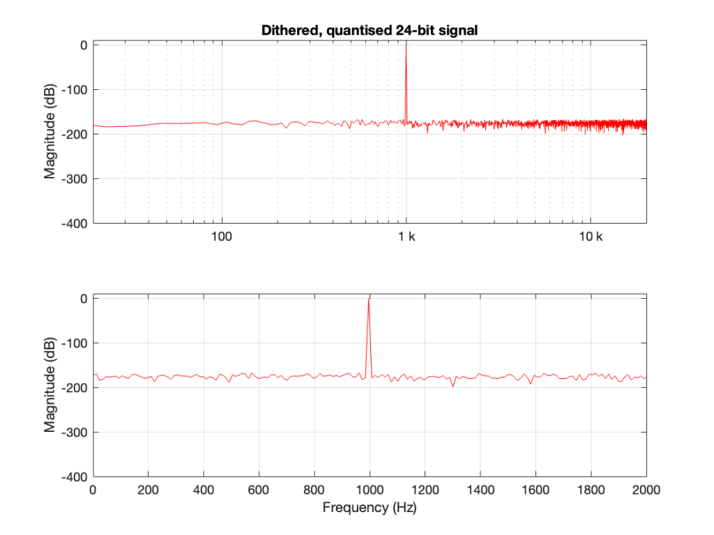
Now the noise floor seen in the FFT analysis is the noise that is intentionally generated as dither to randomise the quantisation error when converting to LPCM.
However, what happens if the signal is quantised but not dithered? Then the result looks like Figure 3.
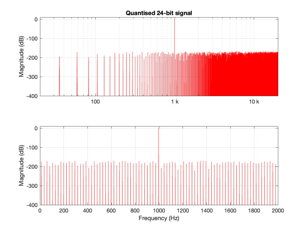
This is interesting because, starting the first bin, every second bin has nothing in it, so on a decibel scale, the value is -∞ dB. Why does this happen?
The short answer is symmetry. By quantising the sine wave, I made it perfectly symmetrical.
This removes the DC content, since the positive-going portion of the waveform is identical to the negative-going portion. Therefore there’s nothing at 0 Hz (which is DC) or any of its “harmonics” (at least in the world of FFT bins…).
There is content of some kind in the other bins because our sine wave is not perfectly sinusoidal. All those steps that I put in it are an error that generates information at frequency centres other than the sine tone’s itself.
So, if you do an FFT on a sinusoidal signal and you see a result where half of the bins have nothing in them, one possible reason is that you’re dealing with a perfectly symmetrical signal.
I mentioned in this posting that lately I’ve been doing some measurements of a DUT that:
So, I did this, but I saw some weirdness that I didn’t expect down in the noise floor of the FFT output. Whenever I’m testing something and I see something weird, I start working my way back through the audio chain to verify that the weirdness is coming from the thing that I’m testing, and not from my test system itself.
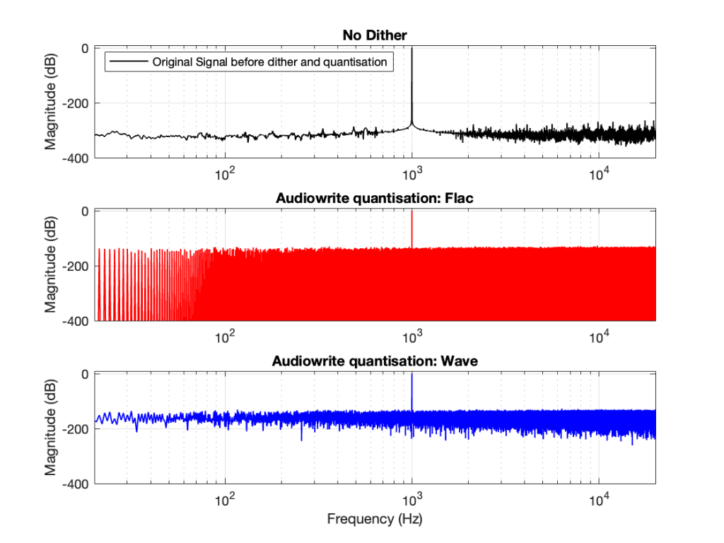
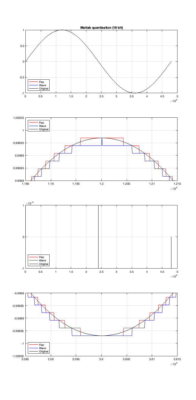
So, the first step was to do of an FFT of both the .wav and the .flac files that I was sending through the DUT. The results of this test looked something like Figure 1.
Before I go further, let’s clarify exactly what I did to generate those three plots.
I would not expect the bottom two plots to be as “good” as the top plot, since they’ve been reduced to a 24-bit fixed point version of the original floating-point signal. However, there are two things to notice in Figure 1.
Let’s address that first issue first. The FFTs show us that the signals coming back from the .wav and .flac import are different. But I’m interested in (1) how they’re different and (2) why they’re different.
Let’s try to answer the first question first. I made a linear ramp that had the same number of samples as the number of quantisation values and had a range of -1 to 1 (just like my sine wave…). So, to test a 16-bit export, I made a ramp that was 216 = 65,536 samples long (shown in the top plot in Figure 2). To test a 24-bit export, the ramp was 224 samples long.
In theory, if I export this ramp to a file type with the matching number of bits, then each sample should quantise to the next quantisation level from the bottom to the top. I then exported this ramp out to .wav and .flac, imported it again, and looked at the result, which is shown in Figure 2.
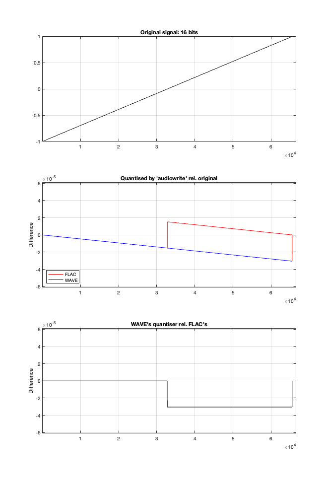
If I subtract the results of the imported files from the original, I get the result shown in the middle plot in Figure 2. I would NOT expect either the .wav or the .flac to be identical to the original, since information is lost in the export to a 16- or 24-bit fixed point LPCM format. However, I WOULD expect the .wav and .flac to be the same, which they obviously aren’t.
As can be seen in the bottom plot in Figure 2, there is a 1-quantisation level difference between the .wav and .flac files for signal values higher than 0.
Now the question is whether this difference is inherent in the file format, or if something else is going on. To test this, I did the same test on the 997-ish Hz sine wave (again) without dither, but with my own quantisation (using the code shown in this post). The result of this test is shown in Figure 3.
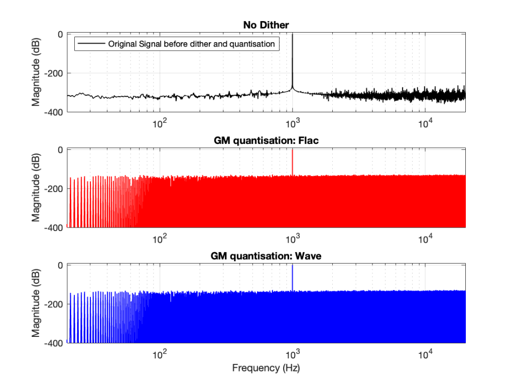
As you can see there, the imported .wav and .flac files behave identically. But, if you look carefully and compare to the .flac version in Figure 1, you’ll see that they’re different from THAT version.
The fact that the red and blue plots in Figure 3 are identical tell me that .wav and .flac are identical.
The fact that my quantisation results in identical results in .wav and .flac, but are different from Matlab’s “audiowrite” results (which produces .wav and .flac files that are different from each other) tells me that Matlab’s quantisation is different for .wav and .flac – and different from what I’m doing.
So, I go back to the ramp shown in Figure 2 and dig into the details again, zooming in on the samples near a value of -1, 0, and 1. These are shown below in Figure 4.
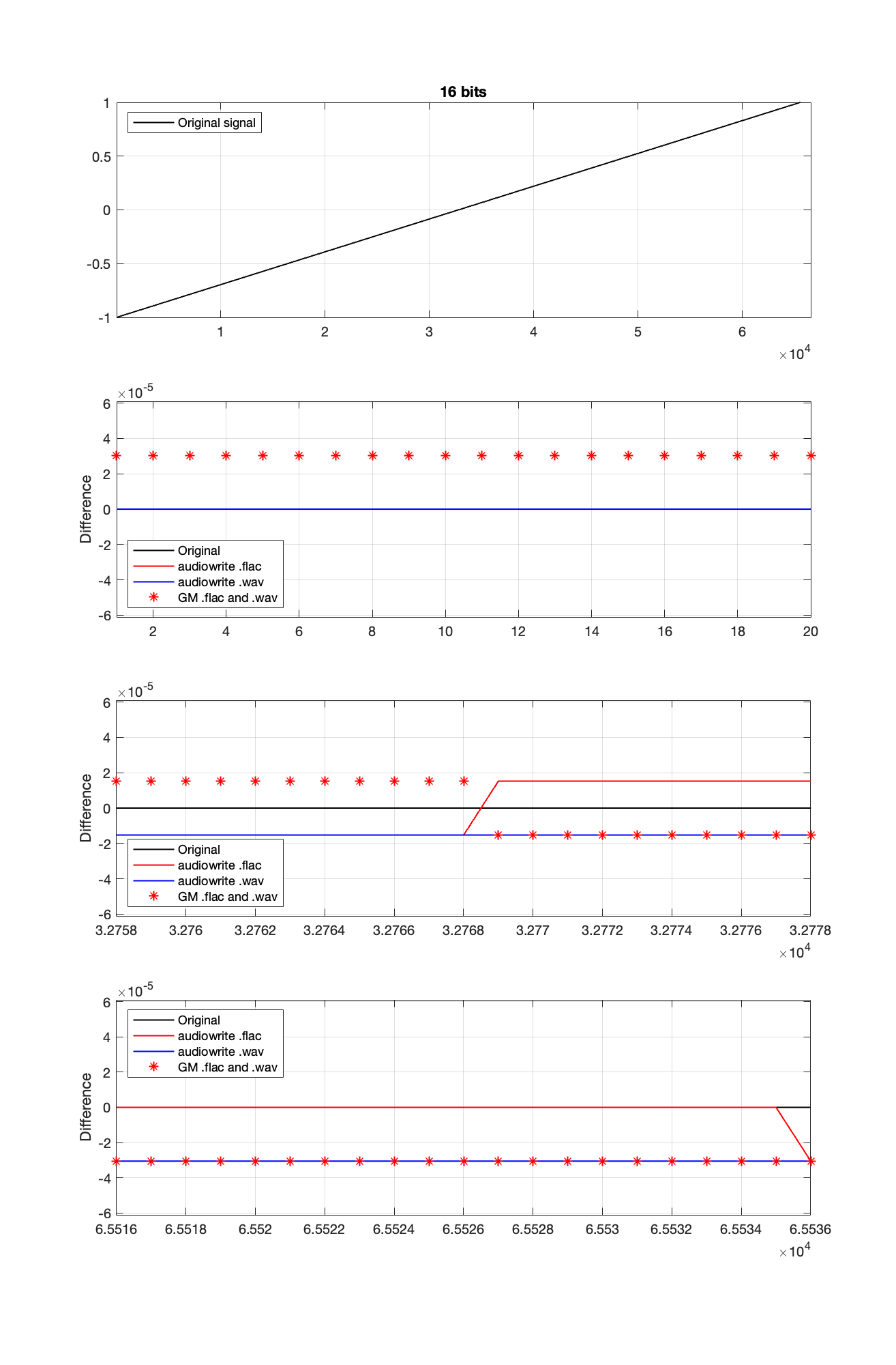
It’s a bit cryptic to see the results in Figure 4, but let’s walk through it.
If the signal were a sine wave, then we’d see the same thing, it would just be harder to interpret, as shown in Figure 5. (There’s nothing useful shown in the third plot there because when you zoom in so closely , the slope of the sine wave as it passes 0 is really steep…)
I titled this series of posts “Excruciating minutiae” for a reason. The “error” (let’s call it a “difference” instead) is VERY small. It’s a difference of 1 quantisation level on a portion of the signal, which raises the very pragmatic question: “So what?”
Unless you’re REALLY digging into the bottom of the noise floor of a device, you probably never need to care about this. (In fact, even if you ARE digging into the bottom of the noise floor, you might not need to care.)
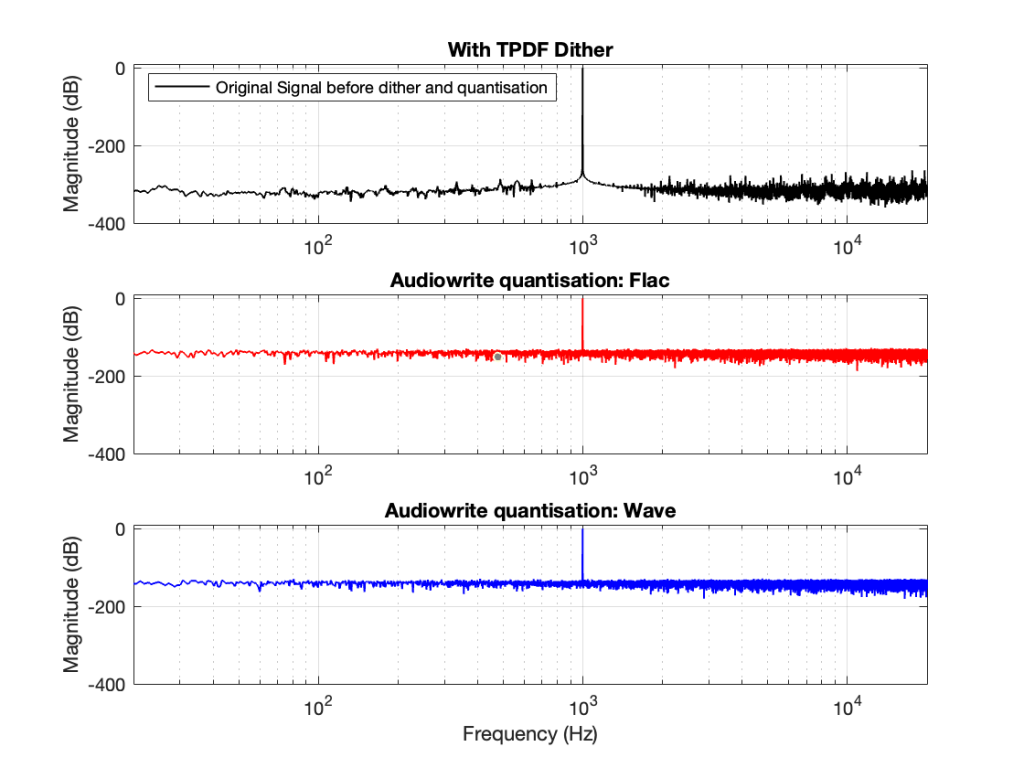
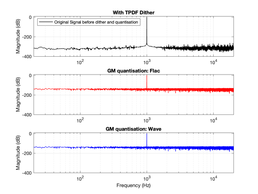
You CERTAINLY don’t have to worry about it if you’re just writing audio files to listen to, since you should be dithering those with TPDF dither, which will create a noise floor that is FAR above the “errors” caused by the differences I described above. This can be seen in Figures 6 and 7 below.
In other words, I’ve been using Matlab to export test files both in .wav and .flac for at least 20 years, and it’s only now that I’ve noticed this issue, which is another way of saying “don’t worry about it…”
If you’re still awake, you might notice that there is one loose end… At the top of this posting I said
The less-important (but more interesting, later…) thing is that, for the FLAC import, every odd-numbered FFT bin is -∞ dB, which means that there is absolutely NO energy at those frequencies.
That will be the topic of another posting, since it’s more or less unrelated to this one – it was just an artefact of the test I described above.
In Part 2 of this series, I wrote the following sentence:
The easiest (and possibly best) way to do this is to create white noise with a triangular probability distribution function and a peak-to-peak amplitude of ± 1 quantisation level.
That’s a very busy sentence, so let’s unpack it a little.
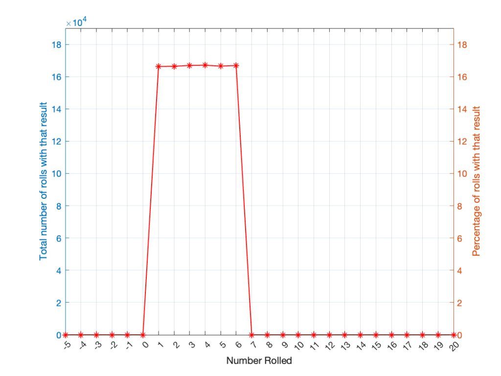
If you roll one die, you have an equal probability of rolling any number between 1 and 6 (inclusive). Let’s roll one die 100 times counting the number of times we get a 1, or a 2, or a 3, and so on up to 6.
| Number rolled | Number of times the number was rolled | Percentage of times the number was rolled |
| 1 | 17 | 17 |
| 2 | 14 | 14 |
| 3 | 15 | 15 |
| 4 | 15 | 15 |
| 5 | 21 | 21 |
| 6 | 18 | 18 |
(Note that the percentage of times each number was rolled is the same as the number of times each number was rolled only because I rolled the die 100 times.)
If I plot those results, it looks like Figure 1.
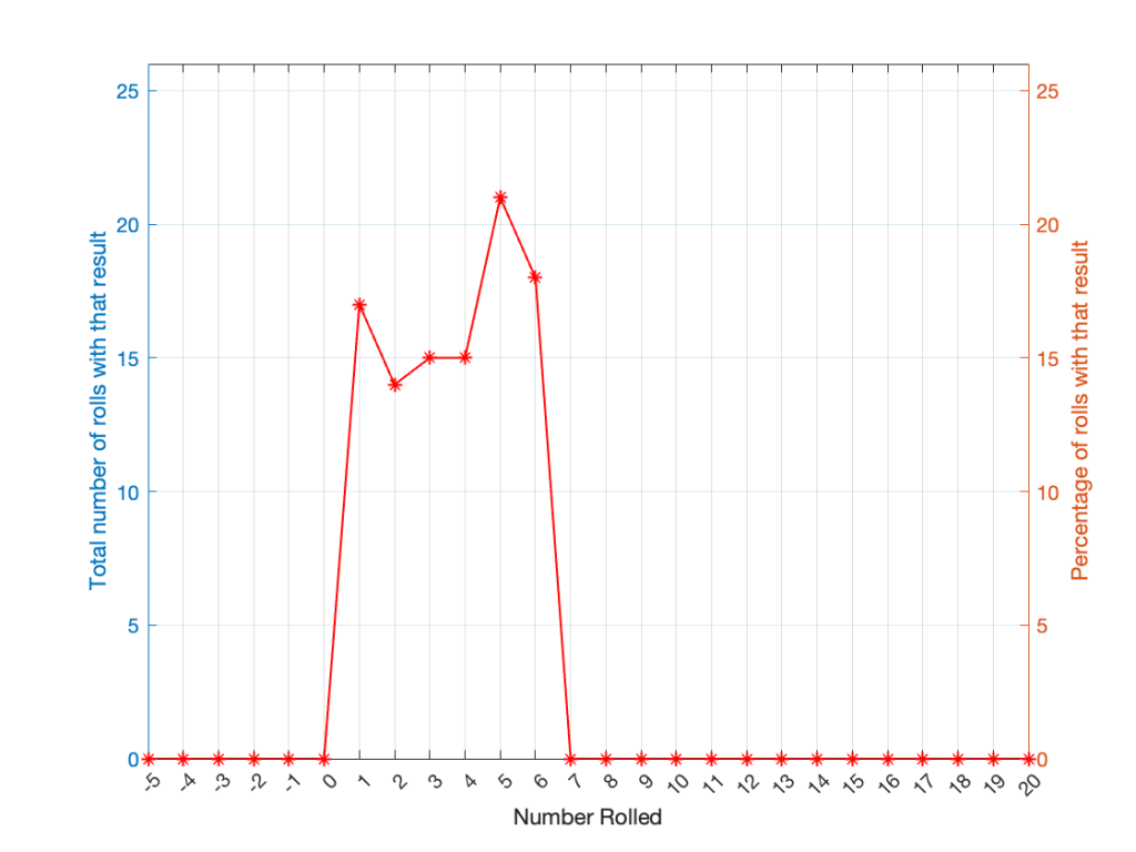
It may be weird, but I’ve plotted the number of times I rolled -5 or 13 (for example). These are 0 times because it’s impossible to get those numbers by rolling one die. But the reason I put those results in there will make more sense later.
Let’s keep rolling the die. If I do it 1,000,000 times instead of 100, I get these results:
| ed | Number of times the number was rolled | Percentage of times the number was rolled |
| 1 | 166225 | 16.6225 |
| 2 | 166400 | 16.6400 |
| 3 | 166930 | 16.6930 |
| 4 | 167055 | 16.7055 |
| 5 | 166501 | 16.6501 |
| 6 | 166889 | 16.6889 |
Now, since I rolled many, many, more times, it’s more obvious that the six results have an equal probability. The more I roll the die, the more those numbers get closer and closer to each other.
Take a look at the shape of the plot above. The area under the line from 1 to 6 (inclusive) is almost a rectangle because the six numbers are all almost the same.
The shape of that plot shows us the probability of rolling the six numbers on the die, so we call it a probability density function or PDF. In this case, we see a rectangular PDF.
But what happens if we roll two dice instead? Now things get a little more complicated, since there is more than one way to get a total result, as shown in the table below.
| Total | ||||||
| 2 | 1+1 | |||||
| 3 | 1+2 | 2+1 | ||||
| 4 | 1+3 | 2+2 | 3+1 | |||
| 5 | 1+4 | 2+3 | 3+2 | 4+1 | ||
| 6 | 1+5 | 2+4 | 3+3 | 4+2 | 5+1 | |
| 7 | 1+6 | 2+5 | 3+4 | 4+3 | 5+2 | 6+1 |
| 8 | 2+6 | 3+5 | 4+4 | 5+3 | 6+2 | |
| 9 | 3+6 | 4+5 | 5+4 | 6+3 | ||
| 10 | 4+6 | 5+5 | 6+4 | |||
| 11 | 5+6 | 6+5 | ||||
| 12 | 6+6 |
As can be (hopefully) seen in the table, there is only one way to roll a 2, and there’s only one way to roll a 12. But there are 6 different ways to roll a 7. Therefore, if you’re rolling two dice, it’s 6 times more likely that you’ll roll a 7 than a 12, for example.
If I were to roll two dice 1,000,000 times, I would get a PDF like the one shown in Figure 3.
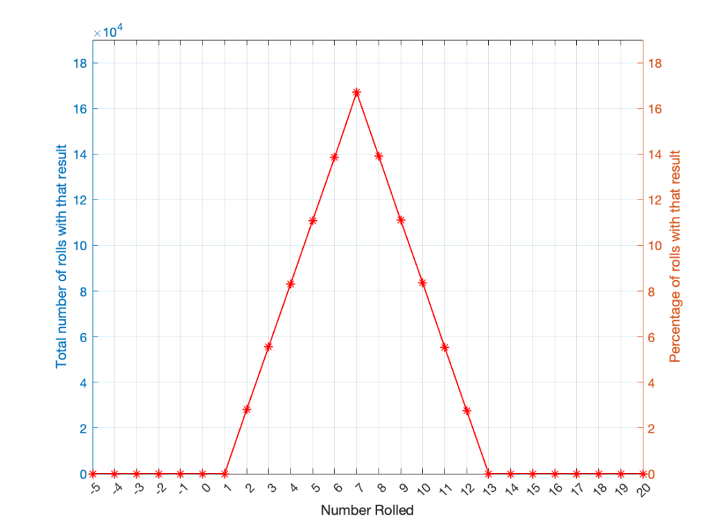
I won’t explain why this would be considered to be a triangular PDF.
Whether you roll one die or two dice, the number you get is random. In other words, you can’t use the past results to predict what the next number will be. However, if you are rolling one die, and you bet that you’ll roll a 6 every time, you’ll be right about 16.7% of the time. If you’re rolling two dice and you bet that you’ll roll a 12 every time, you’ll only be right about 2.8% of the time.
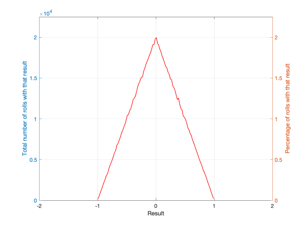
Let’s take two dice of different colours, say, one red die and one blue die. We’ll roll both dice again, but instead of adding the two values, we’ll subtract the blue value from the red one. If we do this 1,000,000 times, we’ll get something like the results shown below in Figure 4.
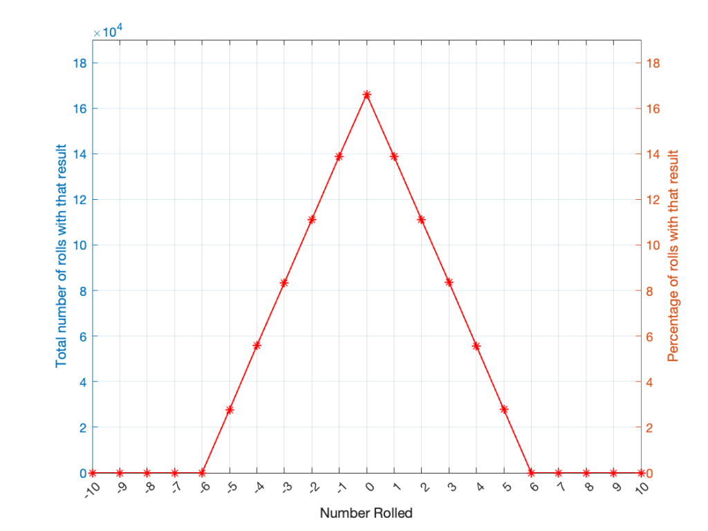
Notice that the probability density function keeps the same shape, it’s just moved down to a range of ±5 instead of 2 to 12.
In audio, noise is a sound that is completely random. In other words, just like the example with the dice, in a digital audio signal, you can’t predict what the next sample value will be based on the past sample values. However, there are many different ways of generating that random number and manipulating its characteristics.
Let’s start with a computer algorithm that can generate a random number between 0 and 1 (inclusive) with a rectangular PDF. We’ll then ask the algorithm to spit out 1,000,000 values. If the numbers really are random, and the computer has infinite precision, then we’ll probably get 1,000,000 different numbers. However, we’re not really interested in the numbers themselves – we’re interested in how they’re distributed between 0.00 and 1.00. Let’s say we divide up that range into 100 steps (or “buckets”) that are 0.01 wide and count how many of our random numbers fall into each group. So, we’ll count how many are between 0.0 and 0.01, between 0.01 and 0.02, and so on up to 0.99 to 1.00. We’ll get something like Figure 5.
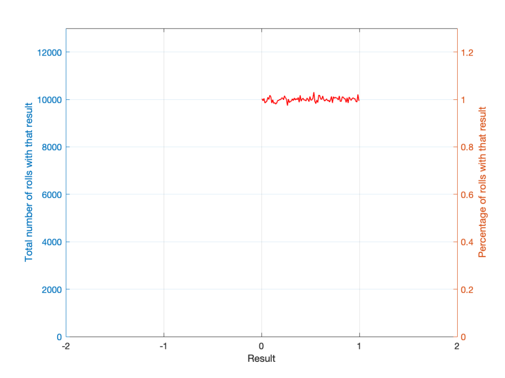
I’ve only plotted the probabilities of the possible values: 0 to 1, which winds up showing only the top of the rectangle in the rectangular PDF.
If I generate 1,000,000 random numbers with that algorithm, and then subtract 1,000,000 other random numbers, one by one, and find the probabilities of the result, the answer will be familiar.
So, this is how we make the noise that’s added to the signal. If, for each sample, you generate two random numbers (making sure that your algorithm has a rectangular PDF) and subtract one from the other, you have the dither signal that will have a maximum level of ±1 quantisation level.
In other words, assuming that you have an audio signal called “Signal” that has a range of ±1 and consists of floating point values:
ScaleUp = 2^(Bitdepth-1)-2
ScaleDown = 2^(Bitdepth-1)

TpdfDither = rand(LengthOfSignal) - rand(LengthOfSignal)

QuantisedDitheredSignal = round(Signal * ScaleUp + TpdfDither) / ScaleDown;In Part 1, I talked about how an audio signal is quantised, and how the world that the quantised signal lives in is slightly asymmetrical.
Let’s stay in a 3-bit world (to keep things comprehensible on a human scale) and do some recreational quantisation. We’ll start by making a sine wave with a peak amplitude of 1. This means that the total range will be ±1.
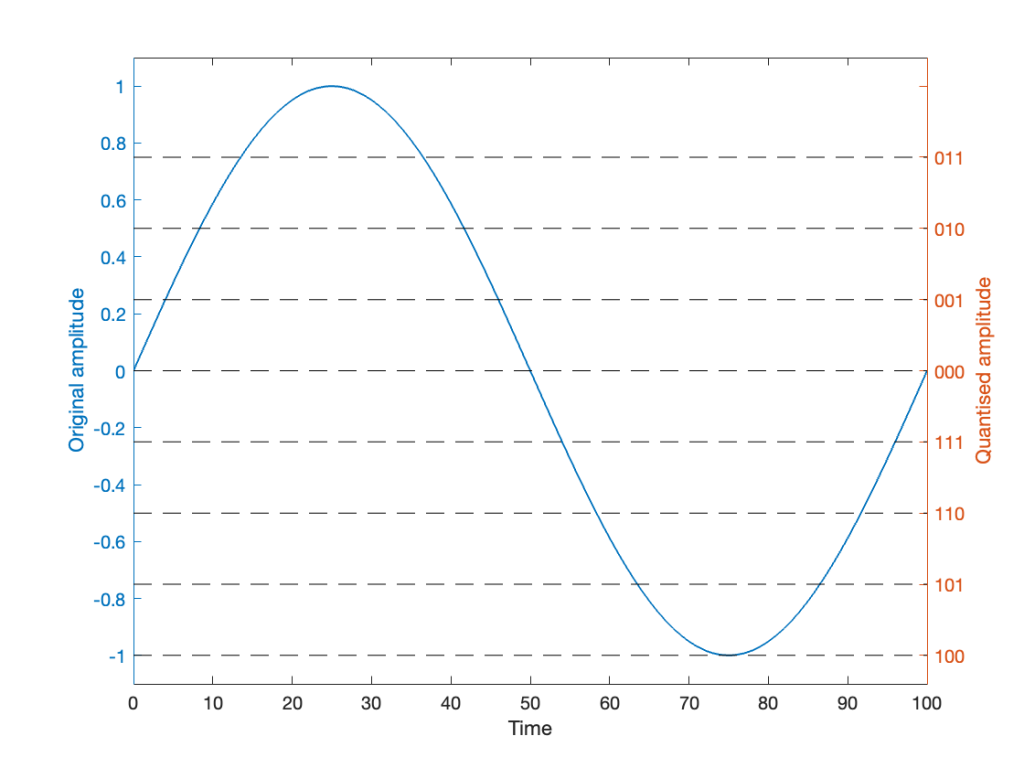
Notice that I put two scales on the plot in Figure 1. On the left, we have the “floating point” amplitude scale. On the right, we have the 8 quantisation levels.
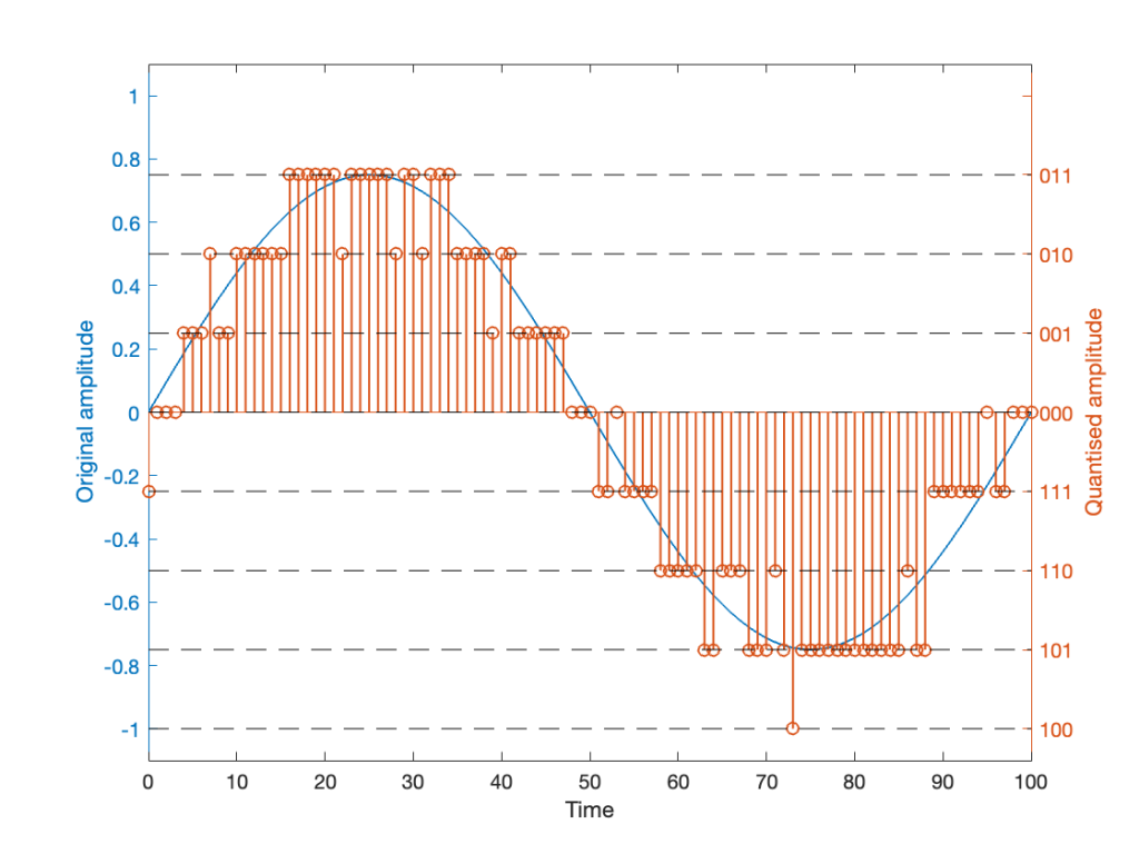
If we are a bit dumb, and we just quantise that sine wave directly, making sure that I’ve aligned the scaling to use ALL possible quantisation values, we get the result in Figure 2.
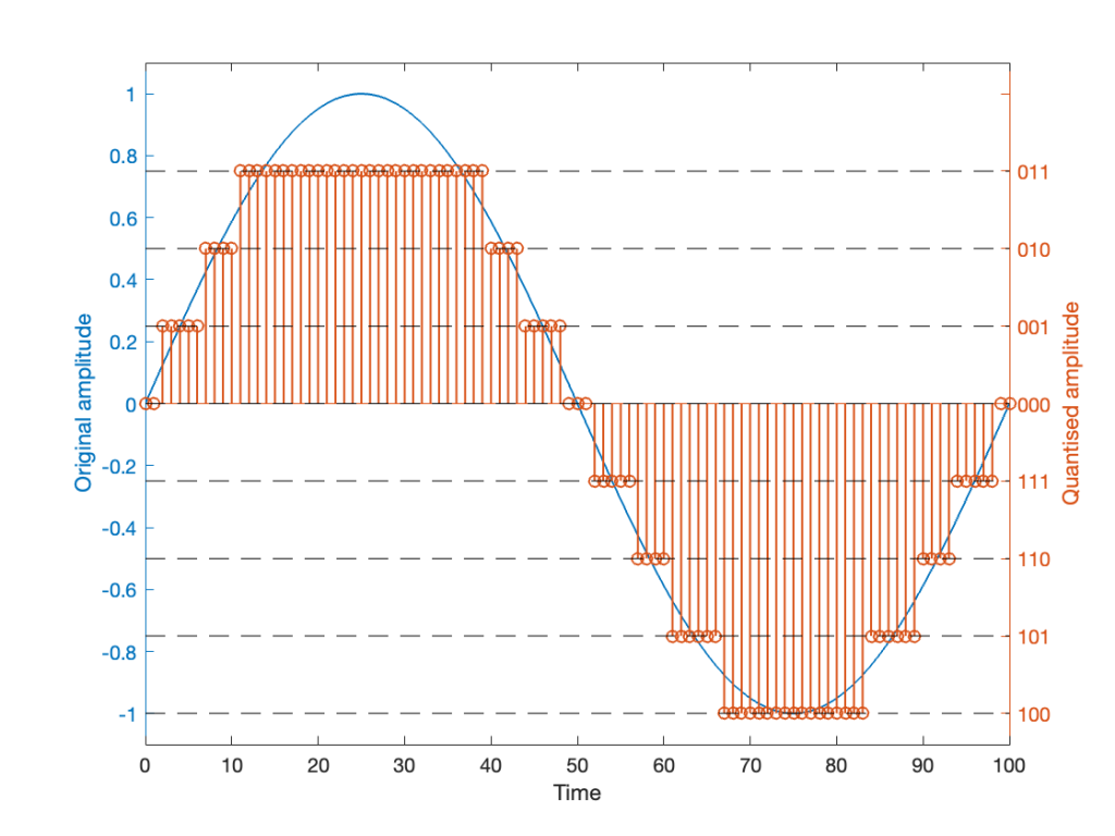
Notice that, because the original signal is symmetrical (with respect to positive and negative amplitudes) but the quantisation steps are not, we wind up getting a different result for the positive values than the negative values. In other words, after quantisation, I’ve clipped the positive peaks of the original signal.
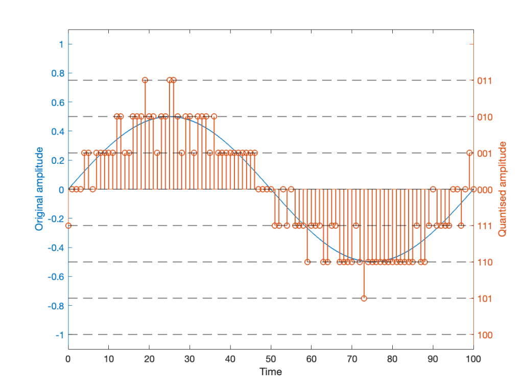
Okay, so this is a dumb way to do this. A slightly less dumb way is to adjust the scaling so that the original wave does not use all possible quantisation values, as shown in Figure 3.
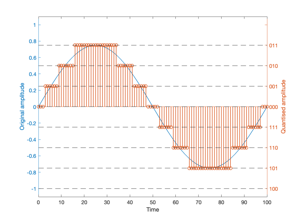
Notice that I’ve set the sine wave to a slightly lower level, so that it rounds to the top-most positive quantisation level, but this means that it doesn’t use the lowest negative quantisation level. If we’re being really picky, I could have made the sine wave just a little higher in amplitude: by 1/2 of a quantisation step, and the quantised result would still not have clipped asymmetrically.
As you can see in Figures 2 and 3 above, just taking a signal and quantising it generates an error. The more bits you have in the word length, the more quantisation levels you have, and the smaller the error. However, that error will always be correlated with the signal somehow, and as a result, it’s distortion, which is easy to learn to hear.
If, however, we add a little noise to the signal before we quantise it, then we can randomise the error, which changes the error from producing distortion to a constant signal-independent noise floor. Since the noise makes the quantiser appear to be indecisive, we call it dither.
The easiest (and possibly best) way to do this is to create white noise with a triangular probability distribution function and a peak-to-peak amplitude of ± 1 quantisation level. I’ll explain what that last sentence means in Part 3 of this series.
If we do this, then we
and the result might look like Figure 4.
It should be easy to see that we still have quantisation, and also that I’ve added some random element to the signal.
However, let’s look at the mistake I made in Figure 4. The noise that was added to the signal has an amplitude of ±1 quantisation level. So, we should see cases where the signal looks like it should be rounding to the closest level, but it might be either 1 above or 1 below. (For example, take a look at Time = 70, 71, and 72 as an example of this.)
However, take a look around Time = 20 to 30. Notice that the original signal is close to the top quantisation level. This means that, although a negative value in the dither in those samples can bring the quantisation level down, a positive value cannot bring it up because we don’t have any room for it. This will, again, result in a small amount of asymmetrical clipping. This is a VERY small amount. (Remember that, in the real world we’re probably using 216 (= 65,536) or 224 (= 16,777,216) quantisation values, not 23 (= 8).
So, if we’re going to avoid this clipping, we need to adjust the scaling of the signal once more, as shown in Figure 5.
This shows a signal that is scaled so that, without dither, it would round to one level away from the top-most quantisation level. When you add the dither, it can go up to that top quantisation level. (In fact, I happened to use the same dither signal for Figures 4 and 5. The only difference is the scaling of the signal.)
Now, I know that if you’re not used to looking at 3-bit signals, and/or if dither is a new concept, the red signal in Figure 5 might make you a little upset. However (and you have to believe me on this…) this is the correct way to encode digital audio. Just because it looks crazy doesn’t mean that it is.
If you want to make the plots above, here’s a simplified version of the math to try it out. Note: I live in a world where a % symbol precedes a comment.
Bitdepth = 3
Fs = 100 % sampling rate in Hz
Fc = 1 % frequency of the sine wave in Hz
TimeInSamples = [0:Fs] % This will make the TimeInSamples all of the integer values from 0 to Fs (therefore, 1 second of audio)Signal = sin(2 * pi * Fc/Fs * TimeInSamples)ScaleUp = 2^(Bitdepth-1)
ScaleDown = 2^(Bitdepth-1)
QuantisedSignal = round(Signal * ScaleUp) / ScaleDown;
% Then apply a clipper to remove the top quantisation level.
% You can do this yourself.ScaleUp = 2^(Bitdepth-1)-1
ScaleDown = 2^(Bitdepth-1)
QuantisedSignal = round(Signal * ScaleUp) / ScaleDown;ScaleUp = 2^(Bitdepth-1)-1
ScaleDown = 2^(Bitdepth-1)
TpdfDither = rand(LengthOfSignal) - rand(LengthOfSignal)
QuantisedDitheredSignal = round(Signal * ScaleUp + TpdfDither) / ScaleDown;
% Then apply a clipper to remove the top quantisation level.ScaleUp = 2^(Bitdepth-1)-2
ScaleDown = 2^(Bitdepth-1)
TpdfDither = rand(LengthOfSignal) - rand(LengthOfSignal)
QuantisedDitheredSignal = round(Signal * ScaleUp + TpdfDither) / ScaleDown;
This past week I found a very small oddity in the behaviour of one of the functions in Matlab. This led me down a rabbit hole that I’m still following, but the stuff I’ve learned along the way has proven to be interesting.
The short version of the story is that I made a test tone which consisted of a sine wave that had a frequency that matched an FFT bin centre so that I could test a thing. In order to get the sine wave through the thing, I had to export the audio signal as something the thing could play. So, I exported it as both a .wav and a .flac file, both with 24-bit word lengths and matching sampling rates.
Once the two signals came back from the thing, they looked different on an FFT analysis. Not very different, but different enough to raise questions. So, I ran the FFT on the .wav and .flac files that I created to do the test and found out that THEY were different, which I didn’t expect, because I know that FLAC is lossless.
The question that came up first was “why are they different?”, and that was just the entrance to the rabbit hole.
In order to explain what happened, we have to following some advice given by Carl Sagan who said
‘If you wish to make an apple pie from scratch, you must first invent the universe.’
We won’t invent the universe, but we’re going to dig down into the basics of LPCM digital audio in order to come back up to talk about where I wound up last Thursday.
Linear Pulse Code Modulation (LPCM) is a way of encoding signals (like an audio signal) by saving the waveform as a series of measurements of the instantaneous amplitude. However, when you do this, you can’t have a measurement with an infinite resolution, so you have to round off the value to the nearest one you can encode. This is just like measuring something with a ruler that has millimetres marked on it. You can’t really measuring something with a precision of less than the nearest millimetre, so you round off the value to something you know. Whether or not that’s good enough depends on what the measurement is for.
In LPCM digital audio, we call the steps that you can round the values to ‘quantisation levels’ because you’re dividing up the amplitude into discrete quanta. Since the values of those quantisation levels are stored or transmitted using a binary number (containing only 0s and 1s), the number of quantisation levels is a power of 2. For example, if you have a 16-bit (bit = Binary digIT) value, then you can count from
0000 0000 0000 0000 = 0
to
1111 1111 1111 1111 = 216 = 65,536
However, since audio signals go above and below 0 (we need to represent positive and negative values) we need a way to split up those options above (a range of 0 to 65,536) to do this.
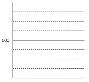
Let’s take a simple example with a 3-bit long word. Since there are 3 bits, we have 23 = 8 quantisation levels. It would be nice if 000 in the binary representation referred to a signal value of 0, like this:
All we need to do now is to figure out what binary values to put on the other quantisation levels. To do this, we use a system like the one shown in Figure 2.
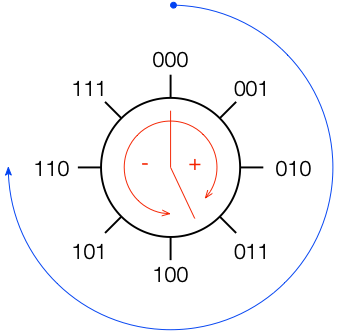
If you start at the top, and follow the blue circular arrow going clockwise, you count from 000 ( = 0) all the way to 111 (= 7). However, if you look at the red arrows, you can see that we can assign the binary values to the positive and negative quantisation levels by looking at the circle clockwise for positive values and counter-clockwise for negative ones. This means that we wind up with the assignments shown in Figure 3.
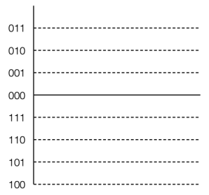
This way of using ‘wrapping’ the values around the circle into number assignments on a one-dimensional (in this case, vertical) scale is called a ‘two’s complement’ method.
There are two nice things about this system:
There is at least one slightly annoying thing about this system: it’s asymmetrical. Notice in Figure 3 that there are 3 available positive quantisation levels, but 4 negative ones. This is because we have an even number of values to use (because it’s a power of 2) but one of the values is 0, leaving an odd, and therefore asymmetrical number of remaining values for the non-0 quantisation levels.
This will come back to be a pain in the arse later…
Back when I was at McGill, one of my fellow Ph.D. students was Mark Ballora, who did his doctorate in converting heart rate data to an audible signal that helped doctors to easily diagnose patients suffering from sleep apnea.
This article from Science magazine in 2017 talked about Mark’s later work sonifying astronomical data, but I was reminded of it in a recent article on the BBC about researchers doing the same kind of work.
I found this at a flea market yesterday and I couldn’t resist buying it. It’s a Sharp EL-805M “pocket” calculator that was released for sale in 1973 and discontinued in 1974.
This would have been a time when a Liquid Crystal display was a feature worth advertising on the front panel of the calculator (since this was the first calculator with an LCD).
Sharp was one of the pioneers of calculators using the DSM (Dynamic Scattering Mode) LCD (Liquid Crystal Display). These DSM LCDs have the now unusual feature of silver-like reflective digits on a dark background, rather than the now common black digits on a light background.
http://www.vintagecalculators.com/html/facit_1106-sharp_el-805s.html

It was also from a time when instructions were included on how to use it. Notice the instructions for calculating 25 x 36, for example…
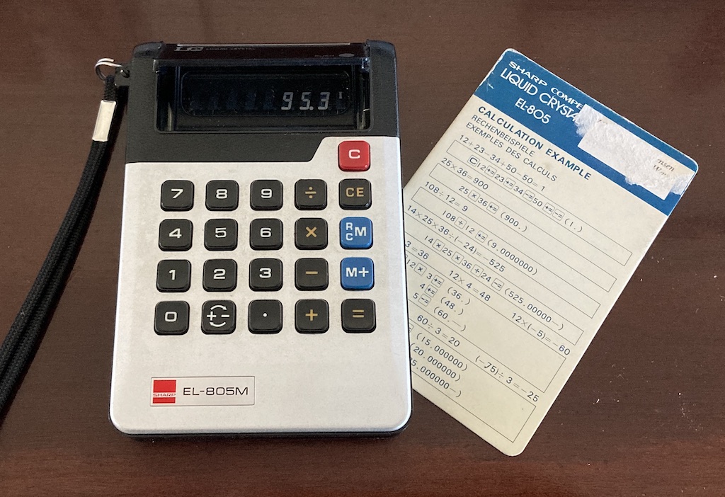
Undoubtably, the best 20 DKK I spent all weekend, given that the original price in 1973 was 110 USD.
For a peek inside, this site has some good shots, but it seems that it proves to be a challenge for automatic translators. There’s also a good history here.
N.B. I updated this page on 2023 04 05 based on new information from our suppliers…
We have two cars. One is a fully-electric car, and the other is a diesel.
Originally, the plan we had with our electricity supplier for the electric car was a flat fee per month, and an “all you can eat” plan. This made the choice of which car to drive a no-brainer: take the electric car whenever possible.
However, due to the rising price of energy, our supplier is changing their plan to a new pricing structure. The new price will be
799 DKK per month flat fee + kWh * (average electrical price – 0.89)
The reasoning behind this pricing is explained on their website – I won’t bother getting into that.
Note that they define the “average electrical price” as the average monthly price for both DK1 and DK2 (Denmark is split into two regions for electricity prices). The calculation is done on a charge-by-charge basis, where the month that’s chosen for the calculation is the month when you unplug the cable at the end of charging your car.
Our problem is that it made the decision of which car to drive (looking at it from a purely economic point of view) complicated. If we park the electric car, it still costs us 799 DKK / month + the price of diesel in the other car. On the other hand, if we drive the electric car, it costs us something that’s difficult to calculate when you’re heading out to the car in the morning with only one cup of coffee in you…
One thing that makes it even more complicated is the fact that, if we charge the electric car at home, we first pay our normal electricity supplier for the power we used, and we then get reimbursed by the electricity supplier for the electric car by some amount per kWh.
The way the electricity supplier for the electric car calculates this reimbursement is also complicated: They use the average monthly electricity price between 11:00 p.m. and 6:00 a.m. including charges. That number changes but it’s currently defaulting to 1.33 DKK / kWh on this page – look for the “Tilbagebetalingssats” amount in the sidebar on the right called “Tilbagebetaling”. (Note that this value is difficult if not impossible to determine using the NordPool information. The webpage linked above calculates it from the “forventet indkøbspris” that you can change yourself on their calculator.
It turned out that figuring out this problem was the most interesting math that I did this week. I ran the calculations first in Matlab, and then duplicated them in Excel (for compatibility’s sake) to find out how to deal with this.

The variables are:
The result is two plots:
So, as you can see in the plots above, at the current prices, and using the average consumption values for our two cars, the more we drive the electric car, the more money we save, and we’ll save a lot more money if we don’t charge at home.
Looking at the plot on the right, if we park the electric car (0 km on the X-axis) we’ll spend about 2700 DKK per month. If we only drive the electric car (2000 km on the X-axis) and charge away from home at charging stations, then we’ll spend less than 1000 DKK (green line on the right-hand plot). Quite a savings! If we charge at home, we’ll spend about 2200 DKK (red line on the right-hand plot) – still cheaper than the diesel, but more than double the price of NOT charging at home.
In case you are in the same position as we are, and the little Excel calculator I made might be useful, you can download it here. However, I make no promises about its reliability. Don’t send me an email because I screwed up the math – fix it yourself. :-)
2023 05 19 update: We switched to “spot pricing” for the house electricity. So, this calculation has become dependent on the time of day when we charge the car. As a result, I’ve given up trying to understand it…
If you’ve read through the first four parts of this series, then you’re already at a point where you can intuitively understand what’s going on. We just have a couple of details to take care of before finishing off.
Firstly, the plots showing the zeros and poles in the figures you’ve been looking at plots of the “Z-plane” or “Complex-plane“. As I said at the start, we’re only trying to get to an intuitive understanding of these plots – so I’m not going to get into complex numbers, or even much math (apart from what you’ll see below… which isn’t very complicated, and avoids complex numbers).
When I’m developing a new DSP algorithm, I use an application called Max from cycling74.com. Figure 1 shows a screenshot from Max, where I’m using an object to calculate the biquad coefficients to make a low pass filter, as you can see. I’ve then connected the output of that object (it looks like a magnitude response) to a Z-plan representation that shows me the same thing in a different way.
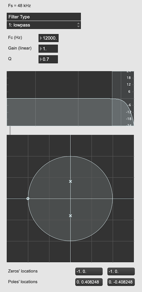
You may notice that this plot has two poles, one at (0, 0.408) and the other at (0, -0.408). In fact there are two zeros there as well, but they’re situated in the same place, on “on top” of the other, at (-1, 0). This is always true for a biquad – there are always two zeros and two poles. Sometimes, they’re located in the same place, sometimes not, sometimes they’re placed symmetrically, sometimes not, depending on the filter, as we’ll see below.
Let’s look at that Z-plane representation in 3-dimensions:
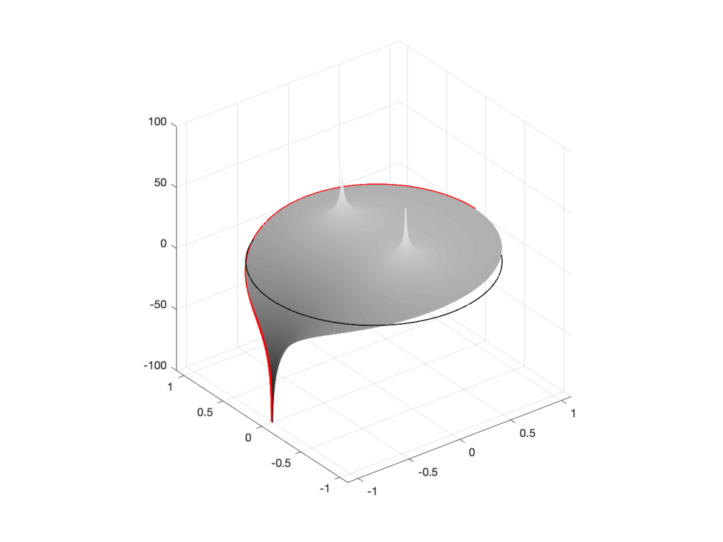
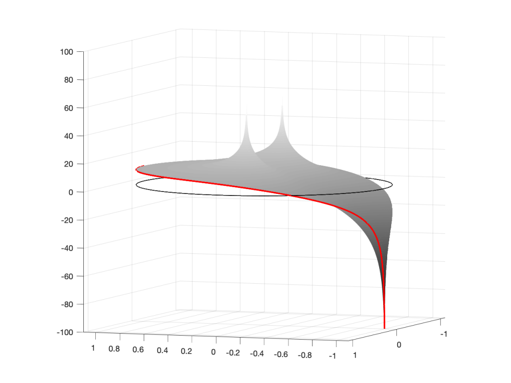
So, as you would now expect, the poles pull up the edge of the circle, and the zeros (both in the same place) pull down, giving the red line the height that it has.
Now, think back to this Figure from earlier in the series:
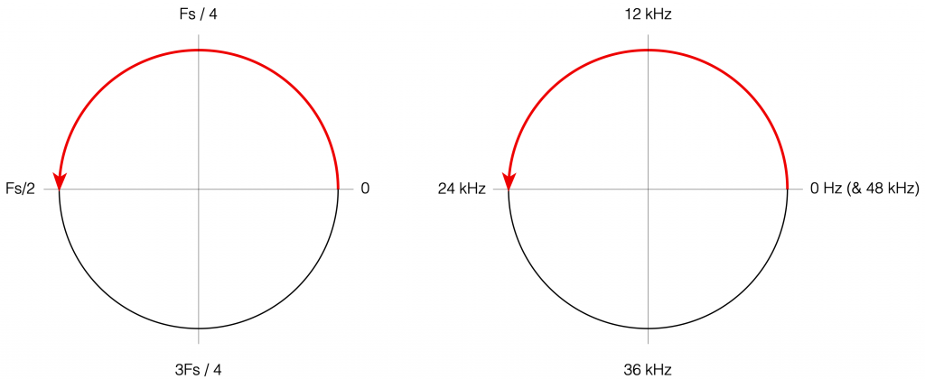
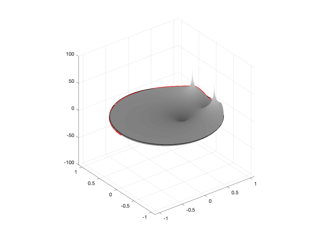
If you therefore look at Figure 3, which is like looking at Figure 4 from the top, you’ll notice that the height of the red line (the edge of the circle is high on the left (in the low frequencies) and drops as you go to the right (the high frequencies). This is the magnitude response that’s shown on the top of Figure 1. The only difference is that it’s on a linear scale instead of a logarithmic scale, so the shape looks a little weird.
Let’s do another one:

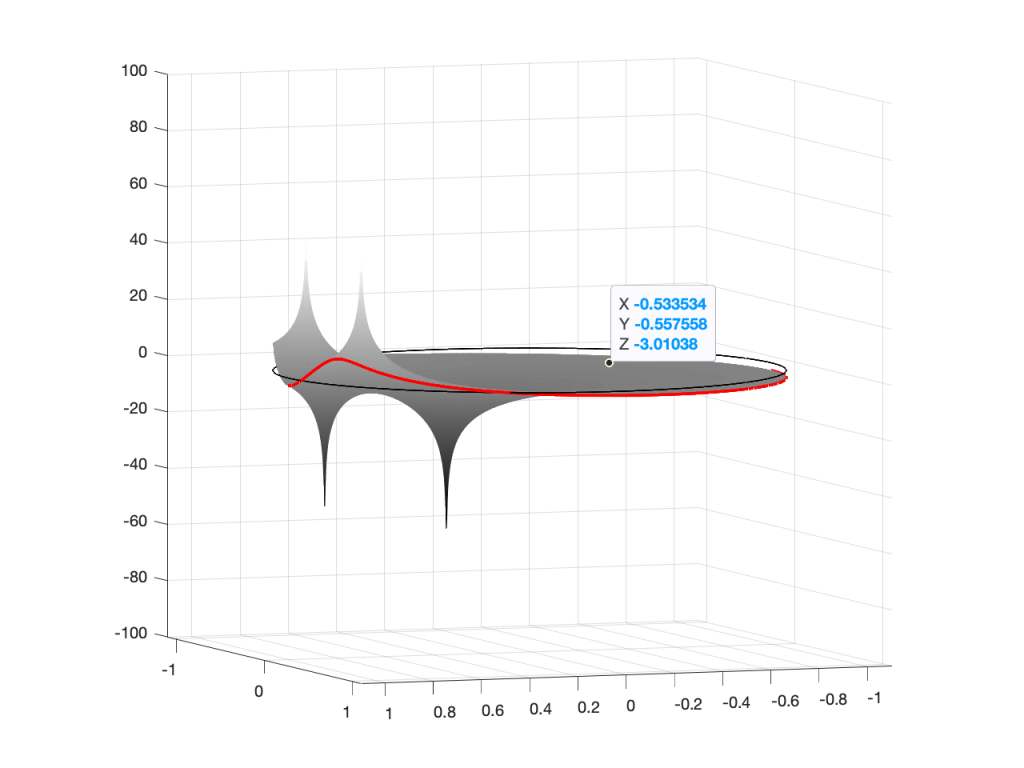
Hopefully, now you are able to look at a Z-plane representation of a filter and think about the effect of the poles and zeros on the edge of the circle, and therefore get a rough idea of the magnitude response of the filter…
If not, I apologize for wasting your time. On the other hand, if you’re in a life-threatening situation, this knowledge probably wouldn’t help you anyway… Very few people have gotten a critical injury in a biquad accident.
If you want to make these plots for yourself, the math is pretty simple.
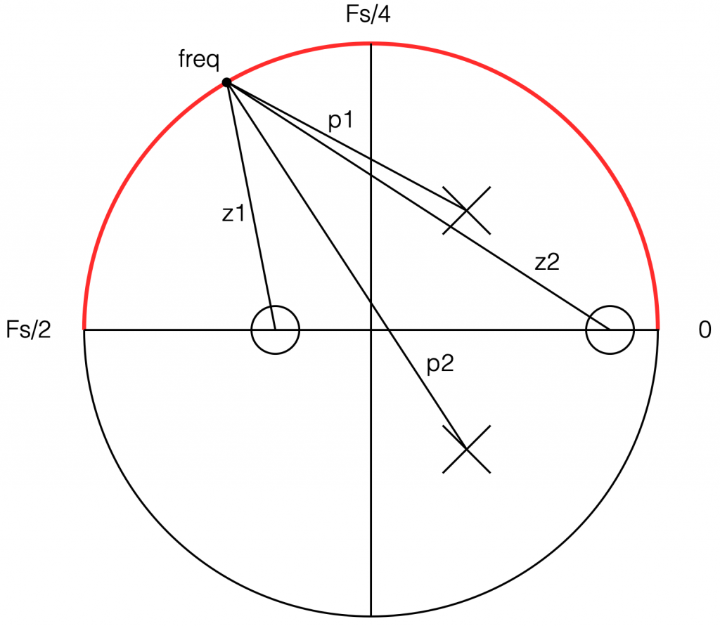
Start by choosing the frequency, which will be a point on the circle. You then find the four distances from the zeros and poles to that point (I’ve indicated those distances in Figure 8 with the variables z1, z2, p1, and p2.) This can be done using the Pythagorean theorem.
To find the gain of the filter at the frequency, you divide the sum of the zeros’ distances by the sum of the poles’ distances. In other words:
(z1 + z2) / (p1 + p2)
That will give you the result as a linear value. If you then want to convert it to decibels, like I’ve done, you do a little extra math like this:
20 * log10 ( (z1 + z2) / (p1 + p2) )
That’s it! You just need to do repeat that math for each frequency that you’re interested in, and you’re done!