I found this document from Roland, published in 1978. The information in here is still valuable – and presented as an excellent introduction.
I found this document from Roland, published in 1978. The information in here is still valuable – and presented as an excellent introduction.
After I posted the last two parts of this series (which I thought wrapped it up…) I received an email asking about whether there’s a similar thing happening if you remove the reconstruction (low-pass) filter in the digital-to-analogue part of the signal path.
The answer to this question turned out to be more interesting than I expected… So I wound up turning it into a “Part 3” in the series.
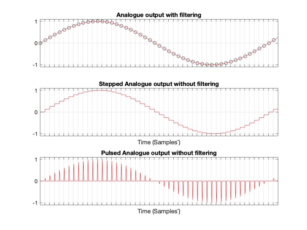
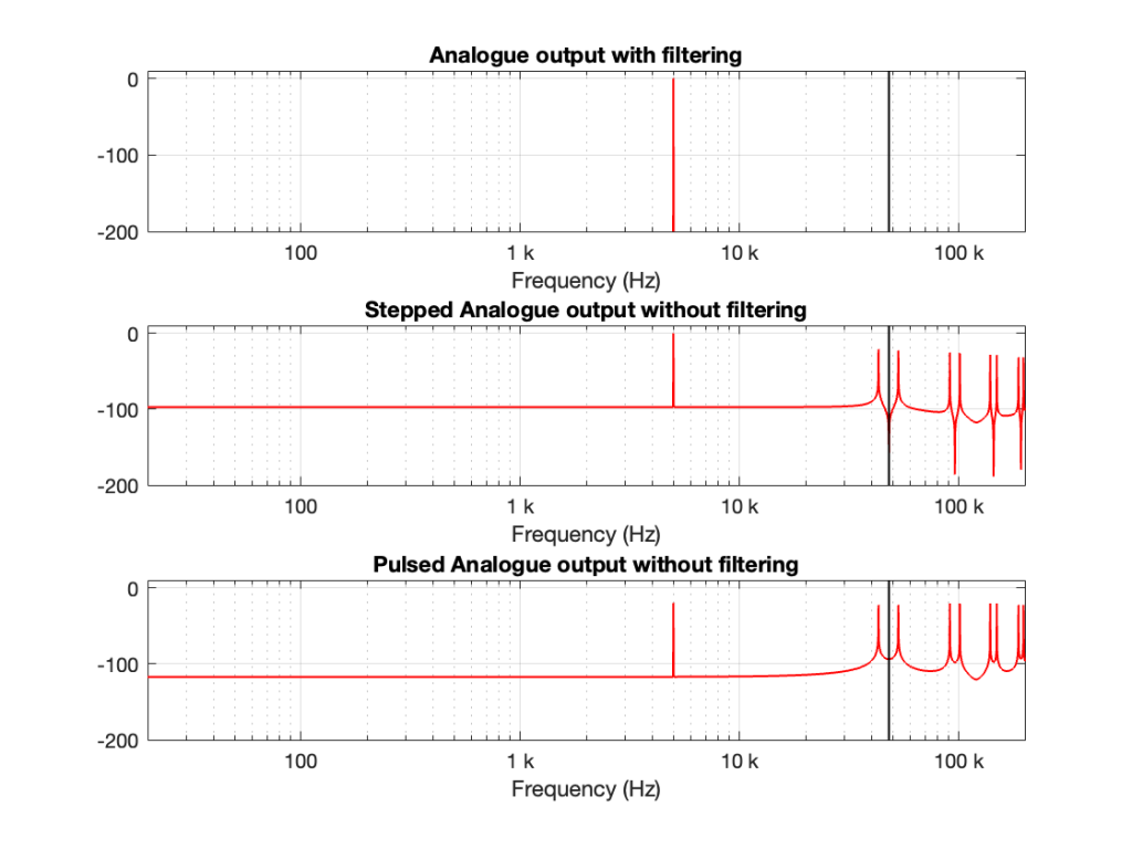
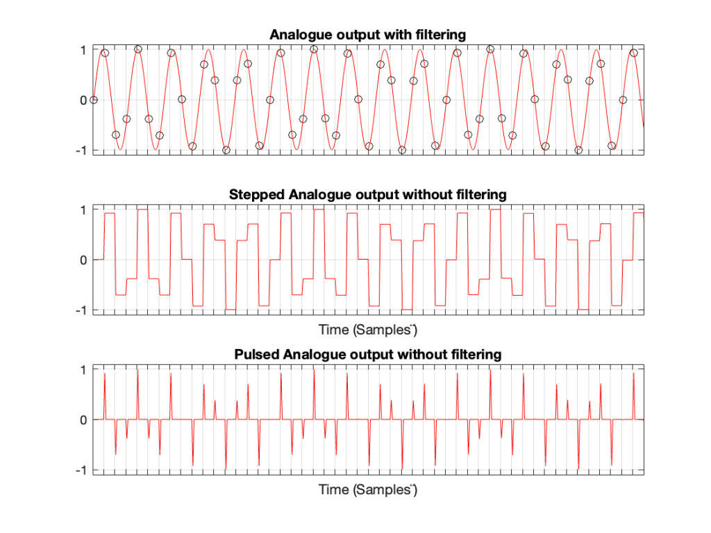
Let’s take a case where you have a 1 kHz signal in a 48 kHz system. The figure below shows three plots. The top plot shows the individual sample values as black circles on a red line, which is the analogue output of a DAC with a reconstruction filter.
The middle plot shows what the analogue output of the DAC would look like if we implemented a Sample-and-hold on the sample values, and we had an infinite analogue bandwidth (which means that the steps have instantaneous transitions and perfect right angles).
The bottom plot shows what the analogue output of the DAC would look like if we implemented the signal as a pulse wave instead, but if we still we had an infinite analogue bandwidth. (Well… sort of…. Those pulses aren’t infinitely short. But they’re short enough to continue with this story.)
If we calculate the spectra of these three signals , they’ll look like the responses shown in Figure 2.
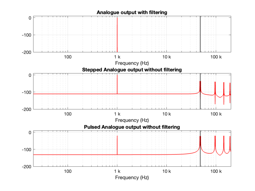
Notice that all three have a spike at 1 kHz, as we would expect. The outputs of the stepped wave and the pulsed wave have much higher “noise” floors, as well as artefacts in the high frequencies. I’ve indicated the sampling rate at 48 kHz as a vertical black line to make things easy to see.
We’ll come back to those artefacts below.
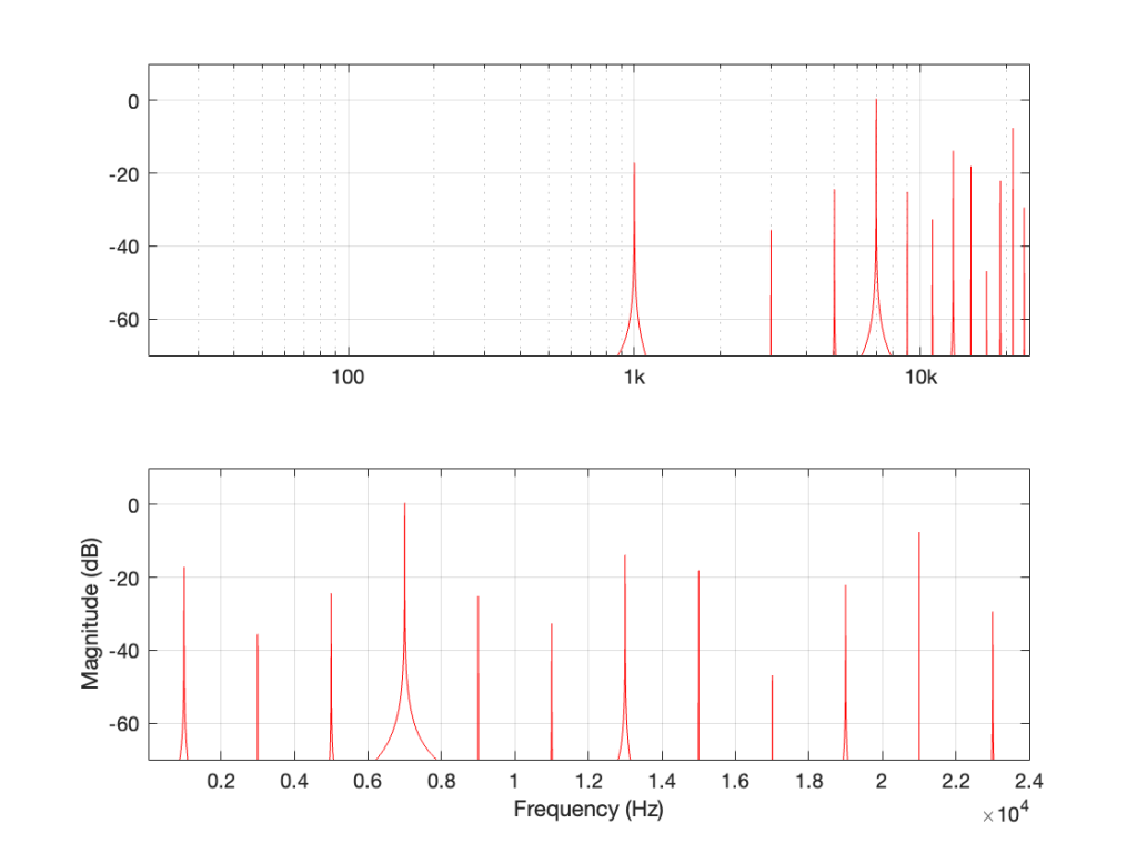
Let’s do the same thing for a 5 kHz sine wave, still in a 48 kHz system, seen in Figures 3 and 4.
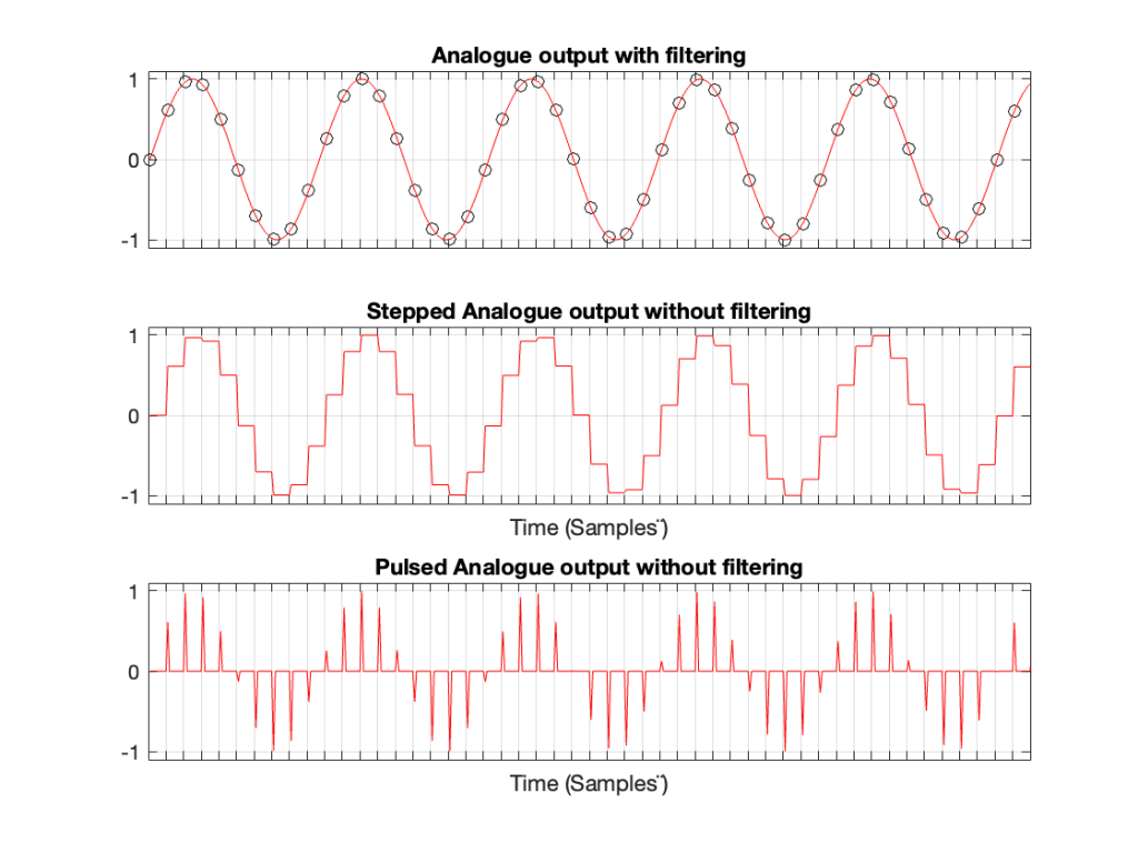
Compare the high-frequency artefacts in Figure 4 to those in Figure 2.
Now, we’ll do it again for a 15 kHz sine wave.
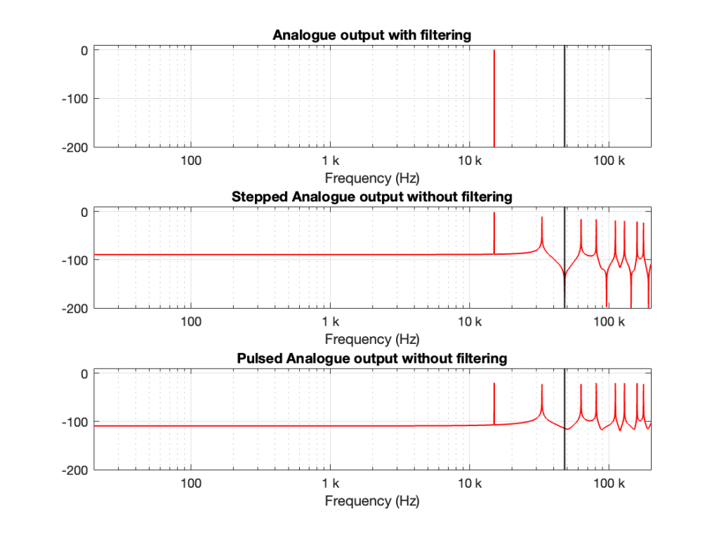
There are three things to notice, comparing Figures 2, 4, and 6.
The first thing is that artefacts for the stepped and pulsed waves have the same frequency components.
The second thing is that those artefacts are related to the signal frequency and the sampling rate. For example, the two spikes immediately adjacent to the sampling rate are Fs ± Fc where Fs is the sampling rate and Fc is the frequency of the sine wave. The higher-frequency artefacts are mirrors around multiples of the sampling rate. So, we can generalise to say that the artefacts will appear at
n * Fs ± Fc
where n is an integer value.
This is interesting because it’s aliasing, but it’s aliasing around the sampling rate instead of the Nyquist Frequency, which is what happens at the ADC and inside the digital domain before the DAC.
The third thing is a minor issue. This is the fact that the level of the fundamental frequency in the pulsed wave is lower than it is for the stepped wave. This should not be a surprise, since there’s inherently less energy in that wave (since, most of the time, it’s sitting at 0). However, the artefacts have roughly the same levels; the higher-frequency ones have even higher levels than in the case of the stepped wave. So, the “signal to THD+N” of the pulsed wave is lower than for the stepped wave.
In Part 1, we looked at what happens when you try to record a signal whose frequency is higher than 1/2 the sampling rate (which, from now on, I’ll call the Nyquist Frequency, named after Harry Nyquist who was one of the people that first realised that this limit existed). You record a signal, but it winds up having a different frequency at the output than it had at the input. In addition, that frequency is related to the signal’s frequency and the sampling rate itself.
In order to prevent this from happening, digital recording systems use a low-pass filter that hypothetically prevents any signals above the Nyquist frequency from getting into the analogue-to-digital conversion process. This filter is called an anti-aliasing filter because it prevents any signals that would produce an alias frequency from getting into the system. (In practice, these filters aren’t perfect, and so it’s typical that some energy above the Nyquist frequency leaks into the converter.)
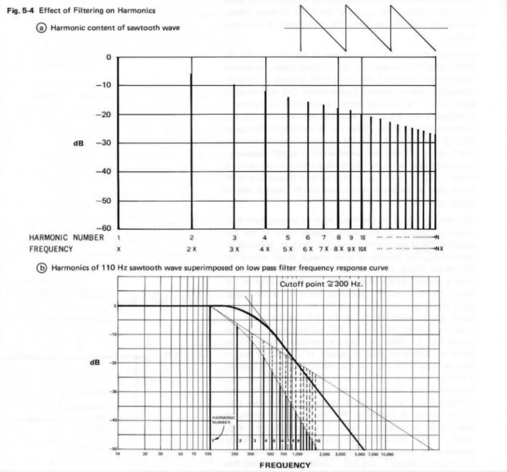
So, this means that if you put a signal that contains high frequency components into the analogue input of an analogue-to-digital converter (or ADC), it will be filtered. An example of this is shown in Figure 1, below. The top plot is a square wave before filtering. The bottom plot is the result of low-pass filtering the square wave, thus heavily attenuating its higher harmonics. This results in a reduction in the slope when the wave transitions between low and high states.
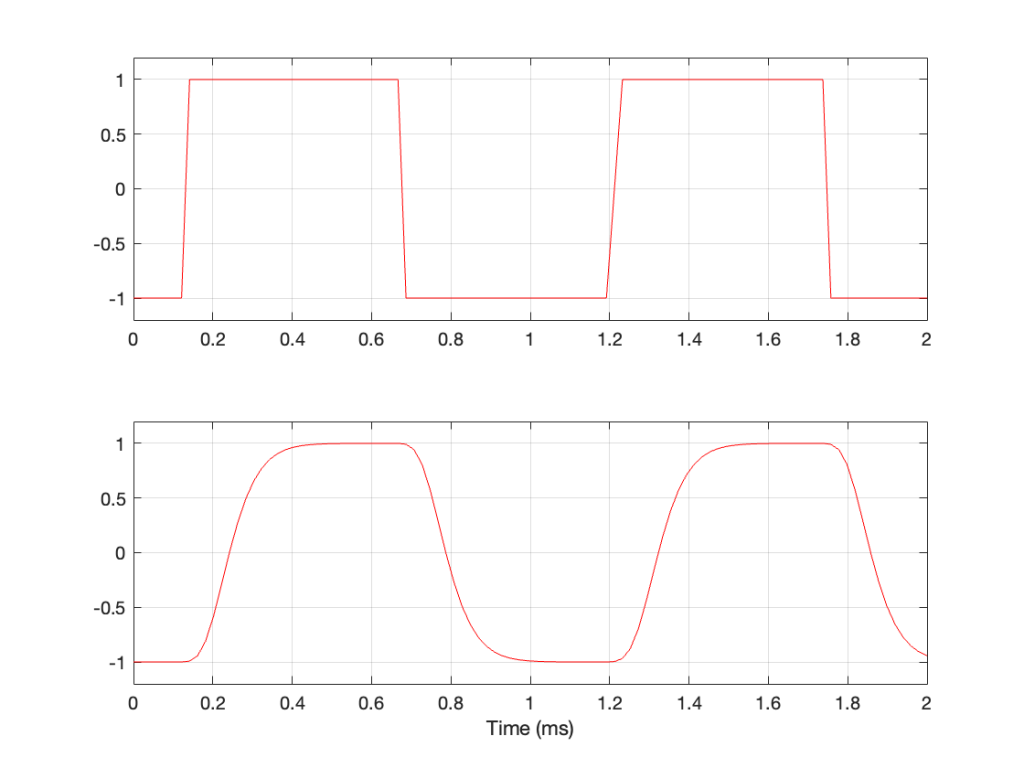
This means that, if I have an analogue square wave and I record it digitally, the signal that I actually record will be something like the bottom plot rather than the top one, depending on many things like the frequency of the square wave, the characteristics of the anti-aliasing filter, the sampling rate, and so on. Don’t go jumping to conclusions here. The plot above uses an aggressively exaggerated filter to make it obvious that we do something to prevent aliasing in the recorded signal. Do NOT use the plots as proof that “analogue is better than digital” because that’s a one-dimensional and therefore very silly thing to claim.
… just because we keep signals with frequency content above the Nyquist frequency out of the input of the system doesn’t mean that they can’t exist inside the system. In other words, it’s possible to create a signal that produces aliasing after the ADC. You can either do this by
Let’s take a sine wave and clip it after it’s been converted to a digital signal with a 48 kHz sampling rate, as is shown in Figure 2.
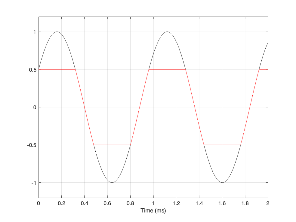
When we clip a signal, we generate high-frequency harmonics. For example, the signal in Figure 2 is a 1 kHz sine wave that I clipped at ±0.5. If I analyse the magnitude response of that, it will look something like Figure 3:
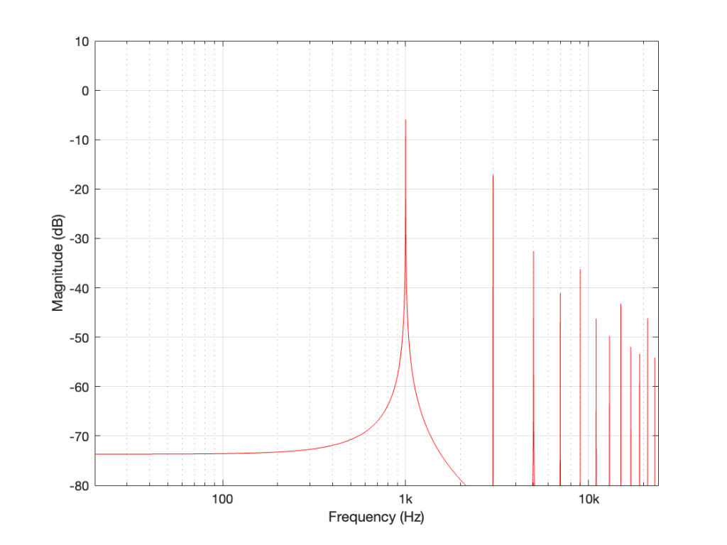
The red curve in Figure 2 is not a ‘perfect’ square wave, so the harmonics seen in Figure 3 won’t follow the pattern that you would expect for such a thing. But that’s not the only reason this plot will be weird…
Figure 3 is actually hiding something from you… I clipped a 1 kHz sine wave, which makes it square-ish. This means that I’ve generated harmonics at 3 kHz, 5 kHz, 7 kHz, and so on, up to ∞ Hz..
Notice there that I didn’t say “up to the Nyquist frequency”, which, in this example with a sampling rate of 48 kHz, would be 24 kHz.
Those harmonics above the Nyquist frequency were generated, but then stored as their aliases. So, although there’s a new harmonic at 25 kHz, the system records it as being at 48 kHz – 25 kHz = 23 kHz, which is right on top of the harmonic just below it.
In other words, when you look at all the spikes in the graph in Figure 3, you’re actually seeing at least two spikes sitting on top of each other. One of them is the “real” harmonic, and the other is an alias (there are actually more, but we’ll get to that…). However, since I clipped a 1 kHz sine wave in a 48 kHz world, this lines up all the aliases to be sitting on top of the lower harmonics.
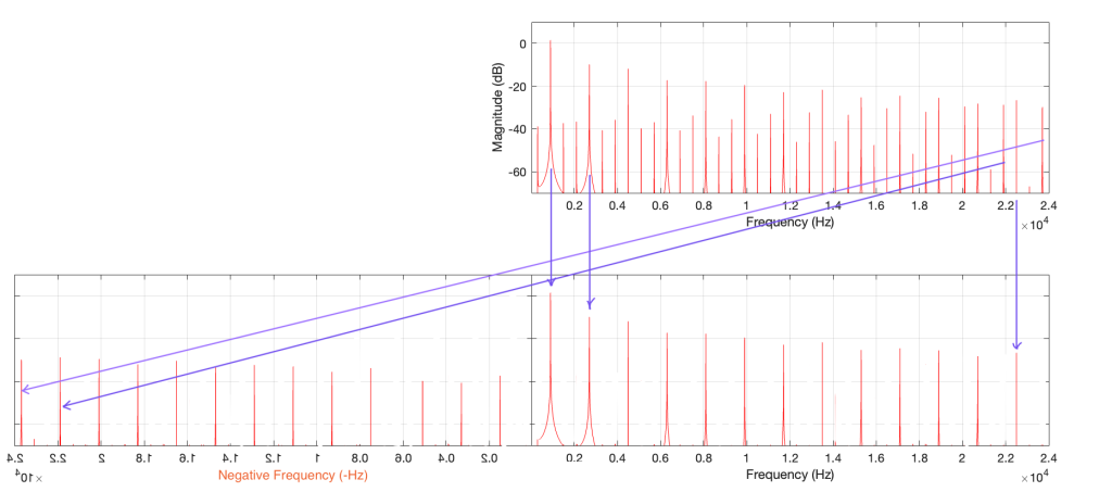
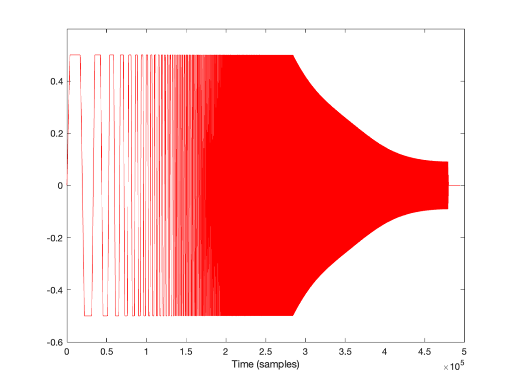
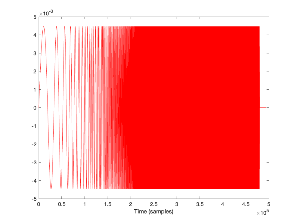
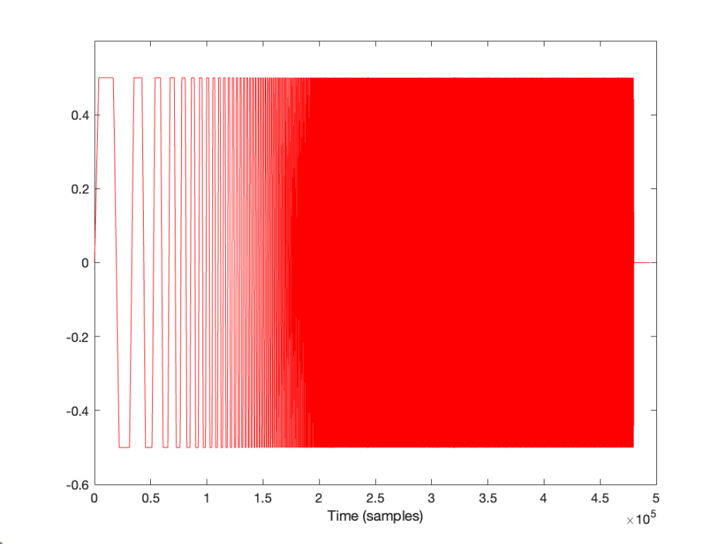
So, what happens if I clip a sine wave with a frequency that isn’t nicely related to the sampling rate, like 900 Hz in a 48 kHz system, for example? Then the result will look more like Figure 4, which is a LOT messier.
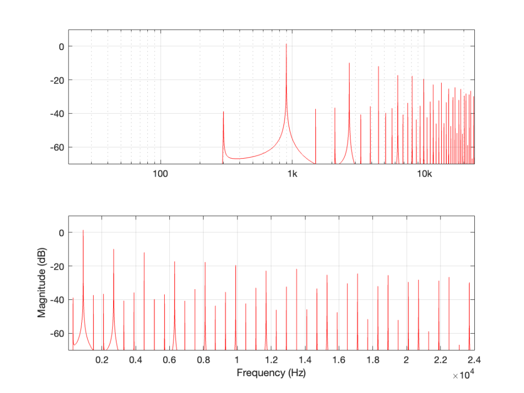
A 900 Hz square wave will have harmonics at odd multiples of the fundamental, therefore at 2.7 kHz, 4.5 kHz, and so on up to 22.5 kHz (900 Hz * 25).
The next harmonic is 24.3 kHz (900 Hz * 27), which will show up in the plots at 48 kHz – 24.3 kHz = 23.7 kHz. The next one will be 26.1 kHz (900 Hz * 29) which shows up in the plots at 21.9 kHz. This will continue back DOWN in frequency through the plot until you get to 900 Hz * 53 = 47.7 kHz which will show up as a 300 Hz tone, and now we’re on our way back up again… (Take a look at Figure 7, below for another way to think of this.)
The next harmonic will be 900 Hz * 55 = 49.5 kHz which will show up in the plot as a 1.5 kHz tone (49.5 kHz – 48 kHz).
Depending on the relationship between the square wave’s frequency and the sampling rate, you either get a “pretty” plot, like for the 6 kHz square wave in a 48 kHz system, as shown in Figure 5.
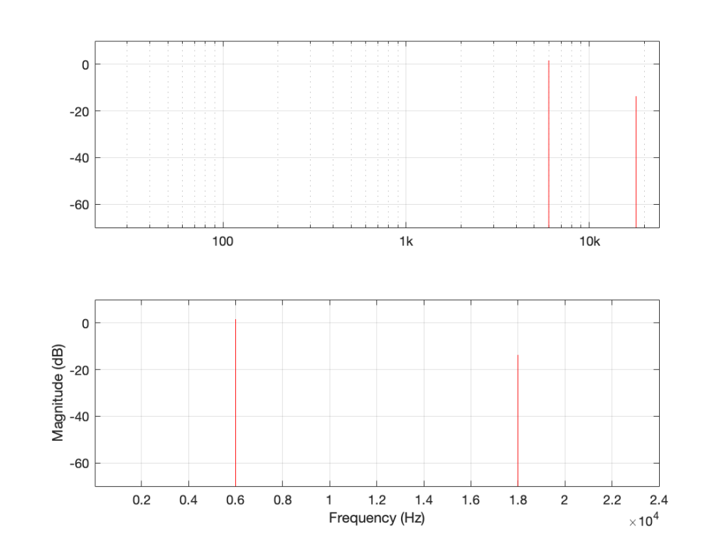
Or, it’s messy, like the 7 kHz square wave in a 48 kHz system in Figure 6.
There are three things to remember from this little pair of posts:
One additional, but smaller problem with all of this is that, when you look at the output of an FFT analysis of a signal (like the top plot in Figure 7, for example), there’s no way for you to know which components are “normal” harmonics, and which are aliased artefacts that are actually above the Nyquist frequency. It’s another case proving that you need to understand what to expect from the output of the FFT in order to understand what you’re actually getting.
One of the best-known things about digital audio is the fact that you cannot record a signal that has a frequency that is higher than 1/2 the sampling rate.
Now, to be fair, that statement is not true. You CAN record a signal that has a frequency that is higher than 1/2 the sampling rate. You just won’t be able to play it back properly, because what comes out of the playback will not be the original frequency, but an alias of it.
If you record a one-spoked wheel with a series of photographs (in the old days, we called this ‘a movie’), the photos (the frames of the movie) might look something like this:

As you can see there, the wheel happens to be turning at a speed that results in it rotating 45º every frame.
The equivalent of this in a digital audio world would be if we were recording a sine wave that rotated (yes…. rotated…) 45º every sample, like this:

Notice that the red lines indicating the sample values are equivalent to the height of the spoke at the wheel rim in the first figure.
If we speed up the wheel’s rotation so that it rotated 90º per frame, it looks like this:

And the audio equivalent would look like this:

Speeding up even more to 135º per frame, we get this:

and this:

Then we get to a magical speed where the wheel rotated 180º per frame. At this speed, it appears when we look at the playback of the film that the wheel has stopped, and it now has two spokes.

In the audio equivalent, it looks like the result is that we have no output, as shown below.

However, this isn’t really true. It’s just an artefact of the fact that I chose to plot a sine wave. If I were to change the phase of this to be a cosine wave (at the same frequency) instead, for example, then it would definitely have an output.

At this point, the frequency of the audio signal is 1/2 the sampling rate.
What happens if the wheel goes even faster (and audio signal’s frequency goes above this)?

Notice that the wheel is now making more than a half-turn per frame. We can still record it. However, when we play it back, it doesn’t look like what happened. It looks like the wheel is going backwards like this:

Similarly, if we record a sine wave that has a frequency that is higher than 1/2 the sampling rate like this:

Then, when we play it back, we get a lower frequency that fits the samples, like this:

There is a simple way to calculate the frequency of the signal that you get out of the system if you know the sampling rate and the frequency of the signal that you tried to record.
Let’s use the following abbreviations to make it easy to state:
IF
F_in < Fs/2
THEN
F_out = F_in
IF
Fs > F_in > Fs/2
THEN
F_out = Fs/2 – (F_in – Fs/2) = Fs – F_in
If your sampling rate is 48 kHz, and you try to record a 25 kHz sine wave, then the signal that you will play back will be:
48000 – 25000 = 23000 Hz
If your sampling rate is 48 kHz, and you try to record a 42 kHz sine wave, then the signal that you will play back will be:
48000 – 42000 = 6000 Hz
So, as you can see there, as the input signal’s frequency goes up, the alias frequency of the signal (the one you hear at the output) will go down.
Go back and look at that last figure showing the playback signal of the sine wave. It looks like the sine wave has an inverted polarity compared to the signal that came into the system (notice that it starts on a downwards-slope whereas the input signal started on an upwards-slope). However, the polarity of the sine wave is NOT inverted. Nor has the phase shifted. The sine wave that you’re hearing at the output is going backwards in time compared to the signal at the input, just like the wheel appears to be rotating backwards when it’s actually going forwards.
In Part 2, we’ll talk about why you don’t need to worry about this in the real world, except when you REALLY need to worry about it.
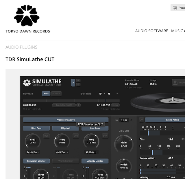
Tokyo Dawn Records has released a vinyl mastering simulator, which includes a prediction of the end result of the mastering process.
If you have a plan to becoming a mastering engineer for vinyl, you can start practicing immediately.
In Part 3, I showed that a magnitude responses calculated from impulse responses produced by the MLS and swept sine methods produce different results when the measurement signals themselves are distorted.
In this posting, I’ll focus on the swept sine method which showed that the apparent magnitude response of the system looked like a strange version of a low shelving filter, but there’s a really easy explanation for this that goes back to something I wrote in Part 1.
The way these systems work is to cross-correlate the signal that comes back from the DUT with the signal that was sent to it. Cross-correlation (in this case) is a bit of math that tells you how similar two signals are when they’re compared over a change in time (sort of…). So, if the incoming signal is identical to the outgoing signal at one moment in time but no other, then the result (the impulse response) looks like a spike that hits 1 (meaning “identical”) at one moment, and is 0 (meaning “not at all alike in any way…”) at all other times.
However, one important thing to remember is that both an MLS signal and a swept sine wave take some time to play. So, on the one hand, it’s a little weird to think of a 10-second sweep or MLS signal being converted to a theoretically-infinitely short impulse. On the other hand, this can be done if the system doesn’t change in time and therefore never changes: something we call a Linear Time-Invariant (or LTI) system.
But what happens if the DUT’s behaviour DOES change over time? Then things get weird.
At the end of Part 1, I said
For both the MLS and the sine sweep, I’m applying a pre-emphasis filter to the signal sent to the DUT and a reciprocal de-emphasis filter to the signal coming from it. This puts a bass-heavy tilt on the signal to be more like the spectrum of music. However, it’s not a “pinking” filter, which would cause a loss of SNR due to the frequency-domain slope starting at too low a frequency.
Then, in Part 2 I said that, to distort the signals, I
look for the peak value of the measurement signal coming into the DUT, and then clip it.
It’s the combination of these two things that results in the magnitude response of the system measured using a swept sine wave looking the way it does.
If I look at the signal that I actually send to the input of the DUT, it looks like this:
I’m normalising this to have a maximum value of 1 and then clipping it at some value like ±0.5, for example, like this:
So, it should be immediately obvious that, by choosing to clip the signal at 1/2 of the maximum value of the whole sweep, I’m not clipping the entire thing. I’m only distorting signals below some frequency that is related to the level at which I’m clipping. The harder I clip, the higher the frequency I mess up.
This is why, when we look at the magnitude response, it looks like this:
In the very low frequencies, the magnitude response is flat, but lower than expected, because the signal is clipped by the same amount. In the high frequencies, the signal is not clipped at all, so everything is behaving. In between these two bands, there is a transition between “not-behaving” and “behaving”.
This means that
Then the magnitude response would look almost flat, but lower than expected (by the amount that is related to how much it’s clipped). In other words, we would (mostly) see the linear response of the system, even though it was behaving non-linearly – almost like if we had only sent a click through it.
However, if we chose to not apply the pre-emphasis to the signal, then the DUT wouldn’t be behaving the way it normally does, since this is very roughly equivalent to the spectral balance of music. For example, if you send a swept sine wave from 20 Hz to 20,000 Hz to a loudspeaker without applying that bass boost, you’ll could either get almost nothing out of your woofer, or you’ll burn out your tweeter (depending on how loudly you’re playing the sweep).
How does the result look without the pre-emphasis filter applied to the swept sine wave? For example, if we sent this to the DUT:
… and then we clipped it at 1/2 the maximum value, so it looks like this:
(notice that everything is clipped)
then the impulse response and magnitude response look like this instead:
… which is more similar to the results when we clip the MLS measurement signal in that we see the effects on the top end of the signal. However, it’s still not a real representation of how the DUT “sounds” whatever that means…
This posting will just be some more examples of the artefacts caused by symmetrical clipping of the measurement signal for the MLS and swept-sine methods, clipping at different levels.
Remember that the clip level is relative to the peak level of the measurement signal.

The take-home message here is that, although both the MLS and the swept sine methods suffer from showing you strange things when the DUT is clipping, the swept sine method is much less cranky…
In the next posting, I’ll explain why this is the case.
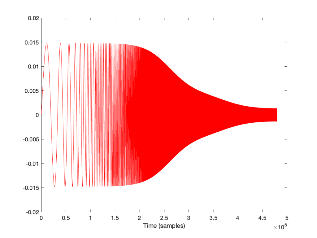
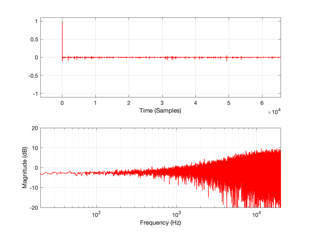
Let’s make a DUT with a simple distortion problem: It clips the signal symmetrically at 0.5 of the peak value of the signal, so if I send in a sine wave at 1 kHz, it looks like this:
Now, to be fair, what I’m REALLY doing here is to look for the peak value of the measurement signal coming into the DUT, and then clipping it. This would be equivalent to doing a measurement of the DUT and adjusting the input gain so that it looks like a peak level of – 6 dB relative to maximum is coming in.
Also, because what I’m about to do through this series is going to have radical effects on the level after processing, I’m normalising the levels. So, some things won’t look right from a perspective of how-loud-it-appears-to-be.
If I measure that DUT using the three methods, the results look like this:


As can easily be seen above, the three systems show very different responses. So, unlike what I claimed this post (which is admittedly over-simplified, although intentionally so to make a point…), the fact that they are measuring the impulse response does not mean that we can’t see the effects of the non-linear response. We can obviously see artefacts in the linear response that are caused by the distortion, but those artefacts don’t look like distortion, and they don’t really show us the real linear response.
In the last posting, I made a big assumption: that it’s normal to measure the magnitude response of a device via an impulse response measurement.
In order to illustrate the fact that an impulse response measurement shows you only the linear response of a system (and not distortion effects such as clipping), I did an impulse response measurement using an impulse. However, it only took about 24 hours for someone to email me to point out that it’s NOT typical to use an impulse to do an impulse response measurement.
These days, that is true. In the old days, it was pretty normal to do an impulse response measurement of a room by firing a gun or popping a balloon. However, unless your impulse is really loud, this method suffers from a low signal-to-noise ratio.
So, these days, mainly to get a better signal-to-noise ratio, we typically use another kind of signal that can be turned into an impulse response using a little clever math. One method is to send a Maximum Length Sequence (or MLS) through the device. The other method uses a sine wave with a smoothly swept-frequency.
There are other ways to do it, but these two are the most common for reasons that I won’t get into.
In both the MLS and the swept-sine cases, you take the incoming signal from the DUT, and do some math that compares the outgoing signal to the incoming signal and converts the result into an impulse response. You can then use that to do your analyses of the linear response of the DUT.
If your DUT is behaving perfectly linearly, then this will work fine. However, if your DUT has some kind of non-linear distortion, then the effects of the distortion on the measurement signal will result in some kinds of artefacts that show up in the impulse response in a potentially non-intuitive way.
This series of postings is going to be a set of illustrations of these artefacts for different types of distortion. For the most part, I’m not going to try to explain why the artefacts look the way they do. It’s just a bunch of illustrations that might help you to recognise the artefacts in the future and to help you make better choices about how you’re doing the measurements in the first place.
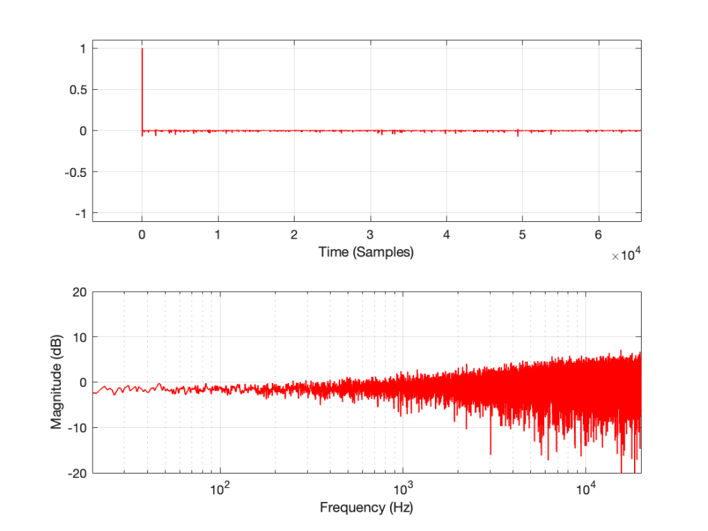
:To start, let’s take a “perfect” DUT and
The results of these three measurement methods are shown below:


If you believe in conspiracy theories, then you might be suspicious that I actually just put up the same plot three times and changed the caption, but you’ll have to trust me. I didn’t do that. I actually ran the measurement three times.
If you’re familiar with the MLS and/or swept sine techniques, then you’ll be interested in a little more information:
Most of that will be true for the other parts of the rest of the series. When it’s not true, I’ll mention it.
Let’s say that we have to do an audio measurement of a Device Under Test (DUT) that has one input and one output, as shown below.

We don’t know anything about the DUT.
One of the first things we do in the audio world is to measure what most people call the “frequency response” but is more correctly called the “magnitude response”. (It would only be the “frequency response” if you’re also looking at the phase information.)
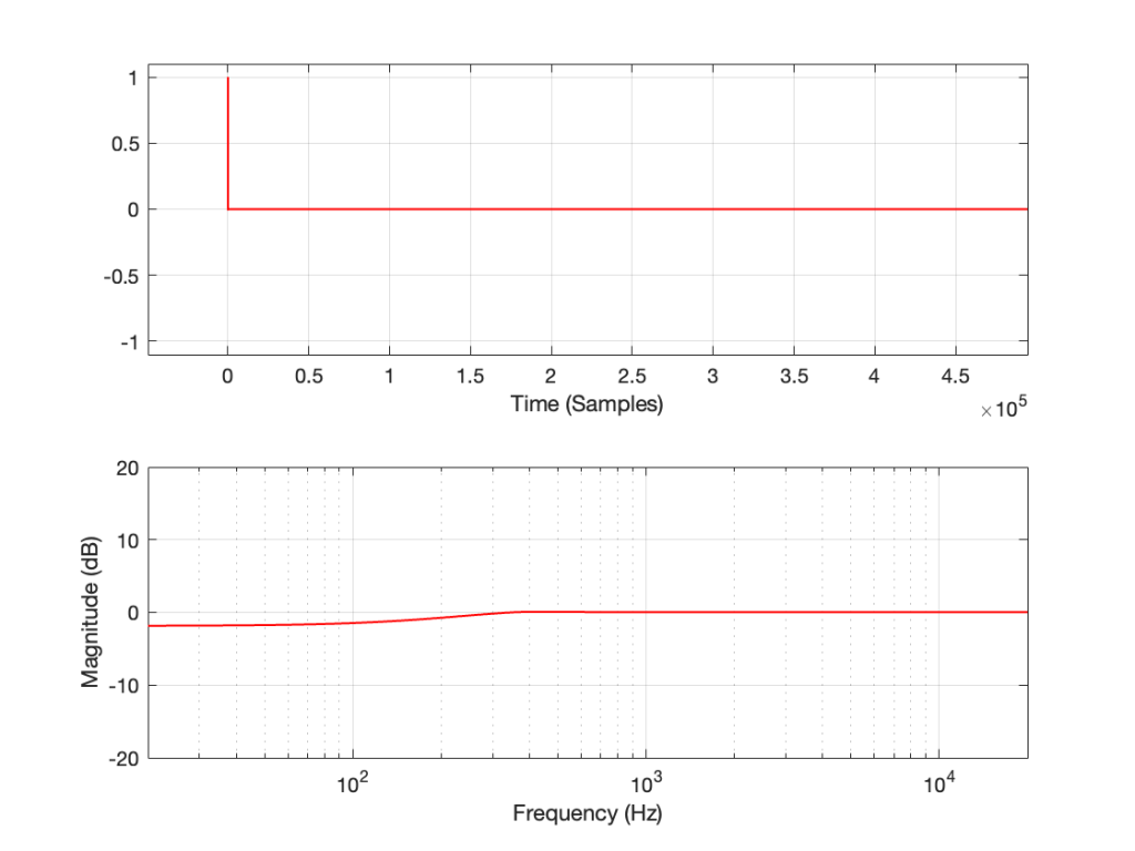
The standard way to do this is to use an impulse response measurement. This is a method that relies on the fact that an infinitely short, infinitely loud click contains all frequencies at equal magnitude. (Of course, in the real world, it cannot be infinitely short, and if it were infinitely loud, you would have a Big Bang on your hands… literally…)
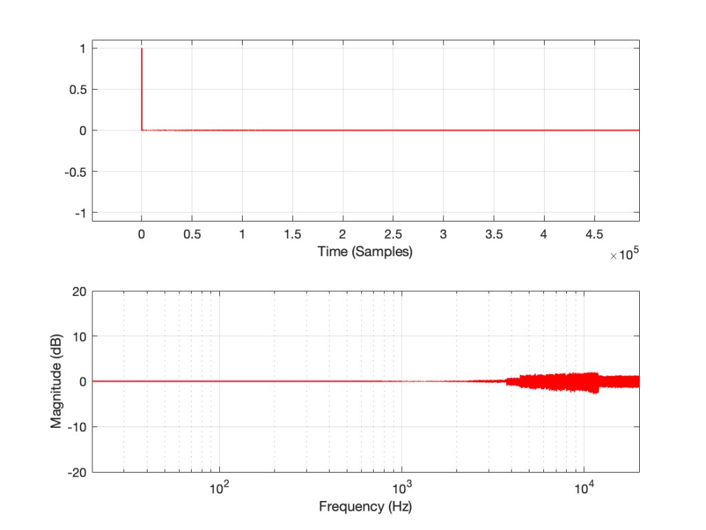
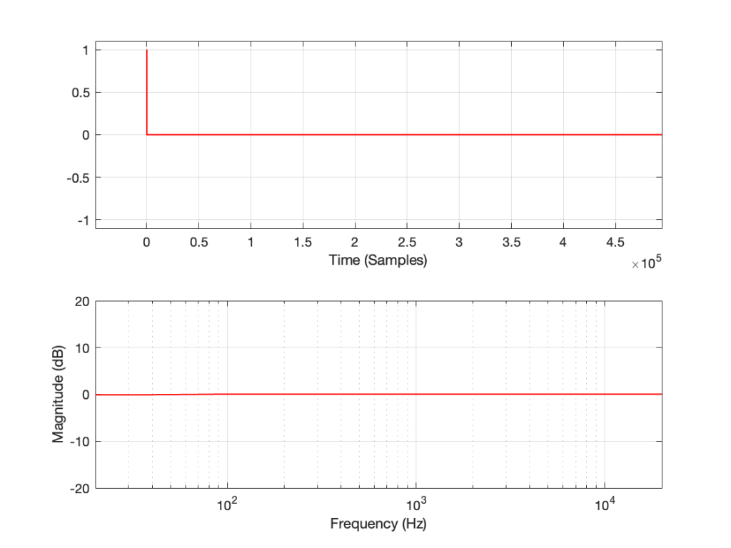
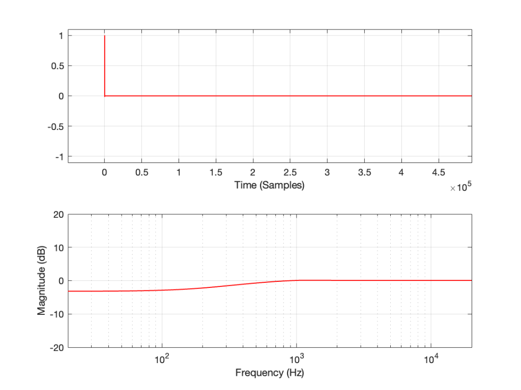
If we measure the DUT with a single-sample impulse with a value of 1, and use an FFT to convert the impulse response to a frequency-domain magnitude response and we see this:

… then we might conclude that the DUT is as perfect as it can be, within the parameters of a digital audio system. The click comes out just like it went in, therefore the output is identical to the input.
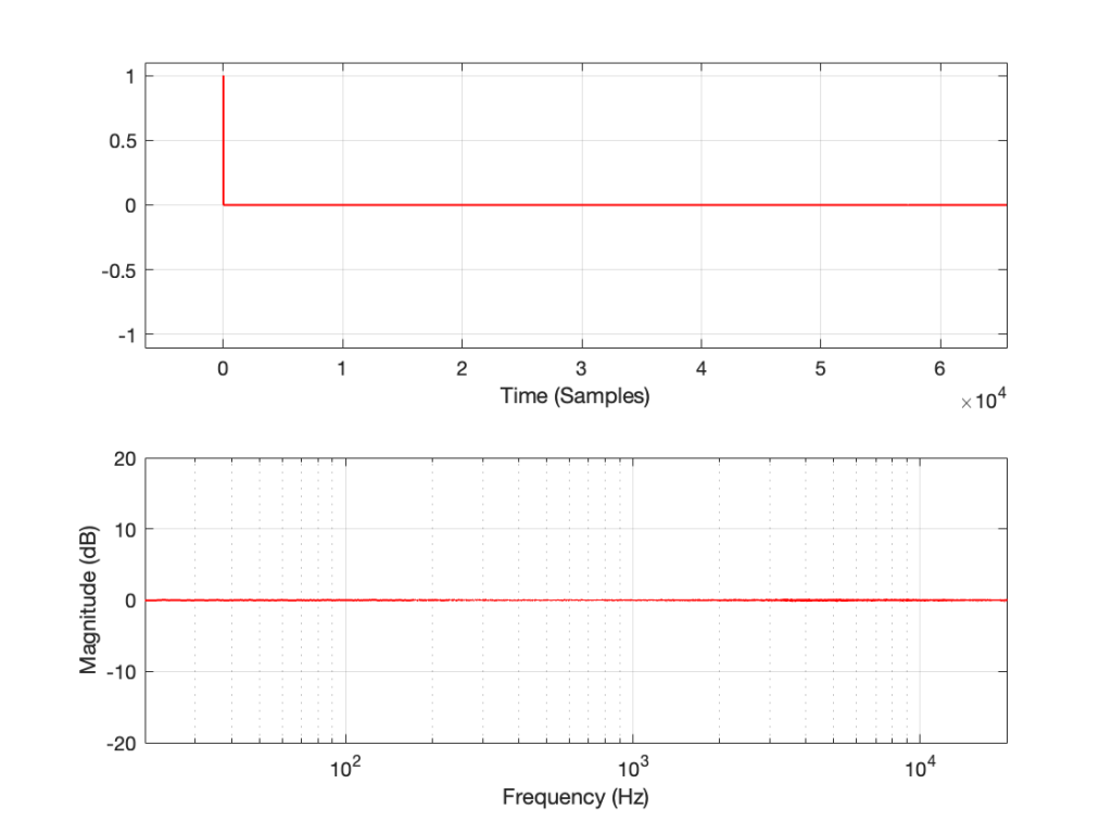
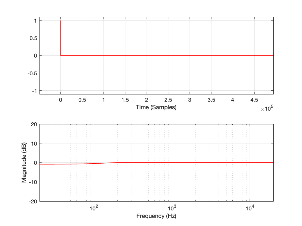
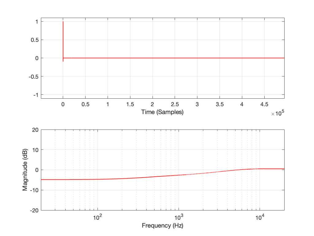
If we measure a different DUT (we’ll call it DUT #2) and we see this:

… then we might conclude that DUT #2 is also perfect. It’s just an attenuator that drops the level by half (or -6.02 dB).
However, we’d be wrong.
I made both of those DUTs myself, and I can tell you that one of those two conclusions is definitely incorrect – but it illustrates the point I’m heading towards.
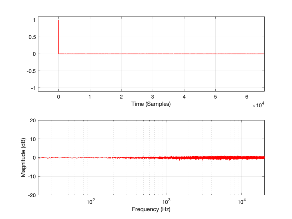
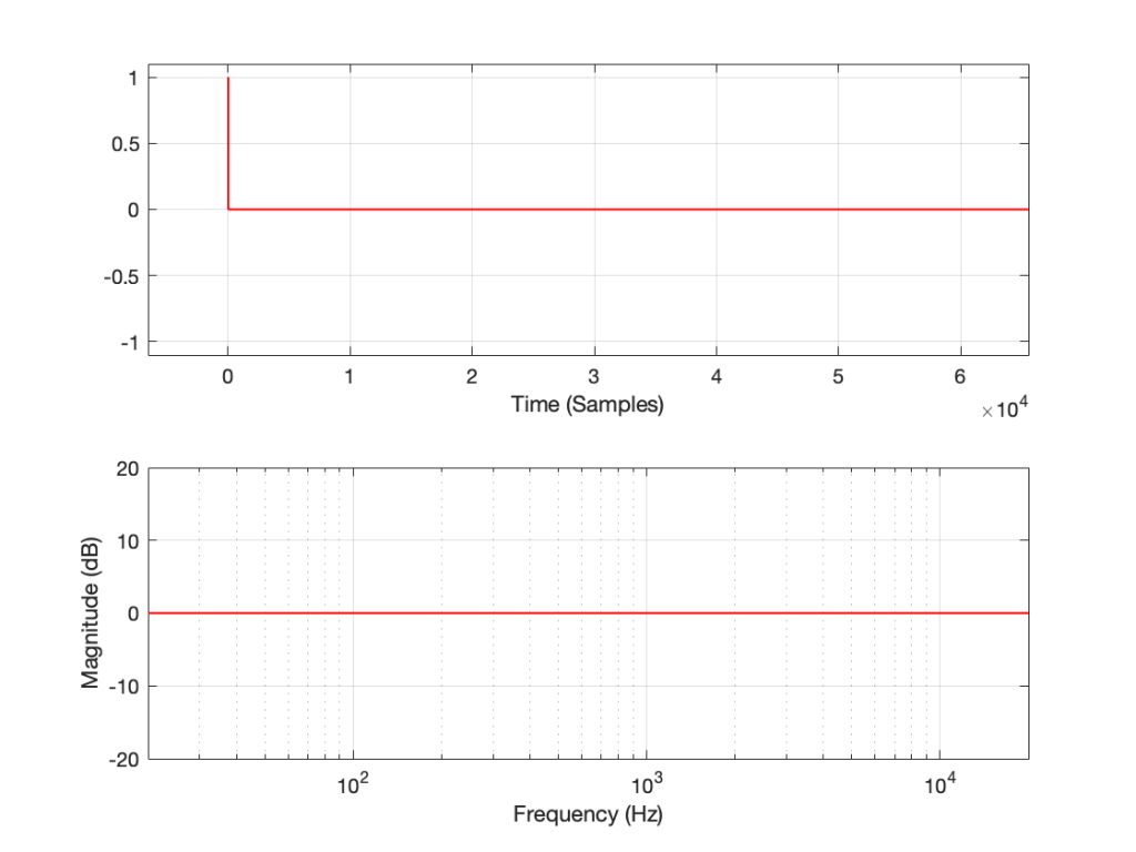
If I take DUT #1 and send in a sine tone at about 1 kHz and look at the output, I’ll see this:

As you can see there, the output is a sine wave. It looks like one on the top plot, and the bottom plot tells me that there ONLY signal at 1 kHz, which proves it.
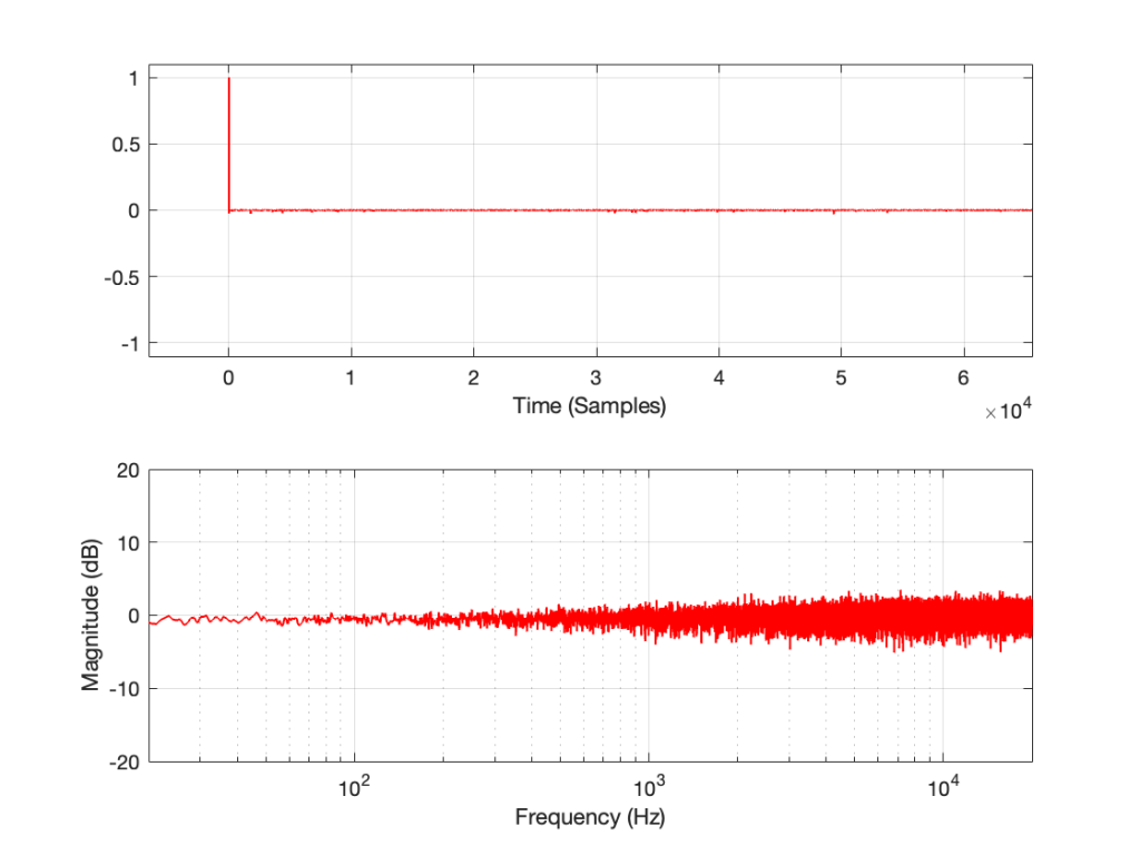
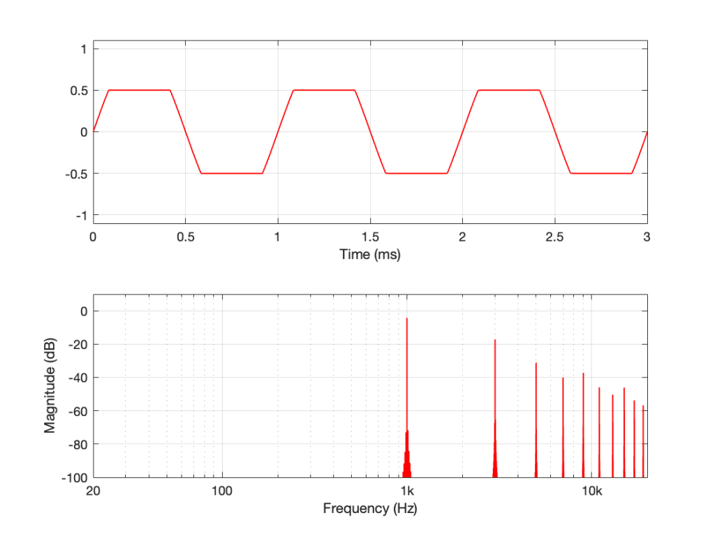
If I send the same sine tone through DUT #2 and look at the output, I’ll see this:
As you can see there, DUT #2 clips the input signal so that it cannot exceed ±0.5. This turns the sine wave into the beginnings of a square wave, and generates lots of harmonics that can be seen in the lower half of the plot.
The point is something that is well-known by people who make audio measurements, but is too easily forgotten:
An Impulse Response measurement only shows you the linear behaviour of an audio device. If the system is non-linear, then your impulse response won’t help you. In a worst case, you’ll think that you measured the system, you’ll think that it’s behaving, and it’s not – because you need to do other measurements to find out more.
The question is “what is ‘non-linear’ behaviour in an audio device?”
This is anything that causes the device to make it impossible to know what the input was by looking at the output. Anything that distorts the signal because of clipping is a simple example (because you don’t know what happened in the input signal when the output is clipped). But other things are also non-linear. For example, dynamic processors like compressors, limiters, expanders and noise gates are all non-linear devices. Modulating delays (like in a chorus or phaser effect), or a transmission system with a drifting clock are other examples. So are psychoaoustic lossy codecs like MP3 and AAC because the signal that gets preserved by the codec changes in time with the signal’s content. Even a “loudness” function can be considered to have a kind of non-linear behaviour (since you get a different filter at different settings of the volume control).
It’s also important to keep in mind that any convolution-based processing is using the impulse response as the filter that is applied to the signal. So, if you have a convolution-based effects unit, it cannot simulate the distortion caused by vacuum tubes using ONLY convolution. This doesn’t mean that there isn’t something else in the processor that’s simulating the distortion. It just means that the distortion cannot be simulated by the convolver.*
The reason for the title: “One measurement is worse than no measurements” is that, when you do a measurement (like the impulse response measurement on DUT #2) you gain some certainty about how the device is behaving. In many cases, that single measurement can tell the truth, but only a portion of it – and the remainder of the (hidden) truth might be REALLY bad… So, your one measurement makes you THINK that you’re safe, but you’re really not… It’s not the measurement that’s bad. The problem is the certainty that results in having done it.
* Actually, one of the questions on my comprehensive exams for my Ph.D. was about compressors, with a specific sub-question asking me to explain why you can’t build a digital compressor based on convolution (which was a new-and-sexy way to do processing back then…). The simple answer is that you can’t use a linear time-invariant processor to do non-linear, time-variant processing. It would be like trying to carry water in a net: it’s simply the wrong tool for the job.