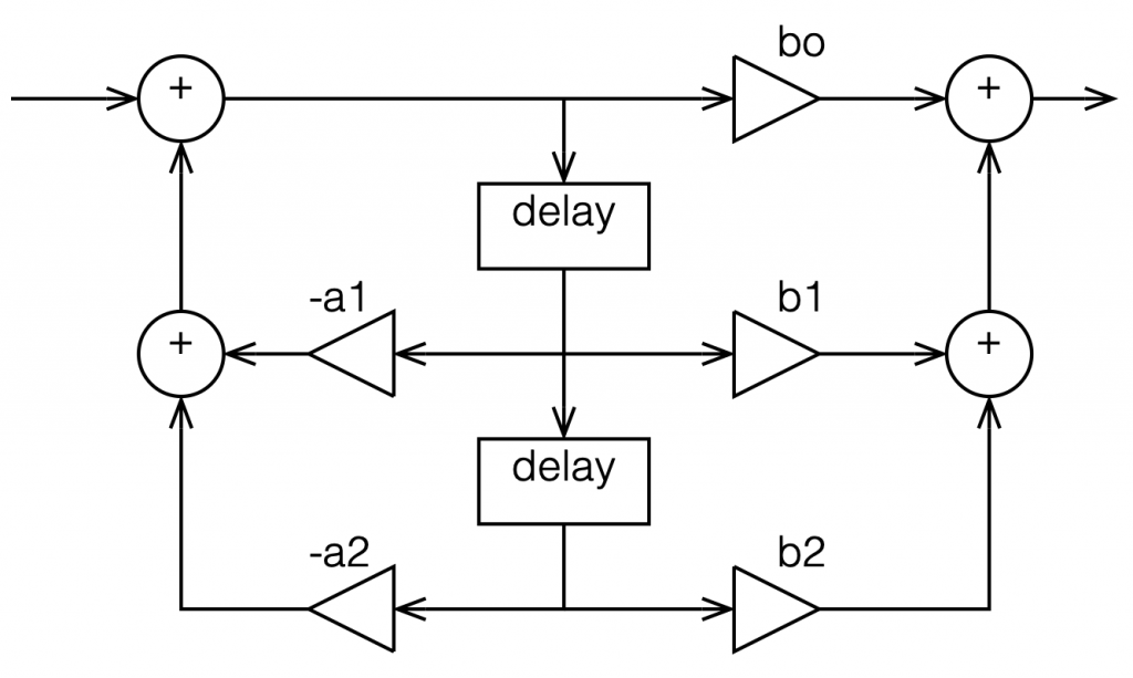
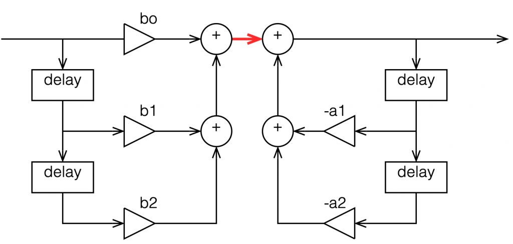
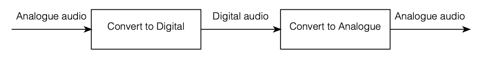
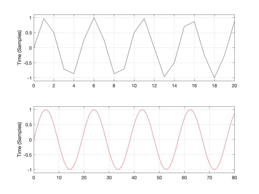
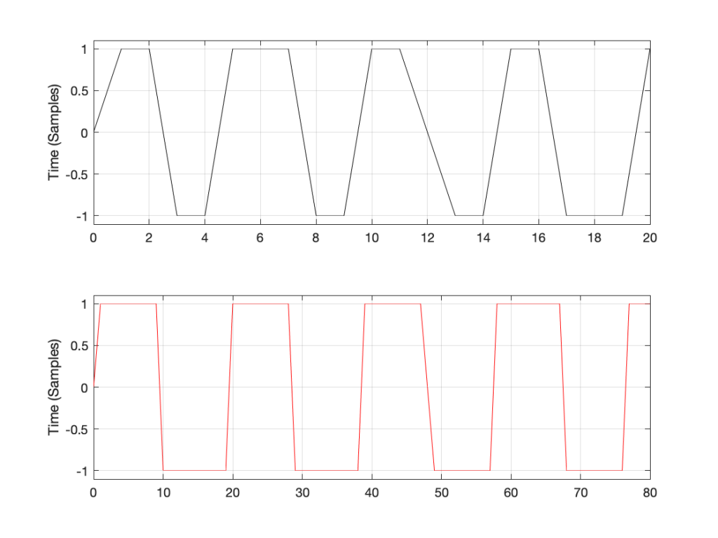
“High-Res” Audio: Part 11: How high can you go?

Part 1
Part 2
Part 3
Part 4
Part 5
Part 6
Part 7
Part 8a
Part 8b
Part 9
Part 10

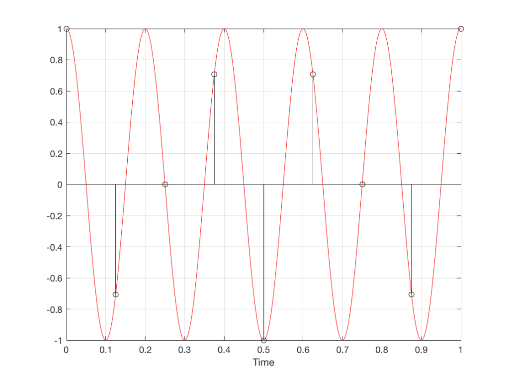
If you you get an audiometry test done, you’ll be shown into a small room, about the size of a public bathroom stall. Someone will put a pair of headphones on you, and pass you a small handle with a button. Your instructions are to press the button if you hear a tone. Then the audiometrist will leave the room, closing the door, and you’ll suddenly realise that if there’s any noise in this room, it’s because you’re making it.

Then you hear a beep in your left ear. You press the button. You hear a quieter beep. Press. Quieter beep. Press…. …. …. Beep, press… …. …. …. Beep, press…. New frequency beep, loud again. Press… and so on.

What’s happening here is that you’re presented with a sine tone at some frequency, probably loud enough for you to hear. You press. The tone gets quieter, and you press again. Eventually, the tone is so quiet that you cannot hear it (this is normal) so you don’t press. So, the tone gets louder, and you press. Then it gets quieter again, until you can’t hear it again.

By crossing over that threshold of “can hear” and “can’t hear” a couple of times, the audiometrist finds out whether or not you got lucky… If you bottom out at the same level a couple of times in a row, then that’s your threshold of hearing at that frequency in that ear.

The frequency changes (usually by 1 octave, but sometimes less), and the whole process is repeated.

If you get a full test done, then this is probably done at 9 frequencies (250, 500, 1k, 1.5k, 2k, 3k, 4k, 6k, and 8kHz) in both ears individually – 18 tests in all.

You’ll then be given a sheet of paper, or at least shown a plot of your hearing threshold. Typically, if you have “normal” hearing (whatever that means) your thresholds will all be sitting on a horizontal line marked 0 dB. If you’re “better than normal” then you get a negative score, if you’re “worse than normal” you get a positive score.

What does this mean?

Let’s start over.

If a lot of people do this test, and we only test at 1 kHz, we’ll find out that, after the results are averaged, the group can hear the 1 kHz sine tone when the change in air pressure at the ear entrance is 20 µPa. We’re not going to talk about what this means other than to say that “sound is a change in air pressure over time, and that pressure is measured in pascals, abbreviated Pa”. Needless to say, 20 µPa is pretty quiet, since it’s the quietest sound a group of people can hear at 1 kHz when you take their average.

If you did that test at a much lower frequency, you would find out that people aren’t as good at hearing quiet sounds. In other words, at 100 Hz, the sine tone has to be louder than 20 µPa for people to hear it.

The same is true if you repeated the test at a much higher frequency – say, 10,000 Hz.

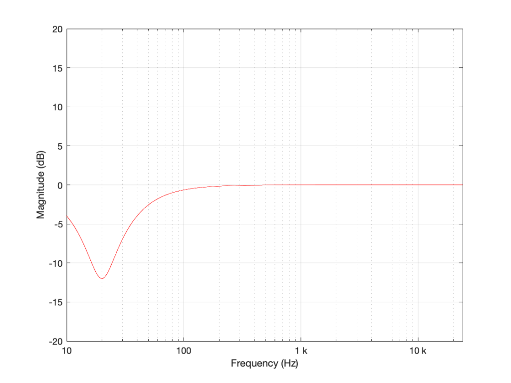
If you did this test at a lot of frequencies, then you’d find out that, on average, the threshold of hearing for a human follows the bottom red line of the plot in Figure 1, borrowed from Wikipedia.

Figure 1: The bottom red curve is the average threshold of hearing for a human being.

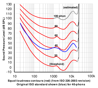
That bottom plot shows the threshold of hearing for different frequencies, plotted in dB SPL. Notice that, at 1 kHz, the line is at 0 dB SPL. This is because 0 dB SPL is defined to be the average threshold of hearing of a human at 1 kHz, which is 20 µPa. So, it’s not an accident…

Looking at that plot, you can see that, in order to hear a sine tone at 20 Hz, the tone has got to be more than 70 dB louder (that’s a LOT louder). So, a microphone “sees” a 73 dB SPL, 20 Hz sine tone as being louder than a 0 dB SPL, 1 kHz sine tone – but as far as you’re concerned, they’re both “the quietest sound you can hear” – therefore, they’re the same level.

If we take that threshold of hearing curve, and we play tones at those levels for those frequencies, then you should “just be able to” hear them. So, we’ll call those levels “0 dB” – since it’s the same as what is expected of you.

In other words, the piece of paper you got from the audiometrist tells you how much above or below that red threshold of hearing YOU sit.

Now, let’s back up a bit.

  1. I said that, in your test, you only went up to 8 kHz. This is because, above that (and possibly even before that) the headphones might not be trust-worthy, and even a tiny movement (say a couple of millimetres) in the position of the headphones will have a (relatively) big effect on the level at your eardrum. So, rather than get people worried about losing their hearing at 20,000 Hz (when, in fact, they were actually just wearing the headphones 1 mm too far forward), you won’t get tested.
  2. Notice how variable that threshold of hearing line is. There are big changes in level over the “audible” frequency range.
  3. Remember that the threshold of hearing curve is an AVERAGE of a lot of people. Just like no one has 2.6 children, no one has this exact response. And, if you are some freak of nature and you DO have exactly that response, you don’t for long… we all get old…
  4. Notice how that threshold of hearing curve only goes up to about 16 kHz, and above that it says “estimated”. See point #1.

Now, you should know that your ability to hear a sine tone at some frequency is defined as how your ability compares to an expectation based on an average, within a relatively small frequency band: 250 to 8 kHz.

Then you look at a textbook or you read a website that says “humans can hear from 20 Hz to 20 kHz”, which is not enough information to be either true or false… It’s like saying “humans are usually between 0 and 10 m tall” which is also sort of true, but also adequately vague to be potentially worse-than-useless information.

The truth is, unfortunately, much more complicated… However, it’s fair to say that, in order for you to just hear a sine tone at 20 kHz, it would have to be much, much louder than one at 1 kHz. In fact, if I played a 20 kHz sine tone loud enough for you to hear, measured that level, and then played a 1 kHz sine tone for you at the same level, you’d probably punch me – after you had passed out due to the pain, woken up, hunted me down, and found me… (I’d already have run away by then….)

So what?

We humans like nice, tidy, answers. “It will rain tomorrow” is preferable to “there is a 70 – 80% chance of scattered showers in the afternoon tomorrow”. We even get mad when the information is correct, but we interpret it tidily… For example, we’ll complain about getting rained on in the middle of our hike, when there was only a 10% chance of rain. On the other hand, if there was a 10% chance of winning 1 Million dollars in the lottery, we’d all buy a ticket.

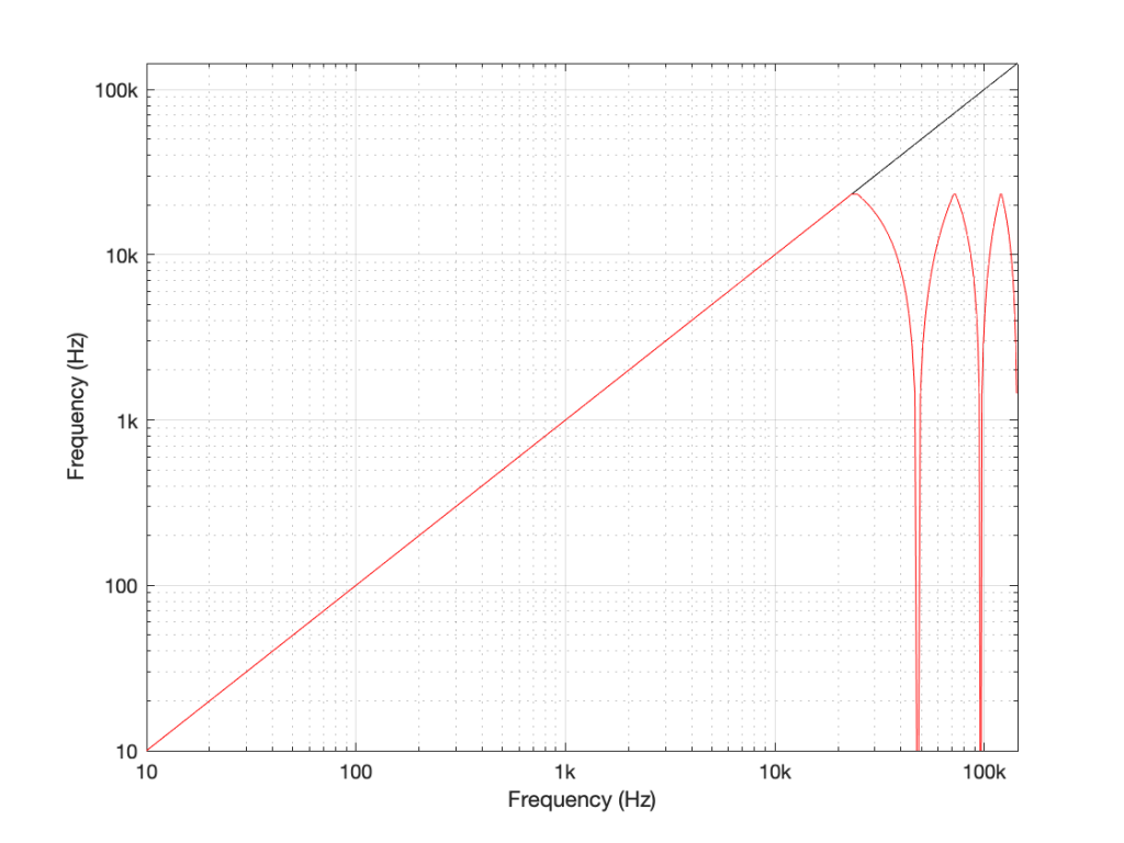
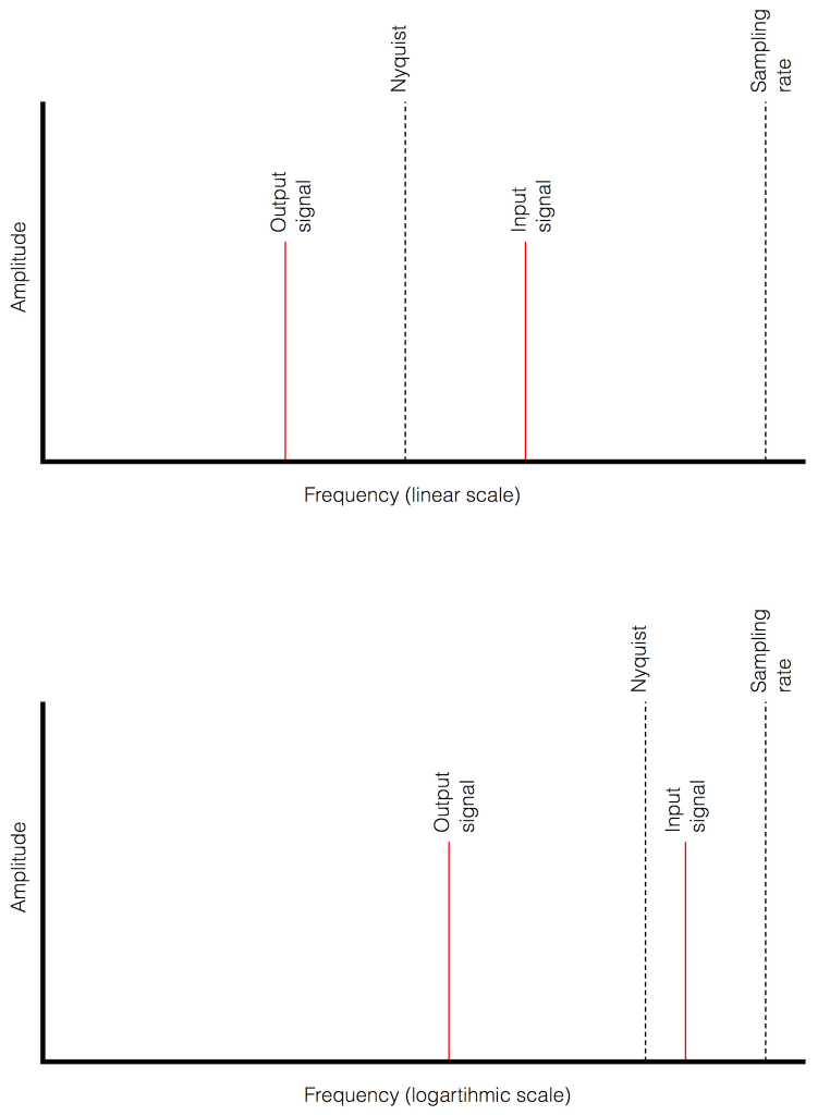
Anyways, once-upon-a-time, when the committee for inventing the compact disc was holding meetings, they said “what should the sampling rate be?” and someone said “at least 40 kHz, because we can hear up to 20 kHz”. (The reason it’s 44100 is related to the fact that the bits were stored as black and white stripes on video tape, and NTSC and PAL come close to meeting each other close to that number, when you look at the numbers of lines per field and frames per second.)

Of course, like any first-generation thing, digital recording equipment wasn’t very good at the start (back around 1980 or so) – so the first DDD recordings that were released on CD sounded… well…. weird. There was quantisation distortion because they hadn’t figured out dither yet, only 12 or 13 of the bit values were working properly on the ADC’s, the anti-aliasing filters were implemented as analogue circuits, so they let some stuff through that aliased, and they rang (“sang along”) with the signal at a high frequency… All of that added up to “weird” – possibly even “bad”. Then, people who had good equipment (high-end turntables or, even better, 1/4″ tape running at 30 ips) listened to this new format, decided it was bad, and that was that.

Some of them asked “why is is bad?” and one answer they came up with was the band limiting… If the system can’t capture or store or play materials above 20 kHz, then it’s useless… Right? Maybe…

Then, instruments were put in front of measurement microphones and spectra were measured – and the proof was in. Trumpets with harmon (wah-wah) mutes, when pointing directly at the microphone, contain harmonics as high as 50 kHz! This must explain why CDs sound bad! Right? Maybe…

Then Rupert Neve did a demo at an AES (Audio Engineering Society) convention where he played people two tones. Both were at 7 kHz, but one was a sine wave and the other was a square wave (at some level). The question was: have a listen and tell me which is which. The results were the same as if everyone was just guessing. (Remember that, in order to make a square wave, you need to add odd harmonics – so the lowest-frequency content difference between a 7 kHz sine wave and a 7 kHz square wave is at 21 kHz.) Proof that we don’t need to go above 20 kHz, right? Maybe…

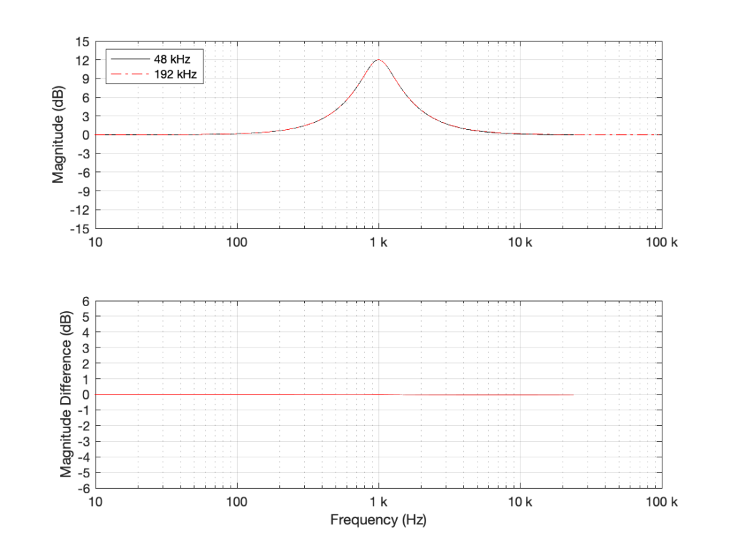
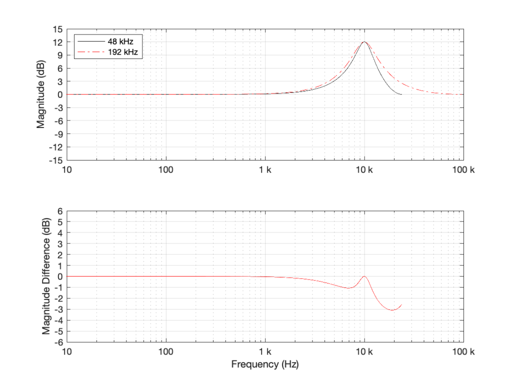
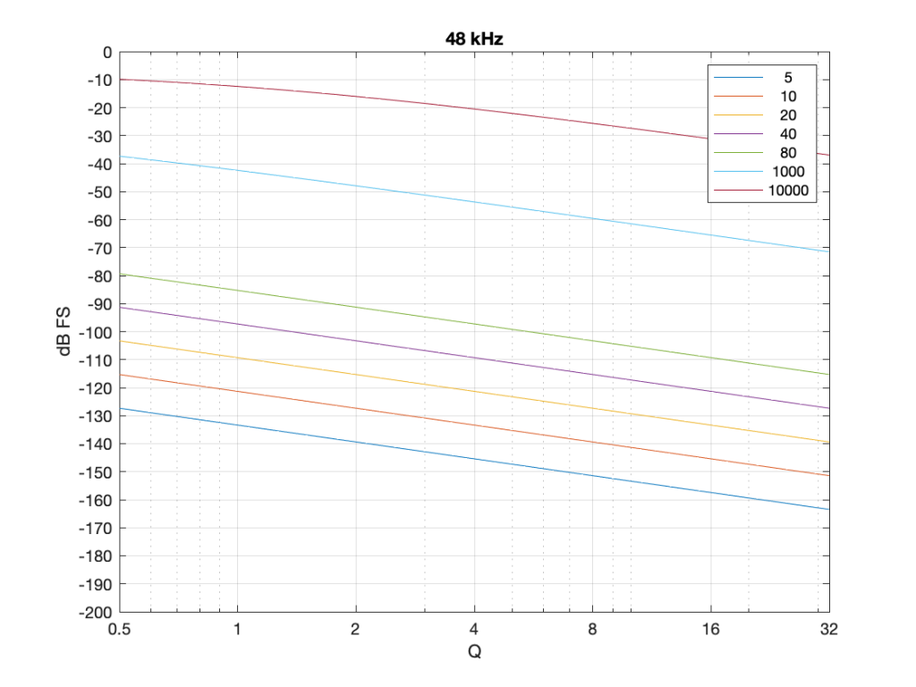
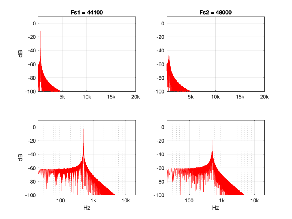
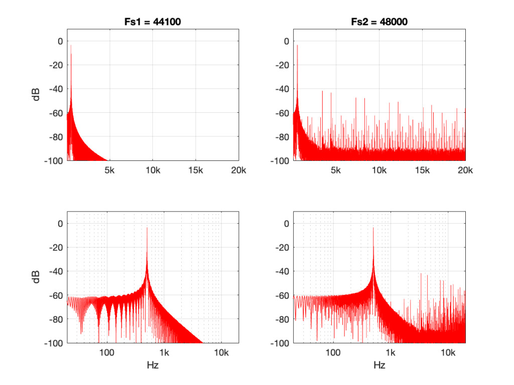
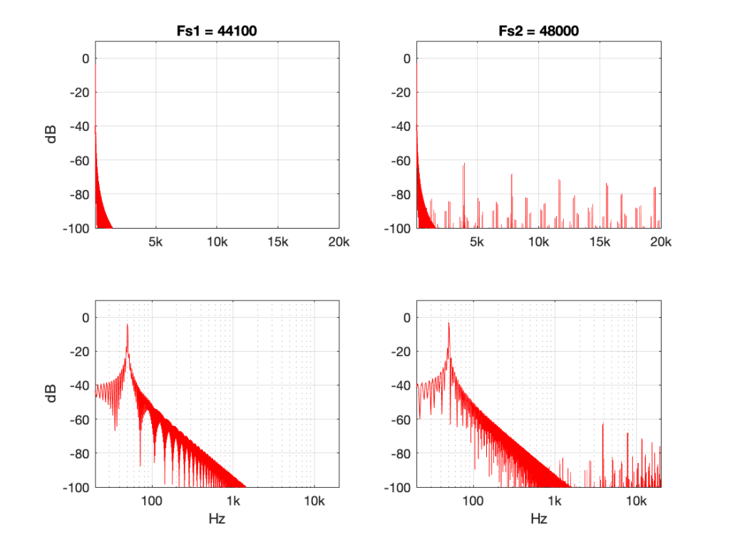
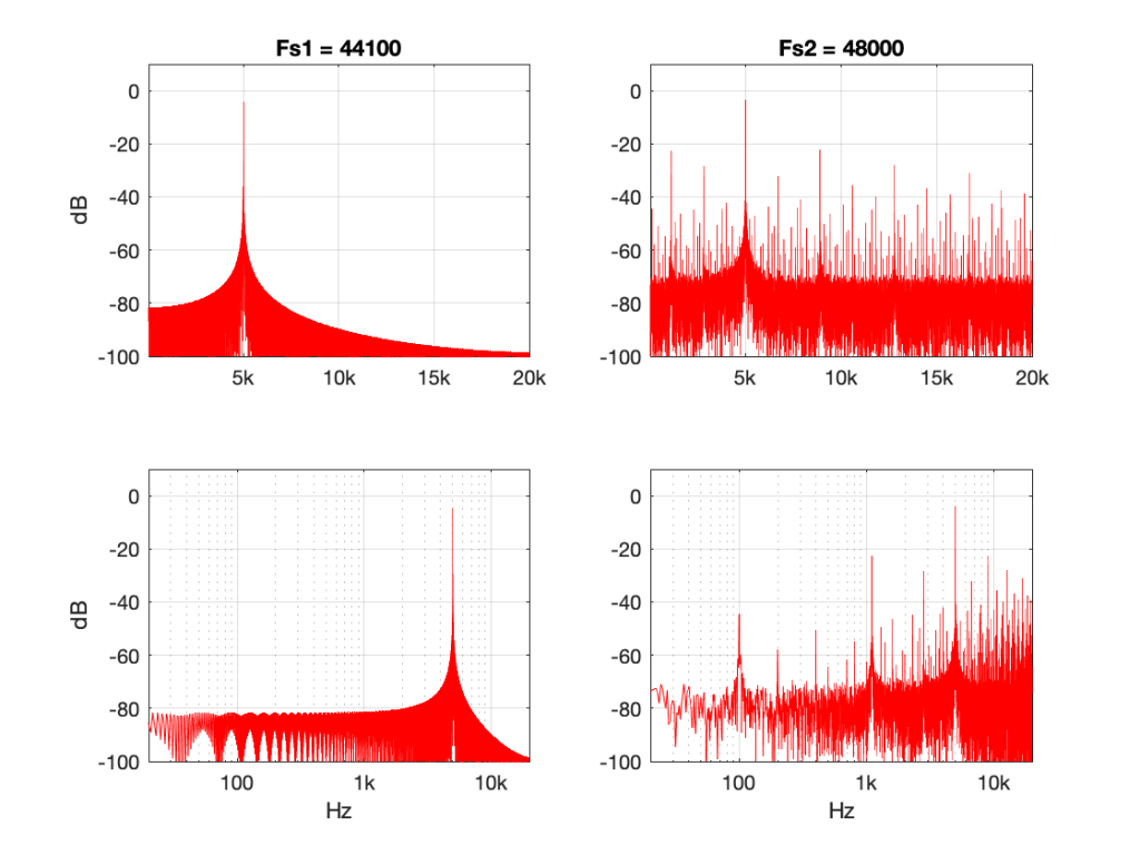
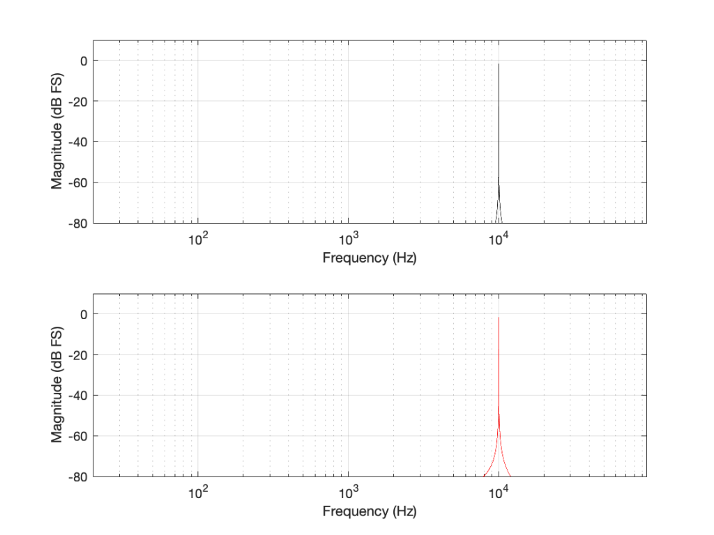
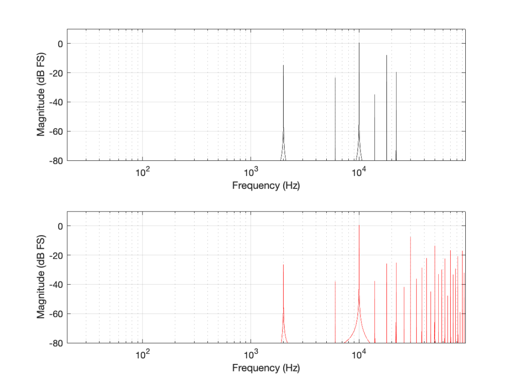
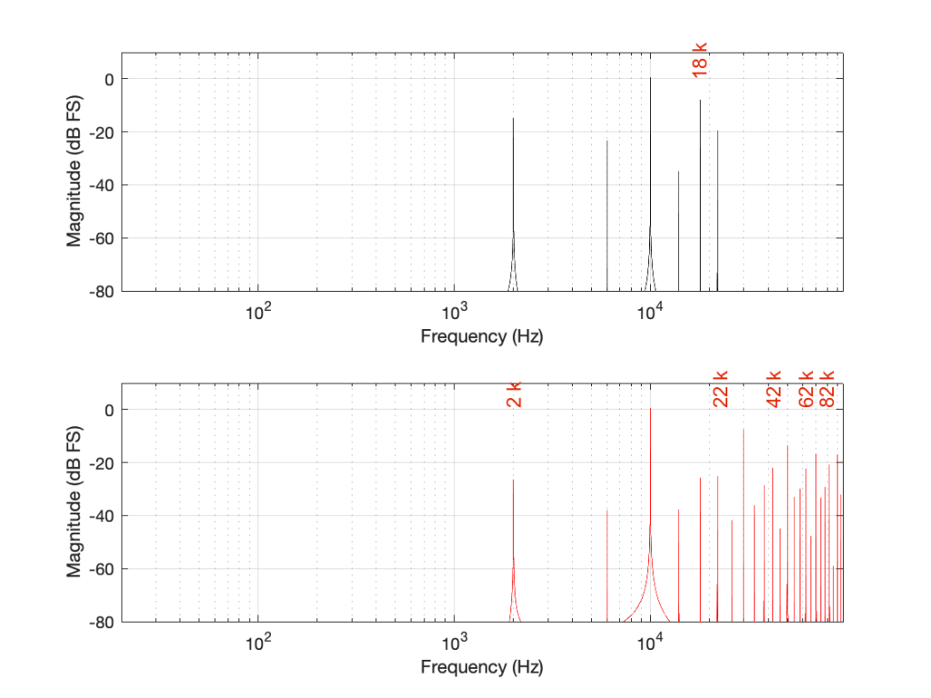
Some years ago, I took some “high resolution” audio files and measured their spectral content. One particularly interesting result is shown in Figures 2, below.

Figure 2: The spectral content of a 96/24 “high resolution” audio file I bought.

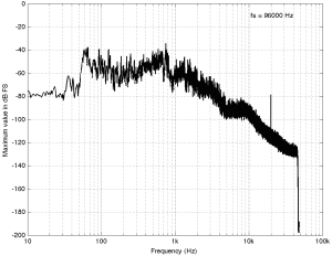
Look at that spike in the top end – around 20 kHz. What musical instrument makes that sound? The answer is “no musical instrument makes that sound – at least none of the baroque instruments in that recording make that sound. As I wrote back in 2014:

 If you’re wondering what it might be, I asked a bunch of smart friends, and the best explanation we can come up with is that it’s noise from a switched-mode power supply that is somehow bleeding into the recording. HOW it’s bleeding into the recording is a potentially interesting question for recording engineers. One possibility is that one of the musicians was charging up a phone in the room where the microphones were – and the mic’s just picked up the noise. Another possibility is that the power supply noise is bleeding electrically into the recording chain – maybe it’s a computer power supply or the sound card and the manufacturer hasn’t thought about isolating this high frequency noise from the audio path. Or, maybe it’s something else.

Interestingly, this is a conflict of two engineers. The designer of the power supply (assuming that’s what it is…) said “I’ll put the switching frequency above 20 kHz so that no one will hear it” and the recording engineer said “I’ll record this at 96 kHz so that people can get the content they’re missing…” The problem is that the content you’re missing is something you don’t want…

Similarly, if you listen to Eric Clapton’s “Unplugged” album with headphones or loudspeakers that have a low-enough low-frequency range, you’ll hear a loud thump, thump, thump going along with the music. This is the sound of someone tapping their foot on a temporary stage floor, shaking a vocal microphone. In my not-very-humble opinion, that should never have made it out to the public release. However, my guess is that the speakers it was mastered on didn’t go low enough… (OR, it was an artistic decision, and I would have done it differently.) Assuming that I’m right, then this is a second example where a “better” system sounds “worse”.

Of course, through all of this, I have assumed that your loudspeakers or headphones can produce the signals that we’re talking about in the direction that you’re sitting in, and that those signals are not being masked by other sounds in the room (like phone chargers singing…) However, to complicate things with reality would just be too far to go today…

Conclusions?

I don’t have any, but I have some questions and (as usual) some opinions…

  • Does a harmon mute on a trumpet produce energy at 50 kHz, if you’re sitting right in front of it?
    Yes.
  • Do you want to sit right in front of a trumpet with a harmon mute?
    Debatable.
  • Can a high-res audio recording include the sound of a phone charger?
    Yes.
  • Do you want to have an expensive recording of a baroque ensemble with obligato phone charger?
    Probably not – the charger is not in Buxtehude’s original score as far as I can see.
  • Can you hear the difference between a 7 kHz sine and a 7 kHz square wave?
    Depends on the speaker / headphone, the listening position, the background noise level, and whether or not you were out clubbing last night. Heads or tails?
  • Will you feel better by knowing that your file contains “audio” content above 20 kHz? Probably.
    Placebos have been known to work bigger miracles than this. (But don’t forget the stuff I said about sampling rate converters earlier…)

“High-Res” Audio: Part 10: The myth of temporal resolution

Part 1
Part 2
Part 3
Part 4
Part 5
Part 6
Part 7
Part 8a
Part 8b
Part 9

If you read about high resolution audio – or you talk to some proponents of it, occasionally you’ll hear someone talk about “temporal resolution” or “micro details” or some such nonsense… This posting is just my attempt to convince the world that this belief is a load of horse manure – and that anyone using timing resolution as a reason to use higher sampling rates has no idea what they’re talking about.

Now that I’ve gotten that off my chest, let’s look at why these people could be so misguided in their belief systems…

Many people use the analogy of film to explain sampling. Even I do this – it’s how I introduced aliasing in Part 3 of this series. This is a nice analogy because it uses a known concept (converting movement into a series of still “samples”, frame by frame) to explain a new one. It also has some of the same artefacts, like aliasing, so it’s good for this as well.

The problem is that this is just an analogy – digital audio conversion is NOT the same as film. This is because of the details when you zoom in on a time scale.

Film runs at 24 frames per second (let’s say that’s true, because it’s true enough). This means that the time between on frame of film being shot and the next frame being shot is 1/24th of a second. However, the shutter speed – the time the shutter is open to make each individual photograph is less than 1/24th of a second – possibly much less. Let’s say, for the purposes of this discussion, that it’s 1/100th of a second. This means that, at the start of the frame, the shutter opens, then closes 1/100th of a second later. Then, for about 317/10,000ths of a second, the shutter is closed (1/24 – 1/100 ≈ 317/10,000). Then the process starts again.

In film, if something happened while that shutter was closed for those 317 ten-thousandths of a second, whatever it was that happened will never be recorded. As far as the film is concerned, it never happened.

This is not the way that digital audio works. Remember that, in order to convert an analogue signal into a digital representation, you have to band-limit it first. This ensures (at least in theory…) that there is no signal above the Nyquist frequency that will be encoded as an alias (a different frequency) in the digital domain.

When that low-pass filtering happens, it has an effect in the time domain (it must – otherwise it wouldn’t have an effect in the frequency domain). Let’s look at an example of this…

Let’s say that you have an analogue signal that consists of silence and one almost-infinitely short click that is converted to LPCM digital audio. Remember that this click goes through the anti-aliasing low-pass filter, and then gets sampled at some time. Let’s also say that, by some miracle of universal alignment of planets and stars, that click happened at exactly the same time as the sample was measured (we’ll pretend that this is a big deal and I won’t suggest otherwise for the rest of this posting). The result could look like Figure 1.

Figure 1: A click in the analogue domain (red) sampled and encoded as a digital signal (black circles). The analogue output of the digital system will be the black line

If I zoom in on Figure 1 vertically, it looks like the plot in Figure 2.

Figure 2: A vertical zoom of Figure 1.

There are at least three things to notice in these plots.

  • Since the click happened at the same time as a sample, that sample value is high.
  • Since the click happened at the same time as a sample, all other sample values are 0.
  • Once the digital signal is converted back to analogue later (shown as the black line) the maximum point in the signal will happen at exactly the same time as the click

I won’t talk about the fact that the maximum sample value is lower than the original click yet… we’ll deal with that later.

Now, what would happen if the click did not occur at the same time as the sample time? For example, what if the click happened at exactly the half-way point between two samples? This result is shown in Figure 3.

Figure 3: The click happened half-way in time between two samples.

Notice now that almost all samples have some non-zero value, and notice that the two middle samples (8 and 9) are equal. This means that when the signal is converted to analogue (as is shown with the black line) the time of maximum output is half-way between those two samples – at exactly the same time that the click happened.

Let’s try some more:

Figure 4: The click happened sometime between two samples
Figure 5: The click happened some other time between two samples.

I could keep doing this all night, but there’s no point. The message here is, no matter when in time the click happened, the maximum output of the digital signal, after it’s been converted back to analogue, happens at exactly the same time.

But, you ask, what about all that “temporal smearing” – the once-pristine click has been reduced to a long wave that extends in time – both forwards and backwards? Waitaminute… how can the output of the system start a wave before something happened?

Okay, okay…. calm down.

Firstly, I’ve made this example using only one type of anti-aliasing filter, and only one type of reconstruction filter. The waveforms I’ve shown here are valid examples – but so are other examples… This depends on the details of the filters you use. In this case, I’m using “linear phase” filters which are symmetrical in time. I could have used a different kind of filter that would have looked different – but the maximum point of energy would have occurred at the same time as the click. Because of this temporal symmetry, the output appears to be starting to ring before the input – but that’s only because of the way I plotted it. In reality, there is a constant delay that I have removed before doing the plotting. It’s just a filter, not a time machine.

Secondly, the black line is exactly the same signal you would get if you stayed in the analogue domain and just filtered the click using the two filters I just mentioned (because, in this discussion, I’m not including quantisation error or dither – they have already been discussed as a separate topic…) so the fact that the signal was turned into “digital” in between was irrelevant.

Thirdly, you may still be wondering why the level of the black line is so low compared to the red line. This is because the energy is distributed in time – so, in fact, if you were to listen to these two clicks, they’d sound like they’re the same level. Another way to say it is that the black line shows exactly the same as if the red curve was band-limited. The only thing missing is the upper part of the frequency band. (You may notice that I have not said anything about the actual sampling rate in any of this posting, because it doesn’t matter – the overall effect in the time domain is the same.)

Fourthly, hopefully you are able to see now that an auditory event that happens between two samples is not thrown away in the conversion to digital. Its timing information is preserved – only its frequency is band-limited. If you still don’t believe me, go listen to a digital recording (which is almost all recordings today) of a moving source – anything moving more than 7 mm will do*. If you can hear clicks in the sound as the source moves, then I’m wrong, and the arrival time of the sound is quantising to the closest sample. However, you won’t hear clicks (at least not because the source is moving), so I’m not wrong. Similarly, if digital audio quantised audio events to the nearest sample, an interpolated delay wouldn’t work – and since lots of people use “flanger” and “phaser” effects on their guitar solos with their weekend garage band, then I’m still right…

The conclusion

Hopefully, from now on, if you are having an argument about high resolution audio, and the person you’re arguing with says “but what about the timing information!? It’s lost at 44.1 kHz!” The correct response is to state (as calmly as possible) “BullS#!T!!”

Rant over.


* I said “7 mm” because I’m assuming a sampling rate of 48 kHz, and a speed of sound of 344 m/s. This means that the propagation distance in air is 344/48000 = 0.0071666 m per sample. In other words, if you’re running a 48 kHz signal out of a loudspeaker, the amplitude caused by a sample is 7 mm away when the next sample comes out.

Thought another way, if you have a stereo system, and your left loudspeaker is 7 mm further away from you than your right loudspeaker, at 48 kHz, you can delay the right loudspeaker by 1 sample to re-align the times of arrival of the two signals at the listening position.

On to Part 11

“High-Res” Audio: Part 9: Filters at high frequencies

Part 1
Part 2
Part 3
Part 4
Part 5
Part 6
Part 7
Part 8a
Part 8b

We’ve already seen that nothing can exist in the audio signal above the Nyquist frequency – one half of the sampling rate. But that’s the audio signal, what happens to filters? Basically, it’s the same – the filter can’t modify anything above the Nyquist frequency. However, the problem is that the filter doesn’t behave well to everything up to the Nyquist and then stop, it starts misbehaving long before that…

Let’s make a simple filter: a peaking filter where Fc=1 kHz, Gain = 12 dB, and Q=1. The magnitude response of that filter is shown in Figure 1.

Figure 1: Magnitude response of a filter with Fc=1 kHz, Gain = 12 dB, and Q=1

What happens if we implement this filter with a sampling rate of 48 kHz and 192 kHz, and then look at the difference between the two? This is shown in Figure 2.

Figure 2: TOP: The black curve shows the same filter from Figure 1, implemented using a biquad running at 48 kHz. The red dotted line shows the same filter, implemented using a biquad running at 192 kHz. BOTTOM: the difference between the two up to the Nyquist frequency of the 48 kHz system. (there’s almost no difference)

As you can see in Figure 2, the filter, centred at 1 kHz, is almost identical when running at 48 kHz and 192 kHz. So far so good. Now, let’s move Fc up to 10 kHz, as shown in Figure 3.

Figure 3: TOP: The black curve shows the magnitude response of a filter with Fc=10 kHz, Gain = 12 dB, and Q=1, implemented using a biquad running at 48 kHz. The red dotted line shows the same filter, implemented using a biquad running at 192 kHz. BOTTOM: the difference between the two up to the Nyquist frequency of the 48 kHz system.

Take a look at the black plot on the top of Figure 3. As you can see there, the 48 kHz filter has a gain of 0 dB at 24 kHz – the Nyquist frequency. Looking at the red dotted line, we can see that the actual magnitude of the filter should have been more than +3 dB. Also, looking at the red line in the bottom plot, which shows the difference between the two curves, the 48 kHz filter starts deviating from the expected magnitude down around 1 kHz already.

So, if you want to implement a filter that behaves as you expect in the high frequency region, you’ll get better results easier with a higher sampling rate.

However, do not jump to the conclusion that this also means that you can’t implement a boost in high frequencies. For example, take a look at Figure 4, which shows a high shelving filter where Fc = 1 kHz, Gain = 12 dB and Q = 0.707.

Figure 4: High shelving filter where Fc = 1 kHz, Gain = 12 dB and Q = 0.707.

As you can see in the bottom plot in Figure 4, the two filters in this case (one running at 48 kHz and the other at 192 kHz) have almost identical magnitude responses. (Actually, there is a small difference of about 0.013 dB…) However, if the Fc of the shelving filter moves to 10 kHz instead (keeping the other two parameters the same) then things do get different.

Figure 5: High shelving filter where Fc = 10 kHz, Gain = 12 dB and Q = 0.707.

As can be seen there, there is a little over a 1 dB difference in the two implementations of the same filter.

Some comments:

  • I’m not going to get into exactly why this happens. If you want to learn about it, look up “bilinear transform”. The short version of the issue is that these filters are designed to work in a system with an infinite sampling rate and bandwidth (a.k.a. analogue), but the band-limiting of an LPCM digital system makes things misbehave as you get near the Nyquist frequency.
  • This does not mean that you cannot design a filter to get the response you want up to the Nyquist frequency.
    If you look at the red dotted curve in Figure 3 and call that your “target”, it is possible to build a filter running at 48 kHz that achieves that magnitude response. It’s just a little more complicated that calculating the gain coefficients for the biquad and pretending as if you were normal. However, if you’re a DSP Engineer and your job is making digital filters (say, for correcting tweeter responses in a digitally active loudspeaker, for example) then dealing with this issue is exactly what you’re getting paid for – so you don’t whine about it being a little more complicated.
  • The side-effect of this, however, is that, if you’re a lazy DSP engineer who just copies-and-pastes your biquad coefficient equations from the Internet, and you just plug in the parameters you want, you aren’t necessarily going to get the response that you think. Unfortunately, this is not uncommon, so it’s not unusual to find products where the high-frequency filtering measures a little strangely, probably because someone in development either wasn’t meticulous or didn’t know about this issue in the first place.

On to Part 10

“High-Res” Audio: Part 8b: Filter Resolution

Part 1
Part 2
Part 3
Part 4
Part 5
Part 6
Part 7
Part 8a

In the previous posting, we left off with this drawing of a biquad filter:

Figure 1: A biquad broken into an FIR filter with two 1-sample long delays and 3 gains combined with an IIR filter with two delays and 2 gains.

This is not the normal way to draw the signal flow inside a biquad, since it has a little too much information. Normally you see something like this:

Figure 2: A Biquad shown in “Direct Form 1” implementation with the feed forwards coming first.

or this:

Figure 3: A simpler way to show the same thing

In the versions I show above, the feed-forward half of the biquad comes first, and its output feeds the start of the feedback portion. It is also possible to reverse these, putting the feedback portion first, like this:

Figure 4: A Biquad shown in “Direct Form 2” implementation with the feedback loops coming first.

In theory, these different implementations will all result in the same output if you match the gain values. However, in practice, they are not the same, and this difference is where we need to look for this part of the discussion on high res audio.

Let’s say I want to make a simple filter that reduces bass in a fairly narrow frequency band. I can use a biquad to do this. For example, if I want a peaking filter that reduces 20 Hz by 12 dB, with a Q of 1, then I get a magnitude response that looks like this:

Figure 5: The magnitude response of a peaking filter where F = 20 Hz, G = -12 dB, Q = 1

If I wanted to build this filter using a biquad in a system with a sampling rate of 48 kHz, it would have the following gain coefficients:

b0 = 0.998049357193933
b1 = -1.994783192754608
b2 = 0.996740671594426
a1 = -1.994783192754608
a2 = 0.994790028788359

We’ll also say that my biquad is implemented like the one shown in Figure 1, above… let’s take a look at that signal flow again:

Figure 6: A copy of Figure 1 with one interior point in the signal flow highlighted in red.

I’ve highlighted a point inside the biquad using a red arrow. Let’s talk about the signal right there, in the middle of the processing…

In the last post, we talked about how, when the signal frequency is very low, a single sample delay has almost the same value at its output as its input, because the phase difference is so small for such a small time. So, let’s start with the (incorrect) assumption that, for those two feed-forward delays at the beginning, their outputs ARE equal to their inputs (because we’re starting with a low frequency). What happens when the input has a value of 1? Then the value at the red arrow is just the sum of the feed forward gains (because I multiplied each of them by 1 and added them together…)

In the case of the filter I described above, this value will be 0.000006836, which is a very small number. Also, if the value coming into the input of the biquad is less than 1, the value at the red arrow will be even smaller! This means that, if you come into the biquad with a low-frequency tone with a level of 0 dB FS, the level at that red arrow will be about -103 dB FS, which is very quiet. The feed-back portion of the biquad, after the red arrow, then has a lot of gain in it to bring the signal level back up towards 0 dB FS again.

So, the issue that we have here is that the FF (Feed Forward) portion of the biquad drops the level A LOT. And the FB portion increases the level A LOT, just to do something like a little 12 dB dip at 20 Hz.

The magnitude of the gains downwards and upwards in those two portions of the biquad are dependent on the parameters of the filter that we’re trying to make, however, we can generalise a little and say that:

  • the lower the frequency
    OR
  • the higher the Q,
  • then the bigger the gain down and up.

In other words, if you have a really low frequency dip, with a really high Q, then the level of the signal at that red arrow will be really low. REALLY low.

How low can you go?

How low is “REALLY low”? let’s see:

Figure 7: The level of a 0 dB FS signal at various frequencies listed in the top right corner, measured inside the biquad shown in Figure 6 at the red arrow, for a peaking filter with a gain of -12 dB, and with variable Q and Fc, in a system running at 48 kHz.

Take a look at Figure 7, which shows some values for one example filter (peaking, Gain = -12 dB, variable Q and Fc, and the test frequency = Fc). Notice that when the Fc is 10 kHz, even at earn Q=32, the signal level at the middle of the biquad is about -38 dB FS or so. However, when the Fc is 20 Hz, it’s -140 dB FS… This is very low.

Now let’s try again at a higher sampling rate: 192 kHz.

Figure 8: Identical parameters to that shown in Figure 7, but in a system running at 192 kHz.

Notice that when we do exactly the same thing running at 192 kHz, the signal levels inside the biquad get much lower. Now for a 20 Hz signal and a Q of 32, the level is around -163 dB FS – a drop of more than 20 dB for 4x the sampling rate.

Why does this happen? It’s because the filter doesn’t “know” that the signal is at 20 Hz. It only knows the relationship between the frequency and the sampling rate. So, in its little world, 20 Hz doesn’t exist. In a system running at 48 kHz, what exists is 20 / 48000 = 0.0004167. This is called the “normalised frequency” where the sampling rate is 1, DC is 0, and everything else is in between. (Note that some textbooks and software say that Nyquist = 1 instead of the sampling rate – but you just need to know what the convention is for the thing you’re reading…) This means that if the sampling rate goes up to 192 kHz, then the normalised frequency for 20 Hz is 20 / 192000 = 0.0001042 (1/4 of the value because the sampling rate was multiplied by 4).

So what?

This is important. If you want to make a low-frequency, high-Q peaking filter in a digital system with a cut of 12 dB, you are forcing the signal to a very low level inside your filter, and then bringing it back up to a normal level again on the way out. If your processing is running with a limited resolution, (e.g. 16-bits, for example) then the signal level can approach or even go below the resolution of your system inside the biquad. This means that, when the signal’s level is raised again on the way out, it’s full of quantisation distortion, and you can’t get rid of it… This is bad.

There are different ways to solve this problem.

  • Increase the resolution of your processing internally. For example, even though your input and output might only be running at 16-bits or 24-bits, maybe you need more resolution inside to make the results of the math better – or at least below the limitations of the input and output.
  • Change the way the biquad is implemented. For example, if you use the implementation shown in Figure 4 (with the feedback before the feed-forward) instead of the one we used, then you don’t drop the signal level and raise it again, you do the opposite. This avoids your quantisation error problem. However, depending on the system, it might overload and clip the signal inside the biquad instead, so then you just end up with a different kind of distortion instead.
  • Reduce your sampling rate to make it closer to your filter’s frequency. The problem I showed above is that the centre frequency of the filter is too far away from the sampling rate. If the sampling rate were lower, then this automatically makes the filter’s centre frequency “higher” in a normalised frequency scale, thus reducing the problem.
  • Other, even more clever solutions that I won’t talk about because they’re not as simple.

This means (for example) that if you’re building a subwoofer with digital filtering, and you know for sure that NOTHING will come out of it above, say 1 kHz (just to pick a random number that’s far enough away from the typical 120 Hz that people normally use…) then it would be dumb to do the filtering at 192 kHz. It’s smarter to run its internal sampling rate at 2 kHz (because we only need to go up to 1 kHz; and we’re not considering anything other issues or artefacts in this posting.)

P.S.

For this discussion, I used the specific example of a peaking filter with a gain of -12 dB, and I was varying the Q and the Fc. I was also measuring the level of the signal using a sine wave with a frequency that was the same as Fc in each case. However, the general lesson here about low frequency and high-Q filtering holds for other filter types and implementations as well.

On to Part 9.

“High-Res” Audio: Part 8a: Filter resolution (The Setup…)

Part 1
Part 2
Part 3
Part 4
Part 5
Part 6
Part 7

Almost every audio system has filters or equalisers in it for some reason or another. Originally, equalisers were named that because they were put in on long-distance telephone lines to make the balance of the frequency content more equal. Nowadays, we use equalisers to do things like add bass, or to add more bass.

In the “old days” audio filters were made by building circuits with resistors, capacitors, and inductors: if you choose the relationships between the values of these devices correctly, you can affect the magnitude response as you choose. The problem was production tolerances: if you take two resistors out of the package, and both are supposed to have the same resistance – they’ll be close, but they won’t be identical.

One of the great things about audio filters implemented in a digital system is that you don’t need to worry about variations as a result of production differences. Since digital filters are “just math”, you put the same equation in every device, and you get the same answer for the same input every time. (In the same way that, if I have two calculators on my desk, and I put “2 x 3″ into both of them, and press”=”, I’ll get the same answer on both devices.)

So, to start, let’s talk a little about how a digital filter works. Generally speaking, digital filters work by taking an audio signal, delaying it, changing the level, and adding the result back to the signal itself. Let’s take a simple example, shown in Figure 1.

Figure 1: Simple digital filter

Let’s say that, to start, we make the gain in that signal flow = 1, and set the delay to equal 1 sample. In this case:

  • At a very low frequency, the output of the delay has almost exactly the same value as its input (because 1 sample is a phase difference of almost 0º at a low frequency). When you add a signal to (nearly) itself, you get twice the output – a gain of 6 dB.
  • As the frequency of the input goes higher and higher, the delay (of 1 sample) is more and more significant, and therefore its output value gets more and more different from its input value.
  • When the input signal’s frequency is 1/2 of the sampling rate, then a delay of 1 sample is equal to a 90º phase shift. When you add a sine wave to itself with a “delay” (actually a “phase shift”) of 90º, the result is a magnitude that is 3 dB higher than the original.
  • When the input signal’s frequency is 1/3 of the sampling rate, then a delay of 1 sample is equal to a 120º phase shift. When you add a sine wave to itself with a “delay” (actually a “phase shift”) of 120º, there’s no change in the magnitude (the level).
  • When the frequency is 1/2 the sampling rate, then each consecutive sample is 180º out of phase with the previous one, so the sum of the delay and the signal results in complete cancellation, and you get no output at all.

An example of the magnitude response plot of this is shown below in Figure 2.

Figure 2: The magnitude response of the filter shown in Figure 1 when the delay is set to 1 sample, the gain is set to 1 and Fs=48 kHz.

If we reduce the gain to, say 0.5, then the effect of adding the delayed signal is reduced. The overall shape of the magnitude response is the same, it’s just less, as shown in Figure 3.

Figure 3: The magnitude response of the filter shown in Figure 1 when the delay is set to 1 sample, the gain is set to 0.5 and Fs=48 kHz.

Notice in Figure 3 that the boost in the low end is less, and the dip in the high end is also less than in Figure 2. So, by adjusting the gain on the delayed signal that’s added to the original signal, we can adjust how much this filter is affecting the signal.

What happens when we change the delay? If we make it 2 samples instead of 1, then the phase difference between the output and the input of the delay will be bigger for a given frequency. This also means that the delay will be equivalent to a 180º phase shift at 1/4 Fs (instead of 1/2). Also, at 1/2 Fs, the delay will be equivalent to a 360º phase shift, so the signal adds constructively, just like it does in the low frequencies. So, the resulting magnitude response will look like Figure 4.

Figure 4: The magnitude response of the filter shown in Figure 1 when the delay is set to 2 samples, the gain is set to 1 and Fs=48 kHz.

Again, if we reduce the gain, we reduce the effect of the filter, as can be seen in Figure 5.

Figure 5: The magnitude response of the filter shown in Figure 1 when the delay is set to 2 samples, the gain is set to 0.5 and Fs=48 kHz.

Now let’s make things a little more complicated. We can add another delay and another gain to get a little more control of things.

Figure 6: Getting a little more complicated

I’m not going to get very detailed about this – but if each of those delays is just one sample long, and we only play with the gains g1 and g2, we can start getting some nice control over the response of this filter. Below are some examples of the results we can get with just this filter, playing with the gains.

Figure 7: g1 = 0.5, g2 = 0.5
Figure 8: g1 = -0.5, g2 = 0.5
Figure 9: g1 = 0.75, g2 = -0.75
Figure 10: g1 = -1, g2 = -0.1

So, as you can see, all I need to do is to play with those two gains to get some nice control over the magnitude response.

Up to now, everything I’ve done is to add a delayed copy of the input to itself. This is what is known as a “feed-forward” design because (as you can see in Figures 1 and 6) I’m feeding the signal forwards in the flow to be added to itself. However, if there’s a “feed-forward”, it must be because we want to distinguish it from a “feed-back” design.

This is a filter where we delay the output (instead of the input) multiply that by a gain, and add it to the signal, as shown in Figure 11.

Figure 11: A simple digital filter using feedback.

This feedback means that, if the gain is not equal to zero, once a signal gets into the input, the output will last forever. This is why this kind of filter is called an infinite impulse response filter (or IIR filter): because if an impulse (a short spike) gets into it, there will be a signal at the output until the end of time (theoretically, at least…).

And, yes… the output of a filter without a feedback loop will eventually stop, which means it’s a finite impulse response filter (or FIR). Stop the input signal, wait for the last delay to send its signal through, and the output stops.

So what?

Most filters in most digital audio devices are built on a combination of these two types of designs. If you take Figure 6 and you combine it with an extended version of Figure 11 (with two delays instead of just one) you get Figure 12:

Figure 12: An FIR filter with two delays and 3 gains combined with an IIR filter with two delays and 2 gains.

This combination of FIR and IIR filters is a powerful little tool that forms the heart of almost every digital audio filter in the world. (yes, there are exceptions, but they’re definitely exceptions…). There are different ways to implement it (for example, you could put the IIR before the FIR, or you could re-draw it to share the delays) but the result is the same.

This little tool is what we call a “biquadratic filter” or “biquad” for short. (The reason it’s called that is that the effect it has on the signal (its “transfer function”) can be mathematically expressed as the ratio of two quadratic equations – but I will not say anything more about that.) Whenever developers are building a new digital audio device like a loudspeaker or a pair of headphones or a car audio system, it’s common in the early meetings to hear someone ask “how many biquads will we need?” which is a way of asking “how much processing power and memory will we need?” (In the same way that I can measure prices in pizzas, or when I was a kid I would ask “how many more Sesame Streets until we’re there?”)

At this point, you may be asking why I’ve gone through all of this, since I haven’t said anything about high resolution audio. The reason is that, in the next posting, we’ll look at what’s going on inside that biquad when you use it to do filtering – and how that changes, not only with the filters you’re building, but how they relate to the sampling rate and the bit depth…

“High-Res” Audio: Part 7: Conversion

Part 1
Part 2
Part 3
Part 4
Part 5
Part 6

Back in Part 5 of this series, I described an example of a pretty typical / normal signal flow for an audio signal that you’re playing from a streaming service to a “smart-ish” loudspeaker in your house. If you read through that list, you’ll see that I mentioned that the signal might be sampling-rate converted two times (once in your player, and once again in your loudspeaker or headphones).

Let me say something very clearly, before we go any further:

  • There’s no guarantee that this is happening.
    For example, many players don’t sampling-rate convert the signal if the device they’re sending the signal is compatible with the sampling rate of the signal. However, many players do sampling-rate convert the signal – and many devices (like DACs, for example) are not compatible with all sampling rates, so the player is forced to do something about it.
  • Sampling rate conversion is not necessarily a bad thing.
    There are many good sampling rate converters out there in the world. In fact, you can use a high-quality sampling rate converter to reduce problems with jitter coming in from an “upstream” device or transmission path.

However, sampling rate conversion is not necessarily a good thing either… so the more of them you have in your audio signal path, the better you want them to be. In an optimal case, the artefacts caused by the sampling rate converter will not be the “weakest link” in the audio chain.

However, this last statement is very easy to mis-interpret, as I alluded to in Part 6. The problem is that, if I say “I have a sampling rate converter with a THD+N of -100 dB relative to the signal level” this might look pretty good. However, if the signal and the SRC artefacts are in COMPLETELY different frequency bands, and you’re playing the signal out of a loudspeaker that can’t produce the signal (say, because it’s too low in frequency) then 100 dB might not be nearly good enough. In other words, it’s not a mere numbers-game… you have to know how to interpret the data…

A what?

Maybe we should first back up a little and talk about what a sampling rate converter is. As you saw in Part 1, at its most basic level, LPCM digital audio is just a way of describing a signal by storing a long string of measurements that were made at a regular time interval. Each of those measurements is called a “sample” and the rate at which you measure the samples (per second) is called the “sampling rate”. A CD, for example, uses a standard sampling rate of 44,100 samples per second, or 44.1 kHz. Other systems use other rates.

If you want to listen to a CD on a loudspeaker with built-in digital processing, and the loudspeaker happens to have an internal sampling rate that is NOT 44.1 kHz (let’s say that it’s 48 kHz), then you need to somehow convert the sampling rate from 44.1 kHz to 48 kHz to get things to work properly. (This is a little like having a gearbox in a car – your engine does not turn at the same speed as your wheels – you put gears in-between to convert the rotational speed of the engine to the rotational speed of the wheels.)

One sneaky way to do this is to use an analogue connection – you convert the 44.1 kHz digital signal to an analogue one using a DAC, and then re-sample the analogue signal using an ADC running at 48 kHz. This is simple, and (if you choose your DAC and ADC properly) potentially a really good solution. In the “old days” (up to the 1990s) before digital SRCs became really good, this was the best way to do it (assuming you had access to some decent gear).

There are many ways to make a fully-digital SRC. For example:

Let’s say that you have an audio signal that’s been sampled at some sampling rate that we’ll call “Fs1” (for “Sampling Frequency 1”) , as is shown in Figure 1.

Figure 1: A signal recorded at some sampling rate.

You then want to have the same signal, represented at a different sampling rate, which we’ll call Fs2. The old signal (in black) and the new sampling rate (the red dots and the gridlines) can be seen in Figure 2.

Figure 2: The original signal at Fs1 and the new samples that we want to create (in red) at Fs2.

How do we do this? One way is to draw straight lines between the original samples, and calculate the values at the point on the line that corresponds with the time of the new samples. This is called “linear interpolation” (because it’s based on drawing straight lines between the original samples), and it’s shown in Figure 3.

Figure 3: An example of linear interpolation for converting to the new sampling rate.

A better way to do this is to use some fancy math to calculate where the signal would be after the reconstruction filter smoothed it back to the original (band-limited) input. There are different ways to do this (in other words, different mathematical strategies) that are outside the scope of this posting, however, I’ve shown an example of a piecewise cubic spline interpolation implementation in Figure 4, below.

Figure 4: An example of piecewise cubic spline interpolation for converting to the new sampling rate.

However, let’s say that:

  • you’ve been given the job of building a sampling rate converter, but
  • you think that the examples I gave above are way to complicated…

What do you do? One possibility is to look at the sample value that you want to output, find the closest sample (in time) in the original signal, and use that. This is a technique commonly called “nearest neighbour” for obvious reasons – and it’s one of the worst-performing SRC strategies you can use. An example of this is shown in Figure 5, below. Notice that the new values (the red circles) are identical to the closest original value

Figure 5: An example of “nearest neighbour” interpolation for converting to the new sampling rate. Note that each new values in red is a copy of the closest value in black.

If we look at these two signals without the sample values, we’ll see some pretty nasty distortion in the time domain, as shown in Figure 6.

Figure 6: The same signals shown in Figure 5 without the circles.

So what?

The plots above show the results of good and bad SRCs in the time domain, but what does this look like in the frequency domain? Let’s take a couple of specific examples.

Figure 7: 500 Hz sine tone at 0 dB FS, Linear interpolation from 44.1 kHz to 48 kHz.

Figure 8: 500 Hz sine tone at 0 dB FS, Piecewise cubic spline interpolation from 44.1 kHz to 48 kHz.

Figures 7 and 8 look almost identical. There are the windowing artefacts of the frequency analysis that I’m doing are larger than most of the artefacts caused by the interpolation implementations. However, you may notice a couple of spikes sticking up between 1 kHz and 10 kHz in Figure 7. These are the most obvious frequency-domain artefacts of the distortion caused by linear interpolation. Notice however, that those artefacts are about 80 dB down from the signal – so that’s pretty good for a cheap implementation.

However, let’s look at the same 500 Hz tone converted using the “nearest neighbour” strategy.

Figure 9: 500 Hz sine tone at 0 dB FS, “nearest neighbour” interpolation from 44.1 kHz to 48 kHz.

Now you can see that things have really fallen apart The artefacts are almost up to 40 dB below the signal level, and they’re quite far away in frequency, so they’ll be easy to hear. Also remember that the artefacts that are generated here are inside the audio band, so they will not be eliminated later in the chain by a reconstruction filter in a DAC, for example. They’re there to stay.

There’s one more interesting thing to consider here. Let’s try the same nearest neighbour algorithm, converting between the same two sampling rates, but I’ll put in signals at different frequencies.

Figure 10: 50 Hz sine tone at 0 dB FS, “nearest neighbour” interpolation from 44.1 kHz to 48 kHz.
Figure 11: 5 kHz sine tone at 0 dB FS, “nearest neighbour” interpolation from 44.1 kHz to 48 kHz.

Figure 10 shows the same system, but the input signal is a 50 Hz sine wave (instead of 500 Hz). Notice that the artefacts are now about 60 dB down (instead of 40 dB).

Figure 11 shows the same system again, but the input signal is a 5 kHz sine wave. Notice that the artefacts are now only about 20 dB down.

So, with this poor implementation of an SRC, the distortion-to-signal ratio is not only dependent on the algorithm itself, but the signal’s frequency content. Why is this?

Think back to the way the “nearest neighbour” strategy works. You’re simply copying-and-pasting the value of the nearest sample. However, the lower the frequency, the less change there is in the signal from sample to sample. So, as your signal’s frequency goes down (more accurately, as it gets further away from the sampling rate), the smaller the error that you create with this system. At 0 Hz, there would be no error, because all of the samples would have the same value.

So, (for example) if your job is to build the SRC in the first place, and you measure it with a 50 Hz tone, you’ll see that the artefacts are 60 dB below the signal and you’ll pat yourself on the back and go to lunch. Then, some weeks later, when the customer complaints start coming in about tweeter distortion, you’ll think it must be someone else’s fault… but it isn’t…

Conclusion

What does this have to do with “High Resolution Audio”? Well, the problem is that most audio gear does not run at crazy-high sampling rates (this is not necessarily a bad thing), so if you play a high-res file, you’re probably sampling rate converting (this is not necessarily a bad thing).

However, if your gear does have a bad SRC in the signal flow (and, yes, this is not uncommon with modern audio gear) then you either need to

  • play the signal with a different (e.g. not-high-res) sampling rate to find out if it’s better,
    OR
  • buy better gear,
    OR
  • at least check for a firmware update.

Note that first recommendation of the three: Because the quality of a sampling rate converter is very dependent upon the relationship between the input and the output sampling rates, it can happen that a “normal” resolution audio signal (say, at 44.1 kHz) will sound better on your particular equipment than a “high” resolution audio signal (say, at 192 kHz) because of this. Of course, the opposite could be true (say, because your gear is running at 48 kHz and it’s easier to get to that from 192 kHz (just multiply by 1/4) than it is to get there from 44.1 kHz (just multiply by 480/441…)

This doesn’t mean that “low-res” is better than “high-res” – it just means that your particular equipment deals with it better. (In the same way that purely from the point of view as a fuel, gasoline might have more energy per litre than diesel fuel, but it’s a terrible choice to put in the tank of a car that’s expecting diesel…)

On to Part 8a.

“High-Res” Audio: Part 6: Noise, noise, noise

Part 1
Part 2
Part 3
Part 4
Part 5

In Part 2 of this series, I talked about the relationship between the noise floor of an LPCM signal and the number of bits used to encode it.

Assuming that the signal is correctly dithered using TPDF dither with a peak-to-peak amplitude of ±1 LSB, then this means that you can easily calculate the dynamic range of your system with a very simple equation:

Dynamic Range in dB = 6.02 * NumberOfBits – 3

(Note that the sampling rate is not part of this equation… That will be useful information later.)

Normally, we’re lazy and we say 6 times the number of bits -3 for the dither – but if you’re really lazy, you leave out the -3 as well.

So, this means that, in a 16-bit system, the noise floor is 93 dB below a sine wave at full scale (6 * 16 -3 = 93) and for a 24-bit system, the noise floor is 141 dB below a sine wave at full scale (you do the math as practice).

Also, we can generalise and say that “adding 1 bit halves the level of the noise floor” (because -6 dB is the same as multiplying by 0.5). However, this is only part of the story.

The noise that’s generated by dither has a “white” characteristic. This means that there is an equal probability of getting some energy per bandwidth (or some say “per Hertz”) over a period of time. This sounds a little complicated, so I’ll explain.

Noise is random. This means that you may or may not get energy at, say 1 kHz, in a given short measurement. However, if you measure white noise for long enough, you’ll eventually see that you got something in every frequency band. Also, you’ll see that, if you look back over the entire length of your measurement of white noise, you got the same amount of energy in the band from 100 Hz to 200 Hz as you did in the band from 1000 Hz to 1200 Hz and the band from 10,000 Hz to 10,200 Hz. (Each of those bandwidths is 200 Hz wide).

There are now two things to discuss:

  1. This distribution of energy is not like the way we hear things. We don’t hear the distance between 100 Hz and 200 Hz as the same distance as going from 1,000 Hz to 1,200 Hz. We hear logarithmically, which means that we hear in multiples of frequency, not additions of bandwidth. So, to use 100 Hz – 200 Hz sounds like the same “distance” as 1,000 Hz to 2,000 Hz. This is why white noise sounds like it is “bright” – or it has emphasis on the high frequencies. If you have a system that has a flat response from 0 to 20,000 Hz, and you play white noise through it, you have the same amount of energy in the top octave (10 kHz to 20 kHz) as you do in all of the octaves below – which is why we hear this as “top-heavy”.
  2. If you had two bands of white noise with equal levels, and let’s say that one ranges from 100 Hz to 200 Hz, and the other is 1000 Hz to 1200 Hz, then the output level of the two of them together will be 3 dB louder than the output level of either of them alone. This is because their powers add together instead of their amplitudes (because the two signals are unrelated to each other).

Let’s put all this (and one or two other things) together:

  1. We know from a previous part in this series that an LPCM digital audio system cannot have signals higher than the Nyquist frequency – 1/2 the sampling rate.
  2. TPDF dither is white noise at a total level that is (6.02 * NumberOfBits – 3) dB below full-scale.
  3. If you add white noise signals with equal levels but different bandwidths, you get a 3 dB increase over the level of just one of them

This means that,

  • if I have a 16-bit, TPDF dithered LPCM audio signal with a sampling rate of 48 kHz, it has a noise floor that is 93 dB below full scale, and that noise has a white characteristic with a bandwidth of 24 kHz (the Nyquist frequency). There will be no noise above that frequency coming out of the system.
  • if I have a 16-bit, TPDF dithered LPCM audio signalwith a sampling rate of 192 kHz, it has a noise floor that is 93 dB below full scale, and that noise has a white characteristic with a bandwidth of 96 kHz (the Nyquist frequency). There will be no noise above that frequency coming out of the system.

So, the two systems have the same noise floor level overall, but with very different bandwidths… What does this mean?

Well, let’s start by looking at the level of the noise floor in the 48 kHz system (so the noise “only” extends to 24 kHz).

If I double the sampling rate (to 96 kHz), I double the bandwidth of the noise without changing its level, so this means that the portion of the noise that “lives” in the 0 Hz – 24 kHz region drops by 3 dB (because I’m ignoring the top half of the signal ranging from 24 kHz to 48 kHz in the 96 kHz system.

Figure 1: The noise floor caused by TPDF dither in a 16-bit LPCM system with a sampling rate of 96 kHz. The total power of the noise drawn in red is the same as the total power of the noise drawn in blue. But notice that this is plotted on a linear scale for frequency.
Figure 1: Re-plotted on a logarithmic scale for the frequency. To us, the top octave is not so important, but to a measurement device, it’s half the signal…

If I had multiplied the original sampling rate by 4 (to 192 kHz) I multiply the bandwidth of the noise by 4 as well (to 96 kHz). This means that the overall level of the noise from 0 to 24 kHz is now 6 dB down from the original version.

In other words: if I multiply the sampling rate by two, but I don’t increase the bandwidth of the noise floor that I’m interested in (say I only care about 20 Hz – 20 kHz), then its level drops by 3 dB.

So what?

Well, you could jump to the conclusion that this proves that higher sampling rates are better. However, that would be a bit (ha hah) premature. Consider that, if you want to drop the (band-limited) noise floor by 6 dB, you have to quadruple the sampling rate – and therefore quadrupling the data rate (and therefore the disc storage, the bandwidth of the transmission system, the error rate, and so on…) A 400% increase in the data is not insignificant.

OR, you could just add one more bit – going from 16 bits to 17 bits will give you the same result with a data increase of only 6.25% – a much smarter decision, no?

The Real World

This little analysis above makes a basic (and possibly incorrect) assumption. The assumption is that, by quadrupling the sampling rate, all other components in the system will remain predictably identical. This may not be true. For example, many DACs (especially older ones) exhibit an increase in their own noise floor when you use them at a higher sampling rate. So, it could be that the benefit you get theoretically is negated by the detriment that you actually get. This is just one example of a flaw in the theory – but it’s a very typical one – especially if you’re building a product instead of just using one.

P.S.

You may have looked at Figures 1 or 2 and are wondering why, if the noise floor is at -93 dB FS in a 16-bit system, I plotted it around -120 dB FS (give or take). The reason is related to the explanation I just gave above. I said in the captions that it’s from a 96 kHz system. This means that the noise extends to the Nyquist frequency at 48 kHz, and that total level is at -93 dB FS. We also know that, if I keep the noise the same, but half the bandwidth that I’m looking at, the level drops by 3 dB. Therefore I can either do math or I can make the following table:

Bandwidth of noise measurement in HzLevel in dB FS
48,000-93
24,000-96
12,000-99
6,000-102
3,000-105
1,500-108
750-111
375-114
187.5-117
93.75-120

If you look carefully at the figures, you’ll see that there’s a point every 100 Hz. (It’s most easily visible in the low-frequency range of Figure 2.) So, the level of the noise that I see on a magnitude response plot like this is not only dependent on the noise level itself, but the bandwidths of the divisions that I’ve used to slice it up. In my case, the bandwidth per “slice” is about 100 Hz, so the noise level of each of those little contributors is at about -120 dB FS. If I had used slices only 50 Hz wide, it would show up at -123 instead…

“High-Res” Audio: Part 5 – Mirrors are bad

Part 1
Part 2
Part 3
Part 4

Let’s go back to something I said in the last post:

Mistake #1

I just jumped to at least three conclusions (probably more) that are going to haunt me.

The first was that my “digital audio system” was something like the following:

Figure 1

As you can see there, I took an analogue audio signal, converted it to digital, and then converted it back to analogue. Maybe I transmitted it or stored it in the part that says “digital audio”.

However, the important, and very probably incorrect assumption here is that I did nothing to the signal. No volume control, no bass and treble adjustments… nothing.


If you consider that signal flow from the position of an end-consumer playing a digital recording, this was pretty easy to accomplish in the “old days” when we were all playing CDs. That’s because (in a theoretical, oversimplified world…)

  • the output of the mixing/mastering console was analogue
  • that analogue signal was converted to digital in the mastering studio
  • the resulting bits were put on a disc
  • you put that disc in your player which contained a DAC that converted the signal directly to analogue
  • you then sent the signal to your “processing” (a.k.a. “volume control”, and maybe some bass and treble adjustment.).

So, that flowchart in Figure 1 was quite often true in 1985.

These days, things are probably VERY different… These days, the signal path probably looks something more like this (note that I’ve highlighted “alterations” or changes in the bits in the audio signal in red):

  • The signal was converted from analogue to digital in the studio
    (yes, I know… studios often work with digital mixers these days, but at least some of the signals within the mix were analogue to start – unless you are listening to music made exclusively with digital synthesizers)
  • The resulting bits were saved on a file
  • Depending on the record label, the audio signal was modified to include a “watermark” that can identify it later – in court, when you’ve been accused of theft.
  • The file was transferred to a storage device (let’s say “hard drive”) in a large server farm renting out space to your streaming service
  • The streaming service encodes the file
    • If the streaming service does not offer an lossless option, then the file is converted to a lossy format like MP3, Ogg Vorbis, AAC, or something else.
    • If the streaming service offers a lossless option, then the file is compressed using a format like FLAC or ALAC (This is not an alteration, since, with a lossless compression system, you don’t lose anything)
  • You download the file to your computer
    (it might look like an audio player – but that means it’s just a computer that you can’t use to check your social media profile)
  • You press play, and the signal is decoded (either from the lossy CODEC or the compression format) back to LPCM. (Still not an alteration. If it’s a lossy CODEC, then the alteration has already happened.)
  • That LPCM signal might be sample-rate converted
  • The streaming service’s player might do some processing like dynamic range compression or gain changes if you’ve asked it to make all the songs have the same level.
  • All of the user-controlled “processing” like volume controls, bass, and treble, are done to the digital signal.
  • The signal is sent to the loudspeaker or headphones
    • If you’re sending the signal wirelessly to a loudspeaker or headphones, then the signal is probably re-encoded as a lossy CODEC like AAC, aptX, or SBC.
      (Yes, there are exceptions with wireless loudspeakers, but they are exceptions.)
    • If you’re sending the signal as a digital signal over a wire (like S/PDIF or USB), the you get a bit-for-bit copy at the input of the loudspeaker or headphones.
  • The loudspeakers or headphones might sample-rate convert the signal
  • The sound is (finally) converted to analogue – either one stream per channel (e.g. “left”) or one stream per loudspeaker driver (e.g. “tweeter”) depending on the product.

So, as you can see in that rather long and complicated list (it looks complicated, but I’ve actually simplified it a little, believe it or not), there’s not much relation to the system you had in 1985.

Let’s take just one of those blocks and see what happens if things go horribly wrong. I’ll take the “volume control” block and add some distortion to see the result with two LPCM systems that have two different sampling rates, one running at 48 kHz and the other at 194 kHz – four times the rate. Both systems are running at 24 bits, with TPDF dither (I won’t explain what that means here). I’ll start by making a 10 kHz tone, and sending it through the system without any intentional distortion. If we look at those two signals in the time domain, they’ll look like this:

Figure 1: Two 10 kHz tones. The black one is in a 48 kHz, 24 bit LPCM system. The red one is in a 192 kHz, 24 bit LPCM system.

The sine tone in the 48 kHz system may look less like a sine tone than the one in the 192 kHz system, however, in this case, appearances are deceiving. The reconstruction filter in the DAC will filter out all the high frequencies that are necessary to reproduce those corners that you see here, so the resulting output will be a sine wave. Trust me.

If we look at the magnitude responses of these two signals, they look like Figure 2, below.

Figure 2: The magnitude responses of the two signals shown in Figure 1.

You may be wondering about the “skirts” on either side of the 10 kHz spikes. These are not really in the signal, they’re a side-effect (ha ha) of the windowing process used in the DFT (aka FFT). I will not explain this here – but I did a long series of articles on windowing effects with DFTs, so you can search for it if you’re interested in learning more about this.

If you’re attentive, you’ll notice that both plots extend up to 96 kHz. That’s because the 192 kHz system on the bottom has a Nyquist frequency of 96 kHz, and I want both plots to be on the same scale for reasons that will be obvious soon.

Now I want to make some distortion. In order to make things obvious, I’m going to make a LOT of distortion. I’ve made the sine wave try to have an amplitude that is 10 times higher than my two systems will allow. In other words, my amplitude should be +/- 10, but the signal clips at +/- 1, resulting in something looking very much like a square wave, as shown in Figure 3.

Figure 3: Distorted 10 kHz sine waves. The black one is in a 48 kHz, 24 bit LPCM system. The red one is in a 192 kHz, 24 bit LPCM system.

You may already know that if you want to make a square wave by building it up using its constituent harmonics, you need to have the fundamental (which we’ll call Fc. In our case, Fc = 10 kHz) with an amplitude that we’ll say is “A”, you then add the

  • 3rd harmonic (3 times Fc, so 30 kHz in our case) with an amplitude of A/3.
  • 5th harmonic (5 Fc = 50 kHz) with an amplitude of A/5
  • 7 Fc at A/7
  • and so on up to infinity

Let’s look at the magnitude responses of the two signals above to see if that’s true.

Figure 4: The magnitude responses of the two signals shown in Figure 3.

If we look at the bottom plot first (running at 192 kHz and with a Nyquist limit of 96 kHz) the 10 kHz tone is still there. We can also see the harmonics at 30 kHz, 50 kHz, 70 kHz, and 90 kHz in amongst the mess of other spikes we’ll get to those soon…)

Figure 5. Some labels applied to Figure 4 for clarity, showing the harmonics of the square waves that are captured by the two systems

Looking at the top plot (running at 48 kHz and with a Nyquist limit of 24 kHz), we see the 10 kHz tone, but the 30 kHz harmonic is not there – because it can’t be. Signals can’t exist in our system above the Nyquist limit. So, what happens? Think back to the images of the rotating wheel in Part 3. When the wheel was turning more than 1/2 a turn per frame of the movie, it appears to be going backwards at a different speed that can be calculated by subtracting the actual rotation from 180º (half-a-turn).

The same is true when, inside a digital audio signal flow, we try to make a signal that’s higher than Nyquist. The energy exists in there – it just “folds” to another frequency – its “alias”.

We can look at this generally using Figure 6.

Figure 6: A general plot of aliasing, showing the intended frequency in black and the actual output frequency in red.

Looking at Figure 6: If we make a sine tone that sweeps upward from 0 Hz to the Nyquist frequency at Fs/2 (half the sampling rate or sampling frequency) then the output is the same as the input. However, when the intended frequency goes above Fs/2, the actual frequency that comes out is Fs/2 minus the intended frequency. This creates a “mirror” effect.

If the intended frequency keeps going up above Fs, then the mirroring happens again, and again, and again… This is illustrated in Figure 7.

Figure 7: An extension of Figure 5 to a higher intended frequency.

This plot is shown with linear scales for both the X- and Y-axes to make it easy to understand. If the axes in Figure 7 were scaled to a logarithmic scaling instead (which is how “Frequency Response” are normally shown, since this corresponds to how we hear frequency differences), then it would look like Figure 8.

Figure 8: The same information shown in Figure 7, plotted on a logarithmic scale instead. Note that this example is for a system running at 48 kHz (therefore with a Nyquist frequency of 24 kHz), and an intended input frequency (in black) going up to 3 times 48 kHz = 144 kHz.

Coming back to our missing 30 kHz harmonic in the 48 kHz LPCM system: Since 30 kHz is above the Nyquist limit of 24 kHz in that system, it mirrors down to 24 kHz – (30 kHz – 24 kHz) = 18 kHz. The 50 kHz harmonic shows up as an alias at 2 kHz. (follow the red line in Figure 7: A harmonic on the black line at 48 kHz would actually be at 0 Hz on the red line. Then, going 2000 Hz up to 50 kHz would bring the red line up to 2 kHz.)

Similarly, the 110 kHz harmonic in the 192 kHz system will produce an alias at 96 kHz – (110 kHz – 96 kHz) = 82 kHz.

If I then label the first set of aliases in the two systems, we get Figure 9.

Figure 9: The first set of aliased frequency content in the two systems.

Now we have to stop for a while and think about what’s happened.

We had a digital signal that was originally “valid” – meaning that it did not contain any information above the Nyquist frequency, so nothing was aliasing. We then did something to the signal that distorted it inside the digital audio path. This produced harmonics in both cases, however, some of the harmonics that were produced are harmonically related to the original signal (just as they ought to be) and others are not (because they’re aliases of frequency content that cannot be reproduced by the system.

What we have to remember is that, once this happens, that frequency content is all there, in the signal, below the Nyquist frequency. This means that, when we finally send the signal out of the DAC, the low-pass filtering performed by the reconstruction filter will not take care of this. It’s all part of the signal.

So, the question is: which of these two systems will “sound better” (whatever that means)? (I know, I know, I’m asking “which of these two distortions would you prefer?” which is a bit of a weird question…)

This can be answered in two ways that are inter-related.

The first is to ask “how much of the artefact that we’ve generated is harmonically related to the signal (the original sine tone)?” As we can see in Figure 5, the higher the sampling rate, the more artefacts (harmonics) will be preserved at their original intended frequencies. There’s no question that harmonics that are harmonically related to the fundamental will sound “better” than tones that appear to have no frequency relationship to the fundamental. (If I were using a siren instead of a constant sine tone, then aliased harmonics are equally likely to be going down or up when the fundamental frequency goes up… This sounds weird.)

The second is to look at the levels of the enharmonic artefacts (the ones that are not harmonically related to the fundamental). For example, both the 48 kHz and the 192 kHz system have an aliased artefact at 2 kHz, however, its level in the 48 kHz system is 15 dB below the fundamental whereas, in the 192 kHz system, it’s more than 26 dB below. This is because the 6 kHz artefact in the 48 kHz system is an alias of the 30 kHz harmonic, whereas, in the 192 kHz system, it’s an alias of the 190 kHz harmonic, which is much lower in level.

As I said, these two points are inter-related (you might even consider them to be the same point) however, they can be generalised as follows:

The higher the sampling rate, the more the artefacts caused by distortion generated within the system are harmonically related to the signal.

In other words, it gives a manufacturer more “space” to screw things up before they sound bad. The title of this posting is “Mirrors are bad” but maybe it should be “Mirrors are better when they’re further away” instead.

Of course, the distortion that’s actually generated by processing inside a digital audio system (hopefully) won’t be anything like the clipping that I did to the signal. On the other hand, I’ve measured some systems that exhibit exactly this kind of behaviour. I talked about this in another series about Typical Problems in Digital Audio: Aliasing where I showed this measurement of a real device:

Figure 10: A measurement of a real device showing some kind of distortion and aliased artefacts of a swept sine tone. Half of the aliasing is immediately recognizable as going downwards when the tone is going upwards.

However, I’m not here to talk about what you can or can’t hear – that is dependent on too many variables to make it worth even starting to talk about. The point of this series is not to prove that something is better or worse than something else. It’s only to show the advantages and disadvantages of the options so that you can make an informed choice that best suits your requirements.

On to Part 6

“High-Res” Audio: Part 4 – Know your limits

Part 1
Part 2
Part 3

If you’ve read the three introductory parts of this series, linked above; and if you’re still awake, then we are ready to start putting things together and jumping to incorrect conclusions…

Let’s say that you’ve been hired to specify a digital audio system for some reason (we’ll assume that it’s an LPCM system – nothing exotic). Using the information I’ve told you so far, you can make two decisions in your specification:

You select a bit depth to be enough to give you the dynamic range you desire. In this case, “dynamic range” means the “distance” in level between the loudest sound you can record / store / transmit (I isn’t say what the “digital audio system” was going to be used for) and the inherent noise floor of the system. If you’re recording the background noise on an airplane while it’s in flight, you don’t need a big dynamic range, because it’s always loud, and never changes. However, if you’re recording a Japanese Taiko Drummer group, you’ll need a huge usable dynamic range because the loud parts of the performance are a LOT louder than the quietest parts.

As we saw in Part 3, an LPCM digital audio system cannot record any audio that has a frequency higher than 1/2 the sampling rate. So, you select a sampling rate that is at least 2x the highest frequency you’re interested in. For example, if you believe the books that say you can hear from 20 Hz to 20,000 Hz, then you might decide that your sampling rate has to be at least 40,000 Hz. On the other hand, if you’re making a subwoofer that you know will never be fed a signal above 120 Hz, then you don’t need a sampling rate higher than 240 Hz.

Don’t get angry yet. I’m just keeping these numbers simple to make the math easy. Later on, I’ll explain why what I just said might not be correct.

Mistake #1

I just jumped to at least three conclusions (probably more) that are going to haunt me.

The first was that my “digital audio system” was something like the following:

Figure 1

As you can see there, I took an analogue audio signal, converted it to digital, and then converted it back to analogue. Maybe I transmitted it or stored it in the part that says “digital audio”.

However, the important, and very probably incorrect assumption here is that I did nothing to the signal. No volume control, no bass and treble adjustments… nothing.

Mistake #2

We assumed above that we can define the system’s dynamic range based on the dynamic range of the audio signal itself. However, this makes the assumption that the noise floor of the digital system and the noise floor of your audio signal are identical, which is probably not true. As we saw in Part 2, the noise generated by TPDF dither is white – it has the same probability of having a given amount of energy per Hertz. Since we hear sound logarithmically (meaning that, to us, octaves are equal widths. Equal spacings in Hz are not.) This means that the noise sound “bright” to us – because there’s just as much energy in the top octave (say, 10 kHz to 20 kHz, if you believe the books) as there is in all other frequencies combined from 0 Hz up to 10 kHz.

If, however, the noise floor in your concert hall where the taiko drummers are playing is caused by the air conditioning system, then this noise will be a lot louder in the low frequencies than the the highs – which is not the same.

Therefore it’s too simplistic to say “the noise floor of the digital system” and the “noise floor of the signal” – since these two noise floors are different. (As Steven Wright said: “It doesn’t matter what temperature the room is, it’s always room temperature.”)

Mistake #3

As we’ll see later, if you’re going to do anything to the signal while it’s in the “digital domain”, then you need to take that into consideration when you’re deciding on your sampling rate. It’s not enough to say “useful audio bandwidth times 2” because there are some side effects that need to be remembered…

However, counter-intuitively, it could be that, in order to improve your system, you’ll want to make the sampling rate LOWER instead of HIGHER – so this is not a simple case of “more is better”.

We’ll get to that topic later. For now, I’ll leave you in suspense.

Some details

One thing we saw in Part 3 was that, if we have an audio signal with energy at a frequency higher than 1/2 the sampling rate, and if that signal gets into the analogue-to-digital converter (ADC), then the output of the ADC will contain an error. We’ll get out energy at frequencies that were not in the original, due to the effect called “aliasing“.

Once that’s in the digital audio signal, there’s no removing it, so we need to make sure that the too-high-frequency signals don’t get into the ADC’s input in the first place. This is done using a low-pass filter that (in theory) removes all energy in the signal above the Nyquist frequency (which is equal to 1/2 the sampling rate). Since that low-pass filter prevents aliasing, we call it an anti-aliasing filter. Normally, these days, that antialiasing filter is built into the ADC itself.

As we also saw in Part 3, the digital-to-analogue converter (DAC) has to smooth out the digital signal to convert it from a “staircase” wave to a smoother one. That’s also done with a low-pass filter that eliminates all the harmonics that would be required to make the staircase have sharp corners. Since this is done to re-construct the analogue signal, it’s called a “reconstruction filter“.

This means that, if we pull apart some of the components in the signal chain I showed in Figure 1, it really looks more like this:

Figure 2.

On to Part 5.

“High-Res” Audio: Part 3 – Frequency Limits

Reminder: This is still just the lead-up to the real topic of this series. However, we have to get some basics out of the way first…

Just like the last posting, this is a copy-and-paste from an article that I wrote for another series. However, this one is important, and rather than just link you to a different page, I’ve reproduced it (with some minor editing to make it fit) here.

Part 1
Part 2

In the first posting in this series, I talked about digital audio (more accurately, Linear Pulse Code Modulation or LPCM digital audio) is basically just a string of stored measurements of the electrical voltage that is analogous to the audio signal, which is a change in pressure over time… In the second posting in the series, we looked at a “trick” for dealing with the issue of quantisation (the fact that we have a limited resolution for measuring the amplitude of the audio signal). This trick is to add dither (a fancy word for “noise”) to the signal before we quantise it in order to randomise the error and turn it into noise instead of distortion.

In this posting, we’ll look at some of the problems incurred by the way we carve up time into discrete moments when we grab those samples.

Let’s make a wheel that has one spoke. We’ll rotate it at some speed, and make a film of it turning. We can define the rotational speed in RPM – rotations per minute, but this is not very useful. In this case, what’s more useful is to measure the wheel rotation speed in degrees per frame of the film.

Fig 1. The position of a clockwise-rotating wheel (with only one spoke) for 9 frames of a film. Each column shows a different rotational speed of the wheel. The far left column is the slowest rate of rotation. The far right column is the fastest rate of rotation. Red wheels show the frame in which the sequence starts repeating.

Take a look at the left-most column in Figure 1. This shows the wheel rotating 45º each frame. If we play back these frames, the wheel will look like it’s rotating 45º per frame. So, the playback of the wheel rotating looks the same as it does in real life.

This is more or less the same for the next two columns, showing rotational speeds of 90º and 135º per frame.

However, things change dramatically when we look at the next column – the wheel rotating at 180º per frame. Think about what this would look like if we played this movie (assuming that the frame rate is pretty fast – fast enough that we don’t see things blinking…) Instead of seeing a rotating wheel with only one spoke, we would see a wheel that’s not rotating – and with two spokes.

This is important, so let’s think about this some more. This means that, because we are cutting time into discrete moments (each frame is a “slice” of time) and at a regular rate (I’m assuming here that the frame rate of the film does not vary), then the movement of the wheel is recorded (since our 1 spoke turns into 2) but the direction of movement does not. (We don’t know whether the wheel is rotating clockwise or counter-clockwise. Both directions of rotation would result in the same film…)

Now, let’s move over one more column – where the wheel is rotating at 225º per frame. In this case, if we look at the film, it appears that the wheel is back to having only one spoke again – but it will appear to be rotating backwards at a rate of 135º per frame. So, although the wheel is rotating clockwise, the film shows it rotating counter-clockwise at a different (slower) speed. This is an effect that you’ve probably seen many times in films and on TV. What may come as a surprise is that this never happens in “real life” unless you’re in a place where the lights are flickering at a constant rate (as in the case of fluorescent or some LED lights, for example).

Again, we have to consider the fact that if the wheel actually were rotating counter-clockwise at 135º per frame, we would get exactly the same thing on the frames of the film as when the wheel if rotating clockwise at 225º per frame. These two events in real life will result in identical photos in the film. This is important – so if it didn’t make sense, read it again.

This means that, if all you know is what’s on the film, you cannot determine whether the wheel was going clockwise at 225º per frame, or counter-clockwise at 135º per frame. Both of these conclusions are valid interpretations of the “data” (the film). (Of course, there are more – the wheel could have rotated clockwise by 360º+225º = 585º or counter-clockwise by 360º+135º = 495º, for example…)

Since these two interpretations of reality are equally valid, we call the one we know is wrong an alias of the correct answer. If I say “The Big Apple”, most people will know that this is the same as saying “New York City” – it’s an alias that can be interpreted to mean the same thing.

Wheels and Slinkies

We people in audio commit many sins. One of them is that, every time we draw a plot of anything called “audio” we start out by drawing a sine wave. (A similar sin is committed by musicians who, at the first opportunity to play a grand piano, will play a middle-C, as if there were no other notes in the world.) The question is: what, exactly, is a sine wave?

Get a Slinky – or if you don’t want to spend money on a brand name, get a spring. Look at it from one end, and you’ll see that it’s a circle, as can be (sort of) seen in Figure 2.

Fig 2. A Slinky, seen from one end. If I had really lined things up, this would just look like a shiny circle.

Since this is a circle, we can put marks on the Slinky at various amounts of rotation, as in Figure 3.

Fig 3. The same Slinky, marked in increasing angles of 45º.

Of course, I could have put the 0º mark anywhere. I could have also rotated counter-clockwise instead of clockwise. But since both of these are arbitrary choices, I’m not going to debate either one.

Now, let’s rotate the Slinky so that we’re looking at from the side. We’ll stretch it out a little too…

Fig 4. The same Slinky, stretched a little, and viewed from the side.

Let’s do that some more…

Fig 5. The same Slinky, stretched more, and viewed from the “side” (in a direction perpendicular to the axis of the rotation).

When you do this, and you look at the Slinky directly from one side, you are able to see the vertical change of the spring from the centre as a result of the change in rotation. For example, we can see in Figure 6 that, if you mark the 45º rotation point in this view, the distance from the centre of the spring is 71% of the maximum height of the spring (at 90º).

Fig 6. The same markings shown in Figure 3, when looking at the Slinky from the side. Note that, if we didn’t have the advantage of a little perspective (and a spring made of flat metal), we would not know whether the 0º point was closer or further away from us than the 180º point. In other words, we wouldn’t know if the Slinky was rotating clockwise or counter-clockwise.

So what? Well, basically, the “punch line” here is that a sine wave is actually a “side view” of a rotation. So, Figure 7, shows a measurement – a capture – of the amplitude of the signal every 45º.

Fig 7. Each measurement (a black “lollipop”) is a measurement of the vertical change of the signal as a result of rotating 45º.

Since we can now think of a sine wave as a rotation of a circle viewed from the side, it should be just a small leap to see that Figure 7 and the left-most column of Figure 1 are basically identical.

Let’s make audio equivalents of the different columns in Figure 1.

Fig 8. A sampled cosine wave where the frequency of the signal is equivalent to 90º per sample period. This is identical to the “90º per frame” column in Figure 1.
Fig 9. A sampled cosine wave where the frequency of the signal is equivalent to 135º per sample period. This is identical to the “135º per frame” column in Figure 1.
Fig 10. A sampled cosine wave where the frequency of the signal is equivalent to 180º per sample period. This is identical to the “180º per frame” column in Figure 1.

Figure 10 is an important one. Notice that we have a case here where there are exactly 2 samples per period of the cosine wave. This means that our sampling frequency (the number of samples we make per second) is exactly one-half of the frequency of the signal. If the signal gets any higher in frequency than this, then we will be making fewer than 2 samples per period. And, as we saw in Figure 1, this is where things start to go haywire.

Fig 11. A sampled cosine wave where the frequency of the signal is equivalent to 225º per sample period. This is identical to the “225º per frame” column in Figure 1.

Figure 11 shows the equivalent audio case to the “225º per frame” column in Figure 1. When we were talking about rotating wheels, we saw that this resulted in a film that looked like the wheel was rotating backwards at the wrong speed. The audio equivalent of this “wrong speed” is “a different frequency” – the alias of the actual frequency. However, we have to remember that both the correct frequency and the alias are valid answers – so, in fact, both frequencies (or, more accurately, all of the frequencies) exist in the signal.

So, we could take Fig 11, look at the samples (the black lollipops) and figure out what other frequency fits these. That’s shown in Figure 12.

Fig 12. The red signal and the black samples of it are the same as was shown in Figure 11. However, another frequency (the blue signal) also fits those samples. So, both the red signal and the blue signal exist in our system.

Moving up in frequency one more step, we get to the right-hand column in Figure 1, whose equivalent, including the aliased signal, are shown in Figure 13.

Fig 13. A signal (the red curve) that has a frequency equivalent to 280º of rotation per sample, its samples (the black lollipops) and the aliased additional signal that results (the blue curve).

Do I need to worry yet?

Hopefully, now, you can see that an LPCM system has a limit with respect to the maximum frequency that it can deal with appropriately. Specifically, the signal that you are trying to capture CANNOT exceed one-half of the sampling rate. So, if you are recording a CD, which has a sampling rate of 44,100 samples per second (or 44.1 kHz) then you CANNOT have any audio signals in that system that are higher than 22,050 Hz.

That limit is commonly known as the “Nyquist frequency“, named after Harry Nyquist – one of the persons who figured out that this limit exists.

In theory, this is always true. So, when someone did the recording destined for the CD, they made sure that the signal went through a low-pass filter that eliminated all signals above the Nyquist frequency.

In practice, however, there are many cases where aliasing occurs in digital audio systems because someone wasn’t paying enough attention to what was happening “under the hood” in the signal processing of an audio device. This will come up later.

Two more details to remember…

There’s an easy way to predict the output of a system that’s suffering from aliasing if your input is sinusoidal (and therefore contains only one frequency). The frequency of the output signal will be the same distance from the Nyquist frequency as the frequency if the input signal. In other words, the Nyquist frequency is like a “mirror” that “reflects” the frequency of the input signal to another frequency below Nyquist.

This can be easily seen in the upper plot of Figure 14. The distance from the Input signal and the Nyquist is the same as the distance between the output signal and the Nyquist.

Also, since that Nyquist frequency acts as a mirror, then the Input and output signal’s frequencies will move in opposite directions (this point will help later).

Fig 14. Two plots showing the same information about an Input Signal above the Nyquist frequency and the output alias signal. Notice that, in the linear plot on top, it’s easier to see that the Nyquist frequency is the mirror point at the centre of the frequencies of the Input and Output signals.

Usually, frequency-domain plots are done on a logarithmic scale, because this is more intuitive for we humans who hear logarithmically. (For example, we hear two consecutive octaves on a piano as having the same “interval” or “width”. We don’t hear the width of the upper octave as being twice as wide, like a measurement system does. that’s why music notation does not get wider on the top, with a really tall treble clef.) This means that it’s not as obvious that the Nyquist frequency is in the centre of the frequencies of the input signal and its alias below Nyquist.

On to Part 4