In this part, I’m going to deviate just a little from something I said at the beginning of this series. To be honest, if I hadn’t admitted this, you probably wouldn’t notice – but I would prefer to keep things clean… The deviation is that, for this part, I’m making a slight change to how Q is defined. This is not serious enough to get into the details of exactly how the definition is different .
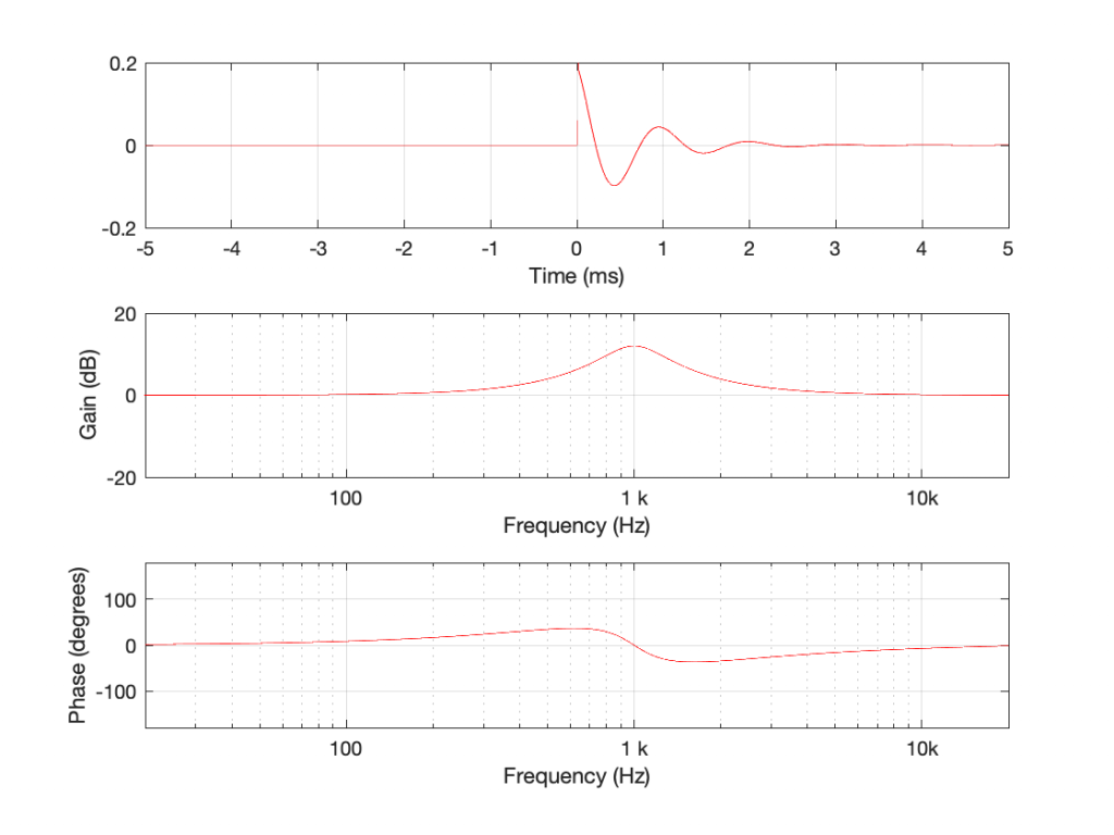
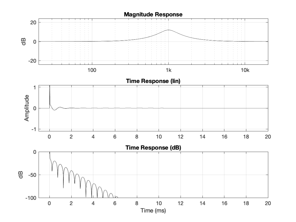
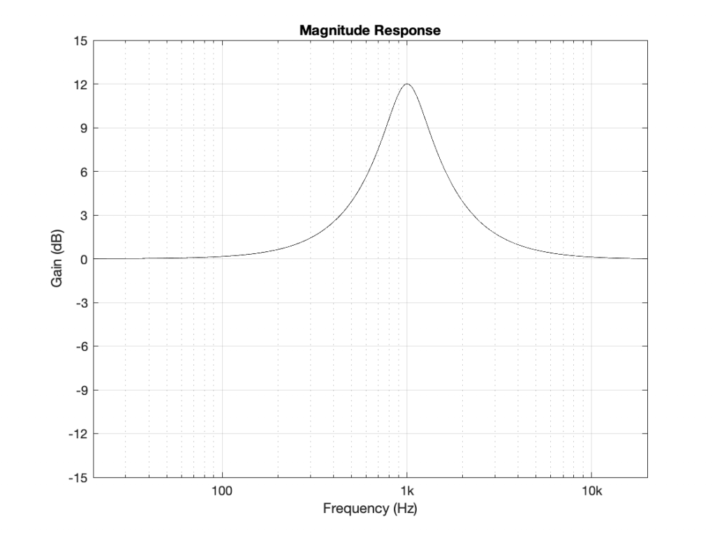
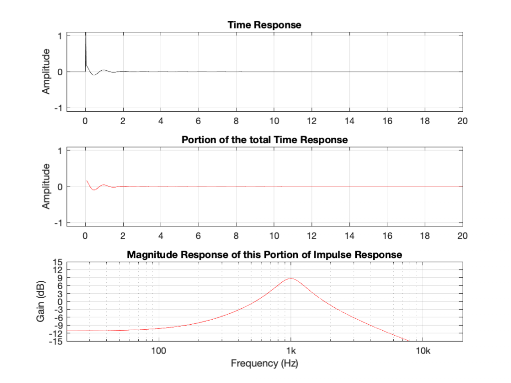
Using the slightly-different definition of Q, let’s make a peaking filter with a centre frequency of 1 kHz, a boost of 12 dB and a Q of 2. This will have the response shown below in Figure 1.

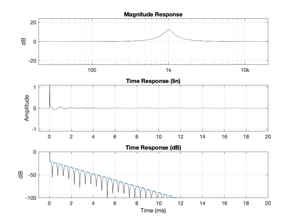
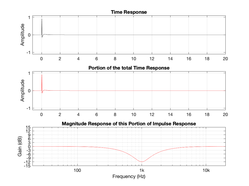
Using the same modified definition of Q, let’s also look at the response of a dip filter with the same parameter values, but a gain of -12 dB instead.
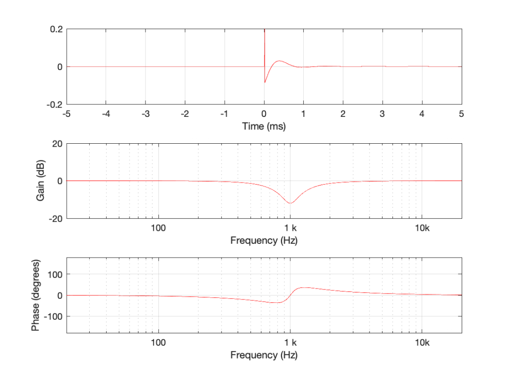
If you look at the magnitude responses of these two filters, you’ll see that it looks like they are mirror images of each other. In fact, they are.
If you look at the phase responses of these two filters, you’ll also see that it looks like they are mirror images of each other. In fact, they are.
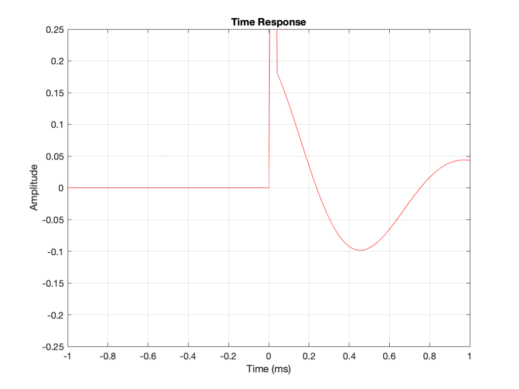
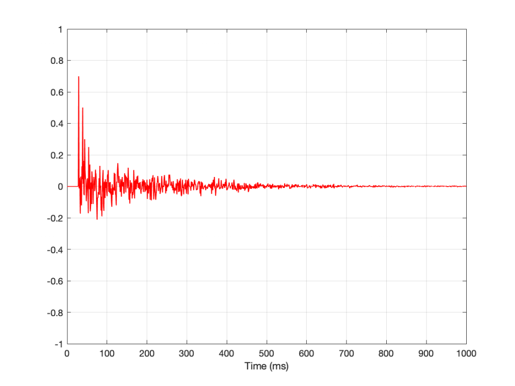
If you look at their impulse responses, you’ll see that it would be difficult to see that they are related at all… But never mind this.
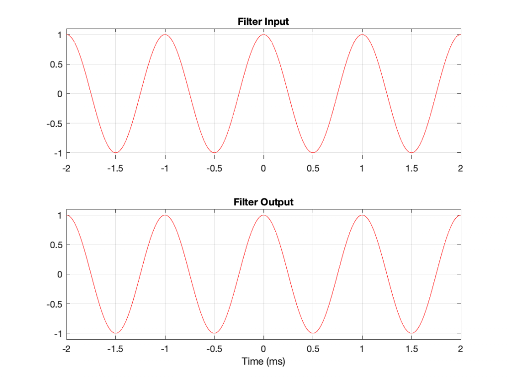
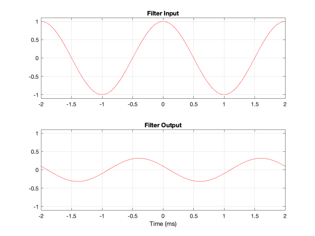
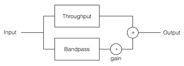
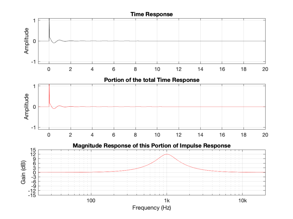
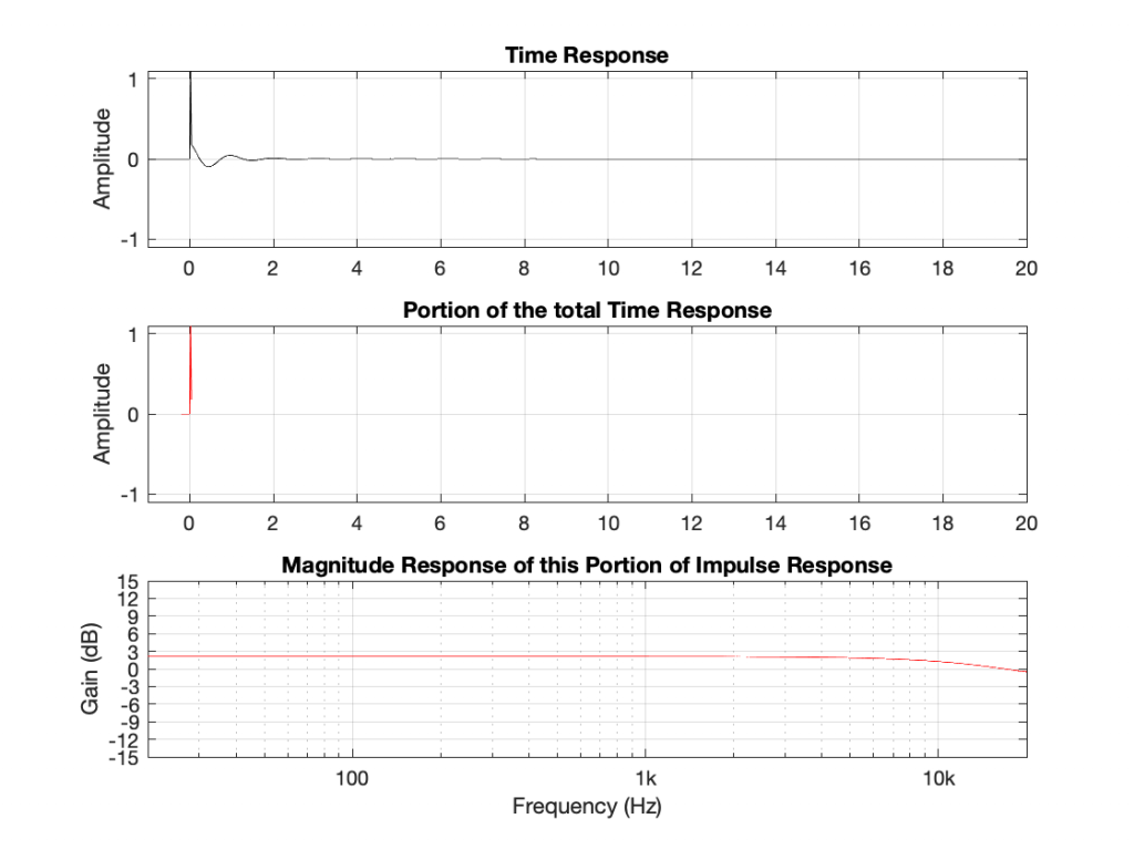
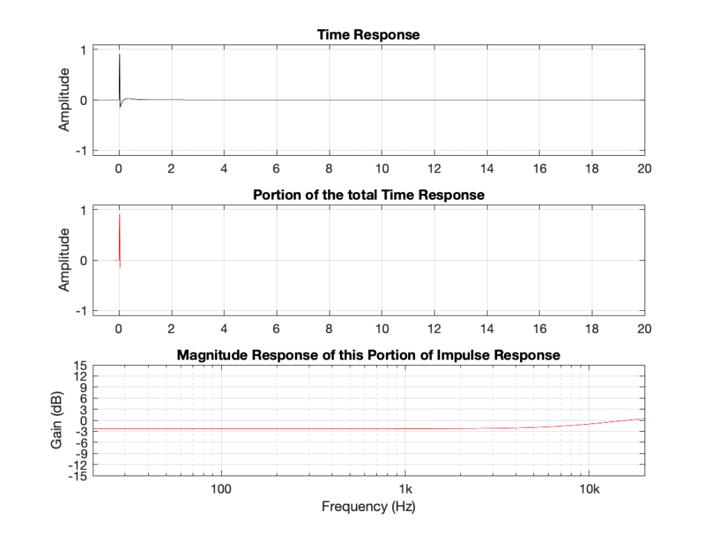
If I connect the output of the first filter to the input of the second filter, and measure the total throughput of the system, it will look like this:
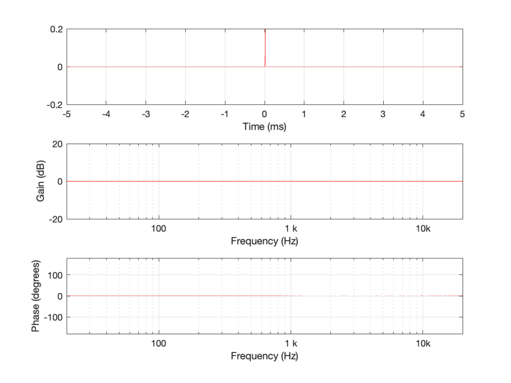
Just in case you’re suspicious, I didn’t fake this. I actually connected the boost to the dip and sent an impulse through the whole thing and you’re looking at the result. No tricks! (Note that I could have reversed their order with the same total result.)
What you can see here is that the responses of the dip and the boost negate each other. Whatever one does, the other does exactly the opposite.
Generally speaking, we audio geeks use some special words to describe not-very special cases like this.
Often, you’ll hear us talking about a linear system which is a fancy way of saying ‘the effects of this system can be undone’. In this example, the dip filter can ‘undo’ the effect of the boost (and vice versa) therefore both must be linear filters.
Just as often, you’ll hear us talking about time-invariant systems, which just means that they don’t change over time. Because I implemented those two filters using equations done on my computer, if I run the math again tomorrow, I’ll get exactly the same answer. If I test them using an impulse that is quieter or louder, I also get exactly the same responses. (If I had implemented them using resistors and capacitors and transistors or vacuum tubes, I might not get the same answer tomorrow or with a different signal level because of temperature changes, for example. Although now I’m really splitting hairs, just to make a point.)
The reason I said “just as often” is because, normally we use the two terms together as a package deal. So, we ask whether a system (like something as simple as a filter or as complicated as a reverb unit or an upmixing algorithm) is Linear Time-Invariant or LTI. This is an important question because it packs a lot of information in it.
For example, if a reverb unit is LTI, then I can measure it today with an impulse, and I know that it will behave the same tomorrow with lute music or a snare drum. It does the same thing all day, every day, regardless of the input signal or its level. One measurement, and I can go away and analyse it for the rest of the week.
If it’s not LTI, then its characteristics will change for some reason that I don’t necessarily know. Maybe the internal delays are modulating in time, so its response in 10 seconds will be different than it is now. Maybe it has a compressor or a noise gate built in, so it changes its behaviour according to the level of the signal.
If we get back to our (rather simple) peak / dip filter example. We know they’re LTI (because I said so – and you have to trust me). We also know that the dip filter is the opposite of the boost. The question is “how, exactly, did I make this happen?”
The general answer to this question has already been answered – the magnitude and the phase responses are mirror images of each other. Therefore, for any given frequency, one filter boosts by the same amount that the other cuts, and one filter advances in phase by the same amount that the other delays in phase.
The more geeky answer to this question requires that we look at the Z-Plane, which I’ve talked about throughly in another series of postings starting with this one. I’ll repeat myself a little by saying that a Z-Plane representation shows a different way of looking at the ‘ingredients’ in a filter. It contains ‘poles’ that are placed at frequencies that are infinitely boosted, and ‘zeroes’ that are placed at frequencies that are infinitely cut. By carefully placing poles and zeros relative to each other in the Z-Plane, you can decide how the filter will behave for other frequencies between 0 Hz and the Nyquist frequency.
When you design (or analyse) filters this way, there are a couple of basic rules:
The ‘safe zone’ in the Z-Plane is defined by a circle. If you start placing poles outside it, then the filter can become unstable. If a filter is unstable, this means that its ringing can get louder over time instead of decaying.
If you place a pole in exactly the same place as a zero, they cancel each other out, and the total result is as if neither were there.
So, let’s look at our two filters above in their Z-Plane representations.
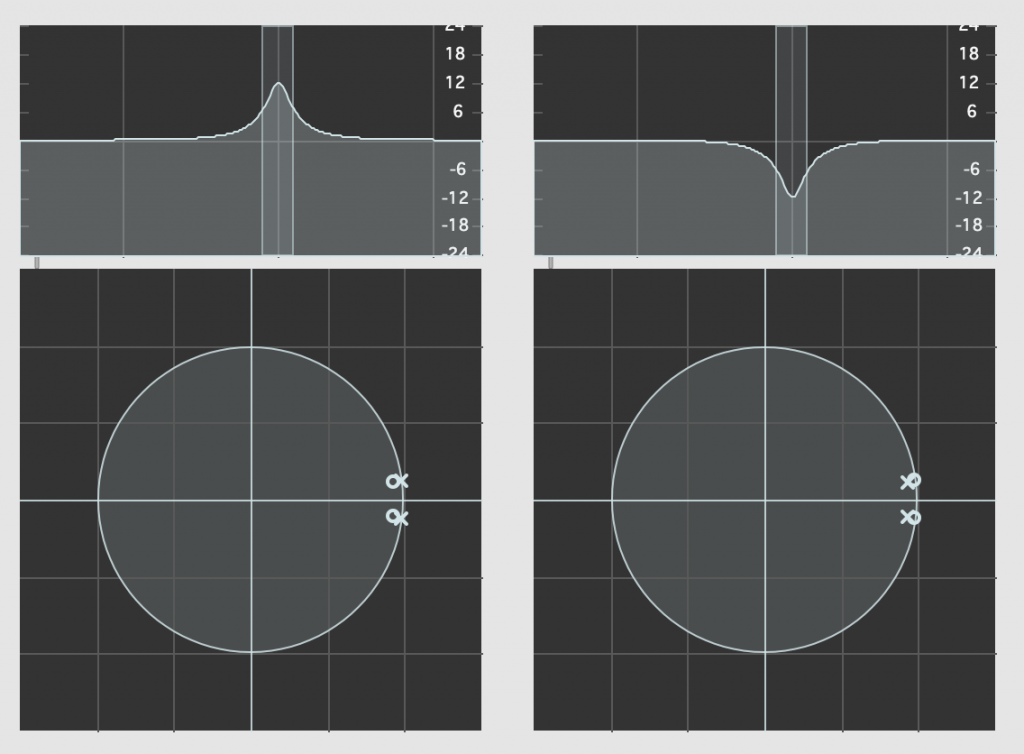
Admittedly, the resolution of the display in the software that I’m using to show this isn’t great, but if you compare the Z-Plane plots on the left and right, you can see that the zeros (marked with ‘o’) and the poles (‘x’) swap places. Just to make things a little clearer, I moved the centre frequency to 10 kHz and kept the gain and Q values the same. These are shown in Figure 5.

What’s the point of showing you this? The Magnitude and Phase response plots (which, combined, comprise the filters’ Frequency Responses) are ‘just’ descriptions of the behaviour of the filter. They tell you what happens to a signal that goes through them.
The Z-Plane representations show you how the filters are actually implemented.
It’s like the difference between reading a description of how a cake tastes and reading the recipe.
What you can see in the Z-Plane is not only that the responses of the filters negate each other: they’re built to ensure that this is the case. The poles and zeros of one filter cancel the zeros and poles of the other, and vice versa.
There’s one other extra piece of information that you already know. The fact that the poles for any of these filters are inside the circle helps to tell us that they’re stable and therefore LTI. It also tells us something else that we’ll talk about in the next part.