It was the third of June, another sleepy, dusty Delta day I was out choppin’ cotton, and my brother was balin’ hay
I’ve always liked the song “Ode to Billy Joe”. It starts on a 7-chord, so you know it’s going to go somewhere… I love how Papa, when he hears that Billy Joe jumped off the Tallahatchie Bridge just says that he “never had a lick of sense”, and asks for more biscuits. And who, exactly, did Brother Taylor see with Billy Joe? What did they throw off the bridge?
I like the fact that there are many questions and few answers – and life just goes on anyway…
But we’re not here to talk about songwriting, we’re here to talk about typical errors in digital audio – specifically today – streaming services.
This error is an easy one to discuss – but an important one nonetheless…
When I’m sitting at work, typing on my computer, I listen to music a lot. Usually, I use the “Audirvana” software on my Mac, with an external Teac UD-501 USB-Audio headphone DAC (which does the digital-to-analogue conversion and the amplification for the headphones, all in one box). The reasons I choose to use Audirvana are (1) that it can play all of my files (I have some DSD stuff on my hard drive), it can stream directly to my external DAC without routing the audio through Mac’s OS, and it can also see my Tidal account.
Now, just to be clear, this posting is not an advertisement for Apple, Audirvana, Teac, or Tidal. I mention all of that just as background information… I also drive an 11-year old base-model Honda Civic (that will come up later in this posting) and I wear Ecco shoes (which is completely irrelevant…).
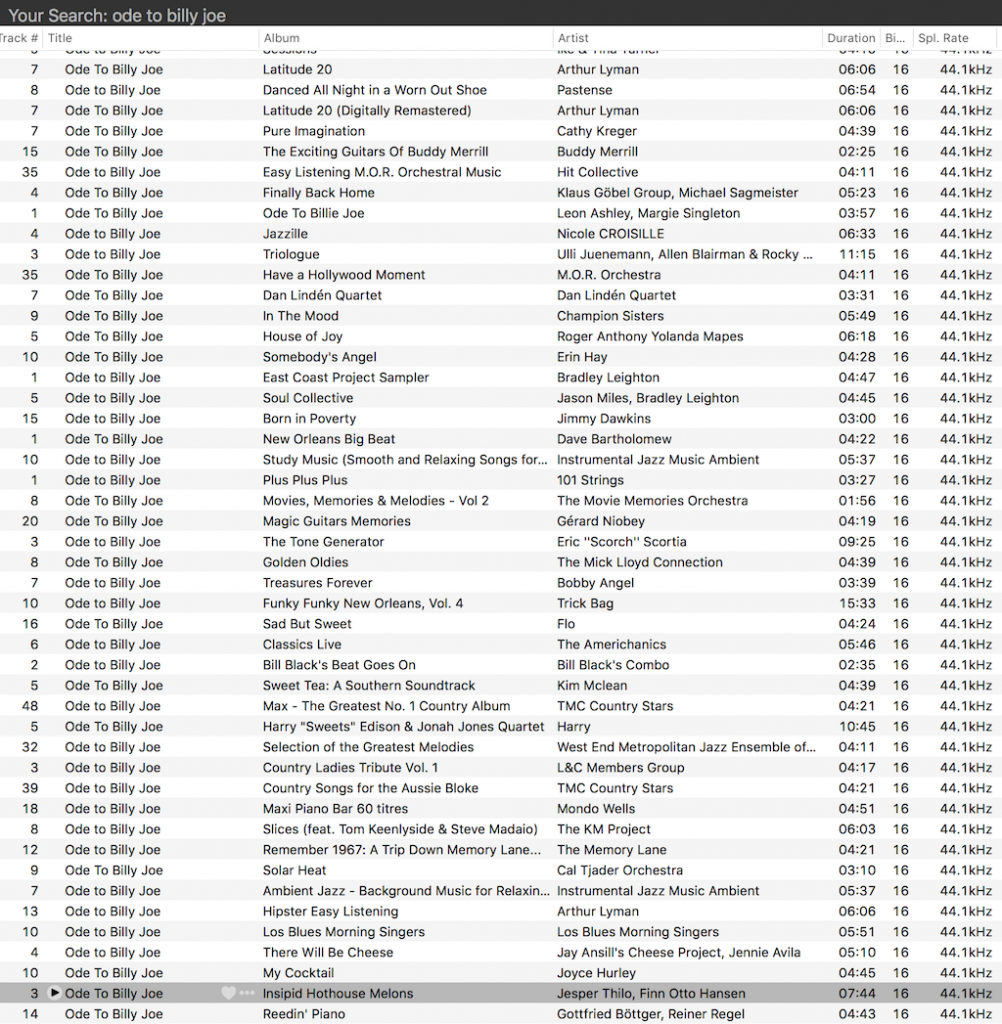
If you use Audirvana to search Tidal for tracks called “Ode to Billy Joe” You will get 300 hits. I don’t know if this is because there are 300 covers of that song on Tidal (I doubt it) or if 300 is a limit on the number of tracks either Tidal or Audirvana will report in a Search function (I suspect that this is the case…)
As you can see in the screenshot in Figure 1, all of them are 16 bit, 44.1 kHz files. So far so good…
Fig 1: There are many “Ode to Billy Joe” covers in Tidal
I have two favourite versions of this song. One of them is by Paula Cole (the other is by Patty Smyth). If I press “play” on the Paul Cole version, and I look at the top of the screen, I see something like the screenshot in Figure 2.
Fig 2: Ode to Billy Joe
One of the nice things about Audirvana is that it tells you a little technical information about the track to which you’re listening. Notice there on the right-hand side of the screenshot above, that we’re listening to a 16-bit, 44.1 kHz FLAC file.
This makes sense. In fact, it’s what I expect, since my Tidal subscription promises “lossless high fidelity sound quality” – that’s why I pay extra for a Tidal HiFi subscription…
So far so good.
One of my less-favourite renditions of “Ode to Billy Joe” is performed by The Stadium Saxophone Players on their album “Timeless Sax Instrumentals – Volume 2”. IF I press play on this version, and look at the top of my Audirvana window, I see the information in Figure 3.
Fig 3: Ode to Billy Joe
Interesting…. Notice that I am now listening to a 96 kbps AAC file with a 16-bit word length, and a sampling rate of “22.1 kHz” (actually 22.05 kHz – half of 44.1). So much for “lossless high fidelity sound quality”.
This calls for more investigation.
So, I pressed “Play” on the top hits in my search, one by one, and checked the file format displayed on the screen. The results of this “test” was that, in the first 66 “Ode to Billy Joe’s” listed, 6 of them were 96 kbps AAC files, 60 of them were FLAC.
So, for this sampling, roughly 9% of the available tracks were not in a lossless format, and were not even full bandwidth. Admittedly, the tracks that were in the lower-quality format were versions that I would not listen to anyway – so, to be honest, I don’t really care too much.
Now, before you mis-interpret me, I want to be very explicit and state that this is NOT Tidal’s fault. Of course they did not ask for an AAC version of the file they put on their hard drives. This was the file format supplied to them by the record label (to use an increasingly old-fashioned term…). So, we can’t blame Tidal for this – and I’m quite certain that they’re not the only streaming service that “suffers” from this issue.
However, what my little test shows is that what Tidal is actually selling me is the capability of streaming “lossless high fidelity sound quality” – and not a guarantee that what is in the “pipe” really is lossless.
Of course, this is not just true for streaming services. Other people have shown that some higher-priced “high resolution” audio files that you can purchase online are actually just a bit-for-bit copy of the “normal resolution” version of the same track. I have at least one CD that contains at least one track that has MP3 artefacts obvious enough that I can hear them on my unbranded audio system in my 11-year old Honda Civic while I’m driving… (It’s a compilation disc, so I guess the label was supplied with an MP3 version that they decoded to PCM and put on the CD.)
So, just like Ode to Billy Joe – there are some questions here… and you don’t need to know much about digital audio to answer them… But the basic moral of this part of the story is that the format that is used to deliver your music is not a guarantee of higher quality…
Reminder: This is still just the lead-up to the real topic of this series. However, we have to get some basics out of the way first…
In the first posting in this series, I talked about digital audio (more accurately, Linear Pulse Code Modulation or LPCM digital audio) is basically just a string of stored measurements of the electrical voltage that is analogous to the audio signal, which is a change in pressure over time… In the second posting in the series, we looked at a “trick” for dealing with the issue of quantisation (the fact that we have a limited resolution for measuring the amplitude of the audio signal). This trick is to add dither (a fancy word for “noise”) to the signal before we quantise it in order to randomise the error and turn it into noise instead of distortion.
In this posting, we’ll look at some of the problems incurred by the way we carve up time into discrete moments when we grab those samples.
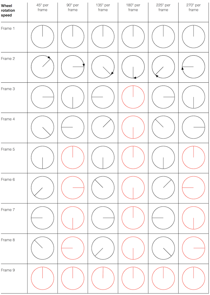
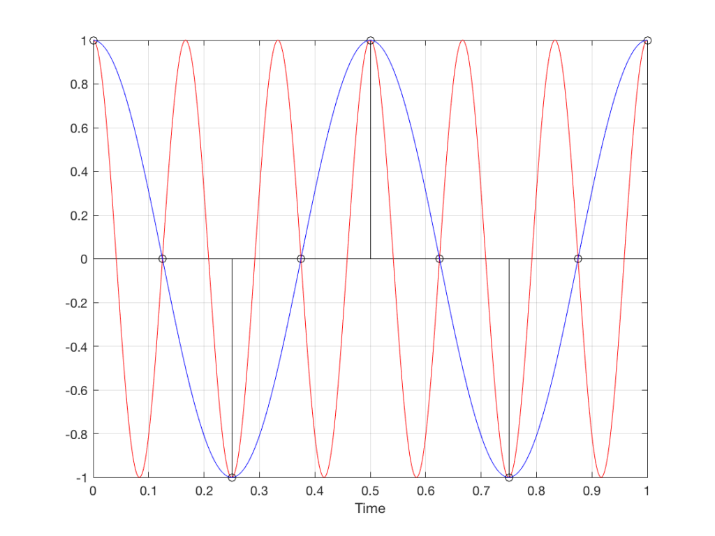
Let’s make a wheel that has one spoke. We’ll rotate it at some speed, and make a film of it turning. We can define the rotational speed in RPM – rotations per minute, but this is not very useful. In this case, what’s more useful is to measure the wheel rotation speed in degrees per frame of the film.
Fig 1. The position of a clockwise-rotating wheel (with only one spoke) for 9 frames of a film. Each column shows a different rotational speed of the wheel. The far left column is the slowest rate of rotation. The far right column is the fastest rate of rotation. Red wheels show the frame in which the sequence starts repeating.
Take a look at the left-most column in Figure 1. This shows the wheel rotating 45º each frame. If we play back these frames, the wheel will look like it’s rotating 45º per frame. So, the playback of the wheel rotating looks the same as it does in real life.
This is more or less the same for the next two columns, showing rotational speeds of 90º and 135º per frame.
However, things change dramatically when we look at the next column – the wheel rotating at 180º per frame. Think about what this would look like if we played this movie (assuming that the frame rate is pretty fast – fast enough that we don’t see things blinking…) Instead of seeing a rotating wheel with only one spoke, we would see a wheel that’s not rotating – and with two spokes.
This is important, so let’s think about this some more. This means that, because we are cutting time into discrete moments (each frame is a “slice” of time) and at a regular rate (I’m assuming here that the frame rate of the film does not vary), then the movement of the wheel is recorded (since our 1 spoke turns into 2) but the direction of movement does not. (We don’t know whether the wheel is rotating clockwise or counter-clockwise. Both directions of rotation would result in the same film…)
Now, let’s move over one more column – where the wheel is rotating at 225º per frame. In this case, if we look at the film, it appears that the wheel is back to having only one spoke again – but it will appear to be rotating backwards at a rate of 135º per frame. So, although the wheel is rotating clockwise, the film shows it rotating counter-clockwise at a different (slower) speed. This is an effect that you’ve probably seen many times in films and on TV. What may come as a surprise is that this never happens in “real life” unless you’re in a place where the lights are flickering at a constant rate (as in the case of fluorescent or some LED lights, for example).
Again, we have to consider the fact that if the wheel actually were rotating counter-clockwise at 135º per frame, we would get exactly the same thing on the frames of the film as when the wheel if rotating clockwise at 225º per frame. These two events in real life will result in identical photos in the film. This is important – so if it didn’t make sense, read it again.
This means that, if all you know is what’s on the film, you cannot determine whether the wheel was going clockwise at 225º per frame, or counter-clockwise at 135º per frame. Both of these conclusions are valid interpretations of the “data” (the film). (Of course, there are more – the wheel could have rotated clockwise by 360º+225º = 585º or counter-clockwise by 360º+135º = 495º, for example…)
Since these two interpretations of reality are equally valid, we call the one we know is wrong an alias of the correct answer. If I say “The Big Apple”, most people will know that this is the same as saying “New York City” – it’s an alias that can be interpreted to mean the same thing.
Wheels and Slinkies
We people in audio commit many sins. One of them is that, every time we draw a plot of anything called “audio” we start out by drawing a sine wave. (A similar sin is committed by musicians who, at the first opportunity to play a grand piano, will play a middle-C, as if there were other notes in the world.) The question is: what, exactly, is a sine wave?
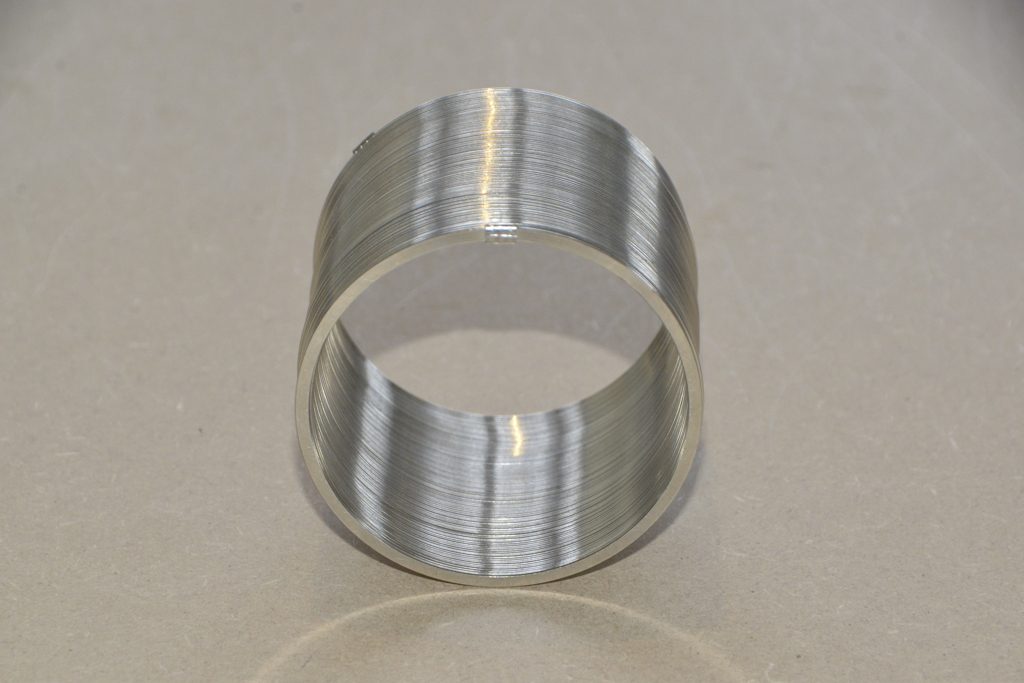
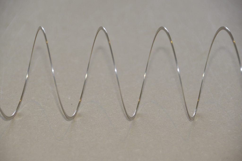
Get a Slinky – or if you don’t want to spend money on a brand name, get a spring. Look at it from one end, and you’ll see that it’s a circle, as can be (sort of) seen in Figure 2.
Fig 2. A Slinky, seen from one end. If I had really lined things up, this would just look like a shiny circle.
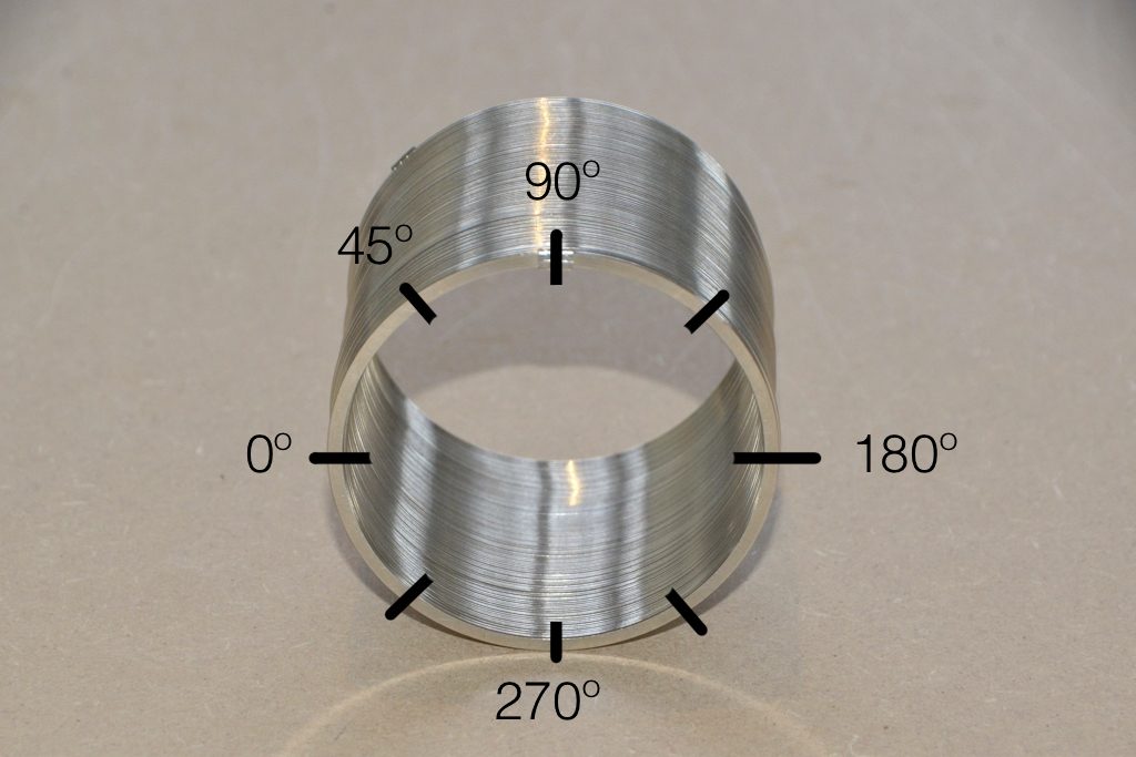
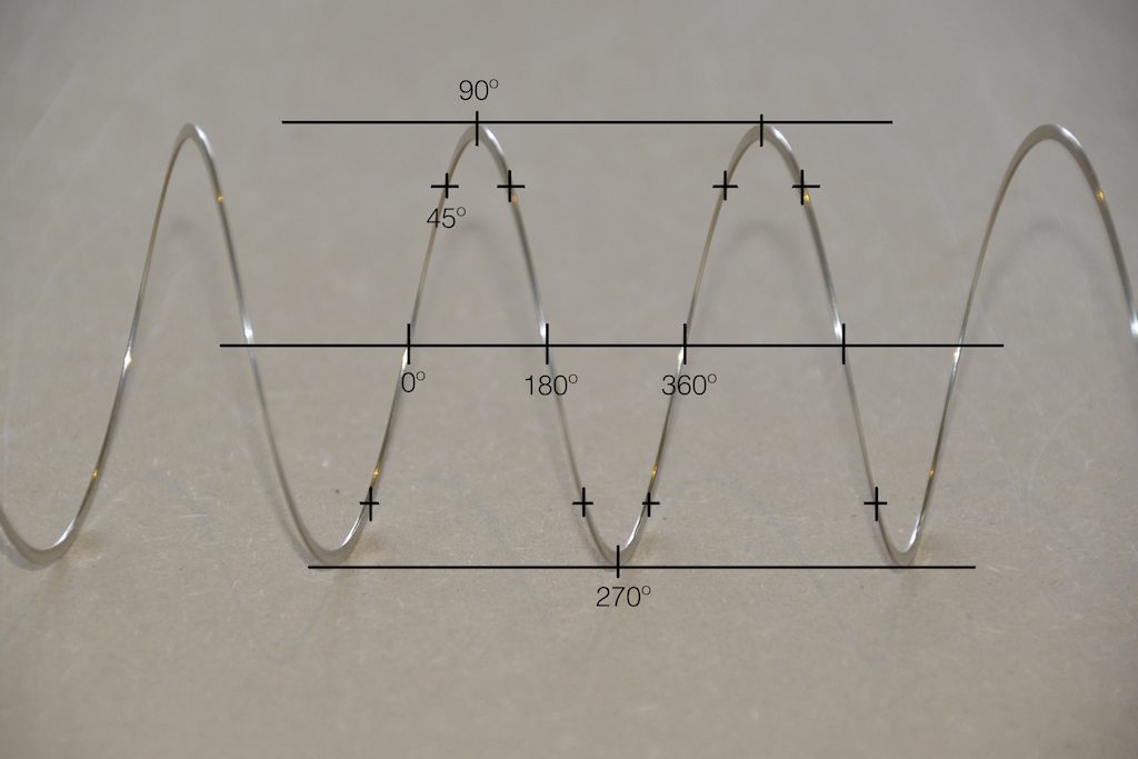
Since this is a circle, we can put marks on the Slinky at various amounts of rotation, as in Figure 3.
Fig 3. The same Slinky, marked in increasing angles of 45º.
Of course, I could have put the 0º marl anywhere. I could have also rotated counter-clockwise instead of clockwise. But since both of these are arbitrary choices, I’m not going to debate either one.
Now, let’s rotate the Slinky so that we’re looking at from the side. We’ll stretch it out a little too…
Fig 4. The same Slinky, stretched a little, and viewed from the side.
Let’s do that some more…
Fig 5. The same Slinky, stretched more, and viewed from the “side” (in a direction perpendicular to the axis of the rotation).
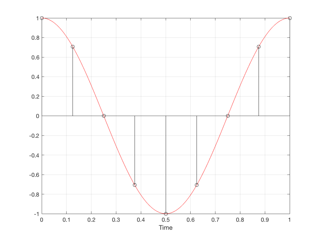
When you do this, and you look at the Slinky directly from one side, you are able to see the vertical change of the spring from the centre as a result of the change in rotation. For example, we can see in Figure 6 that, if you mark the 45º rotation point in this view, the distance from the centre of the spring is 71% of the maximum height of the spring (at 90º).
Fig 6. The same markings shown in Figure 3, when looking at the Slinky from the side. Note that, if we didn’t have the advantage of a little perspective (and a spring made of flat metal), we would not know whether the 0º point was closer or further away from us than the 180º point. In other words, we wouldn’t know if the Slinky was rotating clockwise or counter-clockwise.
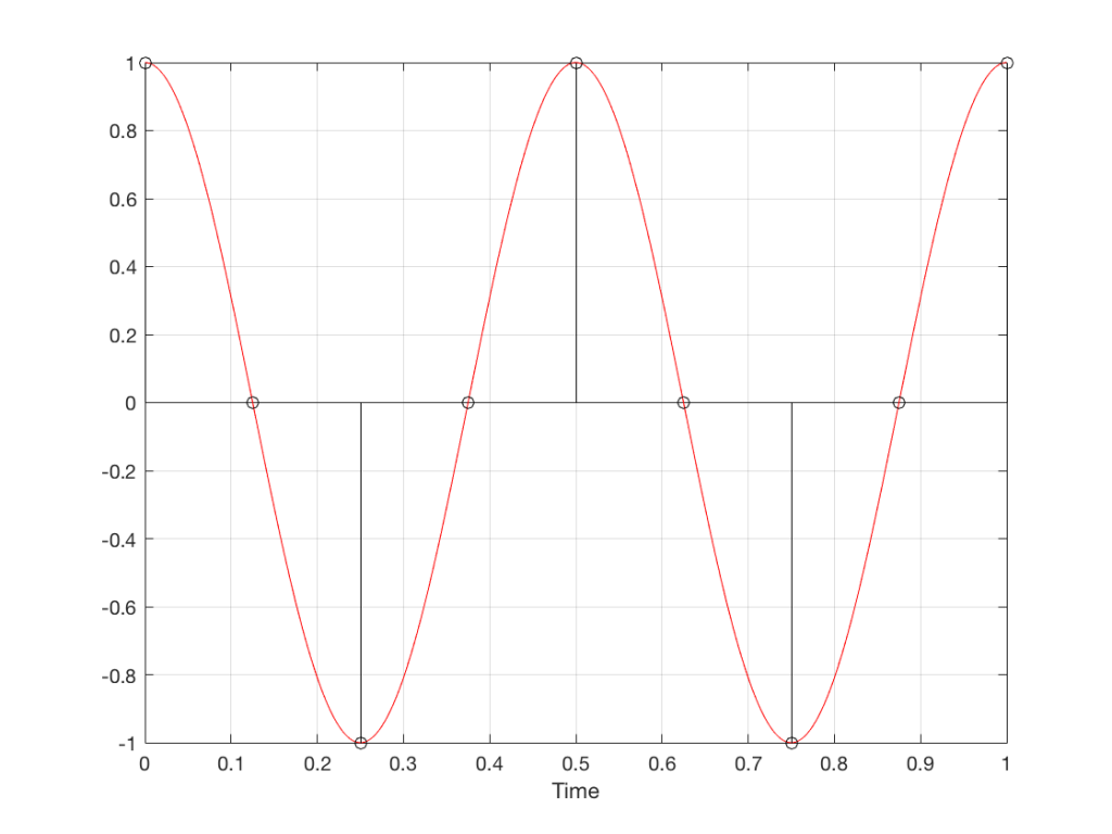
So what? Well, basically, the “punch line” here is that a sine wave is actually a “side view” of a rotation. So, Figure 7, shows a measurement – a capture – of the amplitude of the signal every 45º.
Fig 7. Each measurement (a black “lollipop”) is a measurement of the vertical change of the signal as a result of rotating 45º.
Since we can now think of a sine wave as a rotation of a circle viewed from the side, it should be just a small leap to see that Figure 7 and the left-most column of Figure 1 are basically identical.
Let’s make audio equivalents of the different columns in Figure 1.
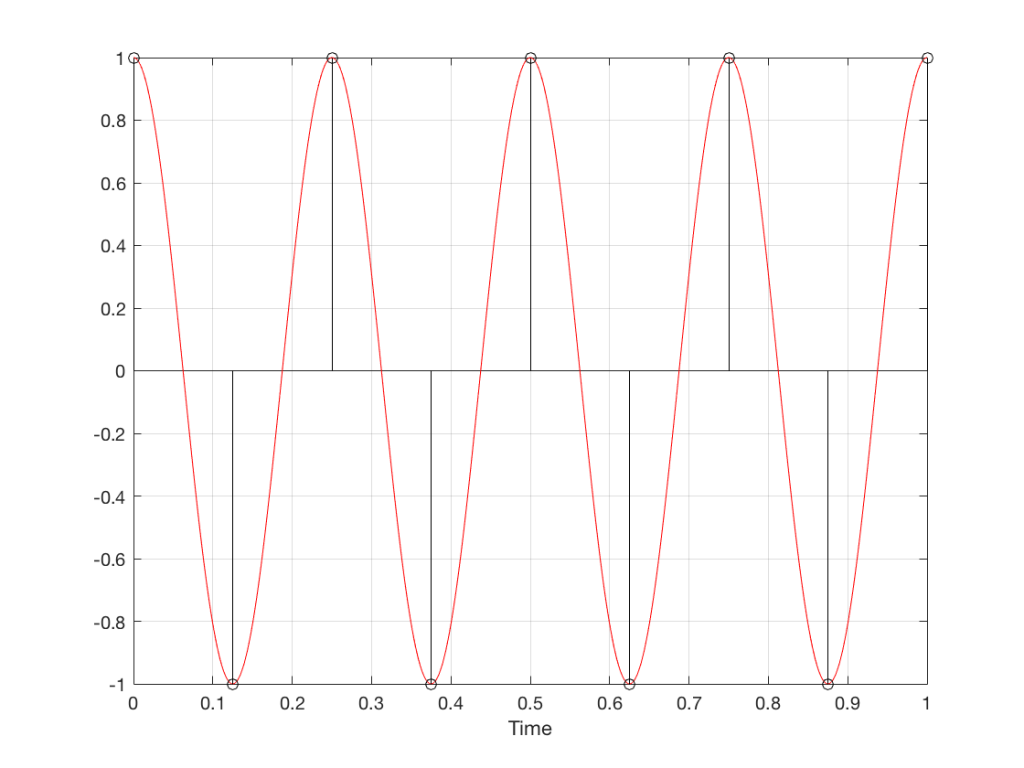
Fig 8. A sampled cosine wave where the frequency of the signal is equivalent to 90º per sample period. This is identical to the “90º per frame” column in Figure 1.Fig 9. A sampled cosine wave where the frequency of the signal is equivalent to 135º per sample period. This is identical to the “135º per frame” column in Figure 1.Fig 10. A sampled cosine wave where the frequency of the signal is equivalent to 180º per sample period. This is identical to the “180º per frame” column in Figure 1.
Figure 10 is an important one. Notice that we have a case here where there are exactly 2 samples per period of the cosine wave. This means that our sampling frequency (the number of samples we make per second) is exactly one-half of the frequency of the signal. If the signal gets any higher in frequency than this, then we will be making fewer than 2 samples per period. And, as we saw in Figure 1, this is where things start to go haywire.
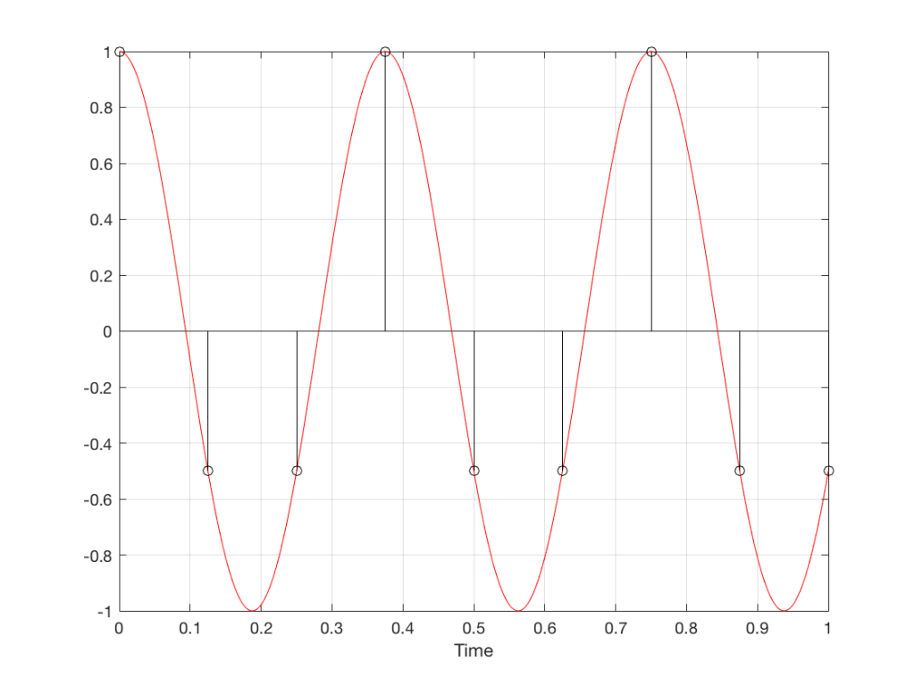
Fig 11. A sampled cosine wave where the frequency of the signal is equivalent to 225º per sample period. This is identical to the “225º per frame” column in Figure 1.
Figure 11 shows the equivalent audio case to the “225º per frame” column in Figure 1. When we were talking about rotating wheels, we saw that this resulted in a film that looked like the wheel was rotating backwards at the wrong speed. The audio equivalent of this “wrong speed” is “a different frequency” – the alias of the actual frequency. However, we have to remember that both the correct frequency and the alias are valid answers – so, in fact, both frequencies (or, more accurately, all of the frequencies) exist in the signal.
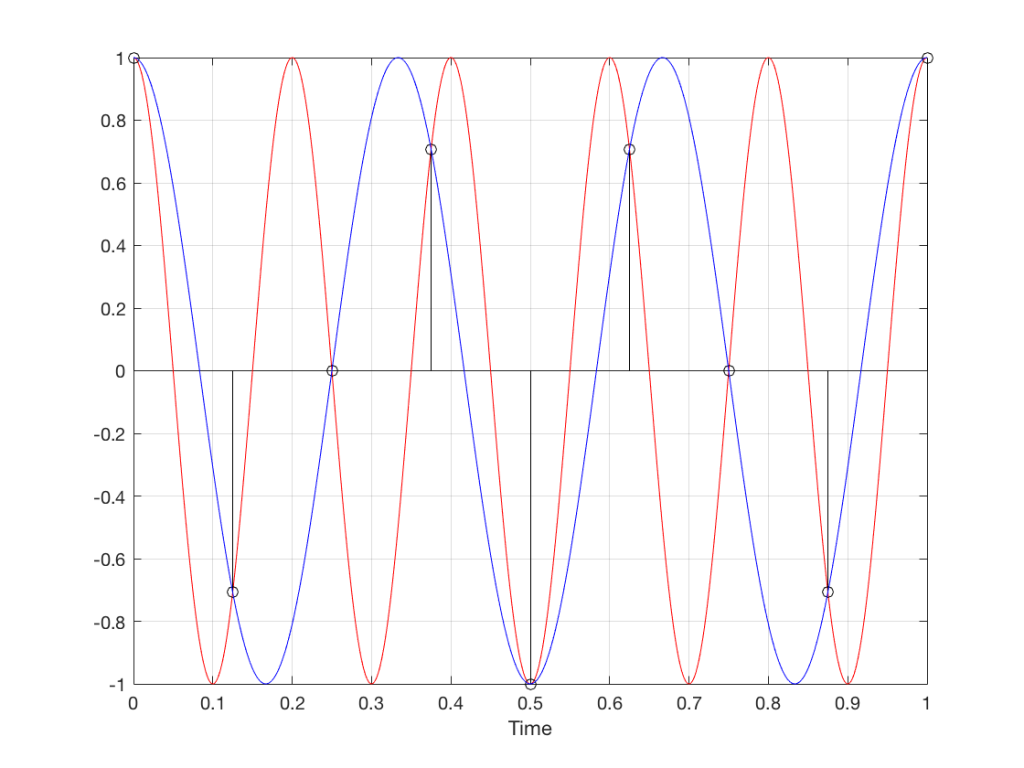
So, we could take Fig 11, look at the samples (the black lollipops) and figure out what other frequency fits these. That’s shown in Figure 12.
Fig 12. The red signal and the black samples of it are the same as was shown in Figure 11. However, another frequency (the blue signal) also fits those samples. So, both the red signal and the blue signal exist in our system.
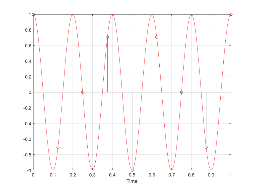
Moving up in frequency one more step, we get to the right-hand column in Figure 1, whose equivalent, including the aliased signal, are shown in Figure 13.
Fig 13. A signal (the red curve) that has a frequency equivalent to 280º of rotation per sample, its samples (the black lollipops) and the aliased additional signal that results (the blue curve).
Do I need to worry yet?
Hopefully, now, you can see that an LPCM system has a limit with respect to the maximum frequency that it can deal with appropriately. Specifically, the signal that you are trying to capture CANNOT exceed one-half of the sampling rate. So, if you are recording a CD, which has a sampling rate of 44,100 samples per second (or 44.1 kHz) then you CANNOT have any audio signals in that system that are higher than 22,050 Hz.
That limit is commonly known as the “Nyquist frequency“, named after Harry Nyquist – one of the persons who figured out that this limit exists.
In theory, this is always true. So, when someone did the recording destined for the CD, they made sure that the signal went through a low-pass filter that eliminated all signals above the Nyquist frequency.
In practice, however, there are many cases where aliasing occurs in digital audio systems because someone wasn’t paying enough attention to what was happening “under the hood” in the signal processing of an audio device. This will come up later.
Two more details to remember…
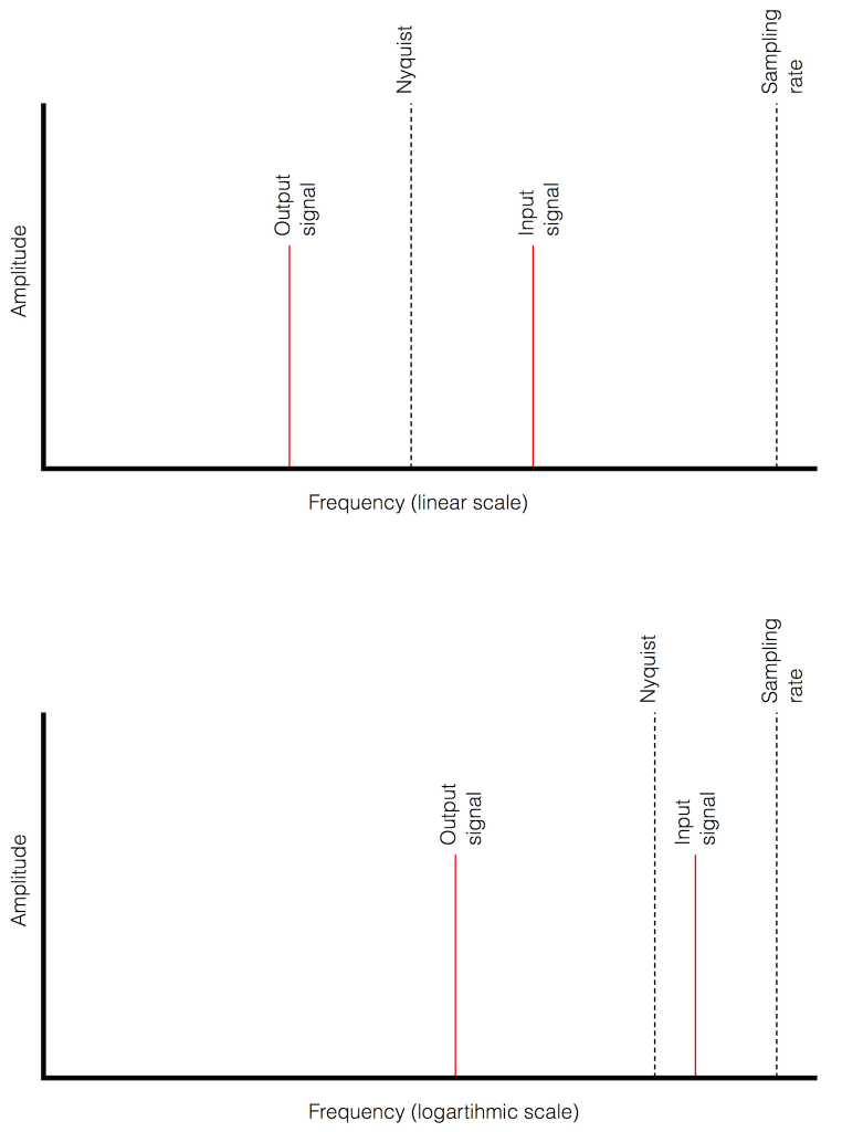
There’s an easy way to predict the output of a system that’s suffering from aliasing if your input is sinusoidal (and therefore contains only one frequency). The frequency of the output signal will be the same distance from the Nyquist frequency as the frequency if the input signal. In other words, the Nyquist frequency is like a “mirror” that “reflects” the frequency of the input signal to another frequency below Nyquist.
This can be easily seen in the upper plot of Figure 14. The distance from the Input signal and the Nyquist is the same as the distance between the output signal and the Nyquist.
Also, since that Nyquist frequency acts as a mirror, then the Input and output signal’s frequencies will move in opposite directions (this point will help later).
Fig 14. Two plots showing the same information about an Input Signal above the Nyquist frequency and the output alias signal. Notice that, in the linear plot on top, it’s easier to see that the Nyquist frequency is the mirror point at the centre of the frequencies of the Input and Output signals.
Usually, frequency-domain plots are done on a logarithmic scale, because this is more intuitive for we humans who hear logarithmically. (For example, we hear two consecutive octaves on a piano as having the same “interval” or “width”. We don’t hear the width of the upper octave as being twice as wide, like a measurement system does. that’s why music notation does not get wider on the top, with a really tall treble clef.) This means that it’s not as obvious that the Nyquist frequency is in the centre of the frequencies of the input signal and its alias below Nyquist.
Sometimes, someone will use a plot to show the relative levels of different frequency bands in a signal. Even I have done this from time to time…. However, it’s important to have the skills to be able to read these plots with a little-more-knowledge-than-normal in order to not be distracted into thinking something that isn’t true.
One way to calculate the relative levels of frequency bands of a signal (whether it’s a measurement of a loudspeaker, a black box, or your favourite track on your favourite CD) is to so something called a “Fourier Transform”. This is a set of calculations that can be used to show how much energy there is in a signal, by frequency.
Typically, we do a Discrete Fourier Transform or “DFT” – although most people call it a Fast Fourier Transform or “FFT”. We will not discuss the difference between these things in this posting. I’ll just use the term “FFT” here, in order to be like everyone else…
(If you’d like to know how to do your own FFT’s by hand, this is one place to start learning…)
In order to give me something to analyse, I made a signal comprised of a sine tone with a frequency around 997 Hz. (I’ll explain at the end why it’s not exactly 997 Hz. I’ll also explain in another posting why I chose 997 Hz instead of a good-old-fashioned 1 kHz.)
I set that sine tone to have a level of -1 dB FS.
Then, I made some white noise and set its level to be exactly 80 dB below the level of the sine tone. In order to calculate this, I found the total RMS value of the noise signal, and used this to create a gain that makes it a level of -81 dB FS. (Just for the sake of being as pedantic as possible, the white noise that I created was the result of a “rand” function in Matlab, which, as you can see in this posting, has a rectangular probability density function.)
Therefore, I have an input that has a signal-to-noise ratio of 80 dB. (Note that this measurement does not use any band-limiting on the white noise… Typically a SNR measurement would apply some low pass filter to the noise.)
To keep things looking pretty on my graphs, I set the sampling rate to 65536 Hz (2^16).
Then, I pretended that this signal was coming in from some unknown device, and I do an FFT on it to find out the relative balance between the signal (the sine tone) and the noise (which I already “secretly” know is 80 dB lower)
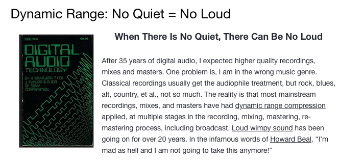
If I do an FFT of 256 points on the signal (and therefore, I’m only looking at the first 256 samples of the signal – this is an important point that we’ll come back to later…), the result looks like Figure 1.
Fig 1: The magnitude response of the signal, calculated using a 256-bin FFT.
Note that the sine tone is a little higher than 997 Hz – but this is not really important. (the explanation is at the end!).
There are some things to notice here:
The first is that the plot does not extend lower than a frequency of 256 Hz. This is because the resolution of a 256-point FFT is 256 Hz – so, there is a “point” on the plot every 256 Hz – typically called a “bin” – since it contains information about the level of a collection of frequencies around its centre frequency. (If you’re new to FFT’s, don’t jump to the conclusion that the frequency resolution is equal to the length of the FFT. This is incorrect. The frequency resolution is equal to the sampling rate divided by the FFT length – 65536 Hz / 256 bins = 256 Hz.) Limiting the length of the FFT limits its resolution, which has an obvious impact when we plot the results on a logarithmic frequency scale.
The second is that, although the SNR of the signal is 80 dB, on the magnitude response, it appears that the noise is generally lower than -100 dB. This is not that difficult to believe, since the noise is spread over a wide frequency range – so, although any one frequency may, indeed, be more than 100 dB below the signal – the sum of the energy in all of those frequency bands totals more than any of the individual contributions. (In the same way that 1000 people can shout louder than 1 person – even if all 1000 people are, individually, shouting at the same level.)
One thing that is not obvious from the plot, but that we have to keep in mind is that this shows us the level of the different frequency ranges over the entire length of the signal (all 256 samples of it). However, the noise that I created that is part of that signal is exactly that – noise. Since it is noise, there is no guarantee that all frequencies are represented at the same level at any one time – in fact, they’re not. “White noise” has the characteristic of having equal probability of having the same level at all frequencies. But if 1000 people have equal probability of winning a lottery, that doesn’t mean than 1000 of them will win. In order to ensure that you actually get the same level at all frequencies, you would have to listen to white noise forever – and I’m not willing to wait that long…
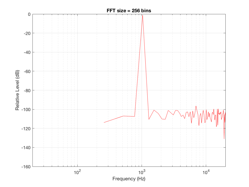
Fig 2: The magnitude response of the signal, calculated using a 512-bin FFT.
Figure 2 shows the same analysis done on the same signal, but with a 512-bin FFT instead. There, you can see that the the resolution of the plot is better – we have a bin or point every 128 Hz (remember 65536 Hz / 512 bins = 128 Hz). Also, the sine tone has the same level (-1 dB FS) but the noise, which we know is 80 dB lower, appears to be even lower than it does in Figure 1… Strange…
Let’s do some more FFT’s with more and more bins to see what happens…
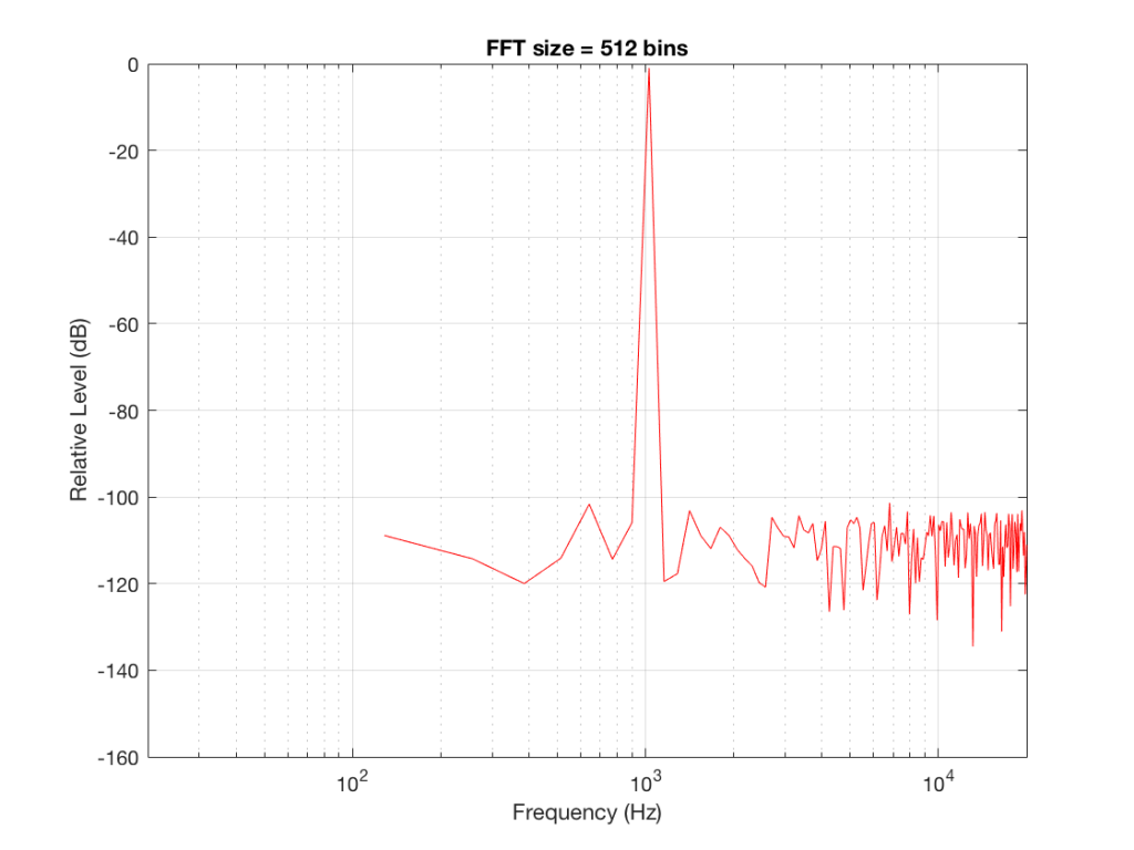
Fig 3: The magnitude response of the signal, calculated using a1024-bin FFT
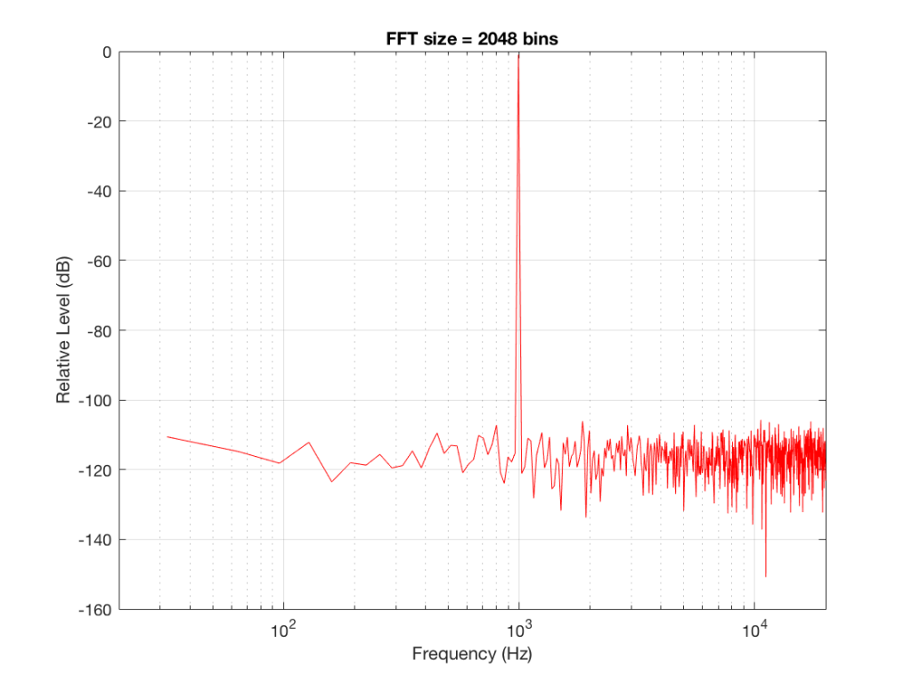
Fig 4: The magnitude response of the signal, calculated using a 2046-bin FFT.
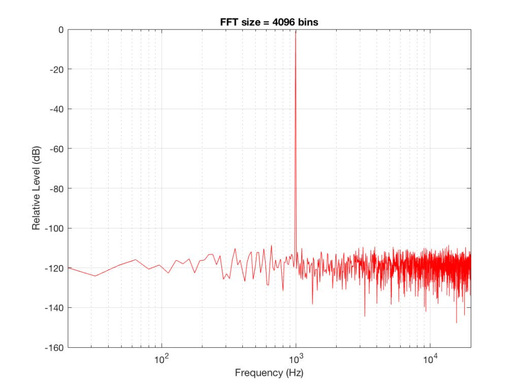
Fig 5: The magnitude response of the signal, calculated using a 4096-bin FFT.
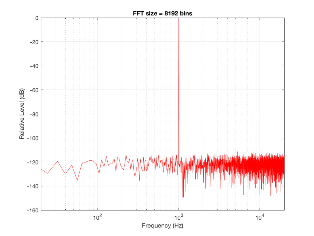
Fig 6: The magnitude response of the signal, calculated using a 8192-bin FFT
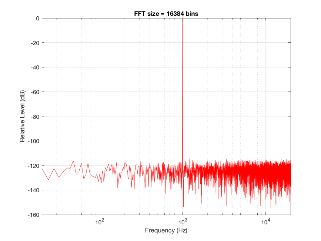
Fig 7: The magnitude response of the signal, calculated using a 16384-bin FFT
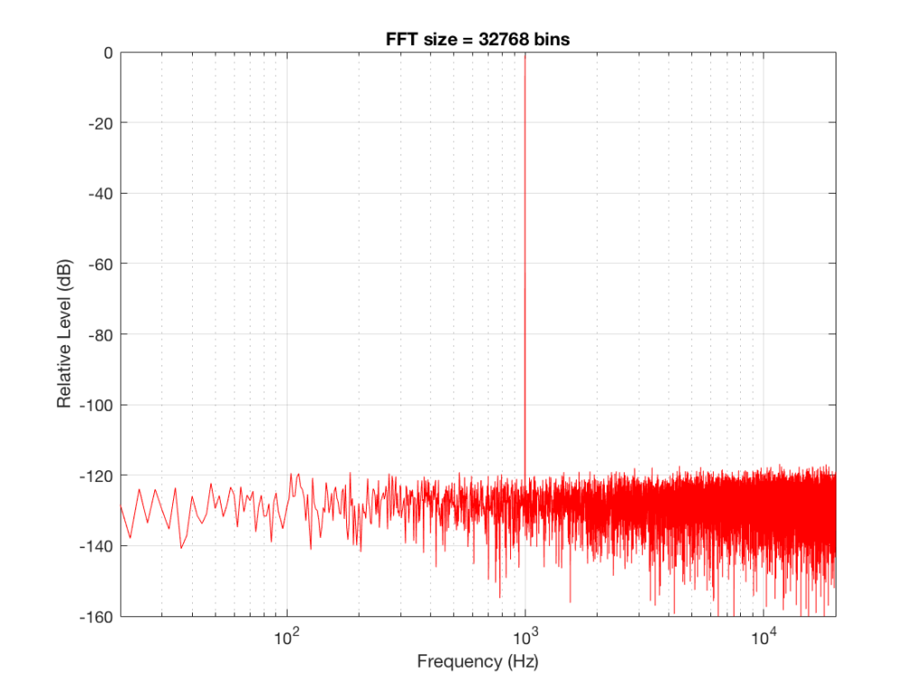
Fig 8: The magnitude response of the signal, calculated using a 32768-bin FFT
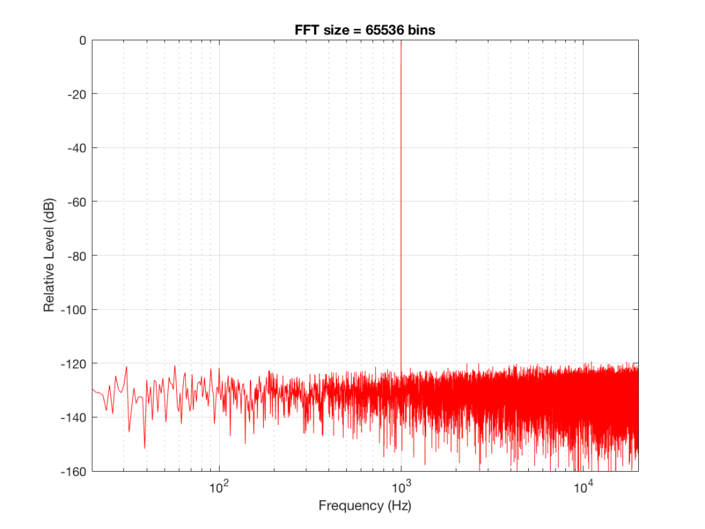
Fig 9: The magnitude response of the signal, calculated using a 65536-bin FFT.
So, by going from a 256-bin FFT to a 65536-bin FFT, we appear to have dropped the noise floor by more than 20 dB.
Weird? No. Why?
Remember that every time we double the length of the FFT, we double the number of frequency bins in its output. So, that plot in Figure 9 has more individual frequencies contributing to add together to the same noise signal, 80 dB lower than the sine tone. (If you asked 1000 people to shout as loudly as 10 people, each individual in the larger group would have to be quieter to produce the same total output.)
The “punch line” here is that we cannot make a direct conclusion about the overall Signal-to-Noise ratio of the signal by looking at any of the plots above. Of course we can say that the “signal” (the sine tone) is obviously louder than the noise – by a lot. But we can’t be much more detailed than that.
So, if someone jumps between a SNR number and a spectral plot like the ones above, in an effort to convince you of something, be very careful about being led down a garden path.
Some extra information:
We also have to remember that, although the signal that I used to make these graphs was initially the same, the actual signal that was used by each of the FFT’s was different. This is because, by default, the length of the signal used by an FFT calculation is the same as the number off bins in the FFT. So, for example, a 256-bin (or 256-point) FFT only uses 256 samples as its input. A 32768-point FFT uses 32768 samples (the first 256 of which were the ones used by the 256-point FFT). So, for example, if you load a recording of Britney Spears singing “Toxic” into Matlab, and you type the command FFT(toxic, 256) – you’ll get a 256-bin FFT of the first 5 .8 milliseconds (256 samples) of the recording – not a representation of the spectral content of the entire song.
Initially, I started out by saying that I would use a 997 Hz sine tone. This might look a little weird because it’s not a nice number like 1000 Hz. There’s a good reason for this, and I’ll write a posting about it some other day.
Then, I said that it’s not really 997 Hz – I moved it a little. This is because I wanted the frequency of my sine tone to land exactly on one of the bins of my FFT. So for example, in the case of the 256-bin FFT, I had a frequency resolution of 256 Hz – so my bins are at the following:
256 Hz
512 Hz
768 Hz
1024 Hz
1024 Hz is the closest value to 997 Hz that occurs in the sequence so I used that instead. If I had kept the sine tone fixed at 997 Hz, the plots would not have looked as pretty, because the information about its level would have “leaked” or “been spread out” into the adjacent bins. So, instead of a nice clean spike, we would have seen a big, round bump.