Sometimes, someone will use a plot to show the relative levels of different frequency bands in a signal. Even I have done this from time to time…. However, it’s important to have the skills to be able to read these plots with a little-more-knowledge-than-normal in order to not be distracted into thinking something that isn’t true.
One way to calculate the relative levels of frequency bands of a signal (whether it’s a measurement of a loudspeaker, a black box, or your favourite track on your favourite CD) is to so something called a “Fourier Transform”. This is a set of calculations that can be used to show how much energy there is in a signal, by frequency.
Typically, we do a Discrete Fourier Transform or “DFT” – although most people call it a Fast Fourier Transform or “FFT”. We will not discuss the difference between these things in this posting. I’ll just use the term “FFT” here, in order to be like everyone else…
(If you’d like to know how to do your own FFT’s by hand, this is one place to start learning…)
In order to give me something to analyse, I made a signal comprised of a sine tone with a frequency around 997 Hz. (I’ll explain at the end why it’s not exactly 997 Hz. I’ll also explain in another posting why I chose 997 Hz instead of a good-old-fashioned 1 kHz.)
I set that sine tone to have a level of -1 dB FS.
Then, I made some white noise and set its level to be exactly 80 dB below the level of the sine tone. In order to calculate this, I found the total RMS value of the noise signal, and used this to create a gain that makes it a level of -81 dB FS. (Just for the sake of being as pedantic as possible, the white noise that I created was the result of a “rand” function in Matlab, which, as you can see in this posting, has a rectangular probability density function.)
Therefore, I have an input that has a signal-to-noise ratio of 80 dB. (Note that this measurement does not use any band-limiting on the white noise… Typically a SNR measurement would apply some low pass filter to the noise.)
To keep things looking pretty on my graphs, I set the sampling rate to 65536 Hz (2^16).
Then, I pretended that this signal was coming in from some unknown device, and I do an FFT on it to find out the relative balance between the signal (the sine tone) and the noise (which I already “secretly” know is 80 dB lower)
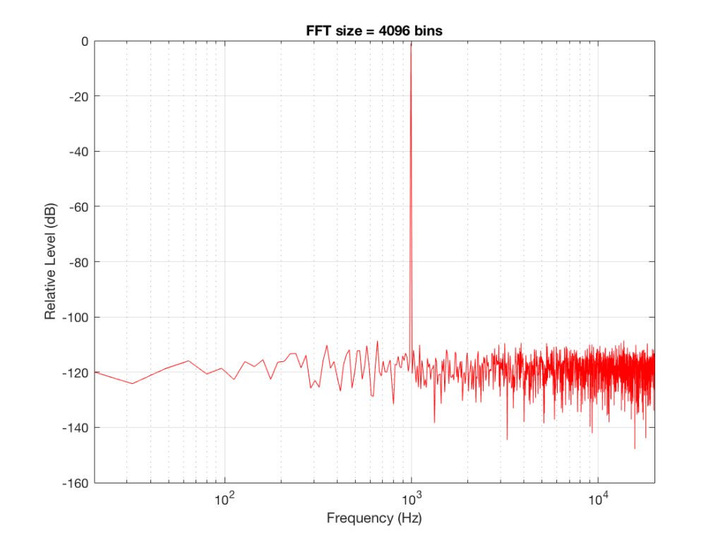
If I do an FFT of 256 points on the signal (and therefore, I’m only looking at the first 256 samples of the signal – this is an important point that we’ll come back to later…), the result looks like Figure 1.
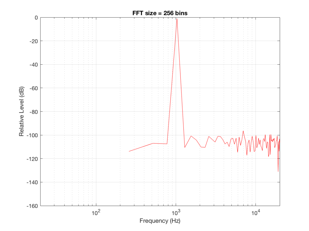
Note that the sine tone is a little higher than 997 Hz – but this is not really important. (the explanation is at the end!).
There are some things to notice here:
The first is that the plot does not extend lower than a frequency of 256 Hz. This is because the resolution of a 256-point FFT is 256 Hz – so, there is a “point” on the plot every 256 Hz – typically called a “bin” – since it contains information about the level of a collection of frequencies around its centre frequency. (If you’re new to FFT’s, don’t jump to the conclusion that the frequency resolution is equal to the length of the FFT. This is incorrect. The frequency resolution is equal to the sampling rate divided by the FFT length – 65536 Hz / 256 bins = 256 Hz.) Limiting the length of the FFT limits its resolution, which has an obvious impact when we plot the results on a logarithmic frequency scale.
The second is that, although the SNR of the signal is 80 dB, on the magnitude response, it appears that the noise is generally lower than -100 dB. This is not that difficult to believe, since the noise is spread over a wide frequency range – so, although any one frequency may, indeed, be more than 100 dB below the signal – the sum of the energy in all of those frequency bands totals more than any of the individual contributions. (In the same way that 1000 people can shout louder than 1 person – even if all 1000 people are, individually, shouting at the same level.)
One thing that is not obvious from the plot, but that we have to keep in mind is that this shows us the level of the different frequency ranges over the entire length of the signal (all 256 samples of it). However, the noise that I created that is part of that signal is exactly that – noise. Since it is noise, there is no guarantee that all frequencies are represented at the same level at any one time – in fact, they’re not. “White noise” has the characteristic of having equal probability of having the same level at all frequencies. But if 1000 people have equal probability of winning a lottery, that doesn’t mean than 1000 of them will win. In order to ensure that you actually get the same level at all frequencies, you would have to listen to white noise forever – and I’m not willing to wait that long…
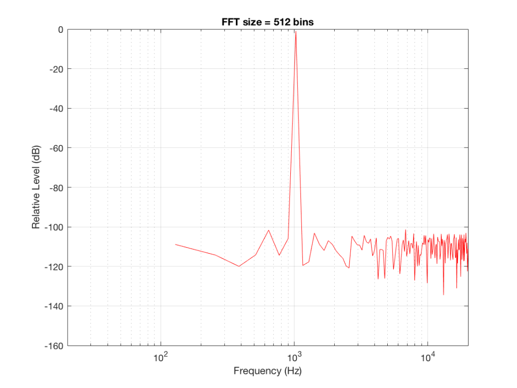
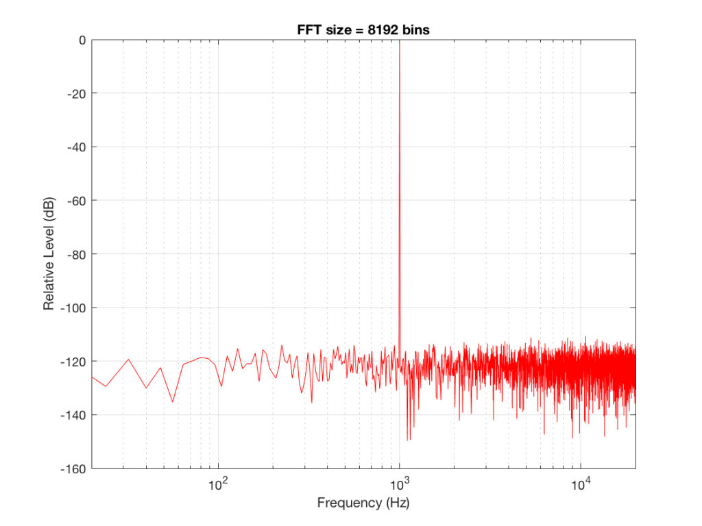
Figure 2 shows the same analysis done on the same signal, but with a 512-bin FFT instead. There, you can see that the the resolution of the plot is better – we have a bin or point every 128 Hz (remember 65536 Hz / 512 bins = 128 Hz). Also, the sine tone has the same level (-1 dB FS) but the noise, which we know is 80 dB lower, appears to be even lower than it does in Figure 1… Strange…
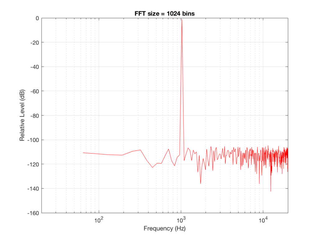
Let’s do some more FFT’s with more and more bins to see what happens…
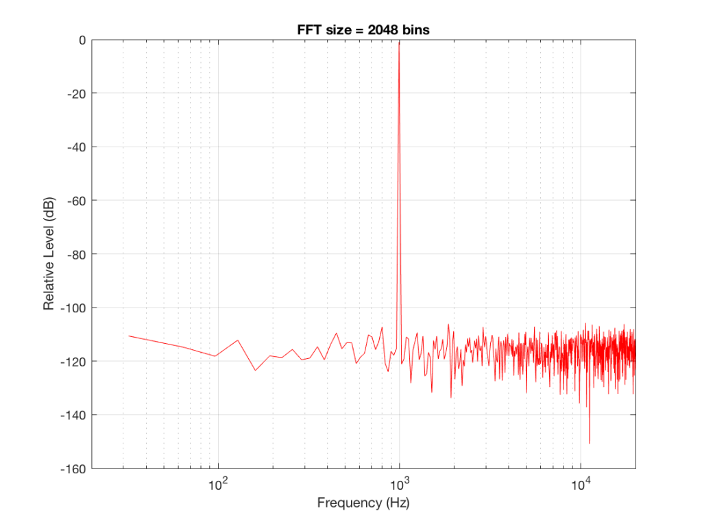
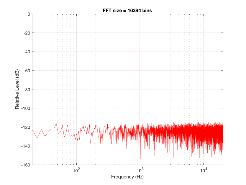
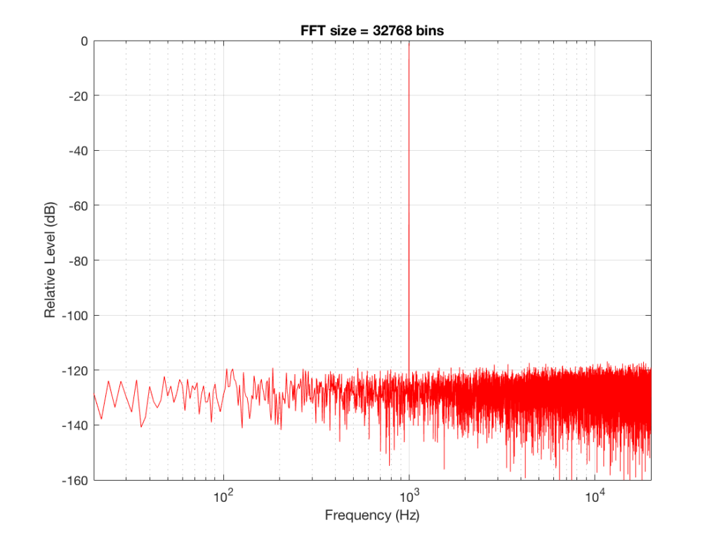
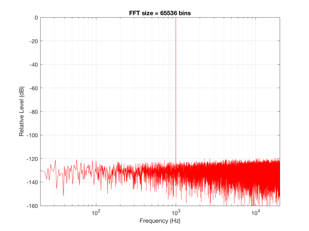
So, by going from a 256-bin FFT to a 65536-bin FFT, we appear to have dropped the noise floor by more than 20 dB.
Weird? No. Why?
Remember that every time we double the length of the FFT, we double the number of frequency bins in its output. So, that plot in Figure 9 has more individual frequencies contributing to add together to the same noise signal, 80 dB lower than the sine tone. (If you asked 1000 people to shout as loudly as 10 people, each individual in the larger group would have to be quieter to produce the same total output.)
The “punch line” here is that we cannot make a direct conclusion about the overall Signal-to-Noise ratio of the signal by looking at any of the plots above. Of course we can say that the “signal” (the sine tone) is obviously louder than the noise – by a lot. But we can’t be much more detailed than that.
So, if someone jumps between a SNR number and a spectral plot like the ones above, in an effort to convince you of something, be very careful about being led down a garden path.
Some extra information:
We also have to remember that, although the signal that I used to make these graphs was initially the same, the actual signal that was used by each of the FFT’s was different. This is because, by default, the length of the signal used by an FFT calculation is the same as the number off bins in the FFT. So, for example, a 256-bin (or 256-point) FFT only uses 256 samples as its input. A 32768-point FFT uses 32768 samples (the first 256 of which were the ones used by the 256-point FFT). So, for example, if you load a recording of Britney Spears singing “Toxic” into Matlab, and you type the command FFT(toxic, 256) – you’ll get a 256-bin FFT of the first 5 .8 milliseconds (256 samples) of the recording – not a representation of the spectral content of the entire song.
Initially, I started out by saying that I would use a 997 Hz sine tone. This might look a little weird because it’s not a nice number like 1000 Hz. There’s a good reason for this, and I’ll write a posting about it some other day.
Then, I said that it’s not really 997 Hz – I moved it a little. This is because I wanted the frequency of my sine tone to land exactly on one of the bins of my FFT. So for example, in the case of the 256-bin FFT, I had a frequency resolution of 256 Hz – so my bins are at the following:
256 Hz
512 Hz
768 Hz
1024 Hz
1024 Hz is the closest value to 997 Hz that occurs in the sequence so I used that instead. If I had kept the sine tone fixed at 997 Hz, the plots would not have looked as pretty, because the information about its level would have “leaked” or “been spread out” into the adjacent bins. So, instead of a nice clean spike, we would have seen a big, round bump.
Jamie Angus says:
Hi Geoff,
What sort of window were you using?
Was it a symmetric one, as used in FIR filters, or was it one that when you replicate it it forms a continuous pattern?
Note in the latter case one side of the window is not the same as the other it is very slightly asymmetric, but it works better for spectral analysis.
Jamie
geoff says:
Hi Jamie,
This was done with a good ol’ fashioned rectangular window, with no fancy symmetry manipulation. I was just a little careful to line up the sine tone frequency on a bin centre to make it pretty. And, as you know, since the rest of the signal was just a rand function in Matlab, then posh windowing is irrelevant-ish… :-)
If I hadn’t been careful about the frequency of the sine tone, then I probably would have used a Blackman-Harris windowing function, but that’s only because it’s what I always use, so I’ve gotten used to seeing it infect my results.
Cheers
-geoff