Once-upon-a-time I posted a little thing about Burmese Colour Needles for grammophones. Then, today, I received an email from the owner of www.burmesecolourneedles.com a company owned by Andy Briggs, where you can buy brand new ones!
Andy also has a YouTube channel that is well worth visiting.
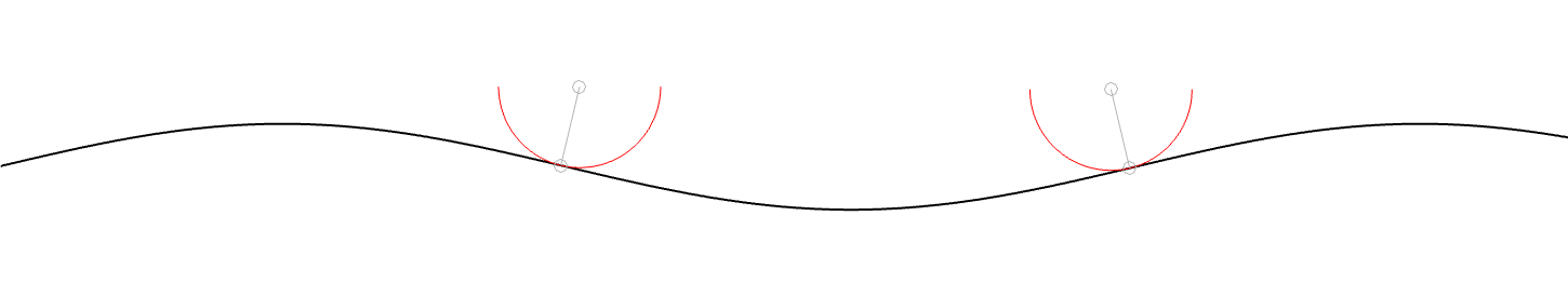
In the last posting, I showed a scale drawing of a 15 µm radius needle on a 1 kHz sine tone with a modulation velocity of 50 mm/s (peak) on the inside groove of a record. Looking at this, we could see that the maximum angular rotation of the contact point was about 13º away from vertical, so the total range of angular rotation of that point would be about 27º.
I also mentioned that, because vinyl is mastered so that the signal on the groove wall has a constant velocity from about 1 kHz and upwards, then that range will not change for that frequency band. Below 1 kHz, because the mastering is typically ensuring a constant amplitude on the groove wall, then the range decreases with frequency.
We can do the math to find out exactly what the angular rotation the contact point is for a given modulation velocity and groove speed.
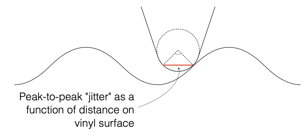
Figure 1: A scale drawing of a 15 µm radius needle on a 1 kHz sine tone with a modulation velocity of 50 mm/s (peak) on the inside groove of a record. These two points are the two extremes of the angular rotation of the contact point.
Looking at Figure 1, the rotation is ±13.4º away from vertical on the maximum; so the total range is 26.8º. We convert this to a time modulation by converting that angular range to a distance, and dividing by the groove speed at the location of the needle on the record.
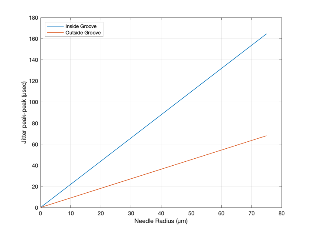
If we repeat that procedure for a range of needle radii from 0 µm to 75 µm for the best-case (the outside groove) and the worst-case (the inside groove), we get the results shown in Figure 2.
Figure 2. The peak-to-peak equivalent “jitter” values of the inside and outside grooves for a range of needle radii.
Back in Part II of what is turning out to be a series of postings on this topic, I wrote
If this were a digital system instead of an analogue one, we would be describing this as ‘signal-dependent jitter’, since it is a time modulation that is dependent on the slope of the signal. So, when someone complains about jitter as being one of the problems with digital audio, you can remind them that vinyl also suffers from the same basic problem…
As I was walking the dog on another night, I got to thinking whether it would be possible to compare this time distortion to the jitter specifications of a digital audio device. In other words, is it possible to use the same numbers to express both time distortions? That question led me here…
Remember that the effect we’re talking about is caused by the fact that the point of contact between the playback needle and the surface of the vinyl is moving, depending on the radius of the needle’s curvature and the slope of the groove wall modulation. Unless you buy a contact line needle, then you’ll see that the radius of its curvature is specified in µm – typically something between about 5 µm and 15 µm, depending on the pickup.
Now let’s do some math. The information and equations for these calculations can be found here.
We’ll start with a record that is spinning at 33 1/3 RPM. This means that it makes 0.556 revolutions per second.
The Groove Speed relative to the needle is dependent on the rotation speed and the radius – the distance from the centre of the record to the position of the needle. On a 12″ LP, the groove speed at the outside groove where the record starts is 509.8 mm/sec. At the inside groove at the end of the record, it’s 210.6 mm/sec.
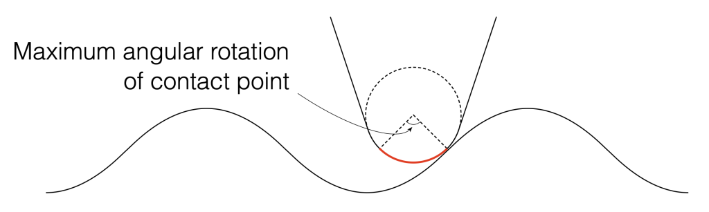
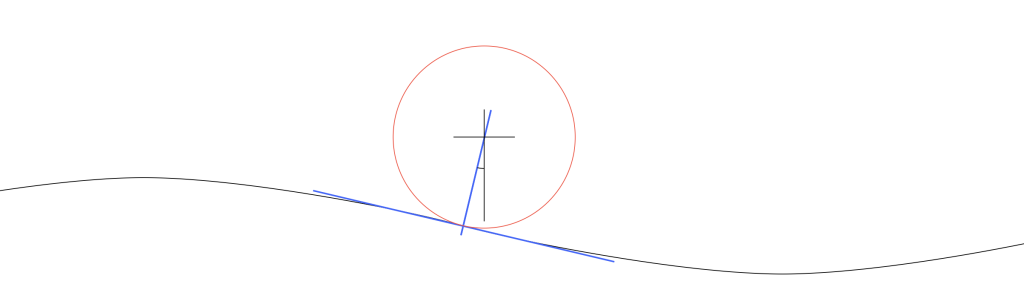
Let’s assume that the angular rotation of the contact point (shown in Figure 1) is 90º. This is not based on any sense of scale – I just picked a nice number.
Figure 1. Artists rendition of the range of the point of contact between the surface of the vinyl and the pickup needle.
We can convert that angular shift into a shift in distance on the surface of the vinyl by finding the distance between the two points on the surface, as shown below in Figure 2. Since you might want to choose an angular rotation that is not 90º, you can do this with the following equation:
2 * sin(AngularRotation / 2) * radius
So, for example, for a needle with a radius of 10 µm and a total angular rotation of 90º, the distance will be:
2 * sin(90/2) * 10 = 14.1 µm
Figure 2. The angular range from Figure 1 converted to a linear distance on the vinyl’s surface.
We can then convert the “jitter” as a distance to a jitter in time by dividing it by the distance travelled by the needle each second – the groove speed in µm per second. Since that groove speed is dependent on where the needle is on the record, we’ll calculate it as best-case and a worst-case values: at the outside and the inside of the record.
Jitter Distance / Groove Speed = Jitter in time
For example, at the inside of the record where the jitter is worst (because the wavelength is shortest and therefore the maximum slope is highest), the groove speed is about 210.6 mm/sec or 210600 µm/sec.
Then the question is “what kind of jitter distance should we really expect?”
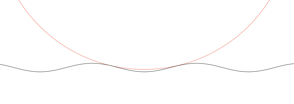
Figure 3. Scale drawing of a needle on a record.
Looking at Figure 3 which shows a scale drawing of a 15 µm radius needle on a 1 kHz tone with a modulation velocity of 50 mm/s (peak) on the inside groove of a record, we can see that the angular rotation at the highest (negative) slope is about 13.4º. This makes the total range about 27º, and therefore the jitter distance is about 7.0 µm.
If we have a 27º angular rotation on a 15 µm radius needle, then the jitter will be
7.0 / 210600 = 0.0000332 or 33.2 µsec peak-to-peak
Of course, as the radius of the needle decreases, the angular rotation also decreases, and therefore the amount of “jitter” drops. When the radius = 0, then the jitter = 0.
It’s also important to note that the jitter will be less at the outside groove of the record, since the wavelength is longer, and therefore the slope of the groove is lower, which also reduces the angular rotation of the contact point.
Since the groove on records are typically equalised to ensure that you have a (roughly) constant velocity above 1 kHz and a constant amplitude below, then this means that the maximum slope of the signal and therefore the range of angular rotation of the contact point will be (roughly) the same from 1 kHz to 20 kHz. As the frequency of the signal descended from 1 kHz and downwards, the amplitude remains (roughly) the same, so the velocity decreases, and therefore the range of the angular rotation of the contact point does as well.
In other words, the amount of jitter is 0 at 0 Hz, and increases with frequency until about 1 kHz, then it remains the same up to 20 kHz.
As one final thing: as I was drawing Figure 3, I also did a scale drawing of a 20 kHz signal with the same 50 mm/s modulation velocity and the same 15 µm radius needle. It’s shown in Figure 4.
Figure 4. Scale drawing of a needle on a record.
As you can see there, the needle’s 15 µm radius means that it can’t drop into the trough of the signal. So, that needle is far too big to play a CD-4 quad record (which can go all the way up to 45 kHz).
I thought that I was finished talking about (and even thinking about) the RCA Dynagroove Dynamic Styli Correlator as well as tracking and tracing distortion… and then I got an email about the last two postings pointing out that I didn’t mention two-channel stereo vinyl, and whether there was something to think about there.
My first reaction was: “There’s nothing interesting about that. It’s just two channels with the same problem, and since (at least in a hypothetical world) the two axes of movement of the needle are orthogonal, then it doesn’t matter. It’ll be the same problem in both channels. End of discussion.”
Then I took the dog out for a walk, and, as often happens when I’m walking the dog, I re-think thoughts and come home with the opposite opinion.
So, by the time I got home, I realised that there actually is something interesting about that after all.
Starting with Emil Berliner, record discs (original lacquer, then vinyl) have been cut so that the “mono” signal (when the two channels are identical) causes the needle to move laterally instead of vertically. This was originally (ostensibly) to isolate the needle’s movement from vibrations caused by footsteps (the reality is that it was probably a clever manoeuvring around Edison’s patent).
This meant that, when records started supporting two audio channels, a lateral movement was necessary to keep things backwards-compatible.
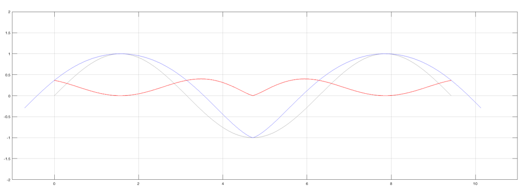
What does THIS mean? It means that, when the two channels have the same signal (say, on the lead vocal of a pop tune, for example) when the groove of the left wall goes up, the groove of the right wall goes down by the same amount. That causes the needle to move sideways, as shown below in Figure 1.
Figure 1. A two-channel groove with identical information in the two channels.
What are the implications of this on tracing distortion? Remember from the previous posting that the error in the movement of the needle is different on a positive slope (where the needle is moving upwards) than a negative slope (downwards). This can be seen in a one-channel representation in Figure 2.
Figure 2. The grey line is the groove wall. The blue line shows the actual movement of the needle and the red line shows the difference between the two – the error contained in the output signal.
Since the two groove walls have an opposite polarity when the audio signals are the same, then the resulting movement of the two channels with the same magnitude of error will look like Figure 3.
Figure 3. The physical movement of the two channels, and their independent errors.
Notice that, because the two groove walls are moving in opposite polarity (in other words, one is going up while the other is going down) this causes the two error signals to shift by 1/2 of a period.
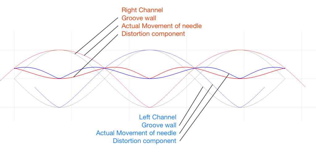
However, Figure 3 doesn’t show the audio’s electrical signals. It shows the physical movement of the needle. In order to show the audio signals, we have to flip the polarity of one of the two channels (which, in a real pickup would be done electrically). That means that the audio signals will look like Figure 4.
Figure 4. The electrical outputs of the two audio channels and their error components.
Notice in Figure 4 that the original signals are identical (that’s why it looks like there’s only one sine wave) but their actual outputs are different because their error components are different.
But here’s the cool thing:
One way to think of the actual output signals is to consider each one as the sum of the original signal and the error signal. Since (for a mono signal like a lead vocal) their original signals are identical, then, if you sit in the right place with a properly configured pair of loudspeakers (or a decent pair of headphones) then you’ll hear that part of the signal as a phantom image in the middle. However, since the error signals are NOT correlated, they will not be localised in the middle with the voice. They’ll move to the sides. They’re not negatively correlated, so they won’t sound “phase-y” but they’re not correlated either, so they won’t be in the same place as the original signal.
So, although the distortion exists (albeit not NEARLY on the scale that I’ve drawn here…) it could be argued that the problem is attenuated by the fact that you’ll localise it in a different place than the signal.
Of course, if the signal is only in one channel (like Aretha Franklin’s backup singers in “Chain of Fools” for example) then this localisation difference will not help. Sorry.
After writing the previous posting, I couldn’t stop thinking about it. Mostly, I wanted to get a better idea of the shape of the waveform that results from the difference in a groove cut with a stylus and a spherically-tipped needle on a turntable pickup. To be perfectly honest, I’m not even interested in a ‘real’ simulation. I just wanted to get an intuitive idea of what’s happening down at that nearly-microscopic level. So, I used Matlab to draw some pictures.
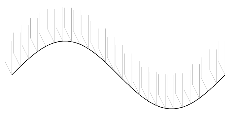
Let’s take one period of a sine wave cut into the vinyl master with a chisel-shaped stylus:
Figure 1: The black line shows the wave cut into the vinyl surface. The grey shapes are “artist’s renditions” of the chisel-shaped stylus that cut it.
In theory, the pickup needle tracks this vertical movement exactly, as shown in Figure 2.
Figure 2. The black line is the original signal. The Red line is the signal tracked by a needle that has the same shape as the cutting stylus.
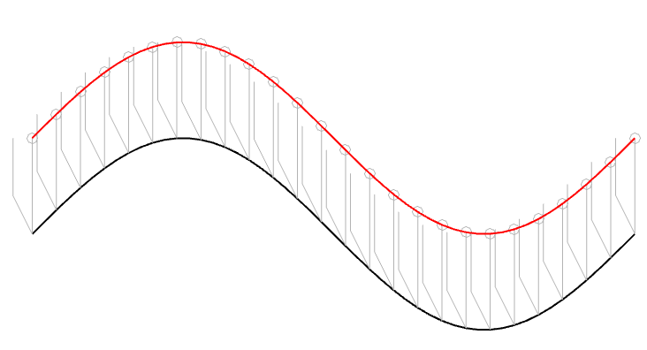
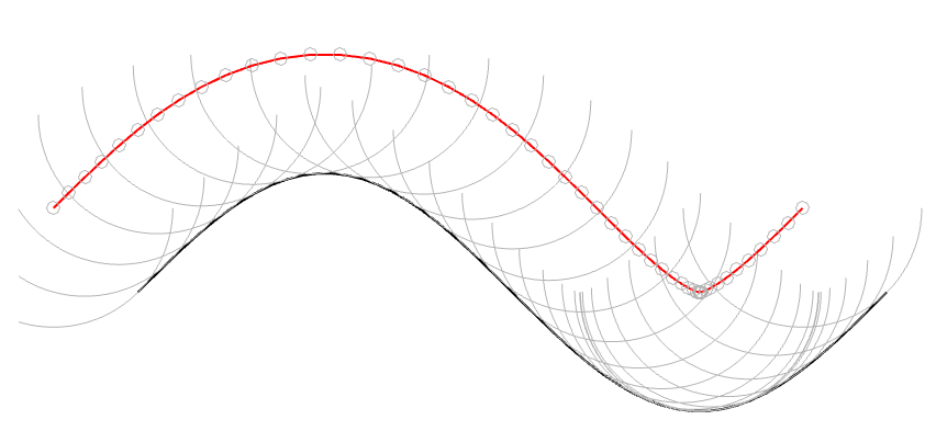
However, we already know that the pickup needle is NOT the same shape as the cutting stylus. In 1964, the needle would have had a spherical tip, which I’ve shown in Figure 3 as a series of semicircles (certainly NOT to scale…).
Figure 3: The black line is the original signal. The grey semicircles are the outline of a spherically-tipped pickup needle. The small grey circles are the centres of those semicircles. When you connect those circles, you get the red line.
In Figure 3, I’ve connected the centres of the semicircles to make the red line. However, you may notice that this line is not directly above the black line because of the interaction between the slope of the original signal and the radius of the ‘sphere’ that I’m showing. This might be easier to see in Figure 4 which is the same as Figure 3, but I’ve ‘connected the dots’.
Figure 4. This is the same as Figure 3, but I’ve shown the radii of the ‘spheres’ connecting the centre to the surface where it’s touching the vinyl.
(1) One interesting thing about the figure above is that it shows that the point where the needle is resting on the vinyl surface isn’t always vertical – it’s 90º from the tangent of the groove wall (assuming a spherically-ground needle). This means that the output of the needle (which, we assume is determined only by its vertical movement) is actually sliding forwards and backwards in time on the recording, depending on whether the slope is positive or negative.
For example, if you look at the far left of Figure 4, you can see that the centre of the needle is to the left of the point where it’s touching the vinyl. If this is drawn so that the vinyl is moving from right to left (or the needle is moving from left to right – so it’s drawn from the perspective of someone looking in from the edge of the record) then this means that the output of the system is looking ahead in time.
When the needle drops back downwards, it’s delaying the signal, looking back in time.
If this were a digital system instead of an analogue one, we would be describing this as ‘signal-dependent jitter’, since it is a time modulation that is dependent on the slope of the signal. So, when someone complains about jitter as being one of the problems with digital audio, you can remind them that vinyl also suffers from the same basic problem…
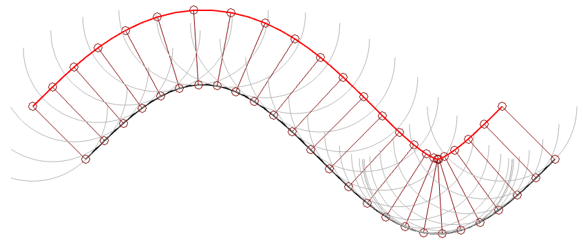
(2) Another interesting thing is that, if we subtract the original signal on the vinyl’s surface from the actual path traced by the needle, we can see the tracing error itself. This is shown below as the red curve in Figure 5.
Figure 5. The original signal is in grey, the movement of the needle is in blue, and the difference (the tracing error) is in red.
Notice that, although the original signal is symmetrical, the blue curve (the actual signal) is not. This means that it has a DC offset, which is easily seen in the error curve in red, which never drops below the vertical 0 line; the mean of the original signal.
(Remember, I’m exaggerating everything here just to get an intuitive understanding of what’s going on.)
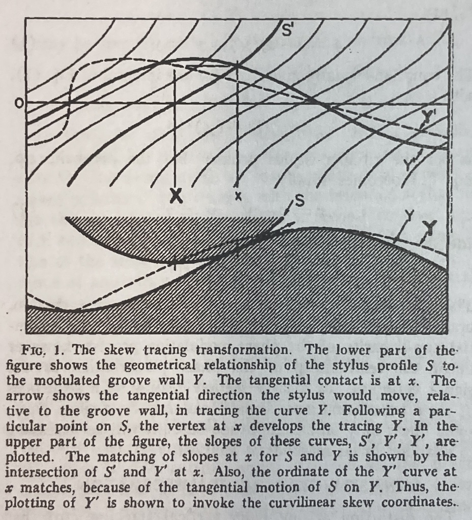
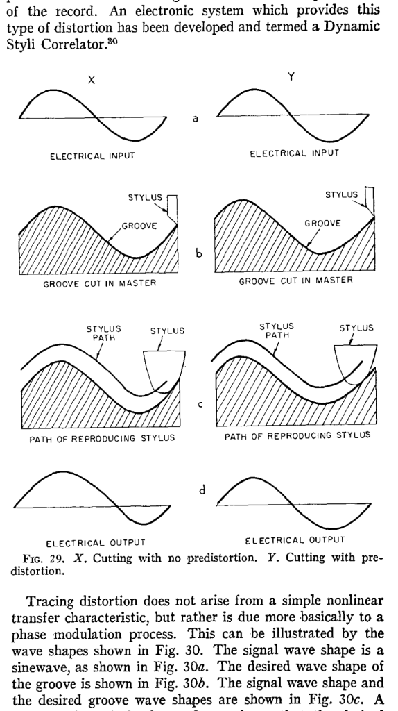
Although I’ve done all of this analysis numerically using Matlab, I’ve also found a paper that describes this error analytically. It’s “Integrated Treatment of Tracing and Tracking Error” by Duane H. Cooper in the Journal of the Audio Engineering Society from January, 1964. In that paper, he shows the following drawing shown below in Figure 6. Compare the dotted line to the blue one above, for example. (It seems that I wasted my time doing math when I should have been reading old papers instead…)
Figure 6.
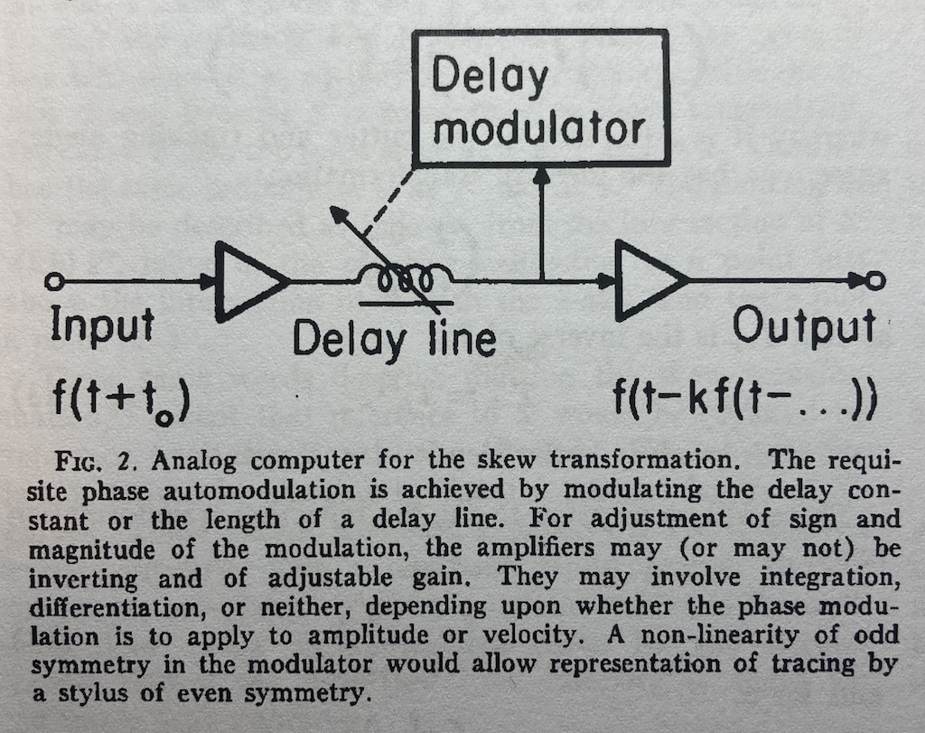
The horizontal distance in Figure 6 between the bold capital ‘X’ and the small ‘x’ is an angular rotation from the centre of the needle’s spherical tip and therefore a time shift in the playback of the recording. Later in the same paper, Cooper proposes an analogue computer that can predict this distortion by modulating a delay applied to the audio signal as a function of the signal itself. A representation of this from the paper is shown below in Figure 7. This prediction can then be used to generate the pre-emphasis distortion of RCA’s “Dynamic Styli Correlator”.
Figure 7.
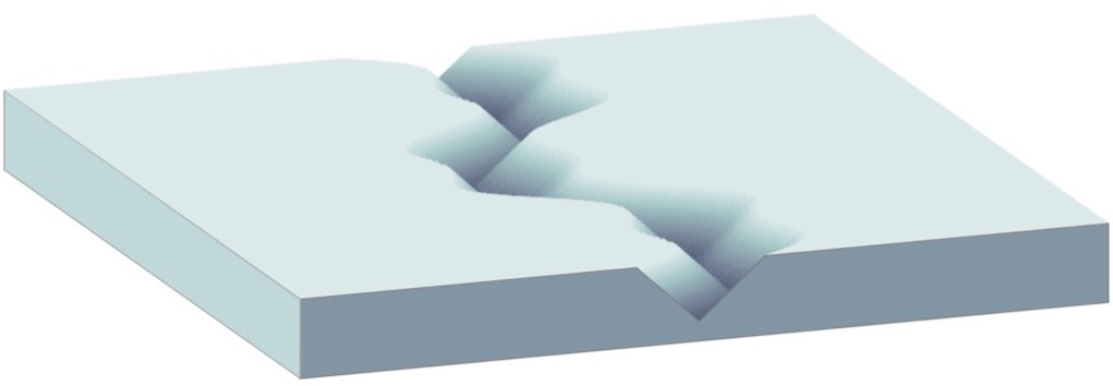
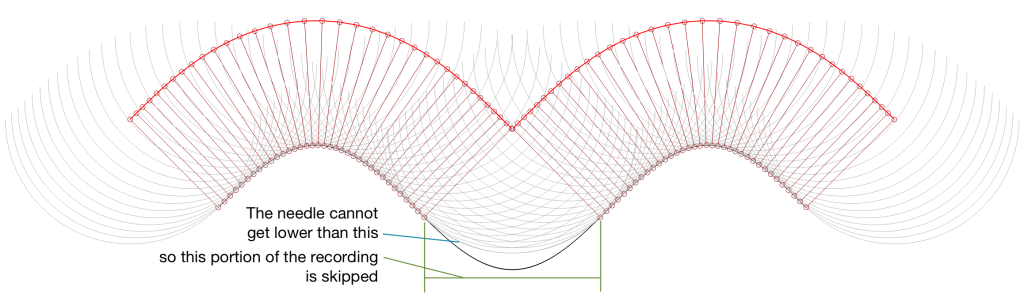
(3) The last thing that I’ve found is an extreme case that should never happen in real life, but it might. This is when the trough that the needle is dropping into is narrower than the diameter of the stylus. When this happens, the point where the stylus is touching jumps instantaneously from one side of the trough to the other. This is shown in Figure 8.
Figure 8. When the stylus is too big to fit into the trough, parts of the waveform are skipped.
This is the same thing that happens when a tire of your car drops into a bad pothole. You roll off one edge of the hole, and hit the edge on the opposite side, but the part of the tire that is actually IN the pothole never actually touches the bottom.
This problem is the same as I described above; but instead of the output signal merely sliding in time, it’s jumping. One example I can think where this would happen in real life is when you play a CD-4 quad LP with a needle that isn’t made for it. However, in this case you won’t notice the problem, since the high-frequency FM modulated surround channels result in a more-or-less constant “ripple” on the groove wall. This means that your needle is just surfing along the tops of the ripples and never drops into a trough at all.
Many audio recording systems are based on a concept known as “pre-emphasis” and “de-emphasis”. This is a process where a signal is distorted (here, I use the word “distorted” to mean “changed”, not “clipped”) at the recording or encoding process to counter-act the effects of something that will happen at playback. One example of this is a RIAA equalisation that applies an overall bass-heavy tilt to the frequency response at playback, and therefore the signal is given the opposite tilt when it’s cut onto the vinyl master. Dolby noise reduction for analogue magnetic tape follows a similar philosophy.
Another type of intentional distortion applied to an audio signal is based on assumptions of what happens at playback. Mixing engineers for television often emphasise lower frequency bands, assuming that everyone’s television loudspeakers needed some help. Pop and rock recording engineers check the mix on a low-quality mono loudspeaker and may make adjustments to the mix – to make sure it survived a clock radio or a portable Bluetooth loudspeaker (depending on which decade we’re talking about). Stereo vinyl records can’t have big low-frequency differences in the two audio channels otherwise the needle will hop out of the groove, so they’re mixed and mastered accordingly.
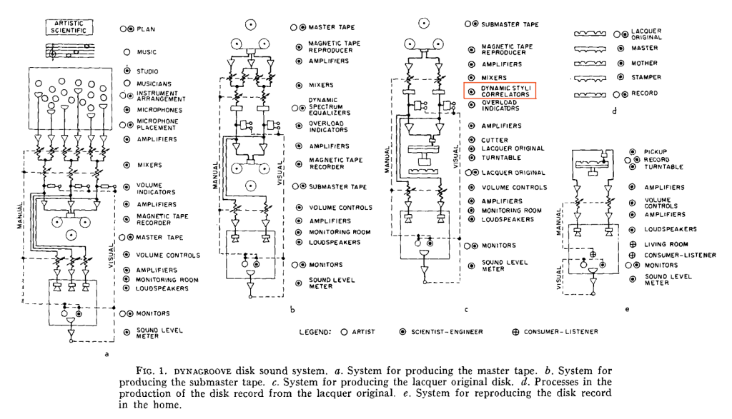
I’ve been reading “The RCA Victor Dynagroove System”, by Harry F. Olsen, published in the April 1964 issue of the Journal of the Audio Engineering Society. In it, he describes the entire recoding chain, including something that piqued my interest called a “Dynamic Styli Correlator” which is a distortion that is applied to the audio at almost the last stage of the signal path before it reaches the cutter head of the lathe that creates the lacquer master. You can see it here in Figure 1 from the article (I drew the red box around it).
Cool name; almost worthy of Dr. Heinz Doofenshmirtz (although it’s missing the “-inator”). But what is it?
One of the problems with playing back a vinyl record is that the shape of the needle on your turntable is not the same shape as the cutting stylus on the lathe. Consequently, the path that the needle tracks is not exactly the same as the path of the stylus. The result of this mis-match is that the electrical input signal that is used to make the master (the original recording) is not the same as the electrical output signal that comes out of your turntable (what you hear).
The idea behind the Dynamic Styli Correlator was that the actual path of the playback needle could be predicted, and the groove cut by the stylus could be modified to ensure that the output was correct. In other words, the distortion caused by the playback needle was estimated, and a distorted groove was cut to make the needle behave. This is shown graphically in Figure 29 of the article:
This is a great idea if the system works and if the prediction of the playback needle’s path is correctly predicted. However, neither of these two assumptions is guaranteed; so a number of things can go wrong here, and if anything can go wrong, it probably will.
However, it does mean at least as a start, that if you play an old RCA Victor Dynagroove record with a stylus shape that wasn’t invented yet in 1964 (say, a contact line stylus made for CD-4 Quadraphonic records, for example). Then you might wind up doing a much better job of reproducing the distortion that RCA created in the first place, instead of what they thought you were supposed to hear.
A question came to my desk this week from a customer who would like to connect a third-party streaming device to his Beolab 50s. He plans to use a USB-Audio connection and his question was “Should I control the volume of the audio signal in the streamer or in the Beolab 50s?” There are three different ways to configure these two options:
Control the volume in the streamer using its interface, and send a signal that has been volume-regulated to the Beolab 50s, which should then be set to have a start up default volume such that the maximum volume on the streamer results in a level that is as loud as the customer will ever want it to be. In order to do this, the Beolab 50s need to be set to ignore the volume information that is received on the USB-Audio connection.
Set the streamer to output an unregulated signal, and set the Beolab 50s to obey the volume information that is received on the USB-Audio connection, then use the streamer’s interface for the volume control (which would actually be happening inside the Beolab 50s).
Set the streamer to output an unregulated signal, and set the Beolab 50s to disobey the volume information that is received on the USB-Audio connection, then use the Beolab 50’s interface for the volume control (which would actually be happening inside the Beolab 50s).
Of course, one way to answer the question is “where do you want to control the volume?” For example, if it’s with a remote control for the Beolab 50s, then the answer is “use option #3”. If you’d prefer to use the streamer’s app, for example, then the answer is “use option #1 or #2”.
However, the question came to my desk because it was specifically about the technical performance of the audio signal. Which of these three options results in the highest audio “quality”? (I put the word “quality” in quotation marks because it is a loaded term, and might mean different things to different persons…)
The simplest answer without getting into any details is “it probably doesn’t matter“. However, that answer is based on a couple of assumptions that may or may not be wrong.
Hypothetically, the Beolab 50 can output an audio signal that peaks at about 122 dB SPL measured at 1 m in a free field, albeit not at all frequencies present at its output. (This is because there are some physical limitations of how far the woofers can move, which means that you can’t get 122 dB SPL at 20 Hz, for example.) The noise floor of the Beolab 50s is about 0 dB SPL measured in the same place (again, this is frequency-dependent). So, it has a total dynamic range at its output of about 122 dB.
The maximum output level is a result of a combination of the loudspeaker drivers, the amplifiers, and the power supply, however, these have all been chosen to reach their maximum outputs approximately simultaneously, so changing one of the three won’t make a big difference.
The noise floor is a result of the combination of the loudspeaker drivers’ sensitivities, the amplifiers’ noise floors, and the signal that feeds the amplifiers: the DAC outputs’ noise floors. For the purposes of this discussion, I’m sticking with a digital input, so we don’t need to worry about the noise floor of the ADC at the loudspeaker’s input.
If you have an audio signal at one of the digital inputs of the Beolab 50, and that signal is at its loudest possible level (for a sine wave, that’s 0 dB FS; or 0 dB relative to Full Scale). At Beolab 50’s maximum volume setting, this will produce a peak output level of 122 dB SPL (depending on the frequency as I mentioned above).
All digital inputs of the Beolab 50 accept at least a 24 bit word length. This means that the dynamic range of the digital input signal itself is about 6 * 24 – 3 = 141 dB. This in turn means that the hypothetical noise floor of a correctly-dithered 24-bit signal is 19 dB below the noise floor of the loudspeakers even at their maximum volume setting. (because 122 – 141 = -19)
In other words, if we assume that the streamer has a correctly-implemented gain function for its volume control, using TPDF dither implemented at the 24-bit level, then its noise floor will be 19 dB below the “natural” noise floor of the Beolab 50. Therefore, if the volume is controlled in the streamer, any artefacts will be masked by the 50s themselves.
On the other hand, the Beolab 50s volume control is done using a gain function that is performed in a 32-bit floating point calculation, which means that it has a dynamic range of 144 to 150 dB. (See this posting for an explanation and comparison of fixed point and floating point systems.) So the noise generated by the internal volume control will be somewhere between 22 and 26 dB below the “natural” noise floor of the Beolab 50.
So, (assuming my assumptions are correct) the noise floor that is produced by controlling the volume control in either the streamer or the Beolab 50s is FAR below the constant noise floor of the DAC / amplifiers.
In addition, the noise floors have roughly the same spectra (in other words, you don’t have pink noise in one case but white noise in the other; they’re all producing white noise). And since both are so far below, it really doesn’t matter. Arguing about whether the noise is 19 dB lower or 22 dB lower is a waste of good argument time, unless you paid for the four-and-a-half-hour argument instead of the five-minute one…
Important Notes
If the customer was asking about using the analogue input, then the answer MIGHT have been different.
Also, if my assumption about a 24-bit signal coming from the streamer, or that it has a correctly-implemented gain function for its volume control are incorrect, the this answer MIGHT be incorrect as well.
Back when I was at McGill, one of my fellow Ph.D. students was Mark Ballora, who did his doctorate in converting heart rate data to an audible signal that helped doctors to easily diagnose patients suffering from sleep apnea.
When you look at the datasheet of an audio device, you may see a specification that states its “signal to noise ratio” or “SNR”. Or, you may see the “dynamic range” or “DNR” (or “DR”) lists as well, or instead.
These days, even in the world of “professional audio” (whatever that means), these two things are similar enough to be confused or at least confusing, but that’s because modern audio devices don’t behave like their ancestors. So, if we look back 30 years ago and earlier, then these two terms were obviously different, and therefore independently usable. So, in order to sort this out, let’s take a look at the difference in old audio gear and the new stuff.
Let’s start with two of basic concepts:
All audio devices (or storage media or transmission systems) make noise. If you hold a resistor up in the air and look at the electrical difference across its two terminals and you’ll see noise. There’s no way around this. So, an amplifier, a DAC, magnetic tape, a digital recording stored on a hard drive… everything has some noise floor at the bottom that’s there all the time.
All audio devices have some maximum limit that cannot be exceeded. A woofer can move in and out until it goes so far that it “bottoms out” on the magnet or rips the surround. A power amplifier can deliver some amount of current, but no higher. The headphone output on your iPhone cannot exceed some voltage level.
So, the goal of any recording or device that plays a recording is to try and make sure that the audio signal is loud enough relative to that noise that you don’t notice it, but not so loud that the limit is hit.
Now we have to look a little more closely at the details of this…
If we take the example of a piece of modern audio equipment (which probably means that it’s made of transistors doing the work in the analogue domain, and there’s lots of stuff going on in the digital domain) then you have a device that has some level of constant noise (called the “noise floor”) and maximum limit that is at a very specific level. If the level of your audio signal is just a weeee bit (say, 0.1 dB) lower than this limit, then everything is as it should be. But once you hit that limit, you hit it hard – like a brick wall. If you throw your fist at a brick wall and stop your hand 1 mm before hitting it, then you don’t hit it at all. If you don’t stop your hand, the wall will stop it for you.
In older gear, this “brick wall” didn’t exist in lots of gear. Let’s take the sample of analogue magnetic tape. It also has a noise floor, but the maximum limit is “softer”. As the signal gets louder and louder, it starts to reach a point where the top and bottom of the audio waveform get increasingly “squished” or “compressed” instead of chopping off the top and bottom.
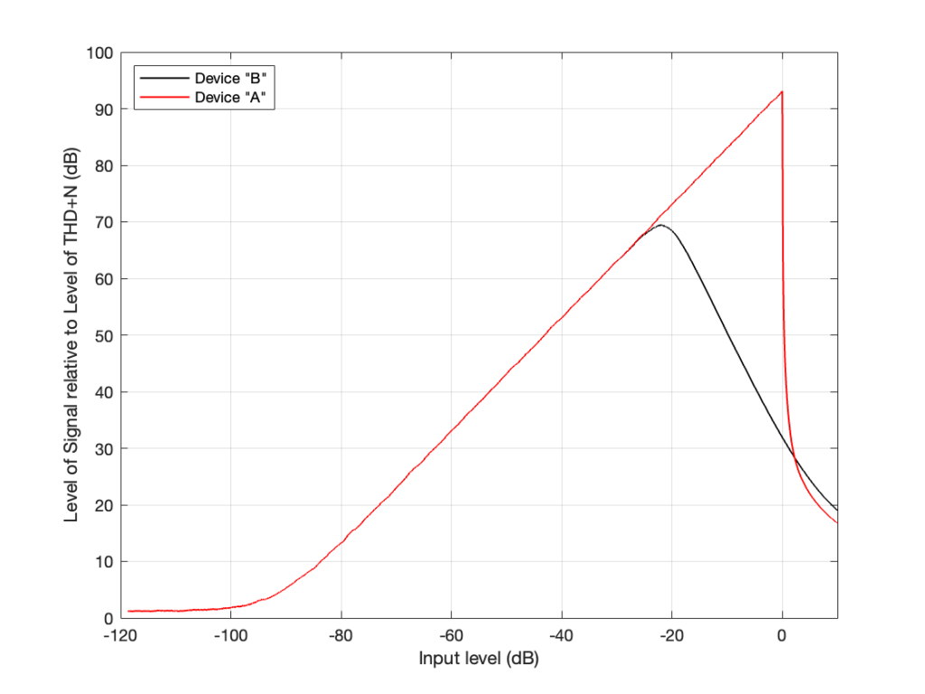
I made a 997 Hz sine wave that starts at a very, very low level and increases to a very high level over a period of 10 seconds. Then, I put it through two simulated devices.
Device “A” is a simulation of a modern device (say, an analogue-to-digital converter). It clips the top and bottom of the signal when some level is exceeded.
Device “B” is a simulation of something like the signal that would be recorded to analogue magnetic tape and then played back. Notice that it slowly “eases in” to a clipped signal; but also notice that this starts happening before Device “A” hits its maximum. So, the signal is being changed before it “has to”.
Let’s zoom in on those two plots at two different times in the ramp in level.
Device “A” is the two plots on the top at around 8.2 seconds and about 9.5 seconds from the previous figure. Device “B” is the bottom two plots, zooming in on the same two moments in time (and therefore input levels).
Notice that when the signal is low enough, both devices have (roughly) the same behaviour. They both output a sine wave. However, when the signal is higher, one device just chops off the top and bottom of the sine wave whereas the other device merely changes its shape.
Now let’s think of this in terms of the signals’ levels in relationship to the levels of the noise floors of the devices and the distortion artefacts that are generated by the change in the signals when they get too loud.
If we measure the output level of a device when the signal level is very, very low, all we’ll see is the level of the inherent noise floor of the device itself. Then, as the signal level increases, it comes up above the noise floor, and the output level is the same as the level of the signal. Then, as the signal’s level gets too high, it will start to distort and we’ll see an increase in the level of the distortion artefacts.
If we plot this as a ratio of the signal’s level (which is increasing over time) to the combined level of the distortion and noise artefacts for the two devices, it will look like this:
On the left side of this plot, the two lines (the black door Device “A” and the red for Device “B”) are horizontal. This is because we’re just seeing the noise floor of the devices. No matter how much lower in level the signals were, the output level would always be the same. (If this were a real, correct Signal-to-THD+N ratio, then it would actually show negative values, because the signal would be quieter than the noise. It would really only be 0 dB when the level of the noise was the same as the signal’s level.)
Then, moving to the right, the levels of the signals come above the noise floor, and we see the two lines increasing in level.
Then, just under a signal level of about -20 dB, we see that the level of the signal relative to the artefacts starts in Device “B” reaches a peak, and then starts heading downwards. This is because as the signal level gets higher and higher, the distortion artefacts increase in level even more.
However, Device “A” keeps increasing until it hits a level 0 dB, at which point a very small increase in level causes a very big jump in the amount of distortion, so the relative level of the signal drops dramatically (not because the signal gets quieter, but because the distortion artefacts get so loud so quickly).
Now let’s think about how best to use those two devices.
For Device “A” (in red) we want to keep the signal as loud as possible without distorting. So, we try to make sure that we stay as close to that 0 dB level on the X-axis as we can most of the time. (Remember that I’m talking about a technical quality of audio – not necessarily something that sounds good if you’re listening to music.) HOWEVER: we must make sure that we NEVER exceed that level.
However, for Device “B”, we want to keep the signal as close to that peak around -20 dB as much as possible – but if we go over that level, it’s no big deal. We can get away with levels above that – it’s just that the higher we go, the worse it might sound because the distortion is increasing.
Notice that the red line and the black line cross each other just above the 0 dB line on the X-axis. This is where the two devices will have the same level of distortion – but the distortion characteristics will be different, so they won’t necessarily sound the same. But let’s pretend that the the only measure of quality is that Y-axis – so they’re the same at about +2 dB on the X-axis.
Now the question is “What are the dynamic ranges of the two systems?” Another way to ask this question is “How much louder is the loudest signal relative to the quietest possible signal for the two devices?” The answer to this is “a little over 100 dB” for both of them, since the two lines have the same behaviour for low signals and they cross each other when the signal is about 100 dB above this (looking at the X-axis, this is the distance between where the two lines are horizontal on the left, and where they cross each other on the right). Of course, I’m over-simplifying, but for the purposes of this discussion, it’s good enough.
The second question is “What are the signal-to-noise ratios of the two systems?” Another way to ask THIS question is “How much louder is the average signal relative to the quietest possible signal for the two devices?” The answer to this question is two different numbers.
Device “A” has a signal-to-noise ratio of about 100 dB , because we’re going to use that device, trying to keep the signal as close to clipping as possible without hitting that brick wall. In other words, for Device “A”, the dynamic range and the signal-to-noise ratio are the same because of the way we use it.
Device “B” has a signal-to-noise ratio of about 80 dB because we’re going to try to keep the signal level around that peak on the black curve (around -20 dB on the X-axis). So, its signal-to-noise ratio is about 20 dB lower than its dynamic range, again, because of the way we use it.
The problem is, these days, a lot of engineers aren’t old enough to remember the days when things behaved like Device “B”, so they interchange Signal to Noise and Dynamic Range all willy-nilly. Given the way we use audio devices today, that’s okay, except when it isn’t.
For example, if you’re trying to connect a turntable (which plays vinyl records that are mastered to behave more like Device “B”) to a digital audio system, then the makers of those two systems and the recordings you play might not agree on how loud things should be. However, in theory, that’s the problem of the manufacturers, not the customers. In reality, it becomes the problem of the customers when they switch from playing a record to playing a digital audio stream, since these two worlds treat levels differently, and there’s no right answer to the problem. As a result, you might need to adjust your volume when you switch sources.
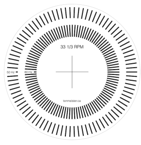
One of the things on my to-do list today was to get a Bang & Olufsen Stereopladespiller Type 42 up and running. Unfortunately, I didn’t have a stroboscopic disc for testing the speed. Since a quick search on the Internet didn’t turn up anything I liked, I decided to make my own.If you’d like to download it, it’s available here as a PDF file for A4 paper, and contains the lines for 50 Hz and 60 Hz mains. You can change the magnification to make it fit on different paper sizes, or to increase or decrease the size of the disc. If your magnification is the same in the X and Y axes, then it won’t change anything.
This meant that I had to do a little math, which goes as follows:
mains_frequency = 50 Hz (this is the rate at which the lights blink)
So, here in Denmark where we have 50 Hz mains, I needed to make a disc with a line every 4º. Since I use a Mac, I used graphic.app to do this, but any decent drawing program will do the trick.
If you want to make your own disc, and you don’t want to do the math, here are the results of the possible mains frequencies and revolution speeds
RPM
50 Hz
60 Hz
16
1.92
1.60
33 1/3
4.00
3.3333…
45
5.3999…
4.50
78
9.36
7.80
For anyone who knows a thing or two about the Type 42… then I’m already ahead of you. I know that the lines are built into the turntable mat itself. However, I was working in pretty bright daylight, and so I needed more contrast on the lines to be able to see the interference from the lighting. And besides, it was fun as a little light recreational math.