I wrote an intuitive explanation of aliasing in this posting and dug in a little deeper, looking at the side-effects of aliasing with audio signals specifically in this posting.
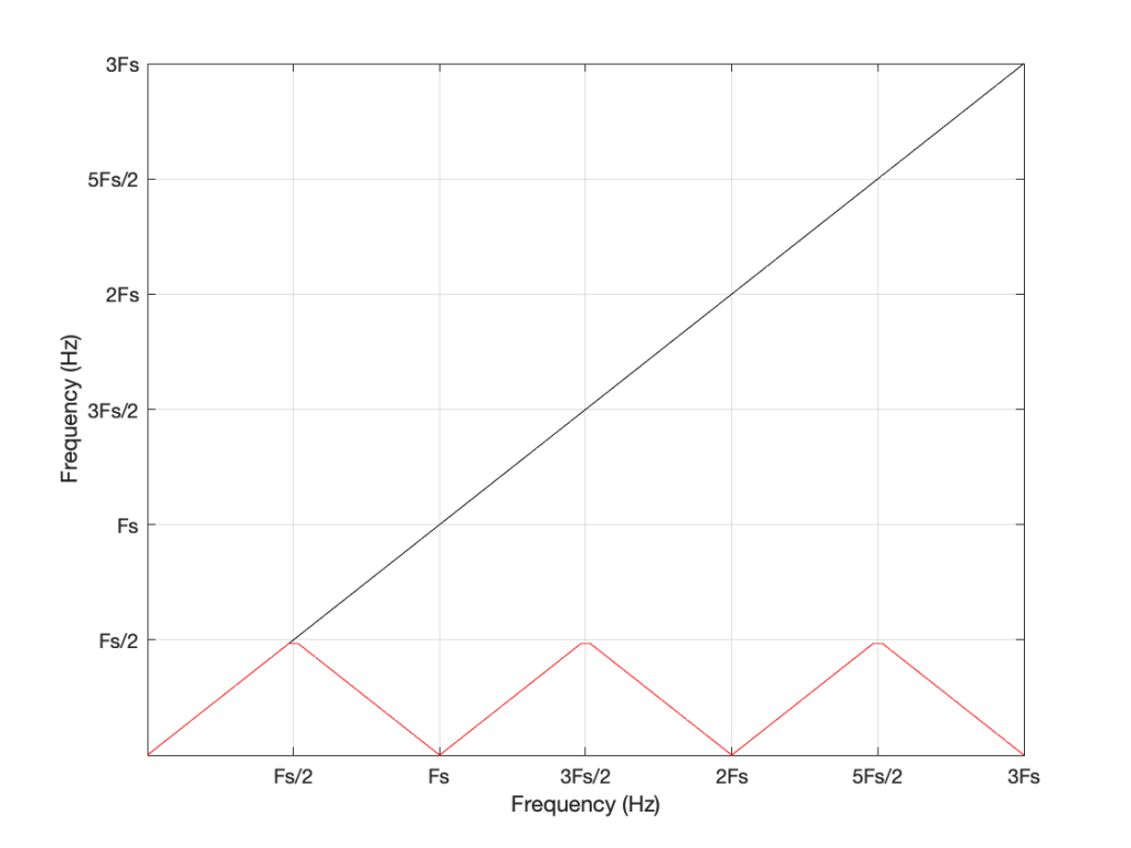
One of the more important figures in that second posting is repeated below in Figure 1.
Let’s say that we wanted to make a sine wave generator in the digital domain. This is pretty easy to do using some rather simple math, as follows:
Output(n) = sin(2 * π * Fc / Fs * n)
where Fc is the frequency of the sine wave in Hz, Fs is the sampling rate in Hz, and n is the time, expressed as a sample number.
There are no restrictions on Fc – so if you wanted to plug in a value that is higher than Fs/2 (the Nyquist frequency) then you’ll get a value. However, if you used this math to try to make a sine wave where Fc > Fs/2, then the output will be different from what you expect. This is what’s shown in Figure 1. The red curve shows the actual frequency of the output (read off the Y-axis) for an intended frequency (on the X-axis).
This problem of the difference between input and output is identical to what would happen if you rotated a wheel by some angle, and then asked someone to measure the rotation. For example, look at Figure 2.

On the left, it shows a wheel that was rotated clockwise by 90º (indicated by the red arrow). Someone measuring the rotation would say that it was rotated by 90º – a perfect match! If you rotated by 180º (the second example), the person measuring would also get the right answer. However, if you rotated by 270º (the third example, in the middle), the person measuring would (correctly) say that you rotated by 90º counterclockwise. A rotation of 360º gets you back where you started, so it would be measured as 0º. A rotation of 450º (the example on the right) would be measured as a rotation of 90º.
If we were to do this a lot, and plot the results, they’d look like Figure 3.
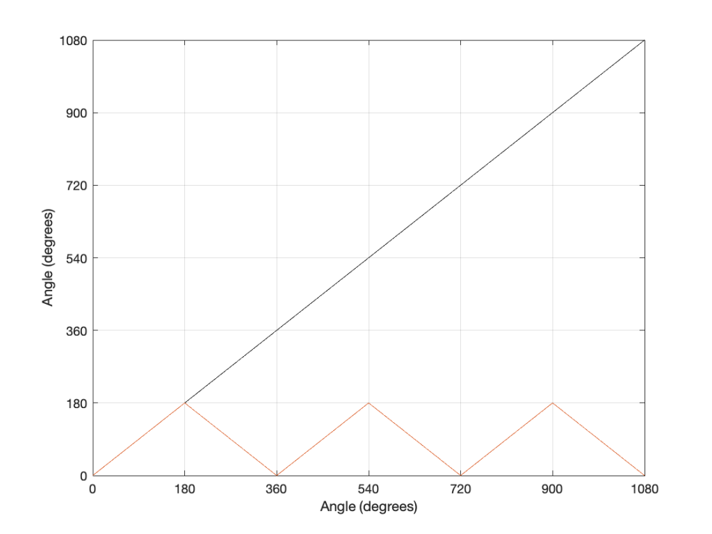
Now compare Figure 3 to Figure 1. Notice how they’re identical? This is important because it’s a graphic example of exactly the way frequencies “wrap” in a digital audio world. This “wrapping” is the result of the fact that a sinusoidal wave (a signal containing only one frequency) is just a 2-dimensional view of a 3-dimensional rotation (I showed this with photos of a Slinky™ in this posting.
When we normal people look at a magnitude response of a device – let’s say, a low-pass filter, we put it on a nice cartesian plot with the frequency displayed on a straight line on the X-axis and the magnitude displayed on a straight line called the Y-axis. This looks something like Figure 4.
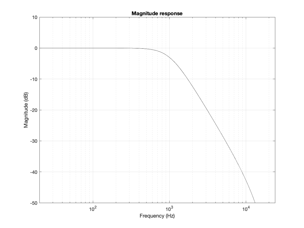
However, this is only a portion of the truth. The truth extends further than the limits of that plot. I conveniently stopped plotting at Fs/2 (since the filter that I made is running at 48 kHz, this plot goes up to 24 kHz). I also didn’t plot anything below 20 Hz – and I certainly didn’t extend the plot below 0 Hz into the negative frequencies… (“Negative frequencies?” I hear you ask… These are the same as positive frequencies, except that 3-dimensional wheel is rotating in the opposite direction; but since we’re only looking at it on-edge from one location, we can’t tell whether it’s rotating clockwise or counter-clockwise. See this posting if you want to go further.)
Let’s try extending the plot. First, I’ll show Figure 4, but using a linear scale for the frequency instead of a logarithmic scale. This is shown in Figure 5.
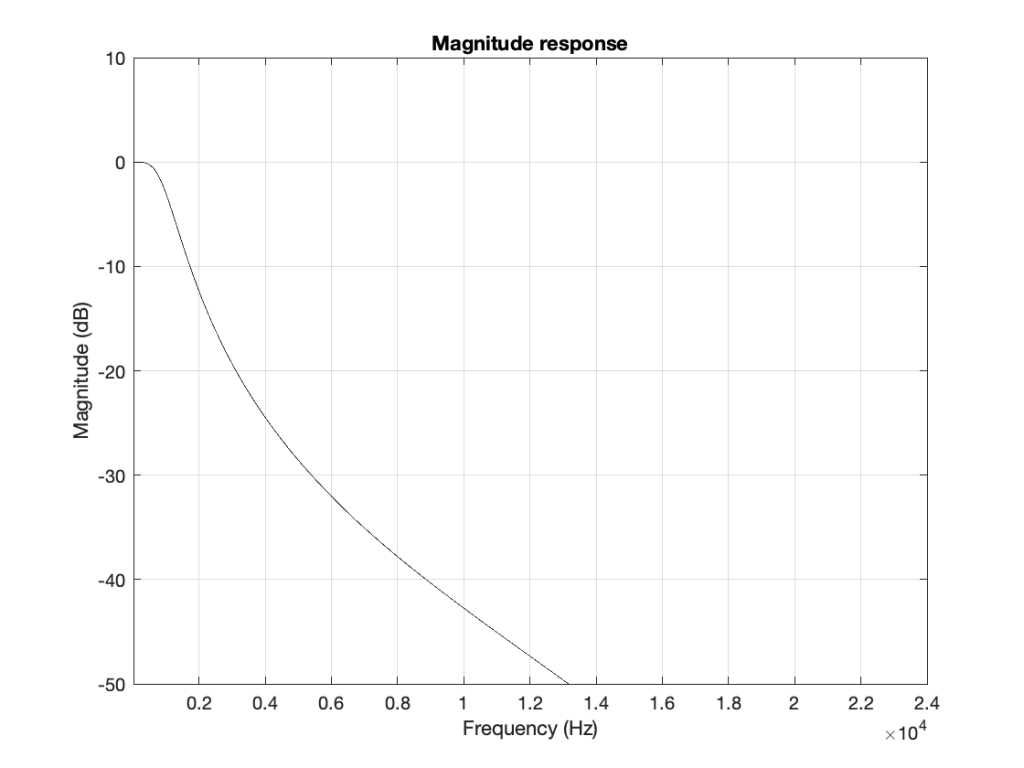
If I then were to plot beyond Fs/2, then the magnitude response would be a mirrored version of the one you see in Figure 4. The same would be true if I were to plot below 0 Hz. This is shown in Figure 6.
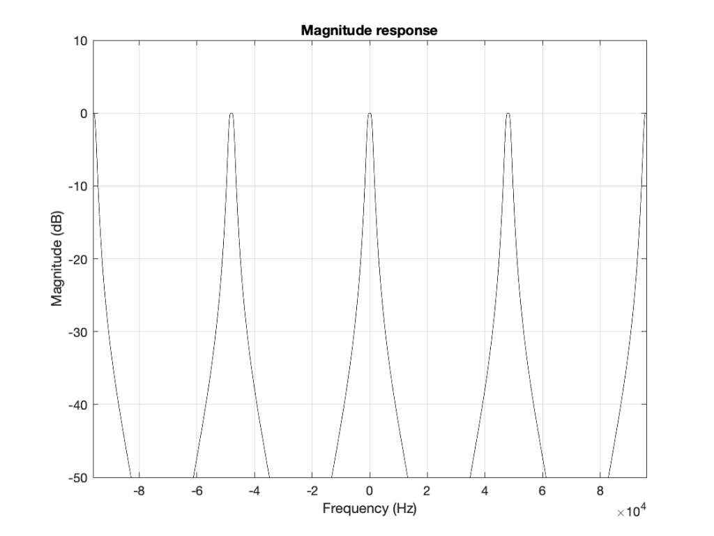
What does this mean? It means for example that, if I had an LPCM system running at 48 kHz, and I were to digitally generate a sine tone at 48 kHz, then the result would be the same as making a “sine tone” at 0 Hz (or “DC”) because all of the samples would have the same value – neither 0 Hz nor 48 kHz would be a sinusoidal wave in a 48 kHz system. If I then, inside the same system, sent that “48 kHz sine tone” through a low-pass filter with a cutoff frequency of 1 kHz, then it would go through un-impeded (just like a 0 Hz signal would get through a low-pass filter).
Assembling the pieces
Let’s take the illustration I just showed in Figure 6, and consider it, knowing what I showed in the comparison between Figures 3 and 1.
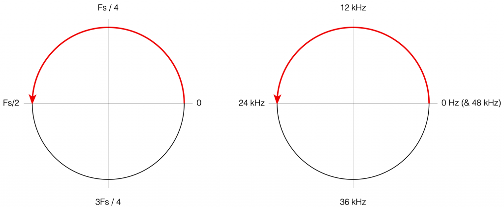
Although we normal people show each other magnitude responses that look like the one in Figure 4, this is not the way people who make digital signal processing (DSP) software think. They see the frequency axis on a circle that goes from 0 Hz up to Fs/2 (the Nyquist frequency), and then wraps back around to 0 Hz (= Fs). This weird way of viewing the world is shown in Figure 7.
There are some very good reasons why DSP engineers think like this – one of which you already know (the wrapping and aliasing issue). There are some reasons I’m not going to talk about here (but you can read this if you’re interested), and there are some other reasons that I’m headed towards…
However, before we move on to the next chapter in our little saga, it’s best to get really comfortable with the plots in Figure 7. I especially want you to get used to some specific things, in order of importance:
- The frequency scale is circle – it’s not a straight line.
- The scale starts on the right (at the 3 o’clock position) and goes counter-clockwise to the left (the 9 o’clock position).
- The scale is linear, not logarithmic, like you’re used to seeing.
- The maximum frequency is the Nyquist frequency, so it’s defined by the sampling rate.
- Once the point on the circle goes beyond the Nyquist, we’ve started aliasing, and so we’ve entered a symmetrical world that mirrors the half below the Nyquist. (In other words, when we get a little farther, you’ll see that the top and the bottom of that circle are mirror images of each other – as I’ve already hinted in Figure 6 looking at the frequency range from 0 to 48 kHz.)