“High-Res” Audio: Part 1

I’ve been debating writing a series of postings about “high resolution” audio for a long time – years. Lately, (probably because of some hype generated by some recent press releases) I’ve been getting lots of question (no, that’s not a typo) about it, so it appears the time has come…

To start: the question that I get (a lot) is “If I can’t hear above 20 kHz, then what’s the use of high-res?” As I’ll explain as we go through, this is only one, rather small aspect to consider in this topic. In fact, it might be the least important issue to consider.

However, before I write too much, I’ll say that I’m not going to argue for or against higher resolutions in digital audio systems. I’m only going to go through a bunch of issues that can be used to argue either for or against them. So, there’s not going to be a big reveal at the end of this series telling you that high-res is either better, worse, or no different than whatever you’re using now. It’s merely going to be a discussion of a number of issues that need to be weighed. The problem is that this entire topic is complicated – and there’s no single “right” answer, as I’ll argue as we go along.

To start, let’s get down to basics and look (once again, from the perspectives of this website) at what sound is, and how it’s converted from an analogue electrical signal into a digital representation. The good thing is that I’ve written this introduction before in a different series of postings. So, I’m going to be extremely lazy and just copy-and-paste that information here. I’m not just referring you to another page because I’m intentionally leaving some things out because we’re headed into having a different discussion this time.

A quick introduction to sound

At the simplest level, sound can be described as a small change in air pressure (or barometric pressure) over short periods of time. If you’d like to have a better and more edu-tain-y version of this statement with animations and pretty colours, you could take 10 minutes to watch this video, for example.

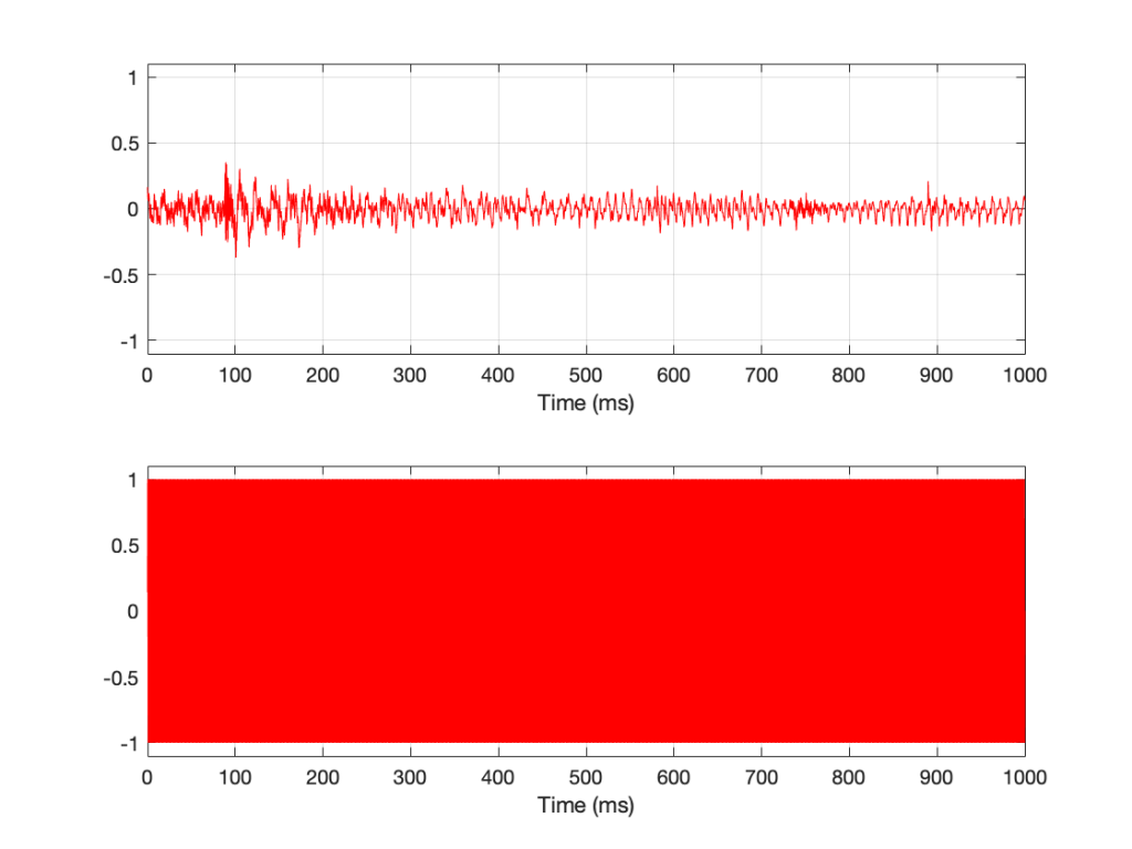
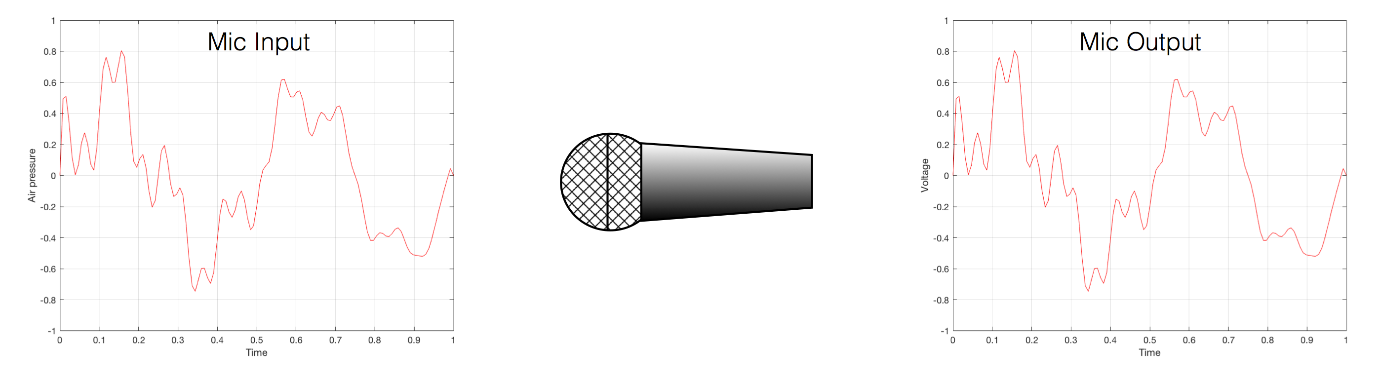
That change in pressure can be “captured” by using a microphone, that is (at the simplest level) a device that has a change in air pressure at its input and a change in electrical voltage at its output. Ignoring a lot of details, we could say that if you were to plot a measurement of the air pressure (at the input of the microphone) over time, and you were to compare it to a plot of the measurement of the voltage (at the output of the microphone) over time, you would see the same curve on the two graphs. This means that the change in voltage is analogous to the change in air pressure.

Fig 1. Notice that (in theory, and ignoring a lot of things…) the change in air pressure over time at the input of the microphone is identical to the change in voltage over time at its output. Of course, this is not true in real life – microphones lie like a cheap rug…

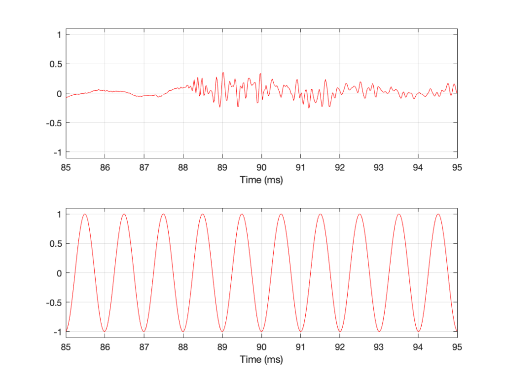
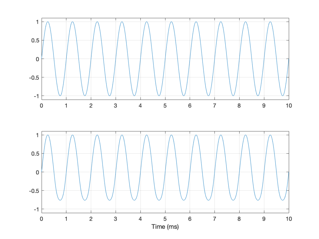
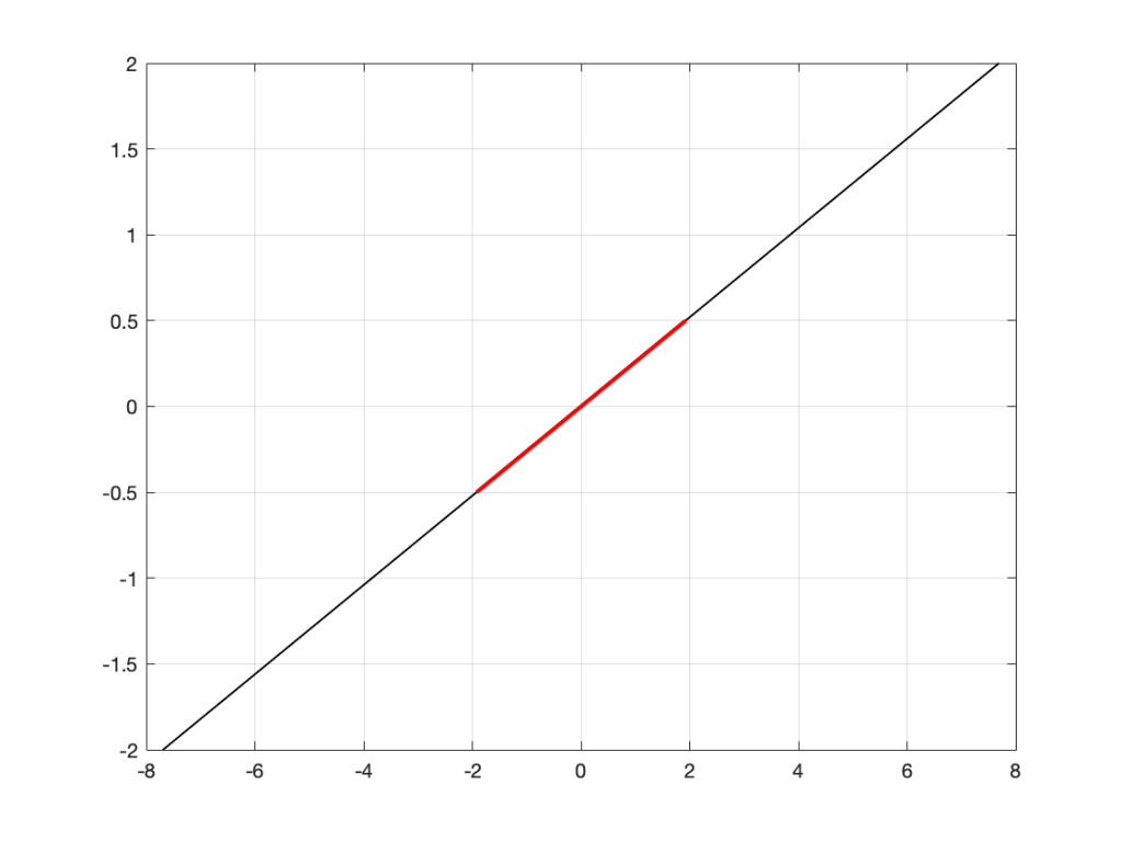
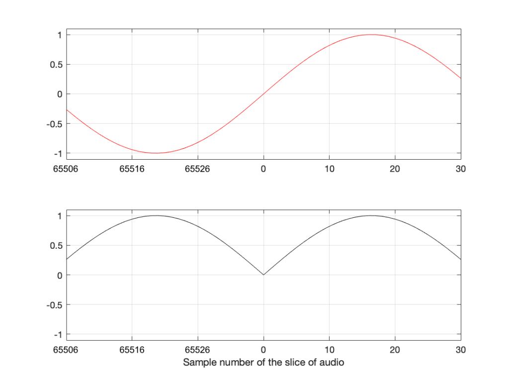
At this point in the conversation, I’ll make a point to say that, in theory, we could “zoom in” on either of those two curves shown in Figure 1 and see more and more details. This is like looking at a map of Canada – it has lots of crinkly, jagged lines. If you zoom in and look at  the map of Newfoundland and Labrador, you’ll see that it has finer, crinkly, jagged lines. If you zoom in further, and stand where the water meets the shore in Trepassey and take a photo of your feet, you could copy it to draw a map of the line of where the water comes in around the rocks – and your toes – and you would wind up with even finer, crinkly, jagged lines… You could take this even further and get down to a microscopic or molecular level – but you get the idea… The point is that, in theory, both of the plots in Figure 1 have infinite resolution, both in time and in air pressure or voltage.

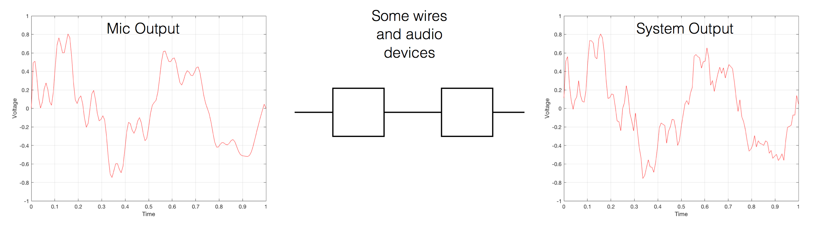
Now, let’s say that you wanted to take that microphone’s output and transmit it through a bunch of devices and wires that, in theory, all do nothing to the signal. Let’s say, for example, that you take the mic’s output, send it through a wire to a box that makes the signal twice as loud. Then take the output of that box and send it through a wire to another box that makes it half as loud. You take the output of that box and send it through a wire to a measuring device. What will you see? Unfortunately, none of the wires or boxes in the chain can be perfect, so you’ll probably see the signal plus something else which we’ll call the “error” in the system’s output. We can call it the error because, if we measure the input voltage and the output voltage at any one instant, we’ll probably see that they’re not identical. Since they should be identical, then the system must be making a mistake in transmitting the signal – so it makes errors…

Fig 2. If you send an audio signal through some wires and devices that (in theory) do nothing to the signal, you’ll find out that they add some extra stuff that you don’t want.

Pedantic Sidebar: Some people will call that error that the system adds to the signal “noise” – but I’m not going to call it that. This is because “noise” is a specific thing – noise is random – so if it’s not random, it’s not noise. Also, although the signal has been distorted (in that the output of the system is not identical to the input) I won’t call it “distortion” either, since distortion is a name that’s given to something that happens to the signal because the signal is there. (We would probably get at least some of the error out of our system even if we didn’t send any audio into it.) So, we could be slightly geeky and adequately vague and call the extra stuff “Distortion plus noise” but not “THD+N” – which stands for “Total Harmonic Distortion Plus Noise” – because not all kinds of distortion will produce a harmonic of the signal… but I’m getting ahead of myself…

So, we want to transmit (or store) the audio signal – but we want to reduce the noise caused by the transmission (or storage) system. One way to do this is to spend more money on your system. Use wires with better shielding, amplifiers with lower noise floors, bigger power supplies so that you don’t come close to their limits, run your magnetic tape twice as fast, and so on and so on. Or, you could convert the analogue signal (remember that it’s analogous to the change in air pressure over time) to one that is represented (and therefore transmitted or stored) digitally instead.

What does this mean?

Conversion from analogue to digital and back
(but skipping important details)

IMPORTANT: If you read this section, then please read the following postings as well. This is because, in order to keep things simple to start, I’m about to leave out some important details that I’ll add afterwards. However, if you don’t add the details, you could (understandably) jump to some incorrect conclusions (that many others before you have concluded…) So, if you don’t have time to read both sections, please don’t read either of them.

In the example above, we made a varying voltage that was analogous to the varying air pressure. If we wanted to store this, we could do it by varying the amount of magnetism on a wire or a coating on a tape, for example. Or we could cut a wiggly groove in a bit of vinyl that has a similar shape to the curve in the plots in Figure 1. Or, we could do something else: we could get a metronome (or a clock) and make a measurement of the voltage every time the metronome clicks, and write down the measurements.

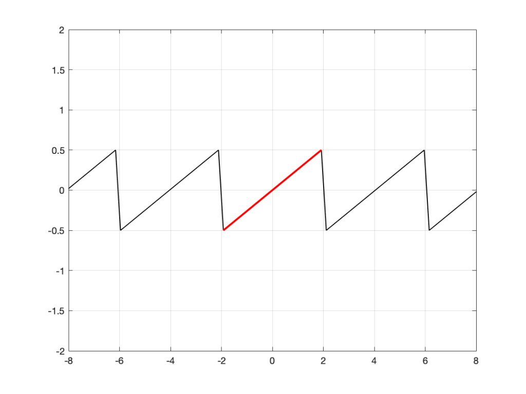
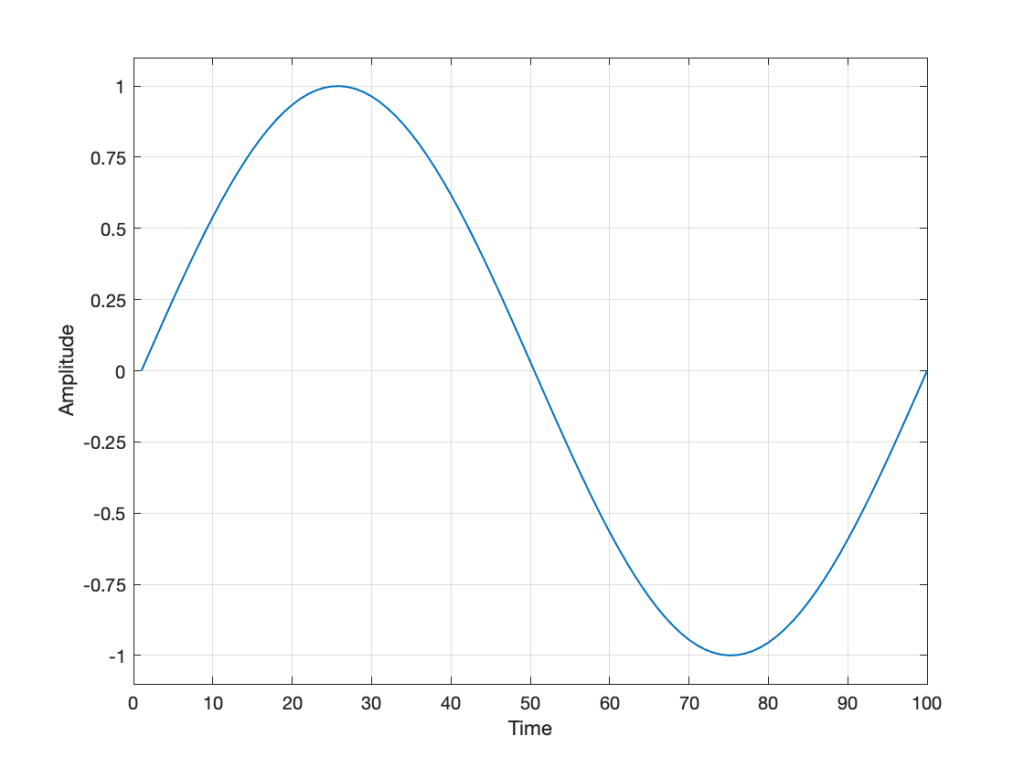
For example, let’s zoom in on the first little bit of the signal in the plots in Figure 1

Fig. 3 The same curve as was shown in Figure 1 – but zoomed in to the very beginning.

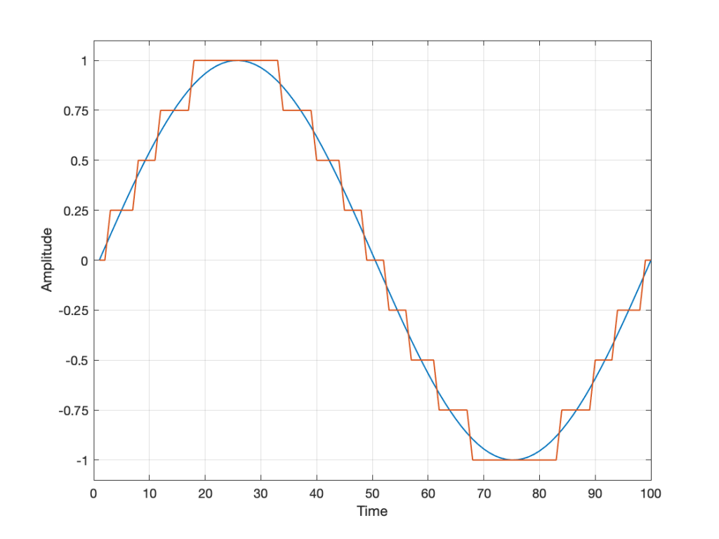
We’ll then put on a metronome and make a measurement of the voltage every time we hear the metronome click…

Fig 4. The same curve (in red) measured at regular intervals (in black)

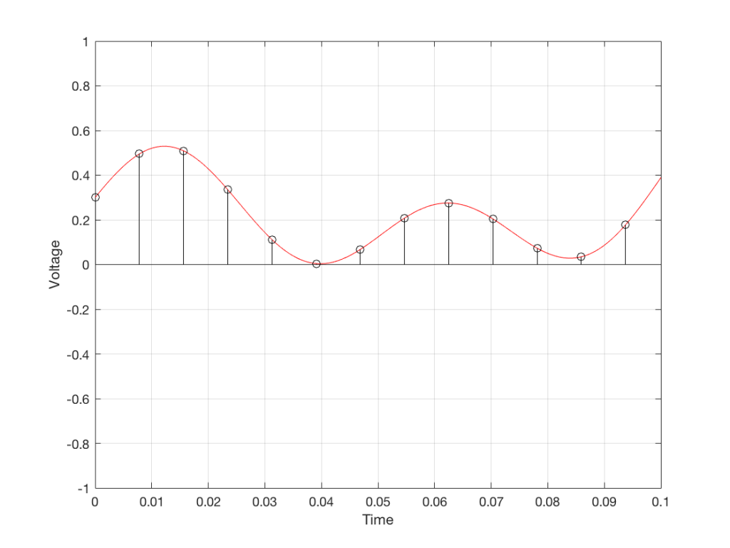
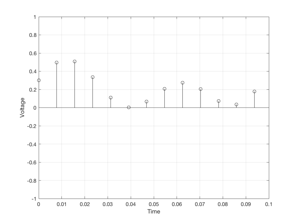
We can then keep the measurements (remembering how often we made them…) and write them down like this:

0.3000
0.4950
0.5089
0.3351
0.1116
0.0043
0.0678
0.2081
0.2754
0.2042
0.0730
0.0345
0.1775

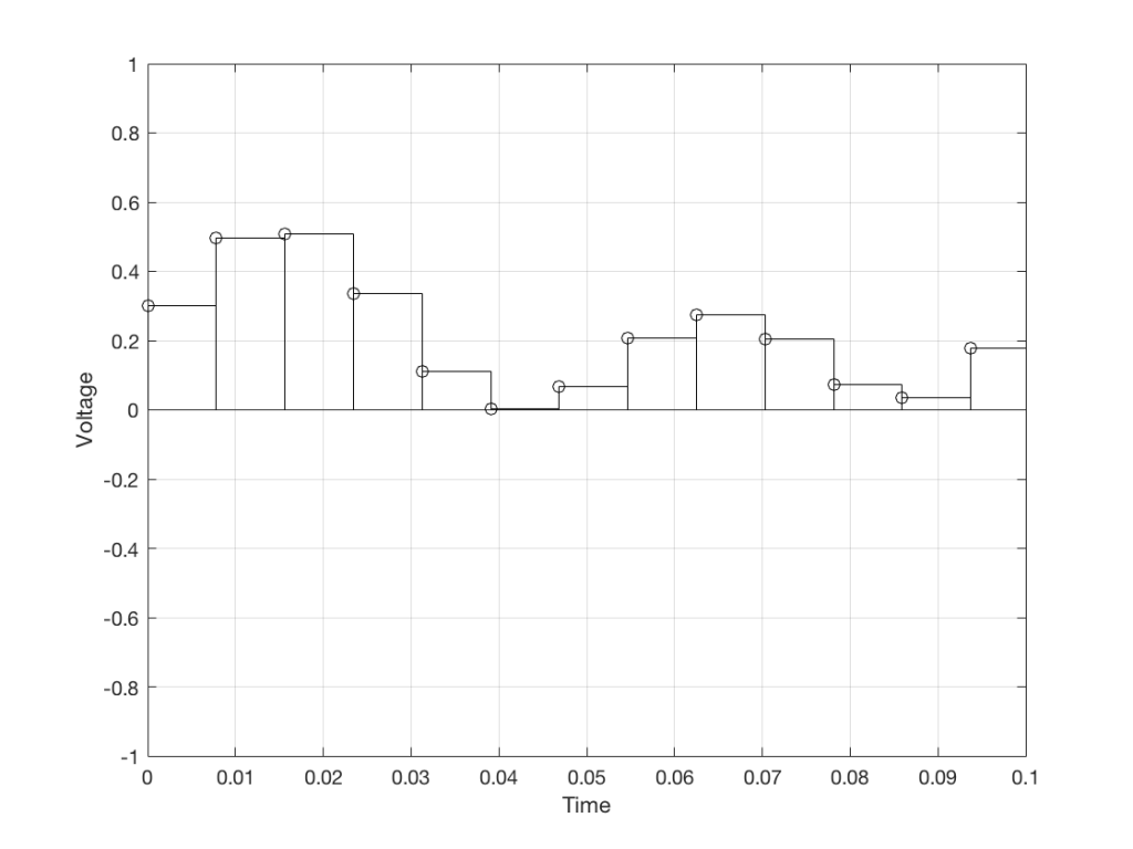
We can store this series of numbers on a computer’s hard disk, for example. We can then come back tomorrow, and convert the measurements to voltages. First we read the measurements, and create the appropriate voltage…

Fig. 5. The voltages that we stored as measurements

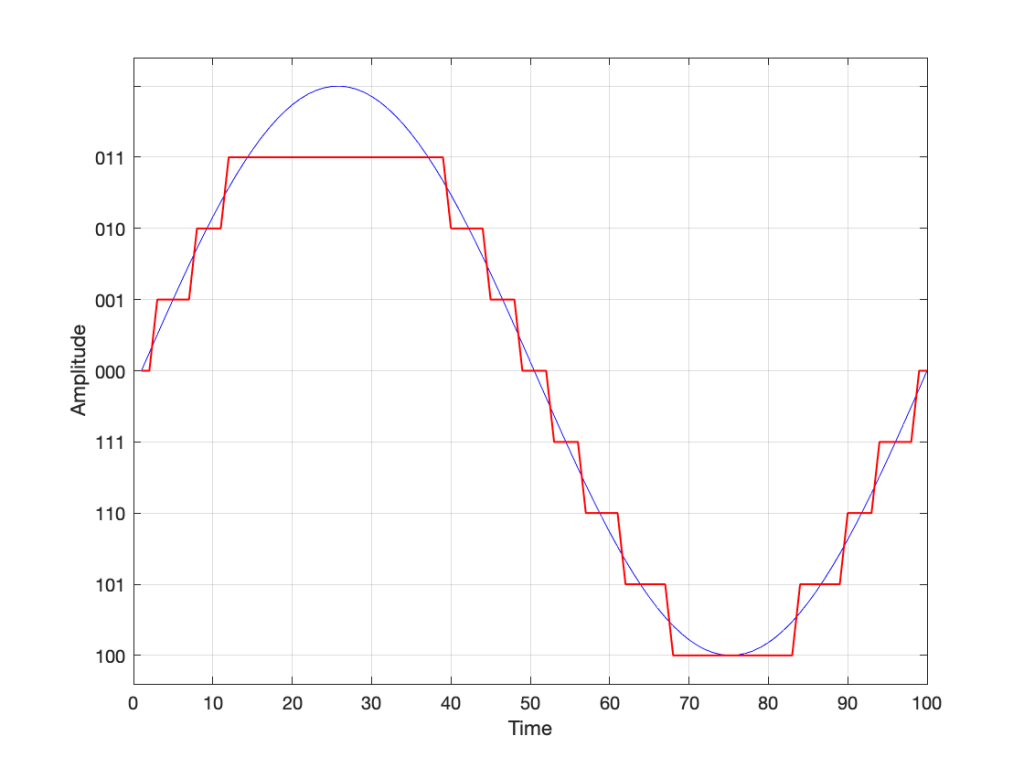
We then make a “staircase” waveform by “holding” those voltages until the next value comes in.

Fig 6. We make a “staircase” curve using the voltages.

All we need to do then is to use a low-pass filter to smooth out the hard edges of the staircase.

Fig 7. When we smooth out the staircase, we get back the original signal (in red).

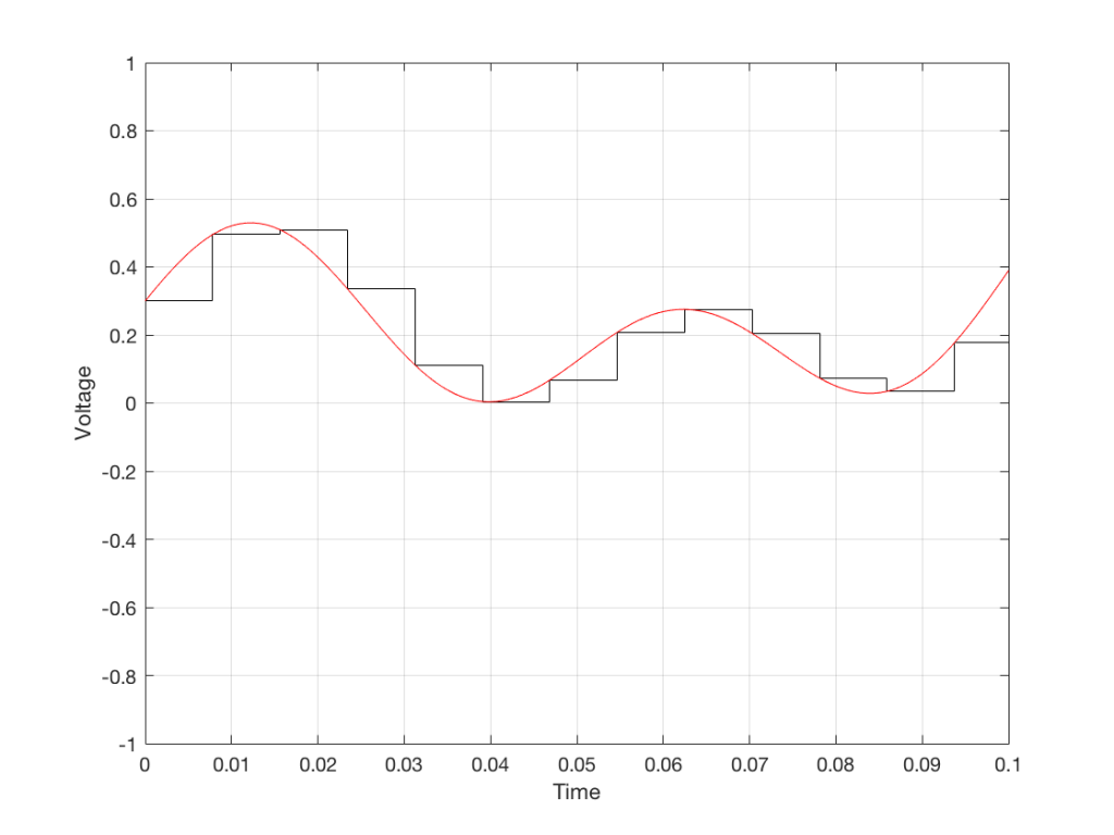
So, in this example, we’ve gone from an analogue signal (the red curve in Figure 3) to a digital signal (the series of numbers), and back to an analogue signal (the red curve in Figure 7).

In some ways, this is a bit like the way a movie works. When you watch a movie, you see a series of still photographs, probably taken at a rate of 24 pictures (or frames) per second. If you play those photos back at the same rate (24 fps or frames per second), you think you see movement. However, this is because your eyes and brain aren’t fast enough to see 24 individual photos per second – so you are fooled into thinking that things on the screen are moving.

However, digital audio is slightly different from film in two ways:

  • The sound (equivalent to the movement in the film) is actually happening. It’s not a trick that relies on your ears and brain being too slow.
  • If, when you were filming the movie, something were to happen between frames (say, the flash of a gunshot, for example) then it would never be caught on film. This is because the photos are discrete moments in time – and what happens between them is lost. However, if something were to make a very, very short sound between two samples (two measurements) in the digital audio signal – it would not be lost. This is because of something that happens at the beginning of the chain that I haven’t described… yet…

However, there are some “artefacts” (a fancy term for “weird errors”) that are present both in film and in digital audio that we should talk about.

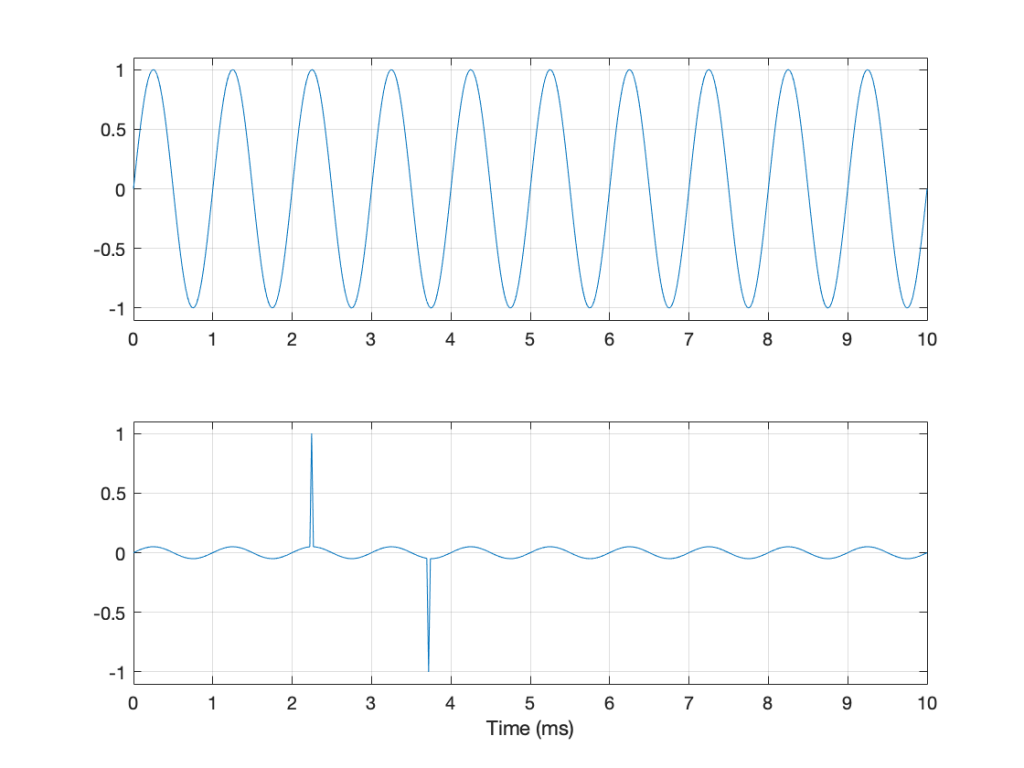
The first is an error that happens when you mess around with the rate at which you take the measurements (called the “sampling rate”) or the photos (called the “frame rate”) – and, more importantly, when you need to worry about this. Let’s say that you make a film at 24 fps. If you play this back at a higher frame rate, then things will move very quickly (like old-fashioned baseball movies…). If you play them back at a lower frame rate, then things move in slow motion. So, for things to look “normal” you have to play the movie at the same rate that it was filmed. However, as long as no one is looking, you can transfer the movie as fast as you like. For example, if you wanted to copy the film, you could set up a movie camera so it was pointing at a movie screen and film the film. As long as the movie on the screen is running in sync with the camera, you can do this at any frame rate you like. But you’ll have to watch the copy at the same frame rate as the original film… (Note that this issue is not something that will come up in this series of postings about high resolution audio)

The second is an easy artefact to recognise. If you see a car accelerating from 0 to something fast on film, you’ll see the wheels of the car start to get faster and faster, then, as the car gets faster, the wheels slow down, stop, and then start going backwards… This does not happen in real life (unless you’re in a place lit with flashing lights like fluorescent bulbs or LED’s). I’ll do a posting explaining why this happens – but the thing to remember here is that the speed of the wheel rotation that you see on the film (the one that’s actually captured by the filming…) is not the real rotational speed of the wheel. However, those two rotational speeds are related to each other (and to the frame rate of the film). If you change the real rotational rate or the frame rate, you’ll change the rotational rate in the film. So, we call this effect “aliasing” because it’s a false version (an alias) of the real thing – but it’s always the same alias (assuming you repeat the conditions…) Digital audio can also suffer from aliasing, but in this case, you put in one frequency (which is actually the same as a rotational speed) and you get out another one. This is not the same as harmonic distortion, since the frequency that you get out is due to a relationship between the original frequency and the sampling rate, so the result is almost never a multiple of the input frequency. (We’re going to dig into this a lot deeper through this series of postings about high resolution audio, so if it doesn’t immediately make sense, don’t worry…)

Some important details that I left out…

One of the things I said above was something like “we measure the voltage and store the results” and the example I gave was a nice series of numbers that only had 4 digits after the decimal point. This statement has some implications that we need to discuss.

Let’s say that I have a thing that I need to measure. For example, Figure 8 shows a piece of metal, and I want to measure its width.

Fig 8. A piece of metal with a width of “approximately 57 mm”.

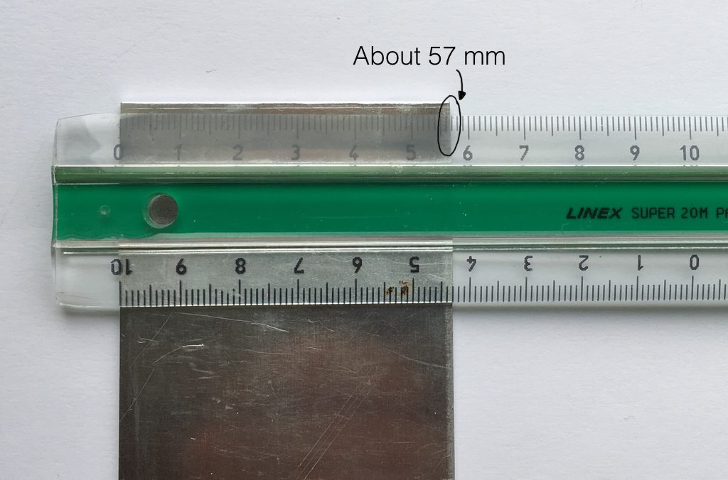
Using my ruler, I can see that this piece of metal is about 57 mm wide. However, if I were geeky (and I am) I would say that this is not precise enough – and therefore it’s not accurate. The problem is that my ruler is only graduated in millimetres. So, if I try to measure anything that is not exactly an integer number of mm long, I’ll either have to guess (and be wrong) or round the measurement to the nearest millimetre (and be wrong).

So, if I wanted you to make a piece of metal the same width as my piece of metal, and I used the ruler in Figure 8, we would probably wind up with metal pieces of two different widths. In order to make this better, we need a better ruler – like the one in Figure 9.

Fig 9. The same piece of metal being measured with a vernier caliper. This gives us additional precision (down to 0.05 mm) so we can make a more accurate measurement.

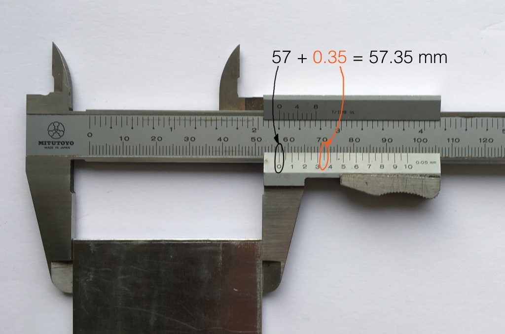
Figure 9 shows a vernier caliper (a fancy type of ruler) being used to measure the same piece of metal. The caliper has a resolution of 0.05 mm instead of the 1 mm available on the ruler in Figure 8. So, we can make a much more accurate measurement of the metal because we have a measuring device with a higher precision.

The conversion of a digital audio signal is the same. As I said above, we measure the voltage of the electrical signal, and transmit (or store) the measurement. The question is: how accurate and precise is your measurement? As we saw above, this is (partly) determined by how many digits are in the number that you use when you “write down” the measurement.

Since the voltage measurements in digital audio are recorded in binary rather than decimal (we use 0 and 1 to write down the number instead of 0 up to 9) then we use Binary digITS – or “bits” instead of decimal digits (which are not called “dits”). The number of bits we have in the number that we write down (partly) determines the precision of the measurement of the voltage – and therefore (possibly), our accuracy…

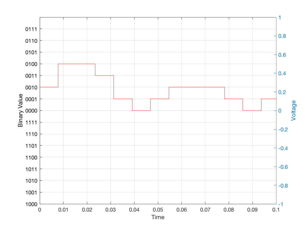
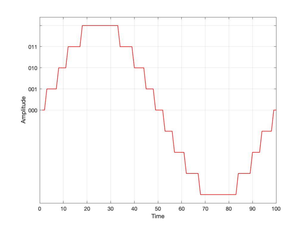
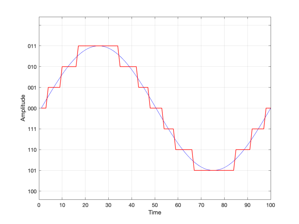
Just like the example of the ruler in Figure 8, above, we have a limited resolution in our measurement. For example, if we had only 4 bits to work with then the waveform in 4 – the one we have to measure – would be measured with the “ruler” shown on the left side of Figure 10, below.

Fig 10: The waveform from Figure 4 as a voltage (notice the Y-axis on the right). We have to measure these values using the ruler with the resolution shown on the Y-axis on the left.

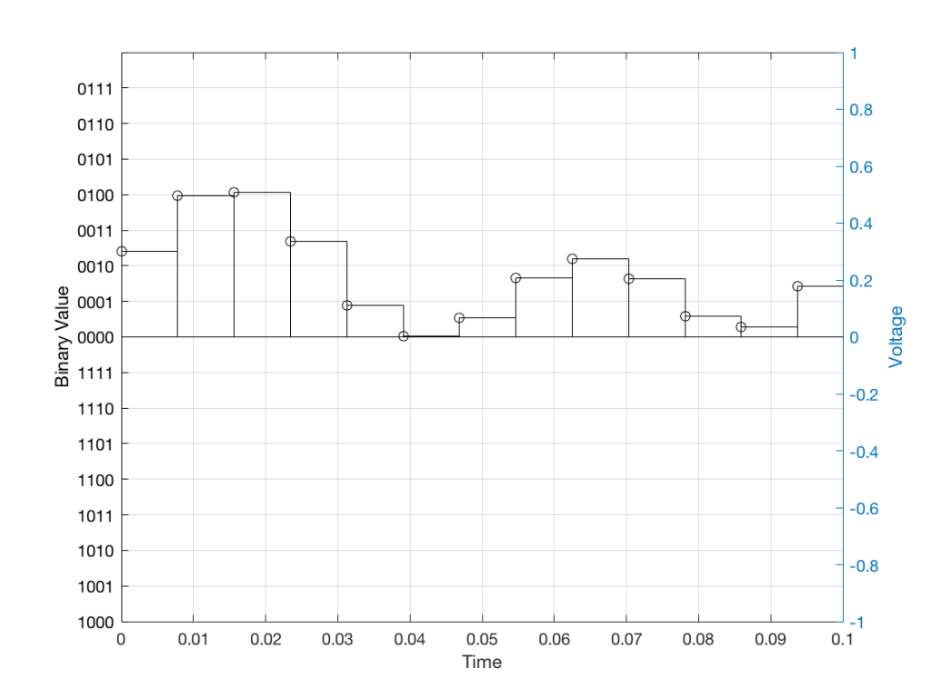
When we do this, we have to round off the value to the nearest “tick” on our ruler, as shown in Figure 11.

Fig 11: The values from figure 10 (shown as the circles) rounded off to the nearest value on our 4-bit ruler (the red staircase).

Using this “ruler” which gives a write-down-able “quantity” to the measurement, we get the following values for the red staircase:

0010
0100
0100
0011
0001
0000
0001
0010
0010
0010
0001
0000
0001

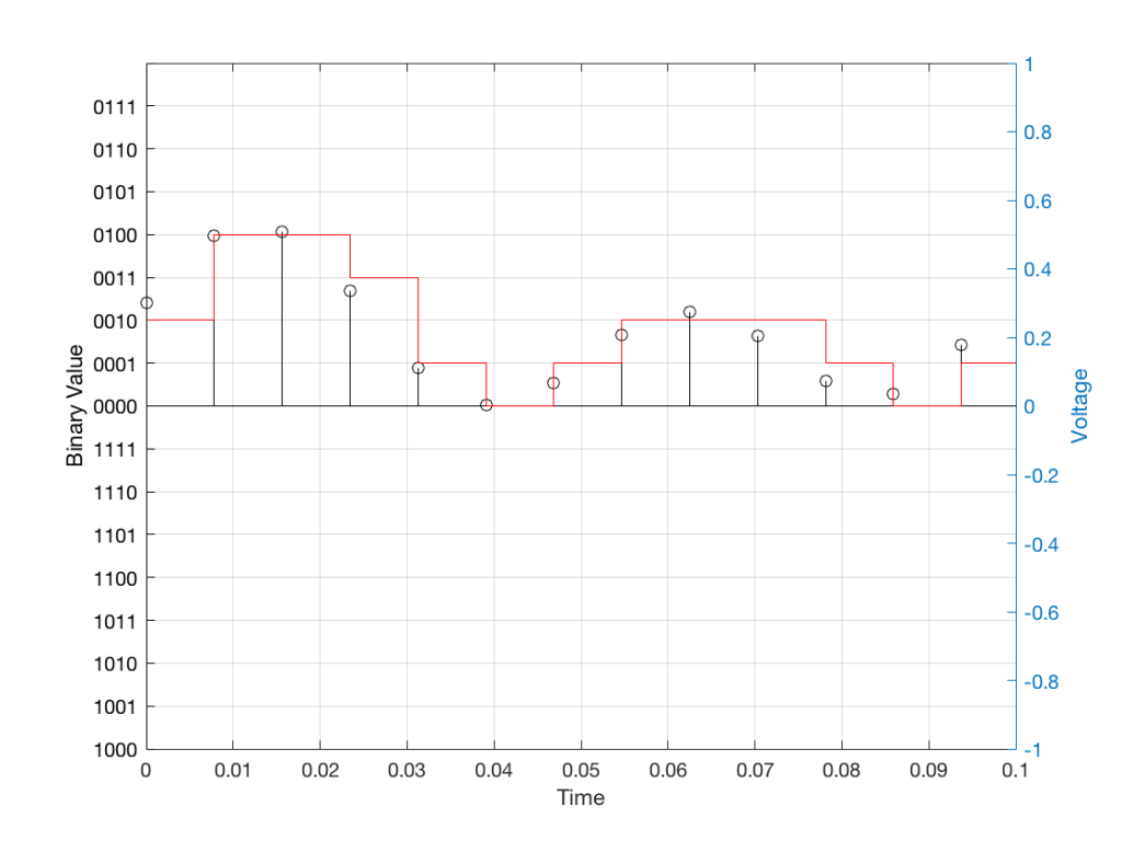
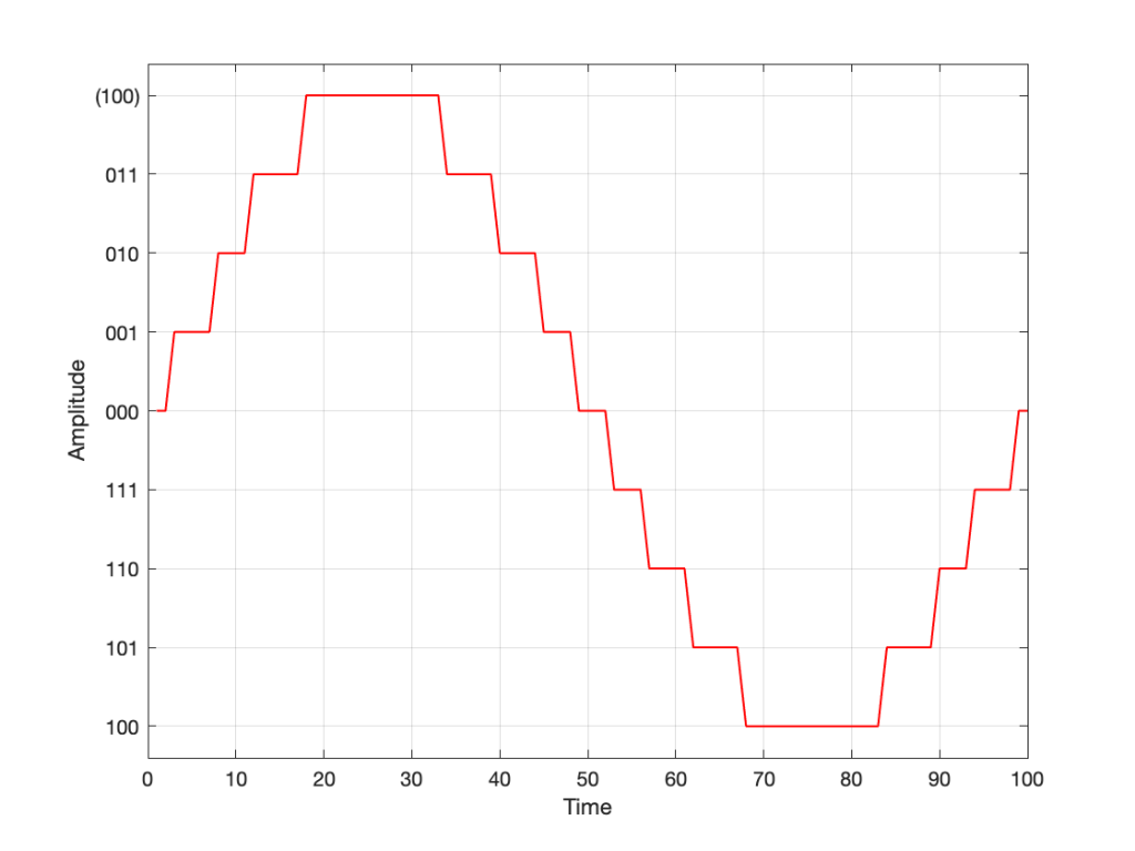
When we “play these back” we get the staircase again, shown in Figure 12.

Fig 12: The output of the measurements. Notice that all values sit exactly on one of the values for the “ruler” on the left Y-axis of the plot.

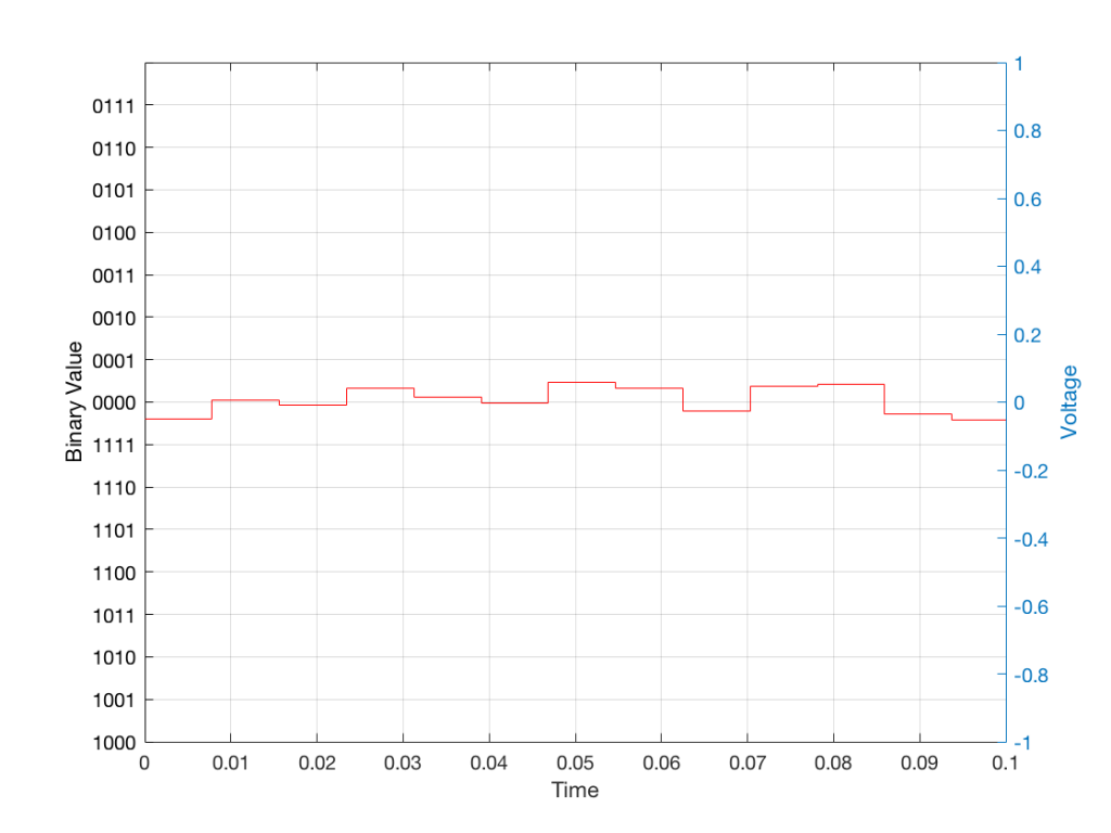
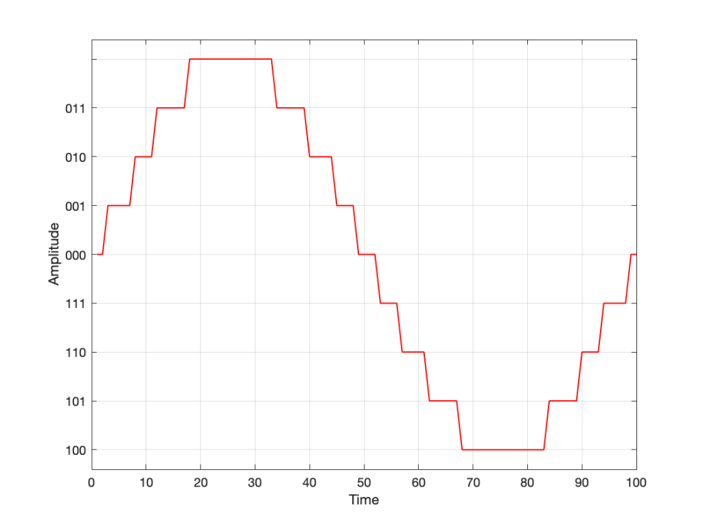
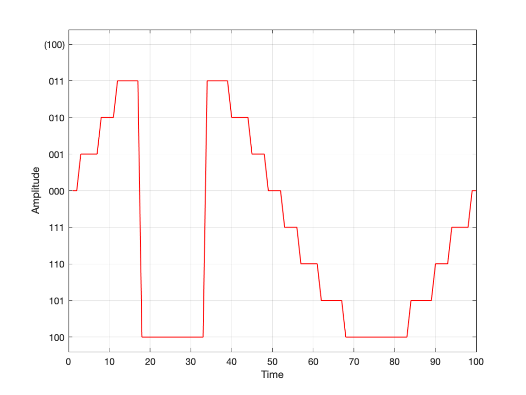
Of course, this means that, by rounding off the values, we have introduced an error in the system (just like the measurement in Figure 8 has a bigger error than the one in Figure 9). We can calculate this error if we just subtract the original signal from the output signal (in other words, Figure 12 minus Figure 10) to get Figure 13.

Fig 13: The error that we produced due to the rounding off of the signal when we did the measurements. Notice that the error is always less than 0.5 of a “tick” of the ruler on the left Y-axis.

In order to improve our accuracy of the measurement, we have to increase the precision of the values. We can do this by adding an extra digit (or bit) to the number that we use to record the value.

If we were using decimal numbers (0-9) then adding an extra digit to the number would give us 10 times as many possibilities. (For example, if we were using 4 digits after the decimal in the example at the start of this posting, we have a total of 10,000 possible values – 0.0000 to 0.9999. If we add one more digit, we increase the resolution to 100,000 possible values – 0.00000 to 0.99999 ).

In binary, adding one extra digit gives us twice as many “ticks” on the ruler. So, using 4 bits gives us 16 possible values. Increasing to 5 bits gives us 32 possible values.

If you’re listening to a CD, then the individual measurements of each voltage – the “sample values” – are stored with 16 bits, which means that we have 65,536 possible values to pick from.

Remember that this means that we have more “ticks” on our ruler – but we don’t necessarily increase its range. So, for example, we’re still measuring a voltage from -1 V to 1 V – we just have more and more resolution with which we can do that measurement.

On to Part 2…

What’s a woofer?

#82 in a series of articles about the technology behind Bang & Olufsen loudspeakers

Occasionally, a question that comes into the customer communications department to Bang & Olufsen from a dealer or a customer eventually finds its way into my inbox.

This week, the question was about nomenclature. Why is it that, on some loudspeakers, for example, we say there is a tweeter, mid-range, and woofer, whereas on other loudspeakers we say that we’re using a “full range” driver instead? What’s the difference? (Folded into the same question was another about amplifier power, but I’ll take that one in another posting.)

So, what IS the difference? There are three different ways to answer this question.

Answer #1: It’s how you use it.

My Honda Civic, the motorcycle that passed me on the highway this morning, and an F1 car all have a gear in the gearbox that’s labelled “3”. However, the gear ratio of those three examples of “third gear” are all different. In other words, if you showed a mechanic the gear ratio of one of those gearbox settings without knowing anything else, they wouldn’t be able to tell you “ah! that’s third gear…”

So, in this example, “third gear” is called “third” only because it’s the one between “second” and “fourth”. There is nothing physical about it that makes it “third”. If that were the case then my car wouldn’t have a first gear, because some farm tractor out there in the world would have a gear with a lower ratio – and an F1 car would start at gear 100 or so… And that wouldn’t make sense.

Similarly, we use the words “tweeter”, “midrange”, “woofer”, “subwoofer”, and “full range” to indicate the frequency range that that particular driver is looking after in this particular device. My laptop has a 1″ “woofer” – which only means that it’s the driver that’s taking care of the low frequencies that come out of my laptop.

So, using this explanation, the Beolab 90 webpage says that it has midranges and tweeters and no “full range” drivers because the midrange drivers look after the midrange frequencies, and the tweeters look after the high frequencies. However, the Beolab 28’s webpage says that it has a tweeter and full range drivers, but no midranges. This is because the drivers that play the midrange frequencies in the Beolab 28 also play some of the high-frequency content as part of the Beam Width control. Since they’re doing “double duty”, they get a different name.

Answer #2: Excruciating minutiae

The description I gave above isn’t really an adequate answer. For example, I said that my laptop has a 1″ “woofer”. Beolab 90 has a 1″ “tweeter” – but these two drivers are not designed the same way. Beolab 90’s tweeter is specifically designed to be used to produce high frequencies. One consequence of this is that the total mass of the moving parts (the diaphragm and voice coil, amongst other things) is as low as possible, so that it’s easy to move. This means that it can produce high frequency signals without having to use a lot of electrical power to push it back and forth.

However, the 1″ “woofer” in my laptop is designed differently. It probably has a much higher total mass for the moving parts. This means that its resonant frequency (the frequency that it would “ring” at if you hit it like a drum head) is much lower. Therefore it “wants” to move easily at a lower frequency than a tweeter would.

For example, if you put a child on a swing and you give them a push, they’ll swing back and forth at some frequency. If the child wanted to swing SLOWER (at a lower frequency), you could

  • move to a swing with longer ropes so this happens naturally, or
  • you can hold on to the ropes and use your muscles to control the rate of swinging instead.

The smarter thing to do is the first choice, that way you can keep sipping your coffee instead of getting a workout.

So, a 1″ woofer and a 1″ tweeter are not really the same thing.

Answer #3: Compromise

We live in a world that has been convinced by advertisers that “compromise” is a bad thing – but it’s not. Someone who does never accepts to compromise is destined to live a very lonely life. When designing a loudspeaker, one of the things to consider is what, exactly, each component will be asked to do, and choose the appropriate components accordingly.

If we’re going to be really pedantic – there’s really no such thing as a tweeter, woofer, or anything else with those kinds of names. Any loudspeaker driver can produce sound at any frequency. The only difference between them is the relative ease with which the driver plays a signal at a given frequency. You can get 20 Hz to come out of a “tweeter” – it will just be naturally a LOT quieter than the signals at around 5 kHz. Similarly, a woofer can play signals at 20 kHz, but it will be a lot quieter and/or take a lot more power than signals at 50 Hz.

What this means is that, when you make an active loudspeaker, the response (the relative levels of signals at different frequencies) is really a result of the filters in the digital signal processing and the control from the amplifier (ignoring the realities of heat and time…). If we want more or less level at 2 kHz from a loudspeaker driver, we “just” change the filter in the signal processing and use the amplifier to do the work (the same as the example above where you were using your muscle power to control the frequency of the child on the swing).

However, there are examples where we know that a driver will be primarily used for one frequency band, but actually be extending into another. The side-facing drivers on Beolab 28 are a good example of this. They’re primarily being used to control the beam width in the midrange, but they’re also helping to control the beam width in the high frequencies. Since, they’re doing double-duty in two frequency ranges, they can’t really be called “midranges” or “tweeters” – they’d be more accurately called “midranges that also play as quiet tweeters”. (They don’t have to play high frequencies loudly, since this is “only” to control the beam width of the front tweeter.) However, “midranges that also play as quiet tweeters” is just too much information for a simple datasheet – so “full range” will do as a compromise.

P.S.

I’ve got some extra things to add here…

Firstly, it has become common over the past couple of years to call “woofers” “subwoofers” instead. I don’t know why this happened – but I suspect that it’s merely the result of people who write advertising copy using a word they’ve heard before without really knowing what it means. Personally, I think that it’s funny to see a laptop specified to have a “1” subwoofer”. Maybe we should make the word “subtweeter” popular instead.

Secondly, personally, I believe that a “subwoofer” is a thing that looks after the frequency range below a “woofer”. I remember a conversation I had at an AES convention once (I think it was with Günther Theile and Tomlinson Holman) where we all agreed that a “subwoofer” should look after the frequency range up to 40 Hz, which is where a decent woofer should take over.

Lastly, if you find an audio magazine from the 1970s, you’ll see that a three-way loudspeaker had a “tweeter”, “squawker”, and “woofer”. Sometime between then and now, “squawker” was replaced with “midrange” – but I wonder why the other two didn’t change to “highrange” and “lowrange” (although neither of these would be correct, since all three drivers in a three-way system have limited frequency ranges).

That’s a wrap…

I spent some time this week helping to track down the source of an error in a digital audio signal flow chain, and we wound up having a discussion that I thought might be worth repeating here.

Let’s start at the very beginning.

Let’s take an analogue audio signal and convert it to a Linear Pulse Code Modulation (LPCM) representation in the dumbest possible way.

Fig 1. A simple analogue signal that we’ll use for the purposes of this discussion.

In order to save this signal as a string of numerical values, we have to first accept the fact that we don’t have an infinite number of numbers to use. So, we have to round off the signal to the nearest usable value or “quantisation value”. This process of rounding the value is called “quantisation”.

Let’s say for now that our available quantisation values are the ones shown on the grid. If we then take our original sine wave and round it to those values, we get the result shown below.

Fig 2. The original signal is shown as the blue line. The quantized version of it is shown as the red line.

Of course, I’m leaving out a lot of important details here like anti-aliasing filtering and dither (I said that we were going to be dumb…) but those things don’t matter for this discussion.

So far so good. However, we have to be a bit more specific: an LPCM system encodes the values using binary representations of the values. So, a quantisation value of “0.25”, as shown above isn’t helpful. So, let’s make a “baby” LPCM system with only 3 bits (meaning that we have three Binary digITs available to represent our values).

To start, let’s count using a 3-bit system:

Binary Value4s place2s place1s placeDecimal Value
000=0 x 4 +0 x 2 + 0 x 1=0
001=0 x 4 +0 x 2 +1 x 1=1
010=0 x 4 +1 x 2 +0 x 1=2
011=0 x 4 +1 x 2 +1 x 1=3
100=1 x 4 +0 x 2 +0 x 1=4
101=1 x 4 +0 x 2 +1 x 1=5
110=1 x 4 +1 x 2 +0 x 1=6
111=1 x 4 +1 x 2 +1 x 1=7
Table 1: The 8 numbers that can be represented using a 3-bit binary representation

and that’s as far as we can go before needing 4 bits. However, for now, that’s enough.

Take a look at our signal. It ranges from -1 to 1 and 0 is in the middle. So, if we say that the “0” in our original signal is encoded as “000” in our 3-bit system, then we just count upwards from there as follows:

Fig 3. Starting at 000 for the “0” value, and counting upwards into the positive values.

Now what? Well, let’s look at this a little differently. If we were to divide a circle into the same number of quantisation values, make the “12:00” position = 000, and count clockwise, it would look like this:

Fig 4. Counting from 000 to 111 around a circle

The question now is “how do we number the negative values?” but the answer is already in the circle shown above… If I make it a little more obvious, then the answer is shown below.

Fig 5. Relating the values on the circle to the values we’ll need to represent the audio signal…

If we use the convention shown above, and represent that on the graph of our audio signal, then it looks like this:

Fig. 6

One nice thing about this way of doing things is that you just need to look at the first digit in the binary word to know whether the value is positive or negative. A 0 means it’s positive, and a 1 means it’s negative.

However, there are two issues here that we need to sort out… The first is that, since we have an even number of values, but an odd number of quantisation steps (4 above zero, 4 below zero, and zero = 9 steps) then we had to do something asymmetrical. As you can see in the plot above, there are no numbers assigned to the top quantisation value, which actually means that it doesn’t exist.

So, if we’re still being dumb, then the result of our quantisation will either look like this:

Fig 7. The dumb way to deal with the asymmetrical quantisation problem. Notice that the result is asymmetrically clipped on the positive side, but not the negative.

or this:

Fig 8. A smarter way to deal with the asymmetrical quantisation problem. Notice that we’ll never use the bottom value.

Wrapping up…

But what happens when you make two mistakes simultaneously? Let’s go back and look at an earlier plot.

Fig 9.

Let’s say that you’re writing some DSP code, and you forget about the asymmetry problem, so you scale things so they’ll TRY to look like the plot above.

However, as we already know, that top quantisation value doesn’t exist – but the code will try to put something there. If you’ve forgotten about this, then the system will THINK that you want this:

Fig 10. Notice that top quantisation value. I’ve labeled it as (100) because that’s the binary number after 011 – but 100 is ACTUALLY already used for the bottom-most negative value… Bad things are about to happen.

As you can see there, your code (because you’ve forgotten to write an IF-THEN statement) will think that the top-most positive quantisation value is just the number after 011, which is 100. However, that value means something totally different… So, the result coming out will ACTUALLY look like this:

Fig 11. The actual output resulting from the mistakes described above.

As you can see there, the signal is very different from what we think it should be.

This error is called a “wrapping” error, because the signal is “wrapped” too far around the circle shown in Figure 5, shown above. It sounds very bad – much worse than “normal” clipping (as shown in Figure 7) because of that huge nearly-instantaneous transition from maximum positive to maximum negative and back.

Of course, the wrapping can also happen in the opposite direction; a negatively-clipped signal can wrap around and show up at the top of the positive values. The reason is the same because the values are trying to go around the same circle.

As I said: this is actually the result of two problems that both have to occur in the same system:

  • The signal has to be trying to get to a level that is beyond the limits of the quantisation values
  • Someone forgot to write a line of code that makes sure that, when that happens, the signal is “just” clipped and not wrapped.

So, if the second of these issues is sitting there, unresolved, but the signal never exceeds the limits, then you’ll never have a problem. However, I will never need the airbags in my car, unless I have an accident. So, it’s best to remember to look after that second issue… just in case.

P.S.

This method of encoding the quantisation values is called the “Two’s Complement” method. If you want to know more about it, read this.

Translating Q to Q

As I’ve talked about in a previous posting, when a reciprocal peak/dip filter says “Q”, there’s no knowing what it might mean, because there are at least 7 different definitions of Q (3 for boosts and 4 for dips).

For many people, this doesn’t really matter. If you’re just playing with an EQ to make things sound better right now, then the values on the display really don’t matter: it’s the sound that counts.

If you’re like me, you need to be able to navigate between different pieces of software and hardware, and to get the same EQ response from them, then you’ll also need to know firstly that you can’t trust the display, and secondly, how to “translate” from device to device when necessary.

For example, take a look at Figure 1

Figure 1: The magnitude response of two peaking filters, both with Fc=1 kHz, Gain = +12 dB, Q = 2

This shows two magnitude responses, however, these are the measurements of two equalisers with identical settings:
Fc = 1 kHz, Gain = +12 dB, Q = 2.

The black curve shows the response of an equaliser that uses the -3 dB points to define the bandwidth of the filter, and therefore the Q is based on 1/(2 zeta). The red curve shows the response of an equaliser that uses the mid-point (in this case, +6 dB because the Gain is +12 dB) to define the bandwidth of the filter.

The difference between these two plots is shown below in Figure 2.

Figure 2: The difference between the two curves in Figure 1.

We’d have a similar problem if we were cutting instead of boosting, as shown in Figure 3.

Figure 3: The magnitude response of two peaking filters, both with Fc=1 kHz, Gain = -12 dB, Q = 2

You have to think upside down in this case, because the 1/(2 zeta) filter is actually using the 3 dB UP points to measure bandwidth; but we’ll ignore that and move on.

If you need to translate between the two systems shown above, there’s a pretty easy way to do it.

I’ll assume that you are implementing your filter using the mid-point definition of the bandwidth, so you need to convert into that system rather than out of it. (I’m making this assumption because it’s the one that Robert Bristow-Johnson used in his Audio Cookbook, which was freely copy-and-pasteable, which means that you find it everywhere these days.) Get the parameters from the filter you want to copy.

We’ll call these parameters Fc (for centre frequency, in Hz), G_{dB} (Gain in dB), and Q_{z}. I’m calling it Q_{z} because it’s a Q based on 1/(2 zeta) and we’ll need to keep it separate from our other Q, which I’ll call Q_{rbj} (for Robert Bristow-Johnson).

Convert the gain into linear.

    \[G_{lin} = 10^\frac{G_{dB}}{20}\]

Then do the following:

IF G_{dB} > 0

    \[Q_{rbj} = \frac {Q_{z}} {\sqrt{ G_{lin}}}\]

ELSEIF G_{dB} < 0

    \[Q_{rbj} = Q_{z} * \sqrt{ G_{lin}}\]

ELSE
your filter isn’t doing anything because G_{dB} = 0

END

Example 1

If you have a -3 dB-based filter with the following parameters:
Fc = 1.0 kHz
G_{dB} = +12 dB
Q_{z} = 2

and you want to implement that using the Bristow-Johnson equations, then you’ll have to use the following parameters:
Fc = 1.0 kHz
G_{dB} = +12 dB

    \[Q_{rbj} = \frac {2} {\sqrt{ 3.9811}} = 1.0024\]


Example 2

If you have a -3 dB-based filter with the following parameters:
Fc = 2.0 kHz
G_{dB} = -9 dB
Q = 2

and you want to implement that using the Bristow-Johnson equations, then you’ll have to use the following parameters:
Fc = 2.0 kHz
G_{dB} = -9 dB

    \[Q_{rbj} = 2 * \sqrt{ 0.3548} = 2.3826\]


Two Extra Things…

If the filter that you’re translating FROM is based on Andy Moorer’s design (which is based on the gain mid-point if the gain is within the ±6 dB range, but based on the 3 dB points if it’s outside that), then you’ll have to write your own IF/THEN statements.

If you’re implementing a filter that was specified for RBJ’s equations in a system that’s based on 1/(2 zeta), then you’re probably smart enough to figure out how to do the above in reverse.

One additional addendum

IF
you don’t like IF/THEN statements for some reason or another (code optimisation, for example)

THEN
you could do it this way instead:

    \[Q_{rbj} = \frac{Q_{z} }{ \sqrt{10^\frac{\lvert G_{dB} \rvert }{20}}}\]

What I’ve done there is to fold the decibel-to-linear conversion into the equation. I’ve also converted the gain in dB to an absolute value before converting to linear. That way, it’s always positive, so you always divide.

Resolution, Part 2: Signal level

Previous parts in this series:
Resolution, Part 1: White Noise

When it comes to audio, the “signal” is an easy thing to define. It’s what you want to listen to – a song, the dialogue in the movie – whatever it was that you wanted to hear that made you turn on the loudspeaker in the first place.

Let’s say that, normally, we listen to music – so that’s the signal. And, although “music” means different things to different people, most of the time, “music” will contain energy at more than one frequency, and its level will change over time. For example, compare the two plots in Figure 1.

Figure 1: The top plot is a 1-second slice from Jennifer Warnes’s “Bird on a Wire”. The bottom plot is a 1-second slice of a 997 Hz sine tone.

Looking at Figure 1, it seems obvious that the level of “Bird on a Wire” changes over time, but the level of a sine wave doesn’t. However, that’s not as obvious when we zoom into that plot, as is shown in Figure 2, below.

Figure 2: a 10-ms slice out of Figure 1.

From Figure 2, we can easily establish the obvious fact that “Bird on a Wire” and a sine wave are different. However, now it’s not as obvious that the sine wave as a constant level – it repeats itself periodically – which is why we call it “periodic” – but what is its level?

The simplest way to determine the level of a signal is similar to the way yesterday’s share prices are shown in the financial section of the newspaper. In that case, you are told the highest price and the lowest price for the day. In audio, we sometimes talk to the “peak-to-peak” amplitude of a signal. This is the difference between the highest and and the lowest peak (more accurately called a “trough”) of the signal in whatever amount of time you’ve been measuring. For example, take a look at Figure 3.

Figure 3: Two different signals with the same peak-to-peak amplitude.

In Figure 3, I’ve drawn two signals. The top one is a 100 Hz sine wave with a peak-to-peak amplitude of 2 (because the difference between the highest peak (+1) and the lowest peak (-1) is 2). The bottom signal is a 100 Hz sine wave with a peak-to-peak amplitude of 0.1 – but with two clicks – one hitting +1 and the other hitting -1. So, if I just look at the peaks of that second signal, it also has a peak-to-peak amplitude of 2.

So, although it was easy to find the peak-to-peak amplitudes of those two signals, it should be obvious that this does not give a fair indication of how loud they appear to be.

However, if you’re building a piece of audio equipment (like an amplifier or an EQ, for example), this measurement does give you an idea of the “worst case” limits of the signal that might come through the system. So it’s not a useless measurement.

An additional problem with a peak-to-peak measurement of a signal is that it doesn’t tell you anything about asymmetry across the 0 line. (In an analogue world, we’d call that a “DC offset” because there would be a DC voltage that is added to the AC waveform.) For example, both of the signals in Figure 4 have a peak-to-peak amplitude of 1, but they are different…

Figure 4: Two sine waves with the same frequency and the same peak-to-peak amplitude. One of them will be nice to a loudspeaker driver (the top one…) but the other will not (the bottom one)

If you’re lazy, you can do half of a peak-to-peak measurement. This is where you just check the maximum value of either the peak or the trough. We call this a “peak” amplitude measurement.

This has its problems, though. For example, take a look at Figure 5.

Figure 5: Two signals, each with a peak amplitude of 1.

Here, we see two signals. The top one is a sine wave. The bottom one was a sine wave until I squished its negative-going half with a cheap compressor. As you can probably see, the top waveform is symmetrical – the negative half of the signal is the same as the positive half of the signal, just upside-down. It is also easily obvious that the second signal on the lower plot is not symmetrical. Its positive peak is higher than its negative peak.

However, both of these signals have a maximum positive peak of 1 – therefore their peak amplitudes are both 1 (but their peak-to-peak amplitudes and their apparent loudnesses are different).

You might think that an easy way around this problem is to look at the absolute value of the signals and find the peaks that way. However, as you can see in Figure 6, in the case of asymmetrical signals, this does not change anything.

Figure 6: The same signals shown in Figure 5 – but the plot shows the absolute values of the signals. Note that their peak amplitudes are still the same here.

Another way to look at the signal is to take an average of the level over time. However, if the signal is symmetrical (like a sine wave, for example) this would not work, since the average will probably be 0. This is because, if the signal is symmetrical, then the average of all of the negative values in the signal (over time) average out to be the negative equal of the average of all of the positive values. So we can’t just use the average of the signal directly… However, with a little extra math, we can do something useful.

I’m going to skip quickly over some old-fashioned math here in order to jump to the punchline which is: “the power in an AC signal (like a sine wave) is proportional to the square of the signal.”

The reason for this can be explained by combining Ohm’s Law and Watt’s Law as follows:

V = IR

where V is electromotive force (or voltage) in volts, I is current in amperes, and R is the resistance in ohms.

P = VI

where P is the power in watts, and V and I are the same as above.

If we fiddle with Ohm’s Law like this:

V = IR

therefore

I = V/R

Then we can replace the “I” in Watt’s Law like this

P = VI

P = V * V/R

P = V2 / R

So, with that last equation, we can see that the Power (in watts) is proportional to the square of the Voltage (in volts). So, if you double the voltage, you get 4 times the power (because 22 = 4).

We could do the same thing for current, as follows:

P = VI

P = IR * I

P = I2 R

So what? Well, one thing this tells us is that, if you want double the power (for example, from a loudspeaker’s output or the heat from a hair dryer) then you’ll need 4 times the amplitude of the signal feeding it (for example, 4 times the voltage at the same current level or 4 times the current with the same voltage).

Now, let’s come back to the problem at hand… What’s the level of the signal? Well, we start by taking our signal and find its equivalent power (by squaring its instantaneous amplitude value over time – so, for example, if it’s a digital signal, we take the value of each sample and multiply it by itself). Part of the effect of this squaring of the signal is that it removes the negative portion of the signal (because a negative number multiplied by a negative number is a positive number).

We then take a slice of time, and average all of the values that we just created by squaring the original values. Now we have the average (or “mean”) power in the signal.

However, we’re not interested in the power of the signal, we’re interested in its “average” amplitude (say, its voltage). So, to get back from power, we take the square root of the average that we just calculated.

By doing all of this, we are finding the Root of the Mean of the Square of the voltage – the RMS level.

If we apply this math to a sine wave, the result will be something like what’s shown in Figure 6.

Figure 6. See the following text.

In Figure 6, the black curve is the original sine wave with a frequency of 100 Hz and a peak amplitude of 1.0 (and no DC offset). The red curve shows the result of squaring all the values in the sine wave (which is why it’s called a “sine squared” wave or sin2 wave). If we find the average of all of the values in the red curve, the result would be 0.5. The square root of 0.5 is approximately 0.707 – which is shown as the blue line in the plot.

So, the RMS value of a sine wave with a peak value of 1 is 0.707. What does this mean? The easiest way to think of this is that if you had an old-fashioned incandescent light bulb and you powered it with a 1Vp (1 Volt Peak) AC voltage sine wave, it would be exactly the same brightness as if you connected it to a 0.707 V DC battery instead. If you wanted to use a battery to power your toaster, and you wanted it to make toast just as quickly as it normally does, then the battery will have to have a voltage that is 0.707 * the peak value of the AC voltage that normally feeds it. (Note that, if you live in North America, then the electrical signal feeding your toaster is 110 V RMS – so you’ll need a 110 V battery. If you live in Europe, then your toaster is fed with 220 V RMS – so you’ll need a 220 V battery. If you live somewhere else, you might need something else… Note that the electrical company has already done the RMS calculation for you…)

So, an RMS measurement of an AC signal tells us what DC value would result in the same power consumption.

There is just one problem: part of the RMS calculation is the “M” part – we are finding the mean of the values over some period of time. The length of time that we’re going to use is easy to choose if it’s a sine wave – we just make sure that the length of time (we call it a “time constant”) is at least as long as one period of the sine wave itself. If it’s smaller, then the RMS value will bob up and down as the sine wave goes up and down.

However, if we’re going to try to use the RMS method to find the level of a music signal, we’re going to have to make some tough choices… For example, let’s find the RMS value of the “Bird on a Wire” sample, using different time constants, shown below.

Figure 7: The green plots show the same thing: a 200-ms slice out of Bird on a Wire. The red plots show the RMS level of the green signal for 4 different time constants – from top to bottom: 1 ms, 10 ms, 100 ms, and 1 second.

If we convert the plot in Figure 7 to a decibel representation by taking 20*log10 of each sample value, we get the plots in Figure 8. (Note that this is not the same as dB FS, since we are not comparing the result to the RMS value of a full-scale sine wave… but that’s a topic for another posting.)

Figure 8: The decibel equivalents of the plots shown in Figure 7.

There are some things that are evident in Figure 8. The most obvious one is that there is a link between the RMS time constant and the variability of the RMS level when the signal that you’re analysing is not periodic. Looking at this short 200 ms-long example from Bird on a Wire, with the four time constants that I used, the range of results are as shown below in Figure 9.

Figure 9. The ranges of RMS levels in Figure 8

[table]

RMS Time constant, Min (dB), Max (dB), Range (dB)

Original signal, -∞, -9.1, ∞

1 ms, -43.6, -10.8, 32.8

10 ms, -27.2, -15.8, 11.4

100 ms, -24.0, -19.4, 4.6

1 sec, -23.2, -22.8, 0.4

[/table]

Of course, it’s important to remember that if I had picked a different signal or different RMS time constants, I would have gotten different results.

The question to ask here is:

“If I want to know the level of that 200 ms slice of Bird on a Wire, which RMS time constant should I use?”

or

“which of those four plots tells me the signal’s level?”

The answer is that none of these is correct – or all of them are, even though they show different things. The problem is that music has such a wide frequency range – from 20 Hz to 20,000 Hz. Therefore, if you choose a time constant that is long enough to give you a stable measurement at 20 Hz (which will be at least 50 ms – 1/20th of a second or one period of a 20 Hz wave), then it will be the length of 1000 periods of the 20 kHz portion of the signal.

Of course, you could argue that you care more about the 20 Hz part than the 20,000 Hz part – but that’s dependent on what you’re doing. If you’re measuring the signal that’s being sent to a tweeter, then you’re probably not interested in what’s going on at 20 Hz at all…

So what?

We’re heading (in a future posting) towards talking about measuring a system’s (or a devices’s) ability to deliver a wide range of signal levels. We’re going to talk about its “signal to noise ratio” which is a measurement of how much louder the signal (the music) is than the noise that the system itself generates. The idea in the design of all audio systems is that you want to make that ratio as big as possible so that you cannot hear the noise because it’s so much quieter than the signal.

The problem is that we’re going to have to measure how loud the signal can be – and compare that to how loud the signal actually is at any given moment. In order to understand the concepts in that discussion, then it’s necessary to understand the concepts that I introduced above, namely the following:

  • Peak-peak level
  • Peak level
  • RMS level
  • the relationship between RMS Time constant and the RMS level

Resolution, Part 1: White Noise

This is the start of what will be a series of posts that are an attempt to answer a question about the pro’s and con’s of implementing a volume control in the digital domain. When I first thought about how to answer this question, I thought I could do it in a couple of sentences – but the more I thought about it, the more I realised that the answer is complicated…

There’s no doubt in my mind that I’m making this answer more complicated than necessary, but, as Carl Sagan once said, “If you wish to make apple pie from scratch, you must first create the universe.”

So, to begin, we have to define what “noise” is from the point of view of audio engineering.

On the one hand, we can define it simply. “Noise” is a random signal. We can be more accurate and say that this means that the amplitude of a noise signal cannot be predicted using a knowledge of what has come before in time.

If I flip a coin, it will be either heads or tails. I can’t predict this. It will be random. If I flip it 100 times, and, by some strange coincidence, I get 100 “tails”, there is still a 50% chance of getting a tails on the 101st flip. What has happened before can, in no way, be used to predict what is about to happen.

Of course, what is about to happen on the 101st flip has a limited number of possible outcomes. I cannot flip the coin and get “dog” as a result… (this sounds silly, but it will come in handy later…) Just like I cannot roll two dice and get a 13…

In LPCM digital audio, a noise signal is one where each individual sample in the signal has a random value that is in no way related to any of the previous samples. Its range (the set of possible values from which we can pick our random number) may be limited (depending on the specific characteristics of the noise signal and what may have come before), but it will be random.

Typically, when you are talking to someone in audio about noise, they describe it using a colour as the first descriptor. So, you’ll hear of “white noise” and “pink noise”, as the two most popular examples. For the purposes of this series of postings, we’ll only be talking about white noise. So, what is this?

One definition that you’ll see thrown around a lot says something like “white noise is a random signal that has equal energy per linear bandwidth” or “… equal energy per hertz” or “…equal intensity at different frequencies” or something like this. These descriptions are sort of true if you don’t want to get into temporal details, which, unfortunately, is exactly where we’re headed…

The good thing about those definitions is that they describe a general characteristic of white noise. If you take a white noise signal, and you measure the intensity of (or the energy in) the signal for a given bandwidth (say, a bandwidth of 100 Hz ranging from 200 Hz to 300 Hz) then it will be the same in another frequency range with the same bandwidth (say, a bandwidth of 100 Hz ranging from 1,000 Hz to 1,100 Hz). Note that these two bandwidths are the same in hertz – not in a multiplier like octaves or semitones or decades. So, if you have white noise that has a total bandwidth of 0 Hz to 20,000 Hz, then you will have the same amount of energy in the 0 – to – 10,000 Hz band as you will in the 10,000 – to – 20,000 Hz band. In other words (to us humans), there is as much energy in the top octave of the signal as in the rest of the bandwidth combined.

This is why white noise sounds like “bright” and “hissy” (similar to the “ss” sound in “hissy”) and not “darker” like the “sh” sound in “ash” (as they incorrectly claim here…). Since white is a “bright” colour, then we use the word “white” to describe the frequency-dependent energy distribution of “white” noise.

However, this is not really true. The truth is that a white noise signal has an equal probability per bandwidth of having the same energy level. This little detail is usually left out, partly because it’s complicated, and partly because it doesn’t matter in most cases in the real world. However, in our case, it does.

Let’s look at an example. I made a white noise signal in Matlab using the statement
rand(SignalLength, 1) – rand(SignalLength, 1)
where SignalLength is the length of the noise signal in samples, and the 1 means that I’m doing this for 1 audio channel…. mono is so retro…

You may be wondering why I did a
rand() – rand()
instead of just a
rand().
the simple answer for now was that I wanted to make the signal “balanced” on either side of the zero line and the rand() function in Matlab has a range of 0 to 1.

I know… I could have done this by saying
2 * (rand(SignalLength, 1) – 0.5)
but there is another reason that we’ll get into later…)

I then used a DFT to find the magnitude response of this signal. The result – both the signal and its magnitude response – are shown below in Figure 1.

Figure 1: A random signal shown in the time domain (top plot) and its magnitude response (bottom plot).

Some additional information that is really not important: The sampling rate of this signal is 2^16 (65,536 Hz), and I did a 2^16 point DFT, so I have one frequency bin per hertz. (If this last bit of information is confusing, but interesting, please start reading this…)

You may notice that the magnitude is “flat” – meaning that it generally doesn’t slope upwards or downwards. However, you will also notice that it is certainly not “flat” – meaning that it is not a perfectly straight line. In fact, if we zoom in on both plots, we can see Figure 2.

Figure 2: A portion of Figure 1, zoomed in to show some details.

Notice that we do NOT have an equal amount of energy per hertz… if we did, then the bottom plot would be a flat line.

If I do all of that again – make a new noise sample the same way (with a new set of random numbers) and plot the result, and a zoomed in version, I get Figures 3 and 4.

Figure 3: The result of running the same code that generated Figure 1. However, this is a new set of random numbers. Notice that, on first glance, it is the same as Figure 1, but if you look carefully, it is completely different.
Figure 4: A detail from Figure 3. Notice that, on first glance, it is the same as Figure 2, but if you look carefully, it is completely different.

Compare Figures 1 and 3 or Figure 2 and 4. You’ll notice that they have similar characteristics overall – but not only are they NOT identical, they are completely different (on a sample-by-sample or a DFT bin-by-bin comparison).

Let’s say that I run this code and generate a white noise signal 1 second long, and I then calculate the magnitude response of that noise signal and store it. Then, I’ll repeat this, and average the new magnitude response to the first one. Then, I’ll do it again, each time, including the magnitude response to the average of all of the magnitude responses that I’ve done….

For each 1-second slice of time, the noise signal does not have equal energy per bandwidth – however, it is certainly white noise.

This is because, each time I do this, the average magnitude response will get flatter and flatter… and eventually, after doing this an infinite number of times, it will be a flat line.

This means that, white noise will have an equal amount of energy per bandwidth only if I wait long enough. The question is “how long is long enough?” The answer to that question depends on what you’re doing with it.

Another way to look at this…

In the each of the examples above, I made 1 second-long white noise signals and used the entire signal – all 65,536 samples – to calculate the magnitude response.

What happens if I have a one-second long signal, but only a portion of it is a burst of white noise, and the rest is silence? For example, look at Figure 5.

Figure 5: A 1-second long signal that contains a burst of white noise for 0.5 seconds.

Figure 5’s magnitude response looks similar to the ones we’ve seen before (apart from being a little lower overall than the plots in Figures 1 and 3 – because there’s less energy overall in 0.5 sec of noise than there is in 1 second of noise). I’ll keep going to show what happens if we take this to an extreme.

Figure 6. 1/8-second of noise in a 1-second signal
Figure 7. A detail from Figure 6. Notice how smooth the magnitude response has become…

The magnitude response shown in Figure 7 looks very different from the ones we’ve seen before. It’s much smoother… We’ll keep going…

Figure 8. 16 samples of white noise in the middle of a 65,536 sample long signal of silence. Notice that, even when not “zoomed in”, the magnitude response is smooth

Figure 8 is very different again… The total magnitude response, even when not “zoomed in” is smooth. It’s important here to note that the actual response that we see there will be different every time I run the random generator again. For example, look at Figure 9, which is also a 16-sample long white noise signal.

Figure 9. 16 samples of white noise in the middle of a 65,536 sample long signal of silence. Notice that, even when not “zoomed in”, the magnitude response is smooth – but it is not identical to the one in Figure 8 because the random numbers are not the same.

If we keep getting shorter and shorter, eventually we’ll get down to a single sample with a random value. However, since it’s a single sample (that is very probably non-zero) in a long string of zeros, then its magnitude response will be completely flat. It will not be noise – it will be an impulse with a random level. And it won’t sound like noise – it will sound like a click.

Summary

There are two basic important things to know at this point.

  • White noise has the frequency content you expect only if you average over time.
  • The shorter the time the noise is present, the less energy you will have, overall.

The discussion continues in Part 2.

P.S.

Thanks to David for emailing and pointing out that it’s “Hz” and “hertz” but not “Hertz”. I’ve corrected the text above… Being reminded of this reminds me of a Steven Wright joke – “I’m having amnesia and déjà vu at the same time. I think I’ve forgotten this before…”

DFT’s Part 6: Windowing artefacts

Links to:
DFT’s Part 1: Some introductory basics
DFT’s Part 2: It’s a little complex…
DFT’s Part 3: The Math
DFT’s Part 4: The Artefacts
DFT’s Part 5: Windowing

In Part 5, we talked about the idea of using a windowing function to “clean up” a DFT of a signal, and the cost of doing so. We talked about how the magnitude response that is given by the DFT is rarely “the Truth” – and that the amount that it’s not True is dependent on the interaction between the frequency content of the signal, the signal envelope, the windowing function, the size of the FFT, and the sampling rate. The only real solution to this problem is to know what-not-to-believe when you look at a DFT output.

However, we “only” looked at the artefacts on the magnitude response in the previous posting. In this last posting, we’ll dig a little deeper and NOT throw away the phase information. The problem is that, when you’re windowing, you’re not just looking at a screwed up version of the magnitude response, you’re also looking at a screwed up phase response as well.

We saw in Part 1 and Part 2 how the phase of a sinusoidal waveform can be converted to the sum of a real and an imaginary component. (In other words, if you add a cosine and a sine of the same frequency with very specific separate gains applied to them, the result will be a sinusoidal waveform with any amplitude and phase that you want.) For this posting, we’ll be looking at the artefacts of the same windowing functions that we’ve been working on – but keeping the real and imaginary components separate.

Rectangular windowing

We’ll start by looking at a plot from the previous post, which I’ve duplicated below.

Figure 1: The magnitude responses calculated by a DFT for 6 different frequencies. Note that the bin centre frequency is 1000.0 Hz.

The way I did the plot in Figure 1 was to create a sine wave with a given frequency, do a DFT of that, and plot the magnitude of the result. I did that for 6 different frequencies, ranging from 1000 Hz (exactly on a bin centre frequency) to 999.5 Hz (halfway to the adjacent bin centre frequency).

There’s a different way to plot this, which is to show the result of the DFT output, bin by bin, for a sinusoidal waveform with a frequency relative to the bin centre frequency. This is shown below in Figure 2.

Figure 2: Rectangular window:
The relationship between the frequency of the signal, the frequency centres of the DFT bin, and the resulting magnitude in dB. Note that the X-axis is frequency, measured in distance between bin frequencies or “bin widths”.

Now we have to talk about how to read that plot… This tells me the following (as examples):

  • If the bin centre frequency EXACTLY matches the frequency of the signal (therefore, the ∆ Freq. = 0) then the magnitude of that bin will be 0 dB (in other words, it will give me the correct answer).
  • If the bin centre frequency is EXACTLY an integer number of bin widths away from the frequency of the signal (therefore, the ∆ Freq. = … -10, -9, – 8… -3, -2, -1, 1, 2, 3, … 8, 9, 10, …) then the magnitude of that bin will be -∞ dB (in other words, it will have no output).
  • These two first points are why the light blue curve is so good in Figure 1.
  • If the frequency of the signal is half-way between two bins (therefore, the ∆ Freq. = -0.5 or +0.5), then you get an output of about -4 dB (which is what we also saw in the blue curve in Figure 25 in Part 5.
  • If the frequency of the signal is an integer number away from half-way between two bins (for example, ∆ Freq. = -2.5, -1.5, 1.5, or 2.5, etc… ) then the output of that bin will be the value shown at the tops of those bumps in the plots… (For example, if you mark a dot at each place where ∆ Freq. = ±x.5 on that curve above, and you join the dots, you’ll get the same curve as the curve for 999.5 Hz in Figure 1.)

So, Figure 2 shows us that, unless the signal frequency is exactly the same as the bin centre frequency, then the DFT’s magnitude will be too low, and there will be an output from all bins.

Figure 3: Rectangular window:
The relationship between the frequency of the signal, the frequency centres of the DFT bin, and the resulting phase in degrees.

Figure 3 shows us the same kind of analysis, but for the phase information instead. The important thing when reading this plot is to keep the magnitude response plot in mind as well. For example:

  • when the bin frequency matches the signal frequency (∆ Freq. = 0) then the phase error is 0º.
  • When the signal frequency is an integer number of bin widths away from the bin frequency, then it appears that the phase error is either 0º or ±180º, but neither of these is true, since the output is -∞ dB – there is no output (remember the magnitude response plot).
  • There is a gradually increasing error from 0º to ±180º (depending on whether you’re going up or down in frequency)( as the signal frequency moves from being adjacent to one bin or the next.
  • When you signal frequency crosses the bin frequency, you get a polarity flip (the vertical lines in the sawtooth shape in the plot).
Figure 4. Rectangular window:
The top two plots show the same relationship as in Figures 2 and 3, but divided into the various components, as explained below.

Figure 4, above, shows the same information, plotted differently.

  • The bottom right plot shows the magnitude response (exactly the same as shown in Figure 2) on a linear scale instead of in dB.
  • The top two plots show the Real and Imaginary components, which, combined, were used to generate the Magnitude and Phase plots. (Remember from Parts 1 and 2 that the Real component is like looking at the response from above, and the Imaginary component is like looking at the response from the side.)
  • The Nyquist plot is difficult, if not impossible to understand if you’ve never seen one before. But looking at the entire length of the animation in Figure 5, below, should help. I won’t bother explaining it more than to say that it (like the Real vs. Freq. and the Imaginary vs. Freq. plots) is just showing two dimensions of a three-dimensional plot – which is why it makes no sense on its own without some prior knowledge.
Figure 5. Rectangular window:
The Real, Imaginary, and Nyquist plots from Figure 4, viewed from different angles.

Hopefully, I’ve said enough about the plots above that you are now equipped to look at the same analyses of the other windowing functions and draw your own conclusions. I’ll just make the occasional comment here and there to highlight something…

Hann Window

Figure 6: Hann window: magnitude response error

Generally, the things to note with the Hann window are the wider centre lobe, but the lower side lobes (as compared to the rectangular windowing function).

Figure 7: Hann window: Phase response error
Figure 8: Hann window: Real, Imaginary, and Nyquist plots
Figure 9: Hann window: Real, Imaginary, and Nyquist plots in all three dimensions.

Hamming window

Figure 10: Hamming window: Magnitude response error.

The interesting thing about the Hamming window is that the lobes adjacent to the main lobe in the middle are lower. This might be useful if you’re trying to ignore some frequency content next to your signal’s frequency.

Figure 11: Hamming window: Phase response error.
Figure 12: Hamming window: Real, Imaginary, and Nyquist plots
Figure 13: Hamming window: Real, Imaginary, and Nyquist plots in all three dimensions

Blackman Window

Figure 14: Blackman window: Magnitude response error.

The Blackman window has a wider centre lobe, but the side lobes are lower in level.

Figure 15: Hamming window: Magnitude response error.
Figure 16: Blackman window: Real, Imaginary, and Nyquist plots
Figure 17: Blackman window: Real, Imaginary, and Nyquist plots in all three dimensions.

Blackman Harris window

Figure 18: Blackman-Harris window: Magnitude response error.

Although the Blackman-Harris window results in a wider centre lobe, as you can see in Figure 18, the side lobes are all at least 90 dB down from that…

Figure 19: Blackman-Harris window: Phase response error.
Figure 21: Blackman-Harris window: Real, Imaginary, and Nyquist plots
Figure 22: Blackman-Harris window: Real, Imaginary, and Nyquist plots in all three dimensions.

Wrapping up

I know that there’s lots left out of this series on DFT’s. There are other windowing functions that I didn’t talk about. I didn’t look at the math that is used to generate the functions… and I just glossed over lots of things. However, my intention here was not to do a complete analysis – it was a just an introductory discussion to help instil a lack of trust – or a healthy suspicion about the results of a DFT (or FFT – depending on how fast you do the math….).

Also, a reason I did this series was as a set-up, so when I write about some other topics in the future (like the actual resolution of 16-bit LPCM audio in a fixed point world, or the implications of making a volume control in the digital domain as just two examples…), I can refer back to this, pointing out what you can and cannot believe is the plots that I haven’t even made yet…

DFT’s Part 5: Windowing

Links to:
DFT’s Part 1: Some introductory basics
DFT’s Part 2: It’s a little complex…
DFT’s Part 3: The Math
DFT’s Part 4: The Artefacts

The previous posting in this series showed that, if we just take a slice of audio and run it through the DFT math, we get a distorted view of the truth. We’ll see the frequencies that are in the audio signal, but we’ll also see that there’s energy at frequencies that don’t really exist in the original signal. These are artefacts of slicing a “window” of time out of the original signal.

Let’s say that I were a musician, making samples (in this sentence, the word “sample” means what it means to musicians – a slice of a recording of a sound that I will play using a sampler) to put into my latest track in my new hip hop album. (Okay, I use the word “musician” loosely here… but never mind…) I would take a sample – say, of the bell that I recorded, which looks like this:

Figure 1: My original bell recording – or 2048 samples of it, at least…

We’ve already seen that the first sample (now I’m back to using the technical definition of the word “sample” – an instantaneous measurement of the amplitude of the signal) and the last sample aren’t on the 0 line. So, if we just play this recording, it will start and end with a “click”.

We get rid of the click by applying a “fade” on the start and the end of the recording, resulting in something like the following:

Figure 2: The same recording with a fade in and a fade out applied to it. Now it will sound more like a bell because it has a fast attack (a short fade in) and a longer decay (fade out).

So, the moral of the story so far is that, in order to get rid of an audible “click”, we need to fade in and fade out so that we start and end on the 0 line.

We can do the same thing to our slice of audio (from now on, I’m going to call it a “window”) to help the computer that’s doing the DFT math so that it doesn’t get all the extra frequency content caused by the clicks.

In Figure 2, above, I was being artistic with my fade in and fade out. I made the fade in fast (100 samples long) and I made the fade in slow (2000 samples long) so that the end result would look and sound more like a bell. A computer doesn’t care if we’re artistic or not – we’re just trying to get rid of those clicks. So, let’s do it.

Option 1 is to do nothing – which is what we’ve done so far. We take all of the individual samples in our window, and we multiply them by 1. (All other samples (the ones that we’re not using because they’re outside the window) are multiplied by 0.) If you think about what this looks like if I graph it in time, you’ll imagine a rectangle with a height of 1 and a length equal to the length of the window in samples.

If I do that to my original bell recording, I get the result shown in Figure 3.

Figure 3. The original bell sound, where each sample was multiplied by 1.

You may notice that Figure 3 is almost identical to Figure 1. The only difference is that I put the word “Rectangular” at the top. The reason for this will become clear later.

As we’ve already seen, this rectangular windowing of our recording is what gives us the problems in the first place. So, if I do a DFT of that window, I’ll get the following magnitude response.

Figure 4. The magnitude response of the bell sound with a rectangular window, as shown in Figure 3.

What we know already is that we want to fade in and fade out to get rid of those clicks. So, let’s do that.

Figure 5. The original bell sound, with a fade in and fade out applied to it.

Figure 5, above, shows the result. the ramp in and the ramp out are not straight lines – in fact, they look very much like the shape of an upside-down cosine wave (which is exactly what they are…). If we do a DFT of that window, we get the result shown in Figure 6.

Figure 6. The magnitude response of the bell sound with a Hann window, as shown in Figure 5.

There are now some things to talk about.

The first is to say that the shape of this “envelope” or “windowing function” – the gain over time that we apply to the audio signal – is named after the Austrian meteorologist Julius von Hann. He didn’t invent this particular curve – but he did come up with the idea of smoothing data (but in his case, he was smoothing meteorological data over geographical regions – not audio signals over time). Because he came up with the general idea, they named this curve after him.

Important sidebar: Some people will call this a “Hanning” window. This is not strictly correct – it’s a Hann function. However, you can use the excuse that, if you apply a Hann window to the signal, then you are hanning it… which is the kind of obfuscated back-pedalling and revisionist history used to cover up a mistake that is typically only within the purview of government officials.

The second thing is to notice is that the overall response at frequencies that are not in the original signal has dropped significantly. Where, in Figure 4, we see energy around -60 dB FS at all frequencies (give or take….) the plot in Figure 6 drops down below -100 dB FS – off the plot. This is good. It’s the result of getting rid of those non-zero values at the start and stop of the window… No clicks means no energy spread all over the frequency spectrum.

The third thing to discuss is the levels of the peaks in the plots. Take a look at the highest peak in Figure 4. It’s about -17 dB FS or so. The peak at the same frequency in Figure 6 is about -21 dB or so… 4 dB lower… This is because, if you look at the entire time window, there is indeed less energy in there. We made portions of the signal quieter, so, on average, the whole thing is quieter. We’ll look at how much quieter later.

This is where things get a little interesting, because some people think that the way that we faded in and faded out of the window (specifically, using a Hann function) can be improved in some way or another… So, let’s try a different way.

Figure 7. The original bell sound, with a different kind of fade in and fade out applied to it.

Figure 7, above, shows the same bell sound again, this time processed using a Hamming function instead. It looks very similar to the Hann function – but it’s not identical. For starters, you may notice that the start and stop values are not 0 – although they’re considerably quieter than they would have been if we had used a rectangular windowing function (or, in other words “done nothing”). The result of a DFT on this signal is shown in Figure 8.

Figure 8: The magnitude response of the bell sound with a Hamming window, as shown in Figure 7.

There are two things about Figure 8 that are different from Figure 6. The first is that the overall apparent level of the wide-band artefacts is higher (although not as high as that in Figure 4…). This is because we have a “click” caused by the fact that we don’t start and stop at 0. However, the advantage of this function is that the peaks are narrower – so we get a better idea of the actual signal – we just need to learn to ignore the bottom part of the plot.

Figure 9, shows yet another function, called a Blackman function.

Figure 9. The original bell sound, with a different kind of fade in and fade out applied to it.

You can see there that it takes longer for the signal to ramp in from 0 (and to ramp out again at the end), so we can expect that the peaks will be even lower than those for the Hann window. This can be seen in Figure 10.

Figure 10: The magnitude response of the bell sound with a Blackman window, as shown in Figure 7.

Indeed, the peaks are lower….

Another function is called the Blackman-Harris function, shown in Figures 11 and 12.

Figure 11.
Figure 12.

There are other windowing functions. And there are some where you can change some variables to play with width and things. Or you can make up your own. I won’t talk about them all here… This is just a brief introduction…

The purpose of this is to show some basic issues with windowing. You can play with the windowing function, but there will be subsequent effects in the DFT result like:

  • the apparent magnitude of the actual signal (the peaks in the plots above)
  • the apparent magnitude in frequency bands that aren’t in the signal
  • the apparent width of the frequency band of the actual signal

Also, you have to remember that a DFT shows you the complete frequency content of the slice of time that you fed it. So, if the frequency content changes over time (the sound of a sitar string being plucked, or the “pew pew” sound of Han Solo’s laser, for example) then this change over time will not be shown…

Some more details…

Let’s dig a little into the differences in the peaks in the DFT plots above. As we saw in Part 4, if the frequency of the signal you’re analysing is not exactly the same as the frequency of the DFT bin, then the energy will “bleed” into adjacent bins. The example I showed in that posting compared the levels shown by the DFT when the frequency of the signal is either exactly the same as a frequency bin, or half-way between two of them – a reminder of this is shown below in Figure 13.

Figure 13. The results of a DFT analysis of two signals. The blue plot shows the result when the signal frequency is 1000.0 Hz (exactly the same as the DFT bin frequency). The red plot shows the result when the signal frequency is 1000.5 Hz (half-way between two bins).

As you can see in that plot, the energy in the 1000.5 Hz bleeds into the two adjacent bins. In fact, it’s more accurate to say that there is energy in all of the DFT bins, due to the discontinuity of the signal when the beginning is wrapped around to meet its end.

So, let’s analyse this a little further. I’ll create a signal that is on a frequency bin (therefore it’s a sine wave with a carefully-chosen frequency), and do the DFT. Then, I’ll make the frequency a little lower, and do the DFT again. I’ll repeat this until I get to a signal frequency that is half-way between two bins. I’ll stop there, because once I pass the half-way point, I’ll just start seeing the same behaviour. The result of this is shown for a rectangular window in Figure 14.

Figure 14. The results of doing a DFT analysis on a sine wave with frequencies ranging from exactly on a DFT bin (1000 Hz) to half-way between two bins (999.5 Hz).

As you can see there, there is a LOT of energy bleeding into all frequency bins when the signal is not exactly on a bin. Remember that this does not mean that those frequencies are in the signal – but they are in the signal that the DFT is being asked to analyse.

Let’s do this again for the other windowing functions.

Figure 15. The same results, with a Hann window applied to the signal. Notice that the 1000 Hz result is now not as precise – but all of the other frequencies are “cleaner”.
Figure 16. The same results with a Hamming window. The 1000 Hz is narrower than with the Hann window – but all other frequencies are “noisier” due to the fact that the start and stop gains of the Hamming window are not 0.
Figure 17. The same analysis for the Blackman windowing function.
Figure 18. The same analysis for the Blackman Harris function.

What you may notice when you look at Figures 14 to 18 is that there is a relationship between the narrowness of the plot when the signal is on a bin frequency and the amount of energy that’s spread everywhere else when it’s not. Generally, you have to make a trade between accuracy and precision at the frequency where there’s energy to truth at all other frequencies.

However, if you look carefully at those plots around the 1000 Hz area, you can see that it’s a little more complicated. Let’s zoom into that area and have a look…

Figure 19. A zoom-in of the plot in Figure 14.
Figure 20. A zoom-in of the plot in Figure 15.
Figure 21. A zoom-in of the plot in Figure 16.
Figure 22. A zoom-in of the plot in Figure 17.
Figure 22. A zoom-in of the plot in Figure 18.

The thing to compare in plots 19 to 22 is the how similar the plots in each figure is, relative to each other. For example, in Figure 19, the six plots are very different from each other. In Figure 22, the six plots are almost identical from 995 Hz to 1005 Hz.

Depending on what kind of analysis you’re doing, you have to decide which of these behaviours is most useful to you. In other words, each type of windowing function screws up the result of the DFT. So you have to choose which one screws it up the least for the type of signal and the type of analysis you’re doing.

Alternatively, you can choose a favourite windowing function, and always use that one, and just get used to looking at the way your results are screwed up.

Some final details

So far, I have not actually defined the details of any of the windowing functions we’ve looked at here. I’ve just said that they fade in and fade out differently. I won’t give you the mathematical equations for creating the actual curves of the functions. You can get that somewhere else. Just look them up on the Internet. However, we can compare the shapes of the gain functions by looking at them on the same plot, which I’ve put in Figure 23.

Figure 23. The gain vs. time for 4 of the 5 windowing functions I’ve talked about.

You may notice that I left out the rectangular window. If I had plotted it, it would just be a straight line of 1’s, which is not a very interesting shape.

What may surprise you is how similar these curves look, especially since they have such different results on the DFT behaviour.

Another way to look at these curves (which is almost never shown) is to see them in decibels instead, which I’ve done in Figure 24.

Figure 24. The sample plots that were shown in Figure 23, on a decibel scale.

The reason I’ve plotted them in dB in Figure 24 is to show that, although they all look basically the same in Figure 23, you can see that they’re actually pretty different… For example, notice that, at about 10% of the way into the time of the window, there is a 40 dB difference between the Blackman Harris and the Hann functions… This is a lot.

One thing that I’ve only briefly mentioned is the fact that the windowing functions have an effect on the level that is shown in the DFT result, even when the signal frequency is exactly the same as the DFT bin frequency. As I said earlier, this is because there is, in fact, less energy in the time window overall, because we made the signal quieter at the beginning and end. The question is: “exactly how much quieter?” This is shown in Figure 25.

Figure 25. The relationship between the signal frequency, the maximum level shown in the DFT results, and the windowing function used.

So, as you can see there, a DFT of a rectangular windowed signal can show the actual level of the signal if the frequency of the signal is exactly the same as the DFT bin centre. All of the other windowing functions will show you a lower level.

HOWEVER, all of the other windowing functions have less variation in that error when the signal frequency moves away from the DFT bin. In other words, (for example) if you use a Blackman Harris window for your DFT, the level that’s displayed will be more wrong than if you used a rectangular window, but it will be more consistent. (Notice that the rectangular window ranges from almost -4 dB to 0 dB, whereas the Blackman Harris window only ranges from about -10 to -9 dB.)

We’ll dig into some more details in the next and final posting in this series… with some exciting animated 3D plots to keep things edu-taining.

DFT’s Part 4: The Artefacts

Links to:
DFT’s Part 1: Some introductory basics
DFT’s Part 2: It’s a little complex…
DFT’s Part 3: The Math

The previous post ended with the following:

And, you should be left with a question… Why does that plot in Figure 12 look like it’s got lots of energy at a bunch of frequencies – not just two clean spikes? We’ll get into that in the next posting.

Let’s begin by taking a nice, clean example…

If my sampling rate is 65,536 Hz (2^16) and I take one second of audio (therefore 65,536 samples) and I do a DFT, then I’ll get 65,536 values coming out, one for each frequency with an integer value (nothing after the decimal point. The frequencies range from 0 to 65,535 Hz, on integer values (so, 1 Hz, 2 Hz, 3 Hz, etc…) (And we’ll remember to throw away the top half of those values due to mirroring which we talked about in the last post.)

I then make a sine wave with an amplitude of 0 dB FS and a frequency of 1,000 Hz for 1 second, and I do an DFT of it, and then convert the output to show me just the magnitude (the level) of the signal (so I’m ignoring phase). The result would look like the plot below.

Figure 1. The magnitude response of a 1000 Hz sine tone, sampled at 65,536 Hz, calculated using a 65,536-point DFT.

The plot above looks very nice. I put in a 1,000 Hz sine wave at 0 dB FS, and the plot tells me that I have a signal at 1,000 Hz and 0 dB FS and nothing at any other frequency (at least with a dynamic range of 200 dB). However, what happens if my signal is 1000.5 Hz instead? Let’s try that:

Figure 2. The magnitude response of a 1000.5 Hz sine tone, sampled at 65,536 Hz, calculated using a 65,536-point DFT.

Now things don’t look so pretty. I can see that there’s signal around 1000 Hz, but it’s lower in level than the actual signal and there seems to be lots of stuff at other frequencies… Why is this?

In order to understand why the level in Figure 2 is lower than that in Figure 1, we have to zoom in at 1000 Hz and see the individual points on the plot.

Figure 1 (Zoom)

As you can see in Figure 1 (Zoom), above, there is one DFT frequency “bin” at 1000 Hz, exactly where the sine wave is centred.

Figure 2 (Zoom)

Figure 2 (Zoom) shows that, when the sine wave is at 1000.5 Hz, then the energy in that signal is distributed between two DFT frequency bins – at 1000 Hz and 1001 Hz. Since the energy is shared between two bins, then each of their level values is lower than the actual signal.

The reason for the “lots of stuff at other frequencies” problem is that the math in a DFT has a limited number of samples at its input, so it assumes that it is given a slice of time that repeats itself exactly.

For example…

Let’s look at a portion of a plot like the one below:

Figure 3. A portion of a plot. The gray rectangles hide things…

If I asked you to continue this plot to the left and right (in other words, guess what’s under the gray rectangles), would you draw a curve like the one below?

Figure 3. An obvious extrapolation of the curve in Figure 3.

This would be a good guess. However, the figure below is also a good guess.

Figure 4. An obvious extrapolation of the curve in Figure 3.

Of course, we could guess something else. Perhaps Figure 3 is mostly correct, but we should add a drawing of Calvin and Hobbes on a toboggan, sliding down the hill to certain death as well. You never know what was originally behind those grey rectangles…

This is exactly the problem the math behind a DFT has – you feed it a “slice” of a recording, some number of samples long, and the math (let’s call it “a computer”, since it’s probably doing the math) has to assume that this slice is a portion of time that is repeated forever – it started at the beginning of time, and it will continue repeating until the end of time. In essence, it has to make an “extrapolation” like the one shown in Figure 4 because it doesn’t have enough information to make assumptions that result in the plot in Figure 3.

For example: Part 2

Let’s go back to the bell recording that we’ve been looking at in the previous posts. We have a portion of a recording, 2048 samples long. If I plot that signal, it looks like the curve in Figure 5.

Figure 5. The bell recording we saw in previous postings, hiding the information that comes before and after.

When the computer does the DFT math, the assumption is that this is a slice that is repeated forever. So, the computer’s assumption is that the original signal looks like the one below, in Figure 6.

Figure 6. The signal, as assumed by the computer when it’s doing the DFT math.

I’ve put rectangles around the beginning (at sample 1) and end (at sample 2048) of the slice to highlight what the signal looks like, according to the computer… The signal in the left half of the left rectangle (ending at sample 0) is the end of the slice of the recording, right before it repeats. The signal starting at 2049 is the beginning again – a repeat of sample 1.

If we zoom in on the signal in the left rectangle, it looks like Figure 7.

Figure 7. the signal inside the left rectangle in Figure 6.

Notice that vertical line at sample 1 (actually going from sample 0 to sample 1, to be accurate). Of course, our original bell recording didn’t have that “instantaneous” drop in there – but the computer assumes it does because it doesn’t have enough information to assume anything else.

If we wanted to actually make that “instantaneous” vertical change in the signal (with a theoretical slope of infinity – although it’s not really that steep….), we would have to add other frequencies to our original signal. Generally, you can assume that, the higher the slope of an audio signal, either 1) the louder the signal or 2) the more high frequency content in the signal. Let’s look at the second one of those.

Let’s look at portions of sine waves at three different frequencies. These are shown below, in Figure 8. The top plot shows a sine wave with some frequency, showing how it looks as it passes phase = 0º (which we’ll call “time = 0” (on the X-axis)). At that moment, the sine wave has a value of 0 (on the Y-axis) and the slope is positive (it’s going upwards). The middle plot shows a sine wave with 3 times the frequency (notice that there are 6 negative-and-positive bumps in there instead of just 2). Everything I said about the top plot is still true. The level is 0 at time=0, and the slope is positive. The bottom plot is 5 times the frequency (10 bumps instead of 2). And, again, at time=0, everything is the same.

Figure 8. Three sinusoidal waves at related frequencies. We’re looking at the curves as they cross time=0 (on the X-axis).

Let’s look a little more carefully at the slope of the signal as it crosses time=0. I’ve added blue lines in Figure 9 to highlight those.

Figure 9.

Notice that, as the frequency increases, the slope of the signal when it crosses the 0 line also increases (assuming that the maximum amplitude stays the same – all three sine waves go from -1 to 1 on the Y-axis.

One take-away from that is the idea that I’ve already mentioned: the only way to get a steep slope in an audio signal is to add high frequency content. Or, to say it another way: if your audio signal has a steep slope at some time, it must contain energy at high frequencies.

Although I won’t explain here, the truth is just a little more complicated. This is because what we’re really looking for is a sharp change in the slope of the signal – the “corners” in the plot around Sample 0 in Figure 7. I’ve put little red circles around those corners to highlight them, shown below in Figure 10. When audio geeks see a sharp corner like that in an audio signal, they say that the waveform is discontinuous – meaning that the level jumps suddenly to something unexpected – which means that its slope does as well.

Basically, if you see a discontinuity in an audio signal that is otherwise smooth, you’re probably going to hear a “click”. The audibility of the click depends on how big a jump there is in the signal relative to the remaining signal. (For example, if you put a discontinuity in a nice, smooth, sine wave, you’ll hear it. If you put a discontinuity in a white noise signal – which is made up of nothing but discontinuities (because it’s random) then you won’t hear it…)

Figure 10. The red circles show the discontinuities in the slope of the signal when it is assumed that it repeats.

Circling back…

Think back to the examples I started with at the beginning of this post. When I do a 65,536-point DFT of a 1000 Hz sine wave sampled at 65,536 Hz, the result is a nice clean-looking magnitude response (Figure 1). However, when I do a 65,536-point DFT of a 1000.5 Hz sine wave sampled at 65,536 Hz, the result is not nearly as nice. Why?

Think about how the end of the two sine waves join up with their beginnings. When you do a 65,536-point DFT on a signal that has a sampling rate of 65,536 Hz, then the slice of time that you’re analysing is exactly 1 second long. A 1000 Hz sine wave, repeats itself exactly after 1 second, so the 65,537th sample is identical to the first. If you join the last 30 samples of the slice to the first 30 samples, it will look like the red curve on the top plot in Figure 10, below.

However, if the sinusoid has a frequency of 1000.5 Hz, then it is only half-way through the waveform when you get to the end of the second. This will look like the lower black curve in Figure 10.

Figure 11. The top plot shows the a 1000 Hz sine wave at the end of exactly 1 second, joined to the beginning of the same sine wave. The bottom plot shows the same for a 1000.5 Hz sine wave

Notice that the lower plot has a discontinuity in the slope of the waveform. This means that there is energy in frequencies other than 1000.5 Hz in it. And, in fact, if you measured how much energy there is in that weird waveform that sounds like a sine wave most of the time, but has a little click every second, you’ll find out that the result is already plotted in Figure 2.

The conclusion

The important thing to remember from this posting is that a DFT tells you what the relative frequency content of the signal is – but only for the signal that you give it. And, in most cases, the signal that you give it (a slice of time that is looped for infinity) is not the same as the total signal that you took the slice from.

So, most of the time, a DFT (or FFT – you choose what you call it) is NOT showing you what is in your signal in real life. It’s just giving you a reasonably good idea of what’s in there – and you have to understand how to interpret the plot that you’re looking at.

In other words, Figure 2 does not show me how a 1000.5 Hz sine tone sounds – but Figure 1 shows me how a 1000 Hz sine tone sounds. However, Figures 1 and 2 show me exactly how the computer “hears” those signals – or at least the portion of audio that I gave it to listen to.

There is a general term applied to the problem that we’re talking about. It’s called “windowing effects” because the DFT is looking at a “window” of time (up to now, I’ve been calling it a “slice” of the audio signal. I’m going to change to using the word “time window” or just “window” from now on.

In the next posting, DFT’s Part 5: Windowing, we’ll look at some sneaky ways to minimise these windowing effects so that they’re less distracting when you’re looking at magnitude response plots.