2nd-order Linkwitz Riley
A 2nd-order Linkwitz Riley crossover is something like a hybrid of the previous two crossover types that I’ve described. If you’re building one, then the “helicopter view” block diagram looks just like the one for the 4th-order Linkwitz Riley, but I’ve shown it here again anyway.
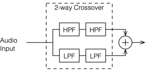
The difference between a 2nd-order and a 4th-order Linkwitz Riley is in the details of exactly what’s inside those blocks called “HPF” and “LPF”. In the case of a 2nd-order crossover, each block contains a 1st-order Butterworth filter, and they all have the same cutoff frequency. (For a 4th-order Linkwitz Riley, the filters are all 2nd-order Butterworth)
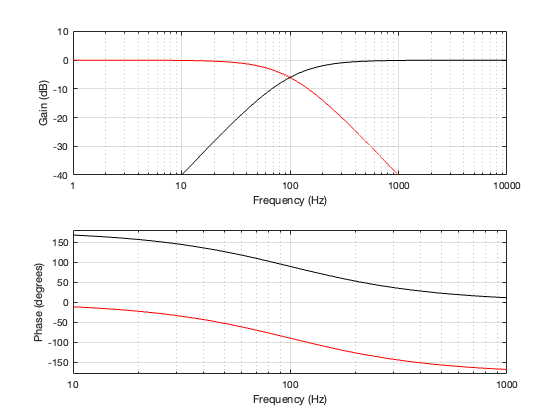
Since each of those filters will attenuate the signal by 3 dB at the cutoff frequency, then the total combined response for each section will be -6 dB at the crossover. This can be seen below in Figure 4.2. Also, the series combination of the two 1st-order Butterworths means that the high and low sections of the crossover will have a phase different of 180º at all frequencies.
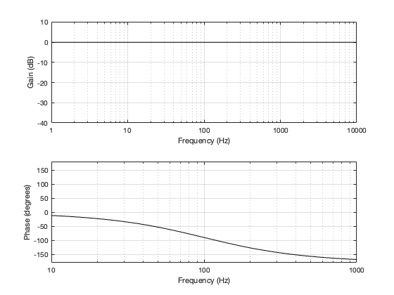
Since the two filter sections have a phase separation of 180º, we need to invert the polarity of the high-pass section. This means that, when the two outputs are summed as shown in Figure 4.1, the total magnitude response is flat, but the phase response is the same as a 2nd-order minimum phase allpass filter, as can be seen in Figure 4.3, below.
If we then look at the low- mid- and high-frequency sinusoidal signals that have been passed through the crossover, the results look like those shown below in Figures 4.4, 4.5, and 4.6.
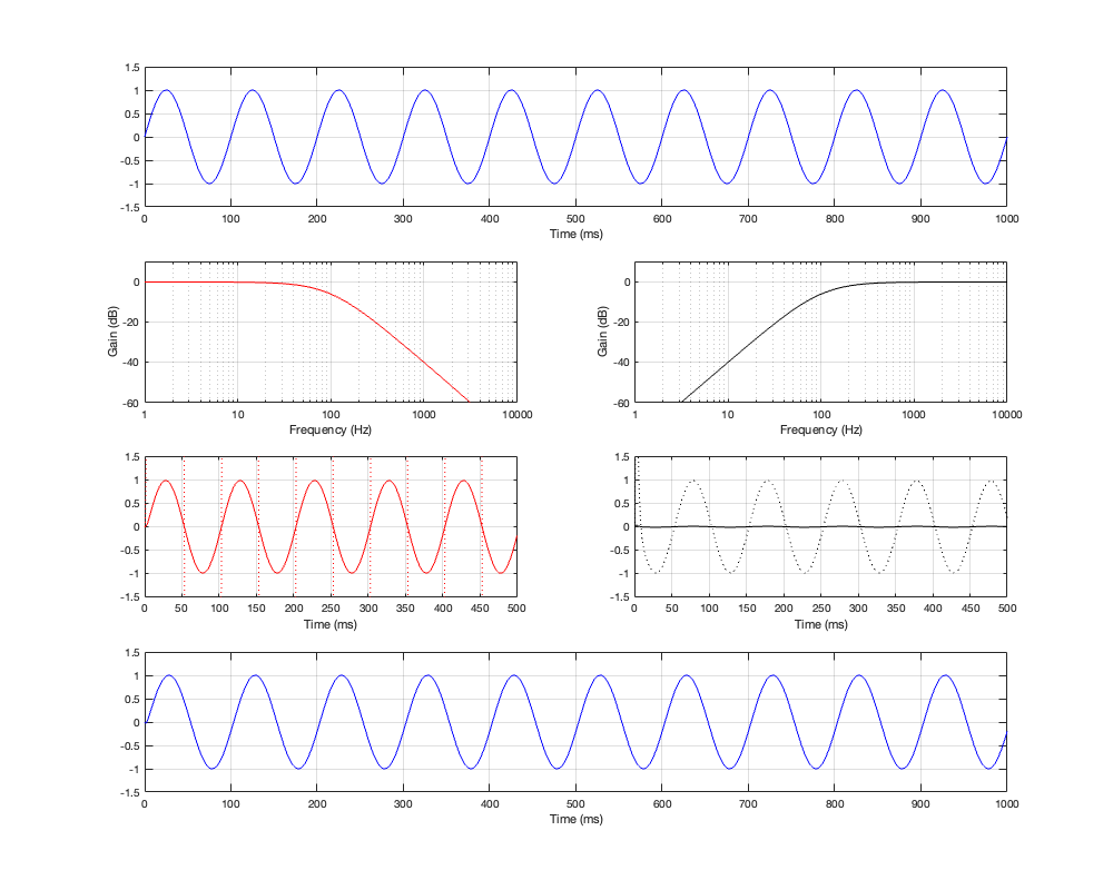
As can be seen in Figure 4.4, for a very low frequency, the output is the same as the input, the magnitude is identical (as we would expect based on the Magnitude Response plot shown in Figure 4.3, and the phase difference of the output relative to the input is 0º.
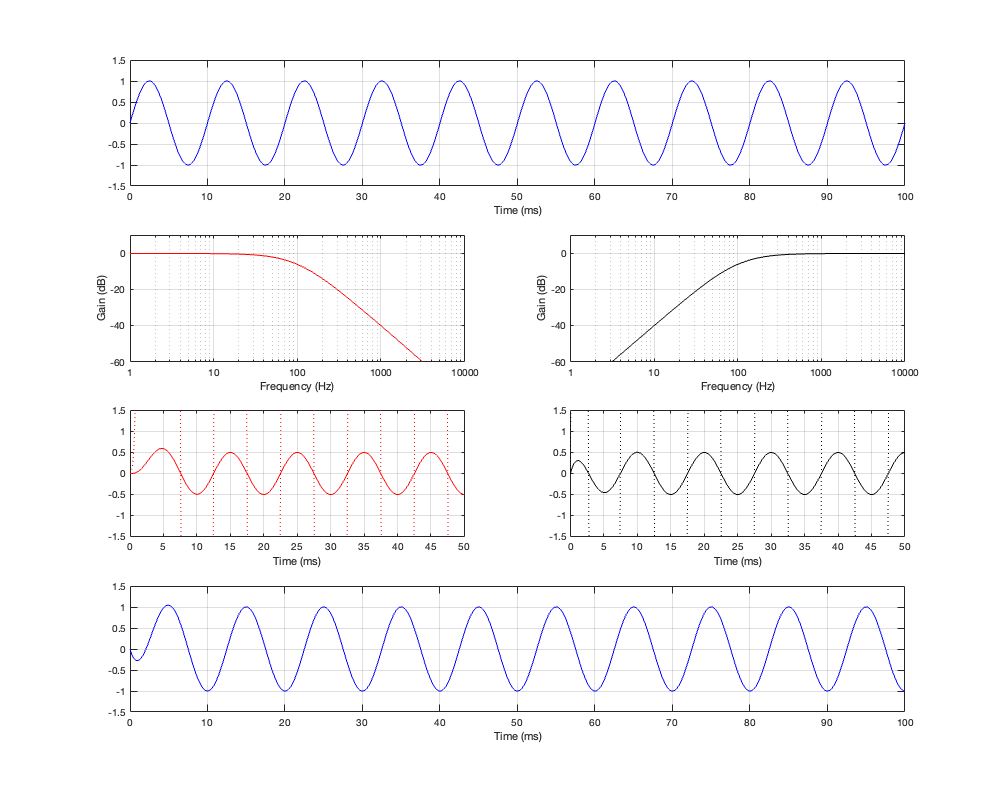
At the crossover frequency, shown in Figure 4.5, the output has shifted in phase relative to the input by 90º, but their magnitudes still match.
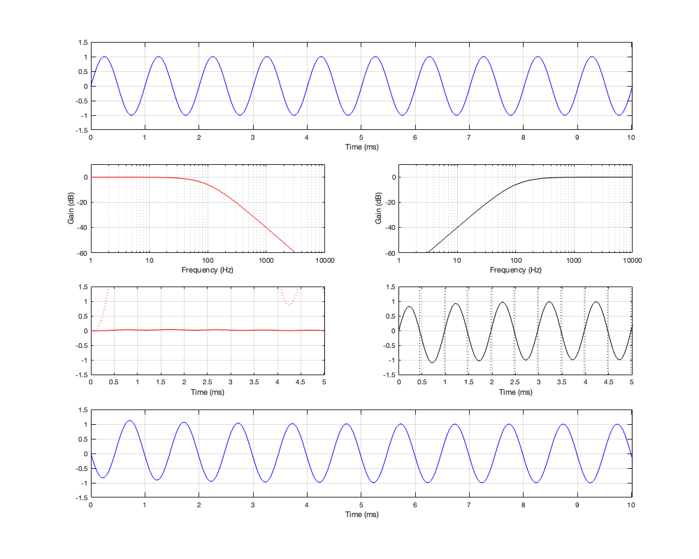
At a high frequency, the phase has shifted by 180º relative to the input.
One last thing. The dotted plots in Figures 4.4 to 4.6 are the signals magnified by a factor of 10 to make them easier to see when they’re low in level. There are two interesting ones to look at:
- the very beginning of the black plot on the right of Figure 4.4. Notice that this one starts with a positive spike before it settles down into a sinusoid.
- the red plot on the left In Figure 4.6. Notice that the signal goes positive, and stays positive for the full 5 ms.
We will come back later to talk about both of these points. The truth is that they’re not really important for now, so we’ll pretend that they didn’t look too weird.