Introduction
Before I start my little rant, let’s do some basic grade-school geometry.
The area of a rectangle is equal to its length multiplied by its width. For example, if you have rectangle with sides of lengths 2 cm and 4 cm, then its area is 8 square centimeters (2 * 4 = 8). This means that if you have a square, then its area is the length of its side squared. For example, if you have a square with sides of a length 3 m, then its area is 9 square metres (3 * 3 = 3^2 = 9). In other words, for rectangles,
A = L * W
where A is Area, L is Length and W is Width. The only thing that makes a square special is that L = W.
The area of a circle is equal to π multiplied by its radius (the distance from the centre of the circle to its edge) squared. In other words, A = π * r^2 (say “pie are squared”) where A is area, π is roughly equal to 3.14 and r is the radius. So, if you have a circle with a radius of 4 mm then its area is approximately 28.27 square millimeters.
In the case of the square and the circle, if you double the width (or diameter, or radius), you quadruple the area. If you increase the width by a factor of 3, you increase the area by a factor of 9 (3 x 3). Stated generally, the area is proportional to the square of the width.
Representing your data with a bar graph
Now, let’s pretend that we have some data to show to people. We’ll start with something simple – we’ll display the total annual sales of widgets over 3 years. Let’s say that, in the first year, you sold 10 widgets; 20 widgets the second year and 30 widgets the third year. Your competitor, by comparison, only sold 10 widgets in each of the three years.
How do we plot these data? Of course, there are lots of ways, but one way that makes sense is to use a bar graph. A bar graph shows a single bar for each value (in our case, widget sales in each year), side by side, where all of the bars have the same width. The value is represented by the height of the bar. An example of a bar graph of our widget sales is shown below.

For the purposes of my little rant, there’s something important in that last paragraph. I said that the height of the bars shows the data, but the width of all of the bars are the same. This means that the data are not only shown by the heights of the bars, but also their areas.
Mis-representing your data with a weird bar graph
What if we were to get creative and say that the data are not only represented by the height of the bars, but also their widths? On the one hand, you could make the argument that this is fair, since you could look at either the relative heights OR the widths to see the data comparions. However, if you take a look at the example shown below where I’ve plotted such a graph, you’ll see that this might not be a fair representation. Why not? Well, if your eyes are like my eyes, you don’t see the heights of the bars, you see the areas of the bars. And, since I’ve doubled the height and the width of the bar with double the value, the area is 4 times. In other words, I’m exaggerating the difference in the values by doing this (to be precise, I’m squaring the difference).

But I hear you cry, “Of course no one would ever do this! I’ve never see such a plot! Or, at least, I can’t make one in Excel…(although I can in Tableau…)” Read on!
Getting to the point… bit by bit
Let’s say that we did some kind of test where we want to represent a bunch of data points for various categories. For example, a listening test comparing four loudspeakers, where each loudspeaker was rated on 15 attributes. We’ll assume for the purposes of this discussion that the test was designed and conducted correctly, and that we can trust the data. We’ll also assume that the test subjects that produced the data (our listening panel) are experts and can rate things perfectly linearly. In other words, for a given attribute, if the listening panel says that one loudspeaker gets a score of 30 and the other one gets a score of 60, then the second one is twice as good as the former. We’ll also say that, for the purposes of this test, each attribute was scored on a range from 0 to 100. Finally, we’ll assume (for the purposes of keeping this discussion clear) that a higher score for any attribute means “better”.
So, we did our test and we got some strange results. (Note that these data are not from a real listening test. I made up everything to illustrate my point.) One loudspeaker got a score of 100 (out of 100) on every attribute. Another loudspeaker got a score of 50 on every attribute. The other two loudspeakers were a little more realistic (but still faked, don’t forget…)

So, as you can see in the above bar graph, one loudspeaker got a score that was only half as good as the other in all categories. This is easily seen in the bar graph. If you squint just right, you can also imagine two rectangles, one big black one and one big red one. Since those two rectangles have the same width, their areas also represent the data accurately.
But, what would happen if we plotted exactly the same data using a spider plot? That would look like the figure below.

Notice that the same data is plotted as before, but the message your eyes see is slightly different. You see the black circle and how it compares to the red circle. Since the red circle has twice the radius of the black circle, it has four times the area. If you’re like me, you see the comparison of the areas of the circles – not their radii. So, if you don’t force your brain to do a little sqare-rooting on the fly, the plot appears to say that the second loudspeaker is four times better overall, which is not what the data says. This is basically where I’m headed…
Now let’s look at the “results” for the other two loudspeakers, whose data was a little more varied. These are displayed in the bar graph and spider plots below.

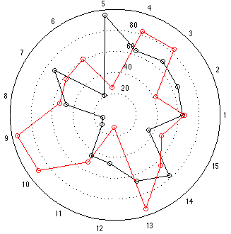
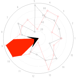
This time, at first glance, things look a little more “normal” but look carefully, particularly at the results for categories 9 and 10. The same problem (of a spider plot showing the square of the results) happens again here. The big area between the red points and the black points for 9 and 10 exaggerates the difference in the actual data, which are better displayed in the bar graph. One way to think of this is that the “slice of the pie” gets bigger in area as you go further out from the centre of the circle. The figure below shows the way my brain interprets the plot.
Of course, if the data were for the same for all attributes for both speakers except for one attribute where one loudspeaker got a score of 100 and the other got a 50 (so you would just see a spike at one angle on the plot), then the spider plot would come very close to representing the data correctly. But this is because, with those weird collection of numbers, you come close to eliminating area in the plot – and it just becomes what most people call a “compass plot” which is something different.
The conclusion
As the title says, my conclusion is that a spider plot mis-represents differences in data because they show us something that it more like the square of the difference rather than the difference itself. To be fair, its representation approaches the square of the difference as all of the values for a given product become more equal (as I showed in the first spider plot with the two circles, above).
Personally, I prefer to have graphs that show me the results – not a weird scaling of the results – which is why I hate looking at spider plots.
Mostly, however, it’s because I’m too lazy to do square roots in my head.